Conclusion / synthesis of the keyboard poll results


Not entirely sure about putting the hardware toggles on a user mappable button.


Is the idea of the Pyra overlay button on super still alive? We could easily add the hardware toggles in that overlay menu (together with kill-current-app, etc...)


If we hotkey each of the entries in such an overlay menu it would even provide some discoverability of those features.


E.g. the menu could be something like:

  • Back (default selection)
  • Kill Application
  • Task Manager
  • Enable WiFi (or Disable WiFi)
  • Enable Bluetooth (or Disable Bluetooth)
This menu could popup on a standalone super. When pressing super + K or super + T it would directly perform those tasks.
Sure, we could do that. I would let a short tap of Super pop up a normal main menu though, like on the Pandora. But a long press could show those things in an overlay, and of course if you want to do the Super+letter shortcuts, you don't have to wait for the overlay to show up.

So yes, maybe hardware toggles are not a good default for Usr1 and Usr2, since we can cover that already with Super.

Maybe context-menu key (also available as Shift-F10, but maybe a direct key is easier)?
 
Am i the only one that gets extremely irritated when comradekingu arbitrarily fabricates 'collective preferance' i.e. "I don't think people care for the pyra/fire connection" and slips these into his arguments in an attempt to seruptitiosly brainwash the rest of us.


God help me, but it makes me livid!
I don't see why you would get upset, if you want to focus solely on one statement, singeling it out makes it totally void. Who cares what I think, you do, and that provokes you..? It is as interesting to the discussion as you getting angry about it. Did you miss the I think so part?
I used the 'one statement' as an example of something you do repeatedly. I.e. fabricate collective preferance to suit your own opinions. And don't claim innocence here, you know perfectly well what you are doing. You will never admit it of course. You will deflect like you always do, like you've just done here. And guess what? What you think bothers me not in the slightest, you can think whatever you like... it's how you opperate in instances like this that i regard as devious and manipulative and i will not hesitate to point it out when i see it.


You are actually doing yourself a disservice, because I am sure there are a number of us now that pretty much just skim your posts to avoid dealing with your tendancy to manipulate information and deflect.


If you respected us enough not to do this, I'm sure we would give your proposals far more concideration and then you might actually find us supporting you a lot more.


Just something to think about.
 
So when I say I think the contrary to what my argument is, holds little preference, based on the no such thing seen, and you, taking that out of its context, forgetting how i only think this is the case, and you say this is fabricating 'collective preference' for the purpose of brainwashing who is manufacturing what exactly?

What is your argument there, that you append 'us' onto..?

If I wanted to deflect, why did I answer you, and why is it you categorize me based on 'one statement' without answering anything suggesting I provided an answer.

Lets keep the door open for what is unbeknownst to me, (do provide more examples on pm and i'll look into it), and that if i wanted to brainwash you, I would be better at it.

Fact of the matter is someone has to be the antagonist. If a design hasn't given something thought, or that isn't shared, either in the design or in explanation, unless we have an influx of people stating their opinion, insight is all we have. That is what i shared, and some part of it, wasn't substantiated, but rather in light of what other things there are to consider.

Some people brought value into the mix, and you just got angry.

I do not care if you like me, I don't care if you like my designs. I care only about what you state about the latter.

If you cant see past that to deal with the content, and manage to get angry in the process, the loss is yours. Edit: I changed the initial thing you had an issue with, to read more to your liking, albeit very verbose. I hope my intention is now more clear.

Lets look at the poll that suggests doublewide space is better (not non-centered doublewide, as that isn't stated, and centered was still very much up for consideration.)

These are a selection people voting for singlespace, which unless i'm mistaken gained the most insight (by a factor of time spent), in the very least are inherently knowledgable about the actual designs in this thread:

_wb_ comradekingu Grench rygD Saber ible


Its very easy to see the difference it makes on the firstpost layouts, you either get a compose or you dont.


My thinking is that the more buttons do something, in the way of working for two thumbs, rather than looking like 10finger design, on a device that has a limited selection of buttons, is better.


The part where it makes the greatest difference is accounting for


"How should the QWERTYUIOP row be aligned?" favouring international input.


Just fix this single thing and those people can make amends. Either by using the compose to type their language, or DIY-hacking the default layout.


I would be happy to put my albeit meagre money where my enormous mouth is and fund an alternative A-aligned layout.
 
Last edited by a moderator:
I rather have a big space button and having it on the side makes sense since having there would be easier for your thumb.

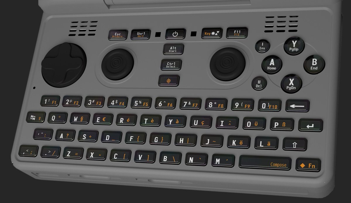
ED has posted the almost finished layout on twitter:


One of the comments on twitter mentions that alt/start and ctrl/select are reversed compared to A/home etc (keyboard function on top vs on bottom).

A valid point in my opinion, I think the keyboard function should be on the bottom in all of these (like it was on the Pandora).

For those wanting to have a second shift on the keyboard. Would mapping shift to the user button work? It's a little bit out of the way, but it should still be reachable.

Since we do not have WiFi/Bluetooth toggle buttons. Do we need to standardize a bit on shortcuts for this? E.g. Super+w (WiFi), super+b (Bluetooth). Also standalone super for global pyra menu, and so forth...

<edit>I also liked the idea of having lid closed being mapped to the other super button (is the pyra button the left or the right super?)</edit>
While I still take some issues with the FN colors, if this is close to what is shipped, that would just be just fine.
 
Last edited by a moderator:
Its still going to be on the right, just in the size and actuation made for your thumb, as per the default for every other button, rather than a morphing of two buttons made to please your mind. Having a dual-button there wont make it available to your other thumb, which is why it doesn't make sense.
 
Last edited by a moderator:
Its still going to be on the right, just in the size and actuation made for your thumb, rather than a morphing of two buttons made to please your mind.
I was talking about the non-centered doublewide vs centered doublewide, not that I actually think that will change.To be fair to both the right and left handed people, mid would be best, but wouldn't be as good for those who are right handed. (Obvious Bias)

Also, even if we were going to have the space button as one button, there would be one on each side.

I rather be sure that I am hitting the space button and not have it blend in with the rest of the keys.
 
Last edited by a moderator:
ED has posted the almost finished layout on twitter:

That render looks AWESOME.

True, the alternate color chosen may take a bit to get used to. I'll gladly get used to it.

Not sure if it's an artifact or other - what is that small black dot above and left of the 1 key?
 
I might like User1/User2 as Mouse1/Mouse2, though I'd probably remap F11/F12 to User1/User2 so I can put M1/M2 above the right nub (so that I can click and drag with the left nub moving the mouse).

I'm more worried about that sharp black edge poking out of the bottom left side of the case ;) .
 
Last edited by a moderator:
Its still going to be on the right, just in the size and actuation made for your thumb, rather than a morphing of two buttons made to please your mind.
I was talking about the non-centered doublewide vs centered doublewide, not that I actually think that will change.
To be fair to both the right and left handed people, mid would be best, but wouldn't be as good for those who are right handed. (Obvious Bias)


Also, even if we were going to have the space button as one button, there would be one on each side.


I rather be sure that I am hitting the space button and not have it blend in with the rest of the keys.
So what i got from that was since you want a doublewide, and that middle would be good for that, it is ok to do the same doublewide on the right. Im pretty sure i got that wrong.

Alas, not only is the premise of having a doublewide on the right gone, having a doublewide centered actually also doesnt carry over from 10finger boards in the same way.

Interestingly, if you look at the sequences, and distance traveled, (longer) and input available, (less) centered doublewide is the same benefit. Yes you benefit at words ending in for example c or v, because you can travel to space with your left hand, but its at the same time farther away from punctuation its used in conjunction with every sentence, that is a given and not chance.

As for dexterity, you have to look to what input dictates. English is already left biased. Both left and right-handed people will have to deal with that equally, and also use both thumbs.

You could do the math, but in any event, dualwide middle is out, because it necessitates having numbers not as a number row, and that isnt preffered, and doesn't balance out. (and by that i mean nobody has been able to)

Edit: Here is a visualization of singlewide based on the latest render:

CK4N7RHWcAAhbEH.jpg:large2.jpeg
 
Last edited by a moderator:
No they aren't. The important bit is the making of the molds, which hasn't happened yet, for the case or the keymat.

Once that happens, it decides the modularity of the whole thing. Because they cost a lot to make. To the tune of 10k euro+ per part.
 
Dude the ship has sailed,   just because you can still see it on the horizon doesn't mean you can bring it back by screaming at it from the dock.

-Neelix
 
So what i got from that was since you want a doublewide, and that middle would be good for that, it is ok to do the same doublewide on the right. Im pretty sure i got that wrong.


Alas, not only is the premise of having a doublewide on the right gone, having a doublewide centered actually also doesnt carry over from 10finger boards in the same way.


Interestingly, if you look at the sequences, and distance traveled, (longer) and input available, (less) centered doublewide is the same benefit. Yes you benefit at words ending in for example c or v, because you can travel to space with your left hand, but its at the same time farther away from punctuation its used in conjunction with every sentence, that is a given and not chance.


As for dexterity, you have to look to what input dictates. English is already left biased. Both left and right-handed people will have to deal with that equally, and also use both thumbs.


You could do the math, but in any event, dualwide middle is out, because it necessitates having numbers not as a number row, and that isnt preffered, and doesn't balance out. (and by that i mean nobody has been able to)


Edit: Here is a visualization of singlewide based on the latest render:

attachicon.gif
CK4N7RHWcAAhbEH.jpg:large2.jpeg
Honestly, I don't understand what your are saying. I meant mid buttom. Put the space button where the VB buttons are and shift them to the right. All I was saying is that, if the space button was in the middle (or two single space buttons on each side), that the left handed and right handed would have equal reach to the space button. Unlike the space button now, favoring the right. I still perfer the 2 buttons space on the right.
 
Last edited by a moderator:
Put the space button where the VB buttons are and shift them to the right.
That is a horrible idea. shifting around the alpha-numeric keys from the standard is a poor idea. If you are talking about being fair to left and right handed people, the only other best solution would have been to split the space bar into two single sized buttons on the left and right. I'm not totally sold on the idea that a right orientated spacebar is a real concern on a keyboard designed to be used with your thumbs. 
 
Natsu, that is also not an option. (ninjad by TrashyMG) Two buttons on the right, is the same bias towards right as one button for space on the right.

The crux here is that using a second button for space on the right, only brings some parts of 10finger looks, but none of the benefit. It removes functionality (dedicated compose), is less efficient (since you cant move to the next button) has worse tactility (unevenly collapsing membrane) and modularity (international layouts, advanced layouts)

Neelix: That is a false analogy. No ship has been made yet.

You select between the two:

Looks          Functionality     Efficiency               Feel              Modularity

10finger-ish      Worse                 Worse               Worse                Worse

Symmetric        Better                 Better                Better                 Better
 
Last edited by a moderator:
Back
Top