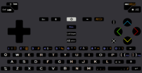
Unofficial keyboard layout poll (bis)

comradekingu's proposal, see http://boards.openpandora.org/topic/17568-final-keyboard-layout-proposa

  • I LOVE this layout

    Votes: 0 0.0%

  • Total voters
    17

Once the user sees AltGr shares the identical color print as the punctuation marks on the keyboard, they'll learn this AltGr key and that other key gives that symbol. For example, on my layout AltGr with letter s produces quotation marks, which is exactly as what's labeled on the s key. A cakewalk.   
This is a nice feature but does not logically support your use of the letter sequence "AltGr". And for the record, I have zero technical knowledge on this matter and have never seen AltGr before (that I recall).

It's a bit like saying I've got a "Storage" sign up over the restroom, but the little man/woman silhouette on the door should inform people properly that it is in fact a restroom. Those who can understand and are familiar with the letter sequence "storage" will be immediately confused, while those who cannot understand the sign (like non-English readers) may later ask where the storage room is when they mean restroom. Both have a high chance of figuring it out thanks to the picture, but that doesn't logically justify my use of the word "storage".

It may be that AltGr is an ambiguous or faulty convention, but I think it's important to state explicitly why the Pyra should deviate besides just "ED said so" (as much as we all do love him).
 
So can we please agree that the Pyra-specific modifier should not be called "AltGr"?
No. ED wants it AltGr. A vocal minority in these threads wants something else because of some standard they believe is being violated, and they are trying to rally others to their viewpoint.
I agree with _wb_ that the Pyra-specific modifier should NOT be called "AltGr".

Saber may call it a 'vocal minority', but from what I can tell, it is agreed by everyone who has created a keyboard layout but Saber that it should be called something other than AltGr.

My suspicion from re-reading ED's comments on your layout was that he saw a button labeled, "AltGr" and assumed Saber had figured out how to include a real "AltGr" key.  It isn't a real AltGr and should not be labeled as such.

Saber, the rest of the people who have educated themselves enough to know the difference are telling you that calling this Fn/Meta/WhatEver key, "AltGr" is simply misleading and wrong.  You're choosing not to take our input.  That is your choice, even if it's wrong.
When ED is ready he'll let you all know(though I understand why he hasn't ventured into all this).  B)
 
attachicon.gif
nr67coloursfixins5-1textfixaltGrpurple.png

So something like this?  I doubt its possible to colour the shoulders, but ok. Wouldnt it make sense if shift was coloured too, if AltGr is going to be?

Ed said this about Meta and Fn. Doesnt sound particularly like he likes hacks. Which is the reason im not using FN, because its a hack button, which can only be found on hack keyboards for hack reasons.

Instead doing almost dedicated mediabuttons and dedicated powertoggles, I dont see a reason to call it Fn.

So lets see if i understand:

So Shift+ is Shift+

If Meta is  AltGr+

Along with meta for F-keys

Then where the F-keys are, its not possible to use third level modifier.

So they have to be on the keyboard.

Meaning third level modifier and fourth level (shift+AltGr) modifier is disturbed.

Unless you make caps-lock for the "shift"  is that what im missing?
Kinda hard to see that color, try this: comradekingu.png

Shift doesn't need to be colored; most people (even US people) are familiar with shifts and how they work; the bad news is that your layout changes the way US people are expecting the number keys to shift.  I suspect this would cause some confusion, though people could get over it.

Not sure ED will go for a dual function spacebar, though, even if the buttons can be different underneath.

Not sure what your Shift+ discussion is about.
 
Last edited by a moderator:
^ New poll! :D
If we do a new poll, I think it would make sense to include your proposal as well, B-Zar.

And I think it would also make sense to include both of my 'main' proposals: both the one with {}|:confused:~_+ as Shift+[]\;/`-= (so they're Shift+Meta symbols) and the one which has them as direct Meta symbols. I currently have a weak preference for direct Meta symbols, but both approaches have their pros and cons and I have no strong feelings about this.

I think ible also has multiple proposals that could be entered into the vote, and while Saber currently has only one proposal, I think it would make sense to also include his v1 proposal (and perhaps also his v2 proposal) since ED has explicitly mentioned that one.

So, looking at the Final keyboard layout proposals/URL] thread, should we do a vote then with the following options?

Would that be OK, or did I overlook something?

How should we do the vote? First choice, second choice, third choice, with the weighting 3,2,1 points?

The problem is that if there are many variants that are rather similar, the votes get spread thinly over those variants, giving some advantage to the 'weird' proposals.

What about a series of checkbox questions, the first one "which ones could you learn to live with, even if you don't really like them", the next one "which ones are OK", then "which ones do you like", then "which one(s) do you really like a lot"? The disadvantage is that strategic voters can maximize their influence by voting extreme (e.g. only pick one proposal in every question), and they can even vote inconsistently. But the advantage is that you can better express your opinion. If we make it a public vote again, then that is probably enough to discourage strategic or inconsistent voting.

Or maybe those are just too many proposals, and ED should make a pre-selection and create an official vote amongst the ones that he likes?
So, what should we do?
 
Last edited by a moderator:
I'd really like ED's opinion first about what the layouts MUST have and what they MUST NOT have. There's little point in voting about doomed layouts. We could try to extract features from the current proposals and make a poll about them with "must have" "may have" "must not have" scale. These features should contain all the essential design choices (for example in mine that would be full button compatibility with US International keyboard and a mostly unmapped modifier for custom stuff) in all of the layouts, and most of the secondary ones. If we could get community and developer opinion on those we could prune or modify layouts that will never be viable.
 
Back
Top