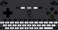
Unofficial keyboard layout poll (bis)

comradekingu's proposal, see http://boards.openpandora.org/topic/17568-final-keyboard-layout-proposa

  • I LOVE this layout

    Votes: 0 0.0%

  • Total voters
    17

I've made a few tweaks to mine (switched shift/meta on my main proposal), and removed some diacritics on the two shifts keyboard (since you can access them via meta+shift+`, meta+shift+', and meta+shift+").

Perhaps we can get ED to do a preselection, so things are more official. It would be nice to have a rating system (vote for first place, second place, third place), and rank the results accordingly. Ideally our chosen keyboard would have the most 1st places, fewer 2nd places, and low third places (like _wb_'s original layout ;) ).
 
in the end, it was too early to push these pools. None of you have a fixed&final version. So these pools are more popularity contest than a real informed pool
 
Last edited by a moderator:
That's true. I'd like to think we each have different design criteria, and you're voting more for those (the design goals) rather than a specific keyboard.  But perhaps we should have a keyboard release freeze ;) .
 
Last edited by a moderator:
One can keep tweaking keyboard layouts, and sometimes it feels like I do 100 tweaks just to end up at the starting position again :)

Anyway, should we ask ED now to make a selection (possibly a 'selection' that just includes everything) from the current set of proposals, and have an 'official' poll? (still with the disclaimer that ultimately ED decides, but if the poll is initiated by ED, it will probably attract much more attention and voters)

Or should we take some more time to tweak and refine the proposals?
 
At least conceptual pruning could be a good idea. I mean at the level of "Layout must not have a driver-level modifier key" or "Layout must contain ß behind at most a single modifier" or "Layout must have two-width space bar located at second and third button from the right on bottom row" or "Layout must retain compatibility with pandora" or "Layout must dedicate buttons beside the power button for hardware feature control". Simple requirements like these would probably drop a few layouts and focus the effort better. All statements this far have felt more like guidelines than requirements.
 
I recognize the need for further tweaks in my layout, a lot of good points were raised that I hadn't considered, but it still revolves around a few key ideas. That's basically what it boils down to, each layout is unique but there are a number of consistent (and sometimes inconsistent) themes. Before any sort of "official" poll, I really, really want EvilDragon to look at the ideas that have been promoted and say whether anything is particularly good or particularly bad. If he comes along and says "left punctuation is an interesting idea, but the numeric F* keys (F1-F10) should be on the number row" then I'll happily ditch the contiguous F row and come up with a new design that keeps the left punctuation. On the other hand, if he says "keep punctuation as close to where it is on a standard US international keyboard as possible" then I may as well scrap the idea entirely and put my money behind someone who's already got something along those lines.

edit: What B-Zar said.
 
Last edited by a moderator:
FWIW, I think it would help (or help me at least) if someone was able to go through the proposals and identify the major features; perhaps as the top five pros and cons.  But reading this thread has shown me that I'm not the person to do this, as I hadn't considered things like whether dot and comma should be on the left or the right, but I can see how that might affect usability.  Unfortunately I don't have the will to read the whole thread and bone up on any features that might be worth noting, but if anyone has and would be willing to write up a few notes on each layout I would appreciate it.
 
It should be easy for the layout author to write a few pros of the keyboard, as well as a few cons (though perhaps it's best for others to fill those in).  I think it'd be good to keep these short.  I think Grench likes to elaborate quite a bit on his layout, but I think it'd be easier for people (ED) to read a few short bullet points than otherwise.

For my primary layout, though my other ones (with different constraints) seek to fulfill the same design criteria:

http://www.keyboard-layout-editor.com/#/layouts/048b81f5eb11d33da8e526077cb3b160

Pros:

  • Keymat has lots of empty space for international users to map Meta as they like.  For German:  A,O,U are free for umlauts, S is free for eszett.
  • Having more punctuation on the right means the keyboard is somewhat balanced left/right, considering QWERTY and letter frequencies for the English language.
  • Coding combinations are quick and typically use the same modifier (Meta):  <= += -= /= :Enter , etc.
  • No more than 3 prints per key, though sometimes two meta prints.
Cons:
  • Diverges from Pandora quite heavily (including moving ,. over to the right).  We shouldn't be too afraid of this, however, if it's a good design.
  • Shift + ,. being ;: is different than standard US keyboard practice (shift+,. is <>); but <> are rarely used in the English writing (except coding, but see above pro for coding considerations).
  • Meta+Shift is necessary to get some symbols like {}|+_ but this can be accomplished by button mashing the lower left corner of the keyboard with left thumb and hitting the right key with the right thumb.
  • Meta and Shift sit on the same side of the device on both the Keyboard and Shoulder buttons.
Thinking of my own design criteria has led me to rethink my "one-meta-per-key" layout, though there are two very closely related options:(1)http://www.keyboard-layout-editor.com/#/layouts/65387ee9e44b44cd79ef19c190c87862

(2)http://www.keyboard-layout-editor.com/#/layouts/dcb735a3f720546a703c4f9cfe2c262d

Any preferences? Do people really want the letter I free for their diacritic enhanced I, or should it be the mneumonic for increment? (Meta+I = +)
 
Last edited by a moderator:
(B-zar I think if there is a discernable difference percentage-wise, then originators shouldnt vote. The whole point is to gauge community feedback. Before that point i think it damages more than it helps)

Ible: this is what im thinking right away: International users use the "international" full layout.

  • Doing away with that and implementing new keys is a hack. You are speaking on behalf of international users by giving them crumbs.
  • Even doing a full layout, its possible to have all letter keys, and tab, free of altGr mods, and still include the regular set of symbols. Its not a pro, its almost as bad as it gets.
  • Is + really up there with the brightness key, on the column-row?
  • Why not put shift at the right too, so that combinations arent needlessly scattered?
  • You have to use both hands to type    { }, how is that quicker for coding?

  • , . over to the right is fantastic, stepping it isnt.
  • . :  and , ; makes sense  < > on Z X doesnt, its also seperated from the other brackets. You can type < with one hand, so a little bonus there.
  • I wouldnt have been able to figure out shift+meta if i hadnt hung out in keyboard threads, the only place where this is used to type visible things. Try it on someone who is new.
  • Meta+shift together is good, if you want to have an easier time typing 4th level modifiers. Not so great for people with only the right hand avail, because you need left to type at all times.

Wb: I would like you to make one of these: http://boards.openpandora.org/topic/17989-unofficial-keyboard-layout-poll-bis/page-3#entry380666 and approach the critique

Still dont understand what kind of overview there is, nor what users this is better for. I dont understand why choices are made, and in my head, those are the choices to be made.

Enlighten me.

Edit: as a question:  

What are the reasons you think doing it in the manner you have done, is better.

What are the flaws you see about

View attachment 11115my layout, or someone elses layout that differs

, where does it fail, thoughts etc.
 
Last edited by a moderator:
The “best” scenario of accurate representation would be if everyone votes for their favorite proposal then, for what it’s worth, the winner is declared after the tally. No averaging just a clear victor(since there won’t be two keymats). Ever heard the expression second place is first loser?  :p
Simple majority vote system only works fairly if there are exactly two options to choose between. Allow me to illustrate:

A community is voting what fruit they get for a convention. The options have been reduced to Apples, Bananas and Cantaloupes. 51% would order these options by preference [A, B, C], 25% would order them [C, B, A] and 24% [b, C, A]. The community proceeds to vote using a simple majority system. Apples get 51% of votes, winning the election with 49% of the community being stuck with their least favorite option.

The 49% demand a new poll using average ranking instead. Weighting is decided to be a simple 3 points for first option, 2 points for the second, 1 point for the third. Apples get 3*51% + 2*0% + 1*49% = 2.02, Bananas get 3*24% + 2*76% + 1*0% = 2.24 and Cantaloupes get 3*25% + 2*24% + 1*51% = 1.74 points. Bananas win the vote.

Which result is more likely to be the least bad for the most?
You're making this more complex than it need be(like these layout discussions). Thinking too much into it with a point system. We aren't making a fruit salad accounting for varied tastes for stone fruit to melon. For our purpose, which distinctive layout(and they are all different from one another) is preferred by the community, it requires just a simple check from each individual member next to the name of the person who's layout they want for the Pyra. No less no more. As I said, there will not be two keymats. No runner ups. No almosts. No degrees. Just yes that's the one for me.  ;)
 
Last edited by a moderator:
Ible: this is what im thinking right away: International users use the "international" full layout.

  • Doing away with that and implementing new keys is a hack. You are speaking on behalf of international users by giving them crumbs.
  • Even doing a full layout, its possible to have all letter keys, and tab, free of altGr mods, and still include the regular set of symbols. Its not a pro, its almost as bad as it gets.
  • Is + really up there with the brightness key, on the column-row?
  • Why not put shift at the right too, so that combinations arent needlessly scattered?
  • You have to use both hands to type    { }, how is that quicker for coding?
To answer your points...

  • Regarding internationalization, I have been following the leads of _wb_ and Saber, one of them because I like their ideas, and the other because it is close to what the Pandora is (and what ED probably wants).
  • I don't say all my keys are available to Meta, but there are more available than in Saber's layout.
  • No, in the Hardware keys, +/- are to go brightness up/down. Use Shift to change Keyboard LED's, and Meta to do something different (toggle screen/HDMI).
  • I only want one keyboard shift, and putting it on the left means you can button mash it with Meta. (I also find that on a regular keyboard I favor the left shift.)
  • It takes two hands to do your {} as well, unless you can chain it with the shift (seems tricky away from a corner), though it is one less modifier away (Shift + [] = {} for you, whereas we have Shift+Meta+JK = {} for me). If you don't use your left thumb, you can still chain both left shoulders to get Meta+Shift.
  • , . over to the right is fantastic, stepping it isnt.
  • . :  and , ; makes sense  < > on Z X doesnt, its also seperated from the other brackets. You can type < with one hand, so a little bonus there.
  • I wouldnt have been able to figure out shift+meta if i hadnt hung out in keyboard threads, the only place where this is used to type visible things. Try it on someone who is new.
  • Meta+shift together is good, if you want to have an easier time typing 4th level modifiers. Not so great for people with only the right hand avail, because you need left to type at all times.
  • Thanks; it appears ED wants the alphabet centered, which necessitates stepping ,. if they're on the right. Not ideal.
  • I don't find myself using <> as if they're brackets. I use them in coding for comparing things and for couting them. At any rate, putting them on the left allows me to combo <= easily with the same modifier. Also, this allows ED to put « and » on Shift+Meta+ZX, if he desires.
  • I find Meta+Shift a little bit easier to understand, but yes there's a learning curve. I still don't really know how to get get certain symbols on your layout. (Though I could figure it out if I had a Pyra in front of me.)
  • I'm not going to optimize the keyboard for a person who's only using their right hand to type...
What are the reasons you think doing it in the manner you have done, is better.

What are the flaws you see about

my layout, or someone elses layout that differs

, where does it fail, thoughts etc.
Just from looking, I don't understand how you get certain symbols, like | or # on your layout, or _ or /. Also having a two-wide spacebar is against the design constraints.

Aesthetically, I have an aversion to symbols for Ctrl and Alt, since I can never remember which one does what.

I think I (and others as well) would have less of a negative reaction to your keyboard if the above were cleared up. It might help if you use colors to distinguish your Meta symbols. (Meta is orange, then the symbol which comes from Meta+{that key} is also orange, type of thing.)

[edit] oops, I see you've changed your funny symbols into words (Ctrl and Alt). But not in the main "final keyboard proposals" thread, which I was looking at.
 
Last edited by a moderator:
You're making this more complex than it need be(like these layout discussions). Thinking too much into it with a point system. We aren't making a fruit salad accounting for varied tastes for stone fruit to melon. For our purpose, which distinctive layout(and they are all different from one another) is preferred by the community, it requires just a simple check from each individual member next to the name of the person who's layout they want for the Pyra. No less no more. As I said, there will not be two keymats. No runner ups. No almosts. No degrees. Just yes that's the one for me.
I'm making it exactly as complex as it needs to be to reflect the community's will as well as it reasonably can. I want to minimize the amount of disappointment.

The system I laid out above does not have two winners. No runner ups. No almosts. No degrees. Just one winner.  The difference is even if your first choice doesn't get but a few votes, your voice still affects the final choice, but less.

If we were choosing several winners I'd probably propose a modified single transferable vote system. A nice video with animals here.
 
Last edited by a moderator:
Ible: this is what im thinking right away: International users use the "international" full layout.

  • Doing away with that and implementing new keys is a hack. You are speaking on behalf of international users by giving them crumbs.
  • Even doing a full layout, its possible to have all letter keys, and tab, free of altGr mods, and still include the regular set of symbols. Its not a pro, its almost as bad as it gets.
  • Is + really up there with the brightness key, on the column-row?
  • Why not put shift at the right too, so that combinations arent needlessly scattered?
  • You have to use both hands to type    { }, how is that quicker for coding?
To answer your points...

  • Regarding internationalization, I have been following the leads of _wb_ and Saber, one of them because I like their ideas, and the other because it is close to what the Pandora is (and what ED probably wants).
  • I don't say all my keys are available to Meta, but there are more available than in Saber's layout.
  • No, in the Hardware keys, +/- are to go brightness up/down. Use Shift to change Keyboard LED's, and Meta to do something different (toggle screen/HDMI).
  • I only want one keyboard shift, and putting it on the left means you can button mash it with Meta. (I also find that on a regular keyboard I favor the left shift.)
  • It takes two hands to do your {} as well, unless you can chain it with the shift (seems tricky away from a corner), though it is one less modifier away (Shift + [] = {} for you, whereas we have Shift+Meta+JK = {} for me). If you don't use your left thumb, you can still chain both left shoulders to get Meta+Shift.
That doesnt answer my points. it just tells me there is something about _wb_ and Sabers designs that you like in this regard, without telling me what that is.


What part of doing away with the keys in the position international users use them, can be defended in the name of "internationalization"?


Less clutter is good with respect to Sabers layout, it still doesnt answer why none isnt preferable.


Then where is the plus symbol, im not seeing it.


Why would you need to button-mash it with meta? You dont need to rely on shift+meta


You can chain it with the shift. My concern is not being able to type any shifts with the right hand only. And only the one with left keyboardshift. Not being able to type with right hand only is also not better. If that is the case.

  • , . over to the right is fantastic, stepping it isnt.
  • . :  and , ; makes sense  < > on Z X doesnt, its also seperated from the other brackets. You can type < with one hand, so a little bonus there.
  • I wouldnt have been able to figure out shift+meta if i hadnt hung out in keyboard threads, the only place where this is used to type visible things. Try it on someone who is new.
  • Meta+shift together is good, if you want to have an easier time typing 4th level modifiers. Not so great for people with only the right hand avail, because you need left to type at all times.
  • Thanks; it appears ED wants the alphabet centered, which necessitates stepping ,. if they're on the right. Not ideal.
  • I don't find myself using <> as if they're brackets. I use them in coding for comparing things and for couting them. At any rate, putting them on the left allows me to combo <= easily with the same modifier. Also, this allows ED to put « and » on Shift+Meta+ZX, if he desires.
  • I find Meta+Shift a little bit easier to understand, but yes there's a learning curve. I still don't really know how to get get certain symbols on your layout. (Though I could figure it out if I had a Pyra in front of me.)
  • I'm not going to optimize the keyboard for a person who's only using their right hand to type...
Do you think that is why he voted "Left, so there are keys available on P+2 and L+2 for international layouts" when asked "How should the QWERTYUIOP row be aligned?" here http://boards.openpandora.org/topic/16868-the-big-pyra-keyboard-poll/URL]Along with over half the concerned people. Excluding that half isnt what half the people want...


Why does <> have even have to be used with modifier? It can be a real key like on 105-key.


There already is a way to type « and »  for germans, ironically its  AltGr+x for « and AltGr+z (their y since z and y are swapped). This would all be back to normal if there wasnt already (an AltGr+) < and > on Z and X in your layout. Yes, z is really » and x is ». It is what it is. 


When has "learning curve" as a different wany to do something standard when the standard is possible been a success? Steve jobs, the guy who did a one button mouse on a modern computer, wasnt even able to do away with Caps Lock as a dedicated key like he did with Next-keyboards when he was hired back to apple.


Im not saying optimize for that, im saying make possible, as in not possible being worse. Its a free bonus if you put shift on the right. Along with efficiency-benefits.

What are the reasons you think doing it in the manner you have done, is better.


What are the flaws you see about


my layout, or someone elses layout that differs


, where does it fail, thoughts etc.
Just from looking, I don't understand how you get certain symbols, like | or # on your layout, or _ or /. Also having a two-wide spacebar is against the design constraints.


Aesthetically, I have an aversion to symbols for Ctrl and Alt, since I can never remember which one does what.


I think I (and others as well) would have less of a negative reaction to your keyboard if the above were cleared up. It might help if you use colors to distinguish your Meta symbols. (Meta is orange, then the symbol which comes from Meta+{that key} is also orange, type of thing.)


[edit] oops, I see you've changed your funny symbols into words (Ctrl and Alt). But not in the main "final keyboard proposals" thread, which I was looking at.
Good feedback!

| and # are the AltGr position. Third position since its third level modifier. AltGr being to the right of Alt on the typewriter. Atop shift, since 3rd level modifier is higher than second.

To the right of altGr on shoulders would be ideal to get for free.


I knew AltGr would fail, which is why i made it so that you can type natural language using only shift. (I also know about insert/delete, pageup, pagedn, home, end failing without more clues)

By clearing up, do you mean colour-code altGr? Or are there other things you had in mind. What colour would you like, if any?

I went with text instead of symbols for that reason. Have a look.  
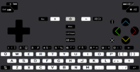
nr67coloursfixins5-1textfix.png

Eki and a lot of other "business" people didnt like it to look like a toy, so im using the least amount of colours possible. Also that is cheaper.
 
Last edited by a moderator:
Discussing this guy:  http://www.keyboard-layout-editor.com/#/layouts/048b81f5eb11d33da8e526077cb3b160

Well, internationalization doesn't really matter to me (don't really speak any other languages besides English well); but I figured _wb_ and Saber would know more about that than myself.  I also figure ED likes "hacks" as you call them, abusing the notion of AltGr to make our own keyboard.  To me, the exact modifier doesn't matter, I consider it "Meta" because I consider its usage completely different than AltGr.  But you're right in that if ED decides to make it AltGr, it breaks standard AltGr stuff.

I wouldn't be opposed to putting the Shoulder Shift/Meta over to the right side, so you can have a shift/meta on both sides of the device, but that breaks Pandora stylings.  I honestly don't have any muscle memory in either trigger finger for Shift/Meta, so either way works if you prefer it.

+ is on Shift+Meta+L.

Discussing your layout:

So, for example, AltGr+1 is | and AltGr+, is _.  I guess that makes sense.  I like your use of colors (the facebutton colors are nice), so I am confident you can choose a nice color for AltGr and the symbols it generates ;) .

But your layout still fails in having a double-width spacebar, against ED's specifications...

Does Meta mean Fn in your layout?  From what I recall, you're using Meta only to create the F keys like F1-F12, correct?  You may want to change its name to "Fn" to be clear about that.  But as far as I know, ED doesn't want two modifiers (AltGr and Fn), and he doesn't want a hardware level modifier (so a true Fn key would be bad).  But maybe we could persuade him to have one extra modifier, only for F keys, but still not be a hardware modifier.  Not sure if that's possible or popular, though.
 
nr67coloursfixins5-1textfixaltGrpurple.png

So something like this?  I doubt its possible to colour the shoulders, but ok. Wouldnt it make sense if shift was coloured too, if AltGr is going to be?

Ed said this about Meta and Fn. Doesnt sound particularly like he likes hacks. Which is the reason im not using FN, because its a hack button, which can only be found on hack keyboards for hack reasons.

Instead doing almost dedicated mediabuttons and dedicated powertoggles, I dont see a reason to call it Fn.

So lets see if i understand:

So Shift+ is Shift+

If Meta is  AltGr+

Along with meta for F-keys

Then where the F-keys are, its not possible to use third level modifier.

So they have to be on the keyboard.

Meaning third level modifier and fourth level (shift+AltGr) modifier is disturbed.

Unless you make caps-lock for the "shift"  is that what im missing?
 
Last edited by a moderator:
Meta (or Fn/Sym/whatever) is just a custom modifier for any missing keys. I make no distinction between F-keys, punctuation keys, or keys like PrintScreen. If it's missing as a dedicated primary key, it has to be put somewhere behind some other key, as a Meta/Fn/Sym/whatever key.

We have more keys than the Pandora and the Pandora just has one Fn modifier to compensate for missing keys, so we certainly don't need two different ones (like in comradekingu's proposal).

It even happens to be the case that we have enough keys to not need Meta labels on every single key (unlike the Pandora), so I (and ible) intentionally kept some keys free of Meta labels so you can map stuff there if you want. Like umlauted vowels and Eszett, ç and ñ, Ø Å and Æ, ¥ or €, acute or grave vowels, or whatever your particular language needs.

AltGr is something else entirely. It's an orthogonal thing. You can have it too if you want to (in the normal way: by letting one of the two Alt keys become AltGr), but most people wouldn't really need it. AltGr gives you third (and fourth) level symbols on every standard key: mostly on letters, numbers and punctuation keys. Here's an example of what AltGr can do:

1024px-Belgian_Linux_keyboard.svg.png


Now, by calling the Meta modifier "AltGr" (like comradekingu and Saber), this option is taken away (or at least it is severaly confused; you would have to define a 'new' AltGr modifier which is the 'real' AltGr, and you could end up with a keyboard with 5 or more Alt-like keys), because the number row already has AltGr labels (in comradekingu's and Saber's layout), the letter keys already have AltGr labels (in Saber's layout), and most of the punctuation keys are AltGr keys (!).

So can we please agree that the Pyra-specific modifier should not be called "AltGr"?
 
You're making this more complex than it need be(like these layout discussions). Thinking too much into it with a point system. We aren't making a fruit salad accounting for varied tastes for stone fruit to melon. For our purpose, which distinctive layout(and they are all different from one another) is preferred by the community, it requires just a simple check from each individual member next to the name of the person who's layout they want for the Pyra. No less no more. As I said, there will not be two keymats. No runner ups. No almosts. No degrees. Just yes that's the one for me.
I'm making it exactly as complex as it needs to be to reflect the community's will as well as it reasonably can. I want to minimize the amount of disappointment.
Reflect the community's will? Minimize the amount of disappointment? It is a wonder how anything is ever accomplished in this world. It's fine though. Spin your wheels as long as you like with whatever system you guys conjure up, with as many levels as need be in place, till you know for sure which direction you'll steer to.  -_-
 
So can we please agree that the Pyra-specific modifier should not be called "AltGr"?
No. ED wants it AltGr. A vocal minority in these threads wants something else because of some standard they believe is being violated, and they are trying to rally others to their viewpoint.

Once the user sees AltGr shares the identical color print as the punctuation marks on the keyboard, they'll learn this AltGr key and that other key gives that symbol. For example, on my layout AltGr with letter s produces quotation marks, which is exactly as what's labeled on the s key. A cakewalk.   
 
Last edited by a moderator:
So can we please agree that the Pyra-specific modifier should not be called "AltGr"?
No. ED wants it AltGr. A vocal minority in these threads wants something else because of some standard they believe is being violated, and they are trying to rally others to their viewpoint.
I agree with _wb_ that the Pyra-specific modifier should NOT be called "AltGr".

Saber may call it a 'vocal minority', but from what I can tell, it is agreed by everyone who has created a keyboard layout but Saber that it should be called something other than AltGr.

My suspicion from re-reading ED's comments on your layout was that he saw a button labeled, "AltGr" and assumed Saber had figured out how to include a real "AltGr" key.  It isn't a real AltGr and should not be labeled as such.

Saber, the rest of the people who have educated themselves enough to know the difference are telling you that calling this Fn/Meta/WhatEver key, "AltGr" is simply misleading and wrong.  You're choosing not to take our input.  That is your choice, even if it's wrong.
 
So can we please agree that the Pyra-specific modifier should not be called "AltGr"?
No. ED wants it AltGr. A vocal minority in these threads wants something else because of some standard they believe is being violated, and they are trying to rally others to their viewpoint.

Once the user sees AltGr shares the identical color print as the punctuation marks on the keyboard, they'll learn this AltGr key and that other key gives that symbol. For example, on my layout AltGr with letter s produces quotation marks, which is exactly as what's labeled on the s key. A cakewalk.   
Ed wanting it to be AltGr, doesnt make it something else than AltGr. The standard you are talking about is how AltGr works. What isnt happening is that me and wb are trying to rally anyone to our viewpoint. You were presented sound arguments backed up with factual information.

Have you actually tested that? 

When i see AltGr i recon it does Alternate-graphics, and not something that should be shift+numberrow. There are other options, but they are _never_ FNmeta+typewriterarea.

AltGr+s is ß  If you ruin that for me, then i dont know how to type the little german i do.

Finally found it on AltGr+u, which is supposed to be ↓, guess i'll have to do without that then, because this recurcive remapping has come to a dead end. Or?

Caron is Shift + AltGr+u
Am i supposed to guess this?
 
Last edited by a moderator:
Back
Top