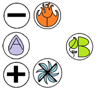
Action button labels: poll 3 (final poll?)

Which of these options are acceptable to you?


  • Total voters
    89

C = SHADOW / EVIL


...


Z = LIGHT / HOLY
To me both the sun and the moon equate to light. I am not alone in this, e.g. in Japanese the kanji combining sun and moon can mean bright or light.


Furthermore, what is the difference between holy and evil?

<edit>This is perhaps phrased a bit as unnecessary flamebait, but my main gist of this is "please keep religion out of the Pyra design"</edit>
Do you have a suggestion for different symbols? I think sun/day/light vs moon/night/shadow is good enough, and while the moon does indeed reflect light and can thus be the main "source" of light at night, it does not emit any light itself so it's fairly accurate to say that it is in fact dark.

I don't mean anything religious with Holy vs Evil, it's just one of those traditional opposing factions in games, it corresponds to Lawful vs Chaotic or Good vs Bad or White vs Black or Bright vs Dark or Healing vs Destruction or Yin vs Yang or whatever. I just used the word "Evil" because I want to make a game that says things like "Press [EVIL] to continue" ;)
Hey all on the Pyra/Pandora forums, saw this idea from you _wb_, and instantly I was reminded of Legend Of Zelda: Ocarina of Time! Don't know if I was the only one, but I just had to jump in here and say I like that idea, because I had also been thinking about some ways you could represent the basic 4 elements, and at first I was thinking something along the lines of Fifth Element, and the four element bricks. Well I was on Google Images looking for different representations, when the medallions of the Zelda: OoT came up. Then I refreshed this page and BAM there's your idea :D

And instead of having light and shadow, maybe you could have the ultimate positive and negative forces of the universe, Stars(light) and Blackholes(dark).
 
These images are a bit too big blobs of colour to my taste. Perhaps only the outline of the images is better.
Don't forget that the labels will be much smaller on the actual buttons than that image on your screen.

And instead of having light and shadow, maybe you could have the ultimate positive and negative forces of the universe, Stars(light) and Blackholes(dark).\\\\
A black hole is a bit tricky to draw though :)
 
These images are a bit too big blobs of colour to my taste. Perhaps only the outline of the images is better.
Don't forget that the labels will be much smaller on the actual buttons than that image on your screen.
To get a sense of scale, here's a quick mock-up based on the Pandora:

pyra_elements_mockup.png
 
To get a sense of scale, here's a quick mock-up based on the Pandora:
Why are you grouping AzY and cXB together with the grey smudge?
Seems weird to me since it is actually quite hard to press cXB as a group.

I can roll my thumb over zYB and press AcX together as well. So it would

seem more logical to group them as such (if at all).

Still not a fan of nearly fully coloured buttons.

<edit>Ah, I found the answer in one of your previous posts.

It is based on hot/cold, wet/dry grouping.

Still feels a bit counter intuitive somehow.

</edit>

<edit2>Some additional observations.

Shape wise, I think that X fits better within the sun (connecting the rays)

whereas A follows the shape of the water drop and z connects the top and bottom

lines of the gust of wind.

I do realize this messes up your grouping and mapping onto the elements,

but ED is ignoring all these discussions anyway :p

</edit2>
 
Last edited by a moderator:
AMAZING ART OF ARTISTRY.png

I am no artist <_< ; and trying to paint a dang blackhole broke my brain. BUT in the process I thought, what are these going to be bound as? Is the layout final? Because I was thinking A and B = Home and End, X and Y = Page up and Page down, and the two new ones would fit as Insert and Delete. Would that make sense? If so, just labeling them as a + and - could work? Kinda like on Wii I believe?
 
I am no artist <_< ; and trying to paint a dang blackhole broke my brain. BUT in the process I thought, what are these going to be bound as? Is the layout final? Because I was thinking A and B = Home and End, X and Y = Page up and Page down, and the two new ones would fit as Insert and Delete. Would that make sense? If so, just labeling them as a + and - could work? Kinda like on Wii I believe?
It is safe to assume that A, B, X and Y will remain bound to home,end, page down and page up for backwards compatibility.So far I have yet to see someone disagree with binding c and z to insert (top-left) and delete (bottom-left).

It places delete close to backspace which makes sense in a delete forward/backward way and maintains the vertical order

of ins and delete on the 6 keys block of the keyboard.

I think that the layout is a constraint space-wise. EvilDragon has mentioned on IRC that he is ignoring this discussion and prefers ABXY CZ.
 
Last edited by a moderator:
Yeah, I just think it looks weird, having the C and Z so... Out of order.
That is true. Someone did suggest using W instead of C such that WXYZ forms a rectangle.
By the way, didn't notice before that you were new. Welcome to the boards!
 
Thanks :) not really new, just never made an account, been here since before the pandora was even being produced.
 
To get a sense of scale, here's a quick mock-up based on the Pandora:
Why are you grouping AzY and cXB together with the grey smudge?

Seems weird to me since it is actually quite hard to press cXB as a group.


I can roll my thumb over zYB and press AcX together as well. So it would


seem more logical to group them as such (if at all).
I'm grouping those as a reference to both the SNES layout and the SEGA layout (two rows of three buttons). The grouping you propose is also there if you look at the colors: there's a cluster of blue-ish buttons and a cluster of orange-ish buttons.

Whoa, _wb_, how did you come up with these poll options? The non-latin non-pandora layout has is more well-liked than the lower-case greek layout according to the poll you made here: http://boards.openpandora.org/topic/15869-action-button-labels-poll-2-bis/

-God Ginrai
Maybe, but I didn't include lower-case Greek either in this poll. I only took the top two proposals from the previous poll since they were overwhelmingly better-liked than the alternatives, as well as a compromise proposal in between those two top proposals.

Welcome back to the discussion by the way.

You'll notice that there is a majority that likes Pandora Latin, and over 80% think it is acceptable, while only 50% think Greek is acceptable. So I'm now looking at ways to improve the Pandora Latin layout, in particular by adding elemental icons.
 
Last edited by a moderator:
Whoa, _wb_, how did you come up with these poll options? The non-latin non-pandora layout has is more well-liked than the lower-case greek layout according to the poll you made here: http://boards.openpandora.org/topic/15869-action-button-labels-poll-2-bis/

-God Ginrai
 Maybe, but I didn't include lower-case Greek either in this poll. I only took the top two proposals from the previous poll since they were overwhelmingly better-liked than the alternatives, as well as a compromise proposal in between those two top proposals.
Oh you're right. I misread your third option.

Welcome back to the discussion by the way.
Thanks. It's been a busy week.

-God Ginrai
 
Last edited by a moderator:
No idea where C and Z came from - the old thread seems to be favouring P and D, and I used 1 and 2 just to avoid having to make a decision, as it seems to me none's been made yet.


Regarding the groupings of three, it makes sense to group the buttons called (in _wb_'s diagram) A, c and Y in one group and z, X and B in the other as those more closely mimic the arc your thumb makes if you move it across the board without flexing your thumb knuckle. Granted, c is a bit of a stretch in the A c Y group, but it's nothing compared to the gymnastics involved in a A, z, X or a c, Y, B group. _wb_'s groups are the groups I mentioned I envisaged in my last post by looking at my Pandora and imagining the extra buttons - that's how I'd map them in a MegaDrive emu.


And regarding _wb_'s mockup, does it not strike anyone else that there's plenty of space right of X and down from B? The keyboard of the Pandora and the prototype Pyra board has half a key's space there, so you can put a button there without interfering with the keyboard as much as the proposed location of the z button will.
 
Last edited by a moderator:
And regarding _wb_'s mockup, does it not strike anyone else that there's plenty of space right of X and down from B? The keyboard of the Pandora and the prototype Pyra board has half a key's space there, so you can put a button there without interfering with the keyboard as much as the proposed location of the z button will.
Yes, there is space over there. It would allow for a more symmetric layout. I'm not opposed to that, but I do think it would make the "main buttons" X and B a bit harder to reach since they would no longer be the first buttons your thumb hits, reaching from the edge.

As for the extra letters: I just picked C and Z because I had to pick something, but of course there are many alternatives:

- I and D for Insert and Delete/Dark

- H and E for Holy/Heaven and Evil

- Z and W like Ziz suggested

- + and -

- S and M for Sun and Moon

- N and M because they are in the middle in the alphabet so there is (A, B)   (M,N)   (X,Y)

It would be easy to modify my proposal to move C to the right of X and below B, or to have different labels on the C/Z keys.

Still not a fan of nearly fully coloured buttons.
The amount of color can be reduced by making the letters bolder, so they cut out more from the symbol.

attachicon.gif
AMAZING ART OF ARTISTRY.png

I am no artist <_< ; and trying to paint a dang blackhole broke my brain. BUT in the process I thought, what are these going to be bound as? Is the layout final? Because I was thinking A and B = Home and End, X and Y = Page up and Page down, and the two new ones would fit as Insert and Delete. Would that make sense? If so, just labeling them as a + and - could work? Kinda like on Wii I believe?
Some nice ideas in that drawing! I like that leaf-B; I prefer a "dry earth" with a brown/red color though, to better fit the color groups and also to correspond better with the PlayStation red circle. The order of the elements is a bit weird to me though: I would put the opposing elements (FIRE-WATER, AIR-EARTH) in opposite sides though.
 
Last edited by a moderator:
Just to be clear - you REALLY want the project to have the added expense of individually painting (color) each of the keys a different color? That paint is going to chip/wear/look like hell with use.


Look at them - some have FOUR colors on ONE key - the paint costs would be insane.
The cost doesnt increase exponentially with added colours. Also, doubleshot, forged or grooved is the way to go.

Otherwise i should think people prefer plain buttons.
 
That's a much better layout with the one button at the bottom right. At least the layout itself should be used like this on the Pyra instead of the weird layout where the extra buttons are both at the left side of the main buttons.
 
I thought the top right and bottom right corner are not possible for buttons, because of some screws or similar stuff in the way? I right this some days ago I am quite sure...
 
I thought the top right and bottom right corner are not possible for buttons, because of some screws or similar stuff in the way? I right this some days ago I am quite sure...
The top right corner is not possible for that reason. Top bottom is possible AFAIK, although one problem could be accidentally pressing C when reaching for the main ABXY buttons...
 
Back
Top