Action button labels: poll 3 (final poll?)

Which of these options are acceptable to you?


  • Total voters
    89

My issue is the confusion that has arisen from the odd placement of the A button on the Pandora - some early software used A as the main button, then B became popular, and lately X seems to be the go-to button, at least when it isn't enter for direct PC ports.
Truthfully this is also another reason I dislike the pandora's ABXY layout.   X and B make much more sense as 'primary' keys due to the fact that you don't have to reach over other keys to get to them. (That's why I numbered them as 1 and 2 in my revised alphanumeric labels proposal)

- Neelix
 
Actually, changing labels in help screens is not really a big effort. At least not compared to upscaling the artwork for higher res, properly threading stuff to take advantage of the second core,  re-thinking the game button mapping to take into account that there are 2 extra shoulder buttons, 2 more game buttons, and clickable nubs, etc.
Those things are all optional enhancements, much of which won't be utilized. But getting the button names right is kind of important.
Indeed. If I do a 1:1 port from pandora to pyra, I don't care about the second core... Even one core should be faster than the pandora cpu. Same for shoulder buttons and similar. With a 1:1 port I don't need more buttons overnight. And I would just scale up the whole screen content...

Sure. I'm just saying that changing help screens is not difficult and not a "big effort" compared to some other things you may want to do when adapting existing Pandora software to the Pyra. But of course it's true that if old PNDs just work out of the box on the Pyra, then any effort is "big" compared to doing nothing.

Anyway, what about this:

I was thinking something like this:

pyra_elements.png
 
I was thinking something like this:

pyra_elements.png


Somebody with more artistic skills than me should give it a go, this is just to explain the concept.


Here is the source file for my drawing, in case someone wants to start from that (it's a dia file): http://people.cs.kuleuven.be/~jon.sneyers/tmp/pyra_elements.dia


The idea is to have Pandora-compatible Latin letters. There is a majority that wants that, so we cannot ignore them. However, just keeping the Pandora layout without any change is too boring.


So the elements FIRE, AIR, EARTH and WATER are added. The element is the background for the Latin letter, and it is colored: red-brown for earth, orange-yellow for fire, blue for water and light blue-cyan for air. There is are some nice coincidences:


- A is the first letter of AIR


- B is Brown and Y is Yellow (cf. the "colored letters" proposal


- Fire refers directly to Pyrrha, water and earth too to some extent if you consider the story of Deucalion and Pyrrha


- Elements are often used in RPG games and in particular for dragons, so there is a (weak) reference to EvilDragon and DragonBox


- there's a correspondence to the Playstation layout: X is cross, earth is a circle, fire is somewhat like a triangle and air is square or a menu list.


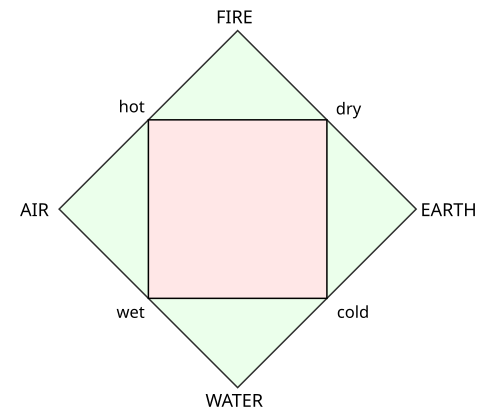
This layout follows the classical Greek elements:

500px-Four_elements_representation.svg.png


What do you think?
I think B like Basketball and A like Atari... ;)

The idea of combining symbols with letters may not be bad but I doubt it will be choosen as final Pyra concept. I still believe ED will use Letters only, however it may be possible to discuss colours for the letters/buttons to improve the Pandora layout a little bit.
 
Last edited by a moderator:
I'm pretty sure we are keeping regular letters and not all this nonsense, but I can see a possibility for the letters to have colors. (Not the whole button.)
 
I don't see any benefit in combining symbols and letters, also colors will make it look less elegant, if Ed chose them again, I would like to see them as discrete as on the Pandora.

I'm pretty sure we are keeping regular letters and not all this nonsense,
There isn't any sense in keeping regular letters except for remain as Pandora.
 
Last edited by a moderator:
Because of your statement from above:

There isn't any sense in keeping regular letters except for remain as Pandora.
I just wonder, where you have been the last days and maybe even weeks, when arguments for and against latin and greek letters were discussed.

Or do you tell me, that all arguments for latin letters are bullshit?
 
Why are you saying that?
Probably because it is relevant and true.
Why are you responding when he already did it ? Nobody said that it isn't  true, but if I read discussions, I already know that there is arguments, so there isn't any reason to say it, unless I have alzheimer. But maybe you didn't know that I read the last discussions, that's why you should not meddle in the case of others.

Or do you tell me, that all arguments for latin letters are bullshit?
That what I am telling you, or more precisely these argument are clearly weaker than mine.
 
Last edited by a moderator:
There isn't any sense in keeping regular letters except for remain as Pandora.
There isn't any sense in changing regular letters except for a small minority finding other symbols (specifically Greek) aesthetically pleasing.
Anyway...

That what I am telling you, or more precisely these argument are clearly weaker than mine.
...if you say so.
 
Last edited by a moderator:
There isn't any sense in keeping regular letters except for remain as Pandora.
There isn't any sense in changing regular letters except for a small minority finding other symbols (specifically Greek) aesthetically pleasing.
There is one sense in labelling button: differentiate them. Labelling with greeks letters is full of sense since it follow the fundamental sense of label existence: differentiate things, and the fundamental rule: no button with the same label.
 
Last edited by a moderator:
pyra_elements2.png


This is an ABC XYZ layout with elemental icons. These elements are something gaming and Greek have in common: Aristotle and the other Greek philosophers wrote a lot about the elements, and they also occur in many RPG games.

A = AIR / WIND

B = EARTH

C = SHADOW / EVIL

X = WATER

Y = FIRE

Z = LIGHT / HOLY

There are several ways to group these buttons:

- by color: B Y Z belong together and go from brownish red to bright yellow (these are "dry" elements); C X A also belong together and go from dark purple to bright sky blue (these are "wet" elements).

- C X B forms a group of "cold" elements, A Z Y is a group of "hot" elements

- there are three opposing pairs: A vs B, X vs Y, and C vs Z
 
^ Like that the alphabetical disorder doesn't seem so bad, I am more focused on the icons than on the actual letters being in the right "order", the smaller 2 buttons almost seem to fit as well.

I really dig this idea where the other ones before I just didn't want the bad ones

EDIT: and think of the games could take advantage of this as well, ones with elemental themes would have natural mappings, standard games can easily fall back on the lettered mapping, and the dual function for the pc users. I personally think this one is a winner.
 
Last edited by a moderator:
C = SHADOW / EVIL

...

Z = LIGHT / HOLY
To me both the sun and the moon equate to light. I am not alone in this, e.g. in Japanese the kanji combining sun and moon can mean bright or light.
Furthermore, what is the difference between holy and evil?

<edit>This is perhaps phrased a bit as unnecessary flamebait, but my main gist of this is "please keep religion out of the Pyra design"</edit>
 
Last edited by a moderator:
C = SHADOW / EVIL


...


Z = LIGHT / HOLY
To me both the sun and the moon equate to light. I am not alone in this, e.g. in Japanese the kanji combining sun and moon can mean bright or light.

Furthermore, what is the difference between holy and evil?
Do you have a suggestion for different symbols? I think sun/day/light vs moon/night/shadow is good enough, and while the moon does indeed reflect light and can thus be the main "source" of light at night, it does not emit any light itself so it's fairly accurate to say that it is in fact dark.

I don't mean anything religious with Holy vs Evil, it's just one of those traditional opposing factions in games, it corresponds to Lawful vs Chaotic or Good vs Bad or White vs Black or Bright vs Dark or Healing vs Destruction or Yin vs Yang or whatever. I just used the word "Evil" because I want to make a game that says things like "Press [EVIL] to continue" ;)
 
Do you have a suggestion for different symbols? I think sun/day/light vs moon/night/shadow is good enough, and while the moon does indeed reflect light and can thus be the main "source" of light at night, it does not emit any light itself so it's fairly accurate to say that it is in fact dark.
That's true. I'm more in disagreement with the name than the symbols of sun/moon themselves.
Some googling around shows that Wu Xing identifies the five elements of Fire, Earth, Water, Metal and Wood.

So you could choose Wood and Metal as fifth and sixth. But it is all a bit arbitrary symbolism to me.

I don't mean anything religious with Holy vs Evil, it's just one of those traditional opposing factions in games, it corresponds to Lawful vs Chaotic or Good vs Bad or White vs Black or Bright vs Dark or Healing vs Destruction or Yin vs Yang or whatever.
Well, the opposite of Evil would be Good as you state yourself.To annotate a sun to good and a moon to bad is a choice which many people will probably agree with but it is not logical to me.

I just used the word "Evil" because I want to make a game that says things like "Press [EVIL] to continue" ;)
Interesting, but such an effect can be achieved by coupling a button to semantics.The design of your game does not need to be in the physical labelling.

These images are a bit too big blobs of colour to my taste. Perhaps only the outline of the images is better.
 
Back
Top