Action button labels, again


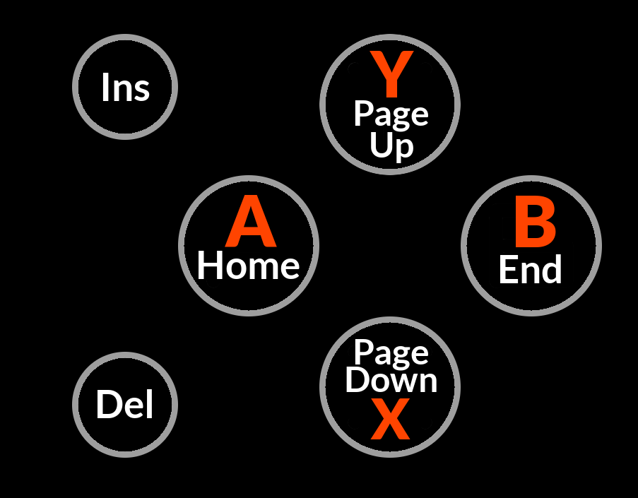
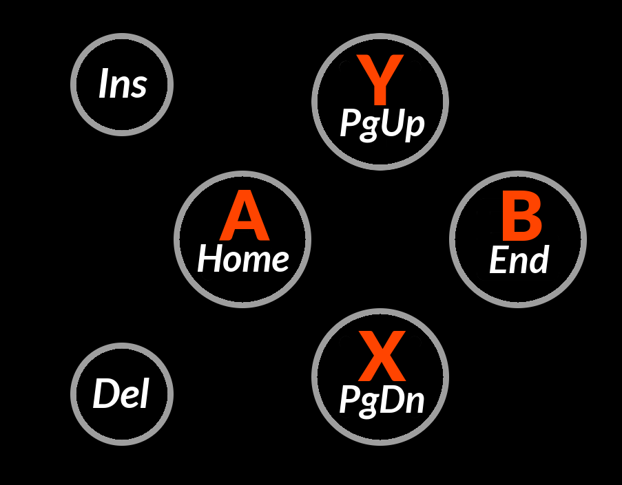
Something like this, then?

post-4382-0-84918900-1434287396.png


abxy2.png
 
Seems perfectly acceptable.

I'm not convinced its the best layout, but its not bad, and probably not worth debating any more.

Can we keep it? :)
 
If we have Home/End/PgUp/PgDn labels on the buttons then why would we need ABYX labels on them as well?

I thought a part of the alleged confusion was keys and buttons having the same label.

Seems like labeling them only what they actually are (Home/End/PgUp/PgDn) could work.
 
Maybe it is not the best possible layout, but it sure is the best to date. Maybe we should now argue about adding a button layout to the two smaller ones too, like + and - or Z and C ?
 
I also would be happy if the action keys just have Home/End/PgUp/PgDn as labels. Just to mention it.
 
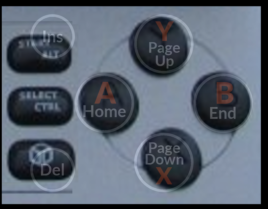
Comradekingu, I see you're trying to compare 1) your "minimalistic" < ^ v > design to 2) the "more complicated" Home/End/PgUp/PgDn design, and yes, from an æsthetic point of view you may have a point there, but those circles I put around the buttons are not something that is different between 1) and 2).

Those circles are a consequence of having a margin of transparent silicone around the button keycaps:

Code:
< _wb_> EvilDragon: is that ring/border around the yellow/green/red bits going to be 
              transparent or will it be painted?
< _wb_> if it's transparent then the buttons/keys get a rather big border with the backlight
< EvilDragon> _wb_, That's the silicon mat.
< EvilDragon> It needs to encapsulate tha plastic.
< EvilDragon> It's transparent.
< _wb_> EvilDragon: so with the backlight, there are thick circles around whatever button labels the action buttons get?
< EvilDragon> When you have the backlight enabled, yes.
< _wb_> and the same with the keyboard keys, thin rounded rectangles around those?
< EvilDragon> _wb_, Exactly.
 
Last edited by a moderator:
Did comradekingu ever directly respond to the critique of his layout, "the d-pad is already thought of as directions and everyone is going to mix those up"?  I have other problems with it, I might plea that simplest does not equate to best, and when trying to find a comfortable balance between simple and useful, it's certain that the very most simple possibility isn't going to work, but I haven't caught comradekingu making any statement about arrows on one side being really easy to mix up with arrows on the other side.  Until then, I'm not sure there's a reason to say anything else about it.
 
^ I agree.

From my point of view, putting arrows on the game buttons is sure to get them muddled with the d-pad.

You couldn't even refer to Right1 as the direction on the dpad and RIght2 as the direction on the game buttons, because of confusion with the shoulders.

Nope, nope, nopey-nopey, no, nope!

Its only slightly better than the "CARL" keyboard layout :/
 
<v^> aren't arrows, just as much as they arent ←↓↑→ on a regular keyboard, when they are similarly in different places. So you aren't mistaking buttoncluster and keyboard, (which was a problem to solve), but dpad for buttoncluster?

If you say press "←↓↑→" on a pandora, thats not marked, if thats not a problem, then telling them to press <v^> in the comparatively few native games, is ok as long as you don't mix up the two on your side. With junk explanation, you can make anything sound confusing.

Right2 isn't ever on buttoncluster, and Right1, I don't know what that's supposed to mean. Heavily projected argument.
 
Last edited by a moderator:
I dont have that problem, but from playing emulators with a keyboard, i do press X on the keyboard when told to press that in pnd_manager for example.

Adding onto it, we are back at W3EM, which cant be written in unicode. Going from direction to arbitration easily typed but not easily found on a keyboard doesnt have any other options that ive been able to find.

I call the buttons home end pageup pagedn ins and del, then if people ask what that is, you only need to say "the bottommost button on the buttoncluster" every so often. Difference is it becomes something of value that you learnt.
 
Last edited by a moderator:
I dont have that problem, but from playing emulators with a keyboard, i do press X on the keyboard when told to press that in pnd_manager for example.
To me the Gui hints in PNDManager are quite easy to understand, I don't think this is as big of a problem you make it out to be.
 
I dont have that problem
That's because the problem doesn't exist yet.There is a huge difference between "Press A" and getting confused by the A key or the A button, vs "Press v" and getting confused between the V key and the downward action button which also conveniently has a "V" like label but is not, actually, V.
 
To me the Gui hints in PNDManager are quite easy to understand, I don't think this is as big of a problem you make it out to be.
The icons actually look like buttons and even have directional dot indicators, if there was ever some GUI to model off it would be PNDManager.
 
Back
Top