Parentheses format for button labels


Yeah, if it was being done by someone who doesn't know what he's doing, it could look cheap, but that can be avoided.
 
Having not used my pandora for a while, i actually pressed y on the keyboard to upgrade all in PNDmanager.

And i skipped out of a game about 3 times before i realized A wasnt either the A or B button. Not that i destinquish between those, but anything from A or B doesnt mean mabye X or Y.
 
[...] i skipped out of a game about 3 times before i realized A wasnt either the A or B button.
...resulting in stress or mild "user-panic", which leads to tunnel vision ("not seeing the forest for the trees"), which often results in a loop, yes.
I'm not a neuroscientist or a "usability expert", but this "user-panic" is a well-known usability problem. You don't have to be stupid to have this happen to you, so I'm hoping that parentheses on the gaming buttons would increase the chances that this specific problem would be mitigated on the Pyra.
 
What happens is "im pressing only the safe buttons to me, being > or v " and then i dont notice what quits the game  (>)

Because someone, put A at <  and B at > when the convention is to have  AB   at   > or v   and XY at   < or ^

Please let us finally close the shelf on this usability-disaster. Its dragging on, and we have a fine opportunity to kill it off now instead of keep dragging.

Edit:  Someone says press A, and a life-long exposure to V or > kicks in. Does it mean nintendo-A or Sega-A, or is it the A as in pandora?

With the latter being highly unlikely, other than to reference the other ones, which is activly confusing, lets just refer to it as < v ^ >  That can be understood _without_ having to look or learn a pattern of 

* relates to ?, relates to position  Where ? is either ABXY in confusing pattern or colours in confusing pattern.

instead of 

* relates to position

( A ) ( B ) ( X ) ( Y ) doesnt fix that.   (< ) ( ^ ) ( v ) ( > ) does

If you really want to drive the point home.

           ( ^ )

( < )               ( > )

           ( v )
 
Last edited by a moderator:
How does that distinguish them from the arrow keys on the dpad?

I Still think the best answer is multiple letter identifiers on the gaming buttons

Code:
   YY

AA    BB

   XX
- Neelix
 
Last edited by a moderator:
Then you have me going  B - B  ?

Arrow keys look like this  →↓←↑

On the device you would distinguished that one was on the other side, symbols are just for reference.

"A" alone wasnt a good idea when it was just one place. Worse so when you add X and Y. Both of those pairs can be interchanged internally on the two paradigms.

Using the same designators in a system that is incompatible with the basis of both is as bad as it gets.
 
Last edited by a moderator:
The same could be argued for F1 - F12 or L1, L2, R1 and R2. If I see an instruction that says something like press (AA) and I already know there's an AA button, I'm not likely to think it means press A twice.

Arrows are just directional indicators, no matter what they look like. There are no arrows painted on the d-pad but we still associate it with the concepts of up, down left and right. If you also then map the gaming buttons to the same concepts and show people an arrow to indicate which button to press it's going to cause confusion.

- Neelix
 
Last edited by a moderator:
F1-F12 is _always_ the F-keys. L1 is top left side shoulder etc.  AA doesn't mean anything, it could for the purpose of argument mean A-A on the keyboard, or the button called AA.

However the button A is _never_ called AA, so AA is an unestablished connotation. I'm not saying it doesn't work, just that it will probably fail first.

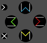
I agree with direction alone being ambiguous, that's why i went with W for ^  M for v Σ for >  and 3 for < so that its easy to write.

" Its the one that looks like *" favours WME3

So isn't "M" as a designator to be confused with M on the keyboard? Yes, as a designator you haven't won much, but you get to choose.

You trade something that can be mistaken for dpad with something that can be mistaken for keyboard.

This is why white lines were added to the edges.  The colours and shapes remain to represent the key function. PageUp, PageDn, Home, End. Functionality aligns with key-placement.

Insert / Del, to be found on the left in that same cluster on a keyboard, is on the left. It can be written (<)  and (><) 

I would advice against writing (x) because then we are back to square 1. ;)

buttoncluster.png

I like the unity.
 
Last edited by a moderator:
It's a dyslexic's nightmare, though I do like the use of Sigma.  We could get around the problem by using all Greek letters...  Everybody could learn a few Greek letters, and then just use phi, psi, Pi, Delta, Omega, and Chi to refer to the buttons:

Φ   Δ
  Π   Ω

Ψ   χ

FaceButtons.jpg
 
I consider this thread here to be primarily about the parentheses around whatever the characters in the middle are. Whether they're AYBX, <^>v, Greek letters, or whatever else, I would consider secondary in the scope of this specific discussion, and while I really do appreciate all input, I also really don't want this thread to go back and forth between different problems that are mostly just tangentially related, like so many other threads on this forum tend to do.

I ask everyone to please consider this before writing into this thread.

I Still think the best answer is multiple letter identifiers on the gaming buttons

[...]
Hmm... have you ever brought this up before? If so, then I didn't remember, sorry.
I haven't thought this through yet, but so far I'm tempted to agree that double letters might achieve a similar thing as the parentheses would.
 
The only problem I envisage with key ids like AA, XX etc. is that fighting games often list moves as a sequence of keys - PPK (punch, punch, kick) may be XXA.  People who haven't observed the key legends closely might assume they need to hit a key twice when presented with an instruction like 'Press BB to continue'.
 
How are you solving the problem of dyslexics not being able to distinguish letters by implementing letters very few people know? They still have colour, and position.

The symmetry, being the problem, is also what makes it look uniform. Without that it stands out. Drawing attention to something that has to be different is begging the question why.

It has been voted over, and it wasn't favoured. Nor can it be defended in relation to the concerns that have been brought up, but you are welcome to try. I dont see for example, any connection to PageUp, PageDn, Home and End.

Here is why i think the baby is thrown out with bathwater.

Ask regular people, what they think the (greek) symbols look like. What are their names. Then take it away and ask how they relate to direction.

report back with results. Teaching people greek is what the buttoncluster should be doing.
 
The only problem I envisage with key ids like AA, XX etc. is that fighting games often list moves as a sequence of keys - PPK (punch, punch, kick) may be XXA.  People who haven't observed the key legends closely might assume they need to hit a key twice when presented with an instruction like 'Press BB to continue'.
That's where the use of something like Guihints comes in. If you are specifically designing a game for use on the Pyra's game button layout then you could use a pictogram representing the key. That would also mean that if you port the software to another device you can just substitute a different set of pictograms to provide device specific instructions. In text based instructions you could use a convention such as the use of brackets around the name to denote a button, which should make things clearer, especially if the convention is used fairly consistently.

- Neelix
 
I Still think the best answer is multiple letter identifiers on the gaming buttons

[...]
Hmm... have you ever brought this up before? If so, then I didn't remember, sorry.
I haven't thought this through yet, but so far I'm tempted to agree that double letters might achieve a similar thing as the parentheses would.
I may not have presented the idea in precisely this manner before, but I'm certain I raised the idea of multiple latin character labels in at least one of the long button label threads.

I think double letters have an advantage over just putting parentheses around single letters in that it's conceptually different to the alphabetic letter keys. AA is likely to be read as "Double A" whereas (A) is most likely to be read as just "A". (rather than "A in parentheses")

Some may dismiss the conceptual differences as unimportant, but I could see this making a difference in something like a dungeon crawler, which tend to have large numbers of commands. If you have one command on "(A)" and another on "A" and you don't end up having to use either one until about 20 minutes after initially reading the help screen to get started it would be easy to misremember which was which.

- Neelix
 
I would mess that up. I think of letters as something that belongs on a keyboard. If its single A, even with ( )'s i have some chance, some of the time.

Even if you understand it, its still at best, press Double A to press B half the time.

Also, listing combos becomes strange  AA+BB+AA+AA is harder to read and say.
 
Last edited by a moderator:
It has been voted over, and it wasn't favoured. Nor can it be defended in relation to the concerns that have been brought up, but you are welcome to try. I dont see for example, any connection to PageUp, PageDn, Home and End.

Here is why i think the baby is thrown out with bathwater.

Ask regular people, what they think the (greek) symbols look like. What are their names. Then take it away and ask how they relate to direction.

report back with results. Teaching people greek is what the buttoncluster should be doing.
Most gamepads (e.g. Playstation controllers) don't have button letters/symbols that help you know where they're located (except for triggers R and L).  That's because you don't really think, "Let me hit the circle button to use this powerup", you get muscle memory after a few looks.  

I'm just saying there wouldn't be any need for a discussion on whether to use parentheses around letters, or even doubling up letters, in order to denote them as the gamepad buttons, if we used Greek letters.

I think people are able to learn (Greek letters, and even the positionings), but sometimes they are extremely averse to new things.  I personally think that's a bad reason to avoid a cool and unique way to label the buttons, but the almighty community has voted ;) .
 
You are arguing why its irrelevant to put anything on the keys.

The playstation method makes sense for people in japan. Accept/select is always the button they think it is O if i am not mistaken, and then thats changed when the games are released in europe.

People are adverse to learning new things when they are foreign. I'd be willing to learn, and I do like the idea. It was just almost there. The "knockoff-ps" effect is novel, but not really something i want on a small community gaming device.

In my brain there is something very bad about gaming-devices aping to be the "real thing". Being the real thing is about doing things right, so thats why i tried to include everything that people were complaining over when voting over the matter. Also, my suggestions from then weren't included ;)
 
Most gamepads (e.g. Playstation controllers) don't have button letters/symbols that help you know where they're located (except for triggers R and L).  That's because you don't really think, "Let me hit the circle button to use this powerup", you get muscle memory after a few looks.  
Still to this day I can't automatically remember which way round square and circle are on a PS pad.  I can reason out that since the Japanese use O for yes and that must be in the Nintendo A-button position, on the right, but prompt me to press square on screen and I still have to look down at the pad.  Muscle memory works as you say, it's only QTE type things that mess me up, which perhaps is why I've not learned where square and circle are definitively, but on a pad with numbered or lettered buttons, I don't have to learn anything (other than whether it's Nintendo or SEGA layout).
 
I just want to let you know what someone who doesn't care about the button markings thinks: Parentheses on the buttons will look ugly, and if the button is marked (A) I will still just call it A, and add "button" if it seems confusing.  Typical users would probably also type A instead of (A).
 
I think people are able to learn (Greek letters, and even the positionings), but sometimes they are extremely averse to new things.
It's not simply the people, it's also the software. After all, depending on how a software is made, it can be quite time-consuming or complicated to retrofit Greek characters into it. I think you may know this, I'm just noting it here for everyone.
So, if any gaming button label that could not be represented verbatim via ASCII characters is considered not a GOOD THING™ by a significant number of people on this forum, it's not really surprising.

[...] I could see this making a difference in something like a dungeon crawler, which tend to have large numbers of commands. If you have one command on "(A)" and another on "A" and you don't end up having to use either one until about 20 minutes after initially reading the help screen to get started it would be easy to misremember which was which.
Hmm, I would think that it's the developer's/maintainer's responsibility at that point, in anticipation of the users' expectations, similarly to how she would have to somehow ensure a clear distinction between "A" (Gaming button) and "A" (Keyboard key) if there were no parentheses. The parentheses format is not a "perfect" solution, just an approximation, and like it says in the opening post of this thread, I do "_not_ attempt to solve a specific subset of problems in a perfect way".
To stay in your example, I assume that it works better the more consistently the parentheses are being used, and I simply consider printing them onto the physical buttons to be a vital means of improving the chances which doesn't really come with any noteworthy drawbacks, none that I could anticipate at least.

[...] Parentheses on the buttons will look ugly, [...]
No, not if you do it "right".
 
Back
Top