You are using an out of date browser. It may not display this or other websites correctly.
You should upgrade or use an alternative browser.
You should upgrade or use an alternative browser.
Action button labels, again
- Thread starter _wb_
- Start date
Saber
Advanced Member
- Joined
- Jan 23, 2012
- Messages
- 1,303
We can have all of those without hiding them under modifiers.I use backspace, space and del more than insert, so yeah.
Nintendo
Nintendo Switch
A knock off (pic removed).
Last edited by a moderator:
Silent-Hunter
Hardcore Member
- Joined
- May 29, 2010
- Messages
- 3,485
What is that thing?
- Joined
- Jan 18, 2010
- Messages
- 11,483
More importantly look at all that wasted space... a keyboard could of gone there.What is that thing?
comradekingu
Glowing ember
Try looking at it without that buttoncluster.
Nintendo
Nintendo Switch
It's just another (one of a billion) Android portable device from the idiots...gpdWhat is that thing?
Yeah, at least an numerical kb or even a little PS4 DS4-esque trackpadMore importantly look at all that wasted space... a keyboard could of gone there.What is that thing?
Last edited by a moderator:
comradekingu
Glowing ember
They are unapologetically advertising their handhelds with Mario. Claiming to work with Nintendo, MS, Sony and Apple.
Knockoff brand, from China, with the looks to match. Please dont link, they don't deserve it.
Knockoff brand, from China, with the looks to match. Please dont link, they don't deserve it.
Last edited by a moderator:
Nintendo
Nintendo Switch
I'll edit my initial post.
FaeMinx
Rainbow Liberation Instigation
Hey, it's not as if any of here are going to get suckered in.
WizardStan
Mega GP Mania
- Joined
- May 24, 2008
- Messages
- 16,733
Google ranks by refering links: the more links there are to a site the higher it'll appear in the list for a given search.Even if no one here will get suckered in it is still helping them get hits off web searches.Hey, it's not as if any of here are going to get suckered in
rygD
Nihilistic Mystic
I was reading something earlier about the PS button labels. I don't know how accurate this is. It said X and O were for yes and no, the triangle is "point of view" and square represents a piece of paper or a page or something like that. I can't remember if that makes sense with many games.
Out of curiosity: Do those explanations make sense for those buttons? Did you ever pick up on that, or do you think that those shapes represent those things? Does it help you remember what button to hit for most (first party?) games , or would it if you had known?
Out of curiosity: Do those explanations make sense for those buttons? Did you ever pick up on that, or do you think that those shapes represent those things? Does it help you remember what button to hit for most (first party?) games , or would it if you had known?
Here's some more information from twitter and irc:


Code:
< _wb_> EvilDragon: is that ring/border around the yellow/green/red bits going to be
              transparent or will it be painted?
< _wb_> if it's transparent then the buttons/keys get a rather big border with the backlight
< EvilDragon> _wb_, That's the silicon mat.
< EvilDragon> It needs to encapsulate tha plastic.
< EvilDragon> It's transparent.
< _wb_> EvilDragon: so with the backlight, there are thick circles around whatever button labels the action buttons get?
< EvilDragon> When you have the backlight enabled, yes.
< _wb_> and the same with the keyboard keys, thin rounded rectangles around those?
< EvilDragon> _wb_, Exactly.
< _wb_> EvilDragon: so those green/yellow/red pieces in that picture, they're solid transparent plastic which gets printed at the side that goes in the rubber?
< EvilDragon> The green/yellow/red pieces are transparent plastic. Painted from the backside (so it doesn't rub off) with black, transparent white (keys) and transparent blue (Fn-Keys).
< _wb_> and it gets glued together or something?
< EvilDragon> Yep. The plastic caps are painted, glued into the silicon keymat. The surrounding is there because you couldn't glue them properly on top otherwise.
< EvilDragon> The caps are all slightly higher than the surrounding and have slightly rounded edges.
< _wb_> is it decided that the Fn-color is blue?
< _wb_> (I'm more in favor of some orangy color)
< EvilDragon> Naaah, I'm just using Blue right now
< _wb_> EvilDragon: what's the diameter of the printable area on those action buttons?
< _wb_> the keyboard keys are still 3x7mm printable?
< EvilDragon> _wb_, Don't know yet, will get a template from the company.
rygD
Nihilistic Mystic
I am also in favor of something other than blue. I like red, but orange also makes sense. It really doesn't matter, and blue is fine, but I like the fire theme stuff.
Nintendo
Nintendo Switch
Yeah, classic flame colours.
The problem with red (depending of course on the exact shade) is that it can be too dark to be easily seen on a black/dark background, which can be solved by making it more bright and more transparent, but then it will in practice probably look pink rather than red, which will look rather girlish.I am also in favor of something other than blue. I like red, but orange also makes sense. It really doesn't matter, and blue is fine, but I like the fire theme stuff.
So I'm in favor of a orange red, e.g. something like this: http://en.wikipedia.org/wiki/Vermilion#Orange-red
or the color named "Flame" http://en.wikipedia.org/wiki/Scarlet_%28color%29#Flame
This would be a very appropriate color because of this:
In Latin the word pyrrhus means red from the Greek adjective πυρρός, purrhos, i.e. "flame coloured", "the colour of fire" or simply "red" or "reddish".[2]Pyrrha was evidently named after her red hair. Horace (Ode, i. 5) and Ovid describes her as red haired.
(emphasis mine, from: http://en.wikipedia.org/wiki/Pyrrha)
rygD
Nihilistic Mystic
Why is pink girlish? I know many men that wear and like pink. I am fond of a very bright pink that everyone seems to call something different. I don't think a bright red would look pink until it had faded quite a bit.
Thanks for the info on the name again, which tells me that we should go with red...or maybe pink.
Thanks for the info on the name again, which tells me that we should go with red...or maybe pink.
Last edited by a moderator:
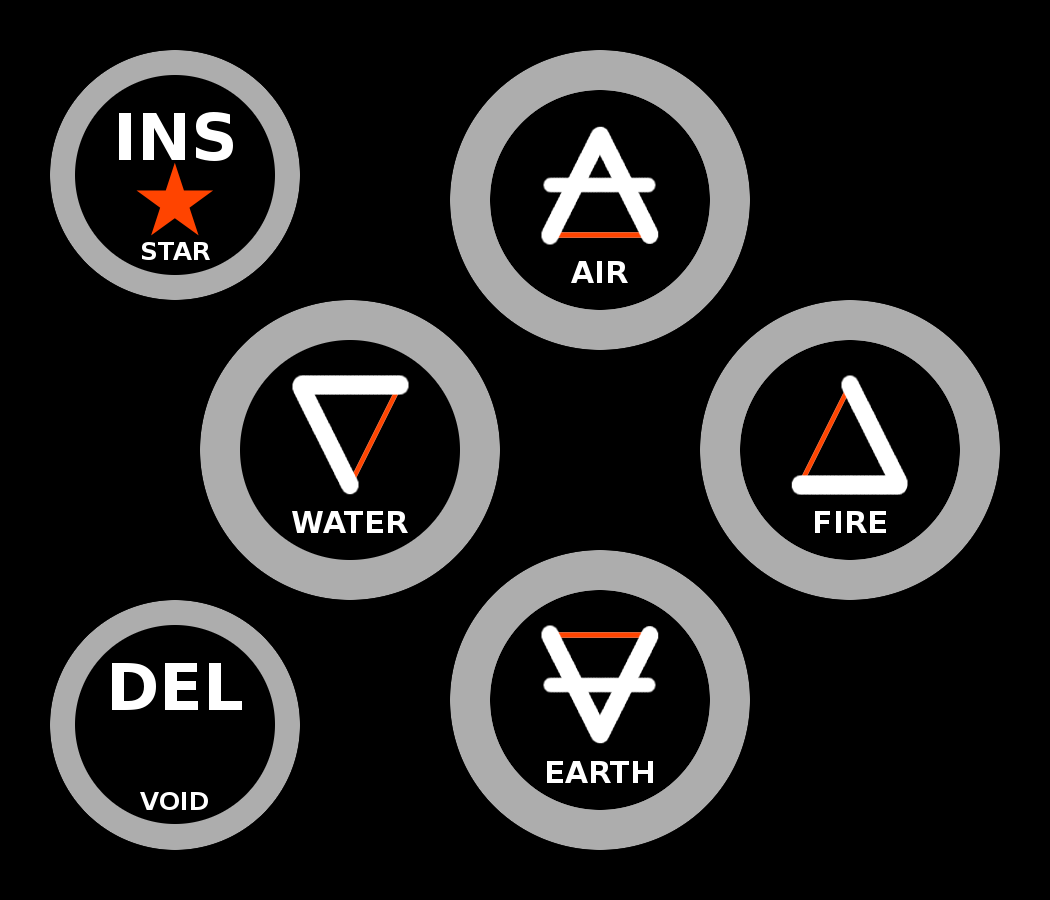
Here is an update on my "elemental" label design that takes into account that the buttons have thick circle borders which are visible with the backlight:


Last edited by a moderator:
Eight Bit
Hardcore Member
Are those the signs for the elements?
Nice mystical touch
Nice mystical touch
Nintendo
Nintendo Switch
Pink happens to be my favourite colour.Why is pink girlish? I know many men that wear and like pink. I am fond of a very bright pink that everyone seems to call something different. I don't think a bright red would look pink until it had faded quite a bit.
Thanks for the info on the name again, which tells me that we should go with red...or maybe pink.
Similar threads
- Replies
- 182
- Views
- 37K
- Replies
- 50
- Views
- 11K
- Replies
- 65
- Views
- 14K
- Replies
- 203
- Views
- 35K

