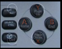
Action button labels, again


I'm not very into the triangle design..

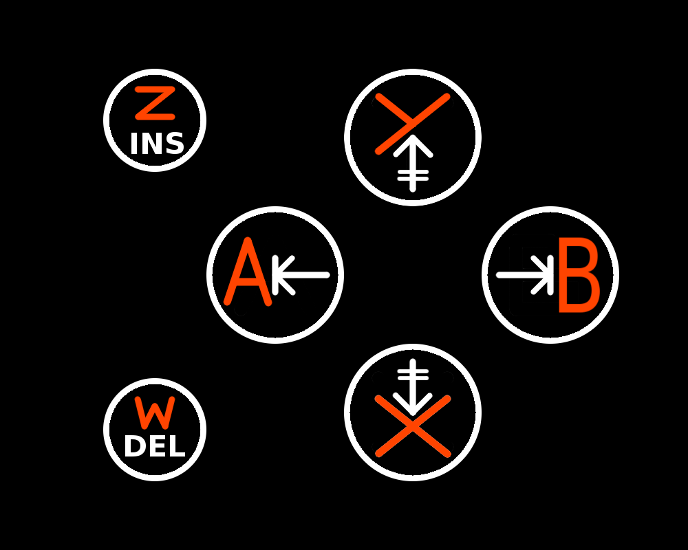
I dont get what it is supposed to be, symbols for air, fire and so on? What does the Meta colored line in each symbol mean? Its too abstract I guess.

Also the left and right action button looks like a "up-left" and "down-right" button, which seems weird since they are just the left and right action button.

I may have lost the track again, but understanding the action buttions should not require to read the full discussion of this thread.
Yes, those are the alchemical symbols for the four Classical elements (as described by the Greek (!) philosophers).

The up-left and down-right aspect of the Home/End buttons is deliberate, it's because Home/End can have both a horizontal (line begin/end) and a vertical (webpage begin/end) meaning. Note however that it's still a bit more left/right than up/down.

The official ISO symbols for Home/End are ⇱  ⇲, by the way.
 
This whole greek "elements" thing is hopelessly confusing:

  • Firstly, very few people are familiar with the symbols
  • Secondly, the symbols are far too complicated
  • Thirdly, the symbols are weirdly distorted in the current suggestions
  • Fourthly, the names (esp. "fire") are going to to be very confusing when writing instructions
  • Fithly, the second coloured lines are extremely non-obvious in thier meaning
  • Sixthly, the only link beween the positions and the labels is the shape of the symbol, which nobody knows.
  • Seventhly, if we're going to make people learn a set of essentially arbitrary symbols, we should be able to come up with much better ones than these.
  • Eight-oh-whatever-I'm-sure-you-can-count-thly  using an empty space (aka "void") as a button label is a really horrible idea, for obvious reasons
  • I'm personally irritated by the use of classical "elements". They're straightforwardly Wrong! If we must be using element symbols, can't we use Dalton's? https://upload.wikimedia.org/wikipedia/commons/9/97/A_New_System_of_Chemical_Philosophy_fp.jpg They may be less classical, but they're also 100% less misguided.

xkcd 965
 
Last edited by a moderator:
I don't find the matter of ascribing spurious meaning to inanimate objects clear, it is occultism. A form of retroactive continuity to an inanimate object.
 
On some level that has merit, but it fails to answer the main issues. Coherency, compatibility, and cognition. And as it stands, isn't just inconvenient in relation to those, it isn't possible in itself.
 
In the area the pandora has engraving, a symbol of the same complexity (faux-elemental symbol to latin letter) cannot be juxtapositioned with a word that is 5-fold the complexity on top of that again. Much less 7-fold atop a star symbol, in the case of INS (star) star.
Nor can it be different colours, because ED said it is to be engraved like the pandora.

He actually said: "Same material, same color." Referencing the rest of the keypad.
 
Last edited by a moderator:
It's not as if any of these redesigns will be seriously considered. All for the expressive aspect of it though. 
 
For some reason, I was thinking the whole button would light up.

It's not as if any of these redesigns will be seriously considered. All for the expressive aspect of it though.
Ikr
 
This whole greek "elements" thing is hopelessly confusing:

Firstly, very few people are familiar with the symbols

Secondly, the symbols are far too complicated

Thirdly, the symbols are weirdly distorted in the current suggestions

Fourthly, the names (esp. "fire") are going to to be very confusing when writing instructions

Fithly, the second coloured lines are extremely non-obvious in thier meaning

Sixthly, the only link beween the positions and the labels is the shape of the symbol, which nobody knows.

Seventhly, if we're going to make people learn a set of essentially arbitrary symbols, we should be able to come up with much better ones than these.

Eight-oh-whatever-I'm"sure-you-can-count-thly  using an empty space (aka "void") as a button label is a really horrible idea, for obvious reasons

I'm personally irritated by the use of classical "elements". They're straightforwardly Wrong! If we must be using element symbols, can't we use Dalton's? https://upload.wikimedia.org/wikipedia/commons/9/97/A_New_System_of_Chemical_Philosophy_fp.jpg

They may be less classical, but they're also 100% less misguided.

xkcd 965
I agree with points 1 to 8, they are indeed valid points.

But the last one, the classical elements being "wrong", I don't see the problem with that. They are game buttons. Games are a kind of fiction. For exact realism, the real world suffices; the whole point of a game is to be "wrong" in one way or another, that's what makes them fun.
 
Here's an ABWXYZ proposal (the only Latin letter extension that makes some amount of sense, originally suggested by Ziz I think), plus keyboard function icons or text.

post-4382-0-22371900-1434095806.png


abwxyz.png
 
I am not going to do a fancy picture since I am on a fone.  Here is my "serious" suggestion to ED:

Ins            Pg Up

       Home            End

Del            Pg Dn

Issues it doesn't address include:

1. Non-English users

2. Buttons that look like game console buttons

I don't know how much of an issue 1 is.  Does anyone seriously see this as a problem?

Since it is a computer with full(ish) keyboard and desktop, and largely used for computer games and emulation this is a pro.  The buttons are marked with what will be seen in emus when binding keys.  It clearly (in English) tells the user (in English abbreviations for most buttons) what the buttons do for desktop use, another pro.  Some Pandora games, and most/all emulated console games, will not have the the correct in game info regarding what button to press, however this is already an issue if using button placement as it is on the actual controllers.  It will remain an issue if using Pandora button layout, or if going with symbols or something else new.

Since these buttons may not have much room it may be needed to make the markings shorter, and this might work (again based on English):

In      Pg Up

    Hm         End

Dl      Pg Dn

I think this makes it worse, but it saves space.  Pg Up and Pg Dn can be split to two lines if needed.  

Symbols, with or without directional arrows, may help for non-English users.  Home can be a house shape (square with triangle on top, maybe a door and windows).  End can be a traditional western style grave marker (aka tombstone), although I think a skull would be cool, but may make less sense to others than the tombstone. Page Up and Down can be rectangles with lines across them, with an arrow up and down, perhaps in the secondary color to make it more visible.  I have no ideas for Insert and Delete.

Perhaps instead of making it more obscure we should try to go with the kind of ideas I was looking at for symbols.  If "official" symbols are unknown and confusing (not to mention eyesores), throw them out.  We should look at alternatives that work better for most users.  For the "Oh noes, what about my super special Pyra only game!?!!!" people, use the appropriate words in whatever language is used for the game, or include the symbols from the button.  

This really seems simple to me, and I don't understand why it is being made so difficult.  Instead of trying to make it a super nerdy, difficult device to use for the main purpose (games) because of symbols most people don't know or understand that are designed to "help" users, how about we actually try to help them.  It is nerdy enough as it is.  KISS!

_wb_:  I am probably one of those that would most love to see elemental symbols of some sort on the gaming buttons, but it isn't working.  Instead of trying to stick with it, let it go, and maybe we can find a way to include them once we have something that people understand.  ABWXYZ, as above, looks bad.  Why do we need more than one marking per button?  I really don't see your Ins and Del buttons working out...those caps are tiny, and you want all that on it?  I think just Ins/Del alone will be too small to easily see if it is larger, and the only thing on the button.
 
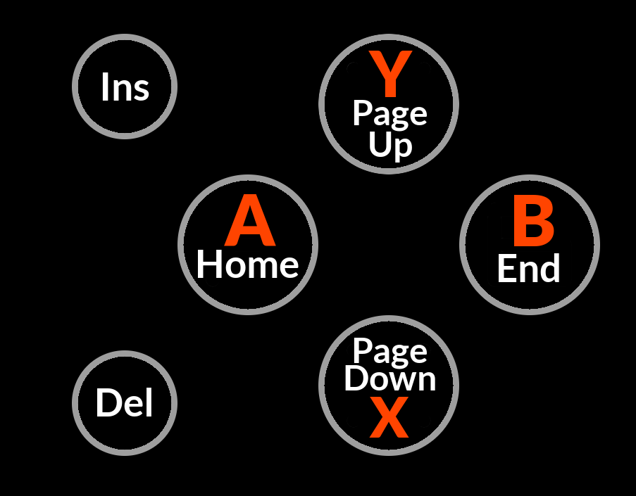
OK, here's a very "Keep it simple" proposal:

post-4382-0-56685900-1434103966.png


It has the keyboard functions in text, since I think that is easiest to understand, even for non-English speakers.

The Pandora Latin letters are also there, in the auxiliary color, mostly for backwards compatibility. The extra buttons don't need such an extra label, because the Pandora didn't have them, and also because there is less room anyway.

Can this fit in a reasonable font size? I hope so. Here's a quick overlay which shows the above proposal with a cut up picture of the Pandora action buttons and the START/SELECT/PANDORA buttons: (sorry about the perspective, which is not right, but the relative scale should be more or less OK)

post-4382-0-80068700-1434103981.png


From the above picture, I would imagine that it should be possible to fit the letters in roughly the same font size as START/ALT and SELECT/CTRL on the Pandora, even if the margins to be respected are bigger than what I used here.

abxy.png

abxy-overlay.png
 
Keep in mind that the caps on those buttons may be smaller than the Pandora buttons.  I sent you a message.

Now I am actually going to read what you said.

Edit:  Looks good.  Maybe the X should be on top like the others (edit edit: although I see why you did it, and it was a good space saver).  I like the use of the alternate color.  Seeing it like that I wonder if it will cause confusion.  I like the look, but everywhere else that color means that it is what that key does when pushing the appropriate button.  I don't see it as a problem, but I am not brand new to the Pyra.  It may not be as pretty, but if there was only room for one marking I would go for the keyboard function labels on those buttons.  I like it the way you did it, though.
 
Last edited by a moderator:
Given that (we assume) the Pyra will be unable to use a common arrangement of ABXY because of some kind of trademarky mess, what is the advantage of ABXY over NSEW?

  • They both share the qualities of being simple, roman characters only.
  • The various arrangements of ABXY may well confuse new users who are used to the layout(s) used by major manufacturers, whereas NSEW should be easy to remember for anyone familiar with English (or similar) compass directions.
  • Both have possibilities for extention to the other buttons. The other buttons could just be "Ins" and "del", or they could be W (or C) and Z, or NW and SW
  • Given that short labels can be printed in a larger font, I would suggest that NW/SW is better than Ins/Del, and worse than W and Z, were it not for the lack of clarity as to which button is W and which Z.
 
...what is the advantage of ABXY over NSEW? ...
Sorry I've already said this, but one disadvantage of NSEW over ABXY is that NSEW adds another rule\law\requirement to possible future button additions.  If the current button labels are cardinal directions then any new buttons will all have to be cardinal directions too, or the labels will be stupid and not match.  ABXY is hardly any better, its "all buttons need to be letters" rule suggests the two new buttons be Z and W or something, and both ideas just use already present letters, but NSEW does add another unnecessary stipulation that these and other buttons would need to fit.

NSEW making it apparent where the current buttons are is cool, but I think it relies too much on where they currently are, and doesn't have enough else going for it.
 
For the purpose of simplicity, since that is the bulk of the argument of why things fare better than others, why not go all the way?

Similarly NSEW may be better than any arrangement of ABXY, but that doesnt take away from the inherent problem, having to do a translation to compass-directions, before getting to the point.

With ABXY you end up having to do X is Y, or else, a lot. With compass directions, you have different languages producing the bearings with different letters.
 
Last edited by a moderator:
What about ABCD for the main 4 and XY (or Ins Del, I prefer XY) for the other two
 
Last edited by a moderator:
Or just stick to the Pandora scheme, pick something for the two new buttons. 

It's really a non-issue, not everything needs to be re-invented. 
 
Last edited by a moderator:
not everything needs to be re-invented.
True, but what's the fun in that.
I'm fine with pretty much any variation on ABXY and I think NSEW would also be fine, coming up with custom symbols or using weird home/end page up/down symbols seems a bit contrived though
 
Back
Top