Action button labels, again


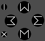
I still think its a bad idea to link the action buttons to the concepts of left, right, up and down.   I also think those symbols are abstract enough that unless you already know them you wouldn't look at them and associate them with the elements they represent.    That said, I think the elements idea might work ok if pictographs are used, instead of the triangle symbols.

That said, I like the Nth, Sth, Est, Wst, NW, SW idea better.

I'm curious...

How are some of you going to feel when all of these non-conventional action button label ideas don't make the final cut?
Over the years there have been countless ideas discussed for all aspects of the Pyra most of which will not be implemented.  Why would you think any of us would be any more emotionally invested in these ideas than any of those?

- Neelix
 
Last edited by a moderator:
It'll stop when ED produces the finalised item. And it'll be ABXY I II
I'm yet to hear a convincing argument why ABXY is better than NSEW

Using NSEW is not a gimmick as per using the elements it genuinely would improve usability to those who know the cardinal points of a compass.
 
How are _wb_'s triangles any different than comradekingu's ^ thingies?  I mean, other than an additional line.  

Since I don't care maybe I should stop looking at the new ideas so that whatever we get is a surprise (or not).  I just hope we don't get something that looks silly because people want it to look the same when you flip it over, or something.  Or, because people vote for something they don't actually like to reduce the chances of something else they also don't like.  

I guess my opinion is that we should go for something practical and understandable.  As has been said many times, arrow things and other pointers don't help.  If we can have keyboard and gaming labels that is a good choice, but it seems trying to combine them isn't producing things that many find acceptable.  What was the problem with just using words for keyboard function?  Too small to be easily read?  It doesn't scream "I am for games"?

I would like to make some serious suggestions, but it doesn't matter to me.  I would love Nintendo location ABXY, but I don't care and kinda wish they weren't going to be a glowing reminder of these discussions/debates whenever I use my Pyra.  I have some stupid ideas bouncing around in my head.  If anything logical comes from them I will post them here.
 
Using NSEW is not a gimmick as per using the elements it genuinely would improve usability to those who know the cardinal points of a compass.
If they are accustomed to the english words - and I have a hard time believing that most peoples first association will be cardinal directions.
But I am rather indifferent about what is actually on the buttons as long as they are not blank and I don't need a magnifying glass to read whats on them. But please no extra thingys printed/embossed/engraved/whatever on the case to emphasize or give clue about whats on the buttons
 
Since I don't care maybe I should stop looking at the new ideas so that whatever we get is a surprise (or not). 
To restate, for apparent legal reasons we cannot use one of the "other" button arrangements that people want. People are talking as they always do but I do not foresee ED changing the Pandora's ABYX no matter how inspired the changes.

It's different I suppose for everyone, but after I map the action buttons in an emulator, my scrutinizing their labels ends as I base my presses/depresses by feel, on where they are, and not what's scribed on the surfaces.  :)
 
Last edited by a moderator:
I'm curious...


How are some of you going to feel when all of these non-conventional action button label ideas don't make the final cut?
Glad the development is moving forward? I'm not expecting anything I propose to make it to the final device :D
 
North south east west actually makes sence as would up down left right but thats reserved for the dpad the 2 extra buttons could be south east and north east. (but any abxy would be fine also)
 
I'm curious...

How are some of you going to feel when all of these non-conventional action button label ideas don't make the final cut?
 Over the years there have been countless ideas discussed for all aspects of the Pyra most of which will not be implemented.  Why would you think any of us would be any more emotionally invested in these ideas than any of those?

- Neelix
 This is an extremely important and integral gaming part of Pyra.

I'm curious...

How are some of you going to feel when all of these non-conventional action button label ideas don't make the final cut?
Glad the development is moving forward? I'm not expecting anything I propose to make it to the final device :D
You never know your luck! :D
 
Last edited by a moderator:
I'm curious...


How are some of you going to feel when all of these non-conventional action button label ideas don't make the final cut?
 
Over the years there have been countless ideas discussed for all aspects of the Pyra most of which will not be implemented.  Why would you think any of us would be any more emotionally invested in these ideas than any of those?
 
This is an extremely important and integral gaming part of Pyra.
So what you are saying is that the outcome of this thread is of critical importance?  Wow, you really are taking this seriously ;)

- Neelix
 
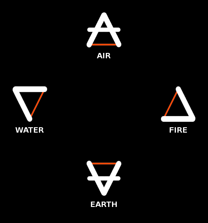
Here is an idea that uses the Aristotelian element symbols ( fire   earth  water   air ) but draws one line thinner and in the auxiliary color that would be available anyway (because of the Meta/Fn labels), to make the symbols a better correspond to Home/End/PgUp/PgDn.

post-4382-0-32391600-1433422442.png


This has the nice property that Home/End get a top-left and bottom-right direction, but still mostly left-right.

If the game or application can for some reason not show the button icons graphically (e.g. with a guihint-like image), then the following names are possible:

Spelled out elements: WATER, FIRE, AIR, EARTH

Abbreviated elements: (W), (F), (A), (E)

Keyboard functions: Home, End, PgUp, PgDn

Unicode alchemical symbols (rather new so not available yet in most fonts):

elements.png
 
How about 6 coloured buttons with the following RGB values:

X : RGB( 127, 54, 167 )

Y : RGB( 127, 55, 167 )

A : RGB( 127, 54, 166 )

B : RGB( 127, 55, 166 )

Z : RGB( 126, 54, 167 )

C : RGB( 126, 54, 166 )

This way you are spoilt for choice, you can either displayed a coloured square on screen when asking for input, or request the user "Press RGB( 127, 54, 167 )", or you could even do the weird option of saying press X, although there is some confusion with 'Press X' first of all the user might press X on the keyboard, but more importantly we don't say how hard to press X, or what with, so they might press it with a hammer being swung a full force, and that would actually destroy the Pyra. We need to be really careful here guys.
 
How about 6 coloured buttons with the following RGB values:

X : RGB( 127, 54, 167 )

Y : RGB( 127, 55, 167 )

A : RGB( 127, 54, 166 )

B : RGB( 127, 55, 166 )

Z : RGB( 126, 54, 167 )

C : RGB( 126, 54, 166 )
Well....  I have heard it said that purple is the new black...   :rolleyes:

- Neelix
 
I'm curious...


How are some of you going to feel when all of these non-conventional action button label ideas don't make the final cut?
as long as it's not in favor of something that is difficult to describe or translate then I'd be absolutely fine

I'd be way more upset seeing a bad system than a system that wasn't my favorite.

And just so we're clear, ABXY or variations and the current layout of the pandora is not a bad system.

It'll stop when ED produces the finalised item. And it'll be ABXY I II
I'm yet to hear a convincing argument why ABXY is better than NSEW
I've yet to hear a convincing argument as to why the current layout should actually change.

A bunch of people not initially familiar with the specific layout, then later getting used to it, a slightly smaller group that  were concerned other people are too stupid to figure it out, and what I'd argue was mythical group that were actually confused by an almost identical system to what's been widely in use for the past 25 years.

unlike ABXY, QWERTY for example is an actual bad system designed to slow typers down to prevent jamming of the mechanical arms of typewriters. It was a good system at the time because of it's utility, but that reasoning is no longer applicable. There are many layouts that correct that problem but are wildly out of popular favor. It's a system, it works, people are used to it, don't fix what isn't broken.
 
Last edited by a moderator:
The problem with AYXB as used on the pandora is firstly that it confuses people who assume that its in the same arangement as other consoles with those letters, and secondly that it has no obvious extention to the two new buttons.

If we call the new buttons Z and C, the order will make no sense.

Compass directions have the advantage that the extra two can be called NW and SW, and that english speakers (a very large chunk of the userbase) will automatically know which button is which

Using whole words is bad because its hard to emboss clearly into the keycap

Using weird symbols (potentially including greek chars (yes, I know...)) is bad because some people won't know what they are. (How many people knew that triangle-with-line-though-it was "air" before reading this thread?)
 
@Binky is it really confusing? or just hypothetical confusion? Does C or Z or +/- or I/II or whatever is used really need to line up with the 4 primary game button? I say it doesn't.
 
Last edited by a moderator:
The problem with AYXB as used on the pandora is firstly that it confuses people who assume that its in the same arangement as other consoles with those letters, and secondly that it has no obvious extention to the two new buttons.

If we call the new buttons Z and C, the order will make no sense.
Secondly that it duplicates the labels on the keyboard section so that you have two each of A B X and Y which have different functions to each other. Regardless of the word games one might play to distinguish them this is a design flaw on a fundamental level.

That said, I would argue that the ABXY order on the Pandora already makes no sense, so to my mind "making sense" isn't really a factor when considering if one should extend the scheme by adding C and Z on the two new buttons.

Using weird symbols (potentially including greek chars (yes, I know...)) is bad because some people won't know what they are. (How many people knew that triangle-with-line-though-it was "air" before reading this thread?)
I certainly didn't, and it's not like I was unfamiliar with the concept of the classical elements. I consider those symbols even more obscure than the greek letter versions. (Though I will admit that _wb_'s last suggestion for adapting those symbols to mean "Home, End, PgUp and PgDn" is kind of interesting and has some merit.) :)
- Neelix
 
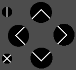
I should think all English users understand < > ^ v. Without the extra an possible erronous translation, which is worse for international users.

Some sort of arcane and cryptic meaning could of course be applied to it.

thebuttoncluster.png

I imagine there is even 90 degree versions in unicode if you want to get special, and separate them from their keyboard counterparts.

Edit: I found
nary_circled_times_operator.png
circled_lessthan.png
circled_greaterthan.png


˂ ˃ ˄ ˅ Are thematically the same.
 
Last edited by a moderator:

Using weird symbols (potentially including greek chars (yes, I know...)) is bad because some people won't know what they are. (How many people knew that triangle-with-line-though-it was "air" before reading this thread?)
I certainly didn't, and it's not like I was unfamiliar with the concept of the classical elements. I consider those symbols even more obscure than the greek letter versions. (Though I will admit that _wb_'s last suggestion for adapting those symbols to mean "Home, End, PgUp and PgDn" is kind of interesting and has some merit.) :)

- Neelix
I don't think anyone is familiar with those alchemical symbols for the four elements, except medieval alchemists. That's why I would certainly add the elements in words ("AIR", "FIRE", etc) too, in addition to the symbol:

post-4382-0-32391600-1433422442.png


It would just be a nice coincidence that those symbols can be made to look like comradekingu's  < > ^ v  with a look that is more distinct from regular dpad arrows and has more of the 'flavor' of Home/End/PgUp/PgDn.

It's a way to integrate the "game" aspect and the "serious" (keyboard) aspect of the device.

Fitting the text "AIR", "EARTH", "WATER" and "FIRE" could be a bit tricky (in addition to the symbols), but those buttons should be bigger than the "START - ALT" and "SELECT - CTRL" buttons on the Pandora, so I think that roughly that size of font should be possible. I think that's big enough to be legible.
 
Last edited by a moderator:
maybe instead of + and -, we could have wind and heart, and instead of a Pyra / home button we could just have CALL PLANET!
 
I would be more inclined to put the elements in this order, not because of any elemental ordering, but because of their button mappings in platformers:

      water
fire        earth
      air


Thinking of mario...  Fire for run/shoot, Air for jump, water is another run/shoot, and earth is special jump.  Then you definitely need these, because everyone knows what the 5th element is (and well, void sounds pretty cool as the 6th):

heart      water
      fire        earth
void        air

and you're done!
 
Last edited by a moderator:
Back
Top