Conclusion / synthesis of the keyboard poll results


Edit: I like the look of keyboards with all lowercase letters and a nice font.  Really, a good font choice helps make a keyboard look nice or "fun".  It isn't important from a functional standpoint (and not relevant to the topic unless ED will consider a sleek sans font), it just adds to the look. Edit edit: Screw conventions unless they give some crucial information.  If lowercase letters are more accurate, and an option ED is open to, might as well go for that.
Do you have an example of a keyboard with lowercase letters where it looks good? I have never seen actual keyboards with all-lowercase labels. Maybe it can look good.

On the other hand, upper case labels are the norm and perhaps there's a reason for that.

In my experience, in most fonts, capital letters have clearer and simpler shapes than lowercase letters. For example, the letter L is unambiguous as a capital letter, but in lowercase, it's easy to confuse l with i I | 1 .
 
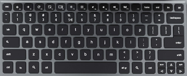
I don't think chromebooks look too terrible.  I check out mechanical keyboard forums and such, and I have seen some interesting stuff, including lowercase caps like this:

https://geekhack.org/index.php?PHPSESSID=0e65u96dkjg1p8ekrm234nlivrlus239&action=dlattach;topic=42447.0;attach=19118;image

I only spent about 3 seconds looking, so there are probably better examples.  I can't remember the sites that had tons of stuff, some that was different but very nice looking (imo).

 What looks good depends on taste.  I would like a font that looks nice, or just a bit different.  It doesn't really need to be lowercase, I was just saying "why stick with convention when there is no harm in making a change?", because it seems stupid to me to do things "because that is how it is done" and for no other reason.  This is why English speakers, and those that use these keyboards, are stuck with qwerty (yes, we can change them, or buy ones that are different, but qwerty is the convention, and if you are not using your own keyboard/computer expect to get what everyone else uses, with several non-letter keys in poorly chosen locations, LIKE CAPS LOCK WHERE CTRL SHOULD BE).  You do have a good point with certain characters looking the same, and this is a bigger concern since it will be a qwerty keyboard and not all users will know a qwerty layout.  That is where picking the right font comes in (although some characters still look the same, like uppercase i and pipe).

Edit:  We can create another thread to discuss fonts (it would be a general discussion, not just for the keyboard) if needed.  If I find the sites I was thinking of I will send links.
 
Last edited by a moderator:
You're in good company. A lot of us liked #7 better.

http://www.keyboard-layout-editor.com/#/layouts/90af356f62ad4e5cc98b56983aef01fa

The arrows above the action button labels are literally the key functions. In this layout they are given what are theoretically international symbols for their function. The main 4 function just like they did on the Pandora. You're right in that the symbol/letter and which one is 'on top' is inconsistent in the example layout. That should be fixed going into production - which way is 'right' is up to ED.
If it was up to me, I would just switch the B and arrow around.

Suspend/power. This button will likely have a multi-function purpose.

When the Pyra is off, press it once to power the Pyra on.

When the Pyra is on, press it once to go into standby.

When the Pyra is on, hold Fn/Meta and press the power button to go into suspend to disk.

When the Pyra is on, hold the power button for 3+ seconds and the Pyra shuts down.

When the Pyra is locked up and otherwise non-responsive, a to be defined button combination will force it to reboot (this hasn't really been discussed yet, but will be needed).

I agree that the logo should be on the Super key - and it should be back lit to the alternate keyboard color.
Cool, but does Susend/Power need to be there? I think the Logo is enough.I prefer "Power", if it needs to be there,but just like those Cap vs Lower case, not that big of a deal.

Alternative Keyboard color?

Also, does having a square for the delete button kind of cheap looking?
 
Last edited by a moderator:
I also prefer the power symbol, fwiw.

I have stated elsewhere that I prefer some red color for the alternate keyboard color.  I am used to seeing the orangish one that has been used, so that is fine, and it may help alleviate the concerns of those that think a pure red will look pink.

I have no strong feelings either way about the use of symbols for backspace and delete (as long as it matches whatever else is used for Ins, Pg Up, Pg Dn, Home and End).  Benefits of symbols are that they are quicker to identify, and don't rely on users knowing English, if that is a problem.

Does anyone think that ED will take this thread seriously?

Should we move the stuff that does not pertain to poll results, like all of my posts, to a different thread about suggestions for making the keyboard pretty (or, better yet, merging it with another thread on that topic...again, only if ED cares what we have to say)?
 
10a: http://i.imgur.com/9oQvr8n.png


9oQvr8n.png
Editor here.


10b: http://i.imgur.com/VTJXyiK.png


VTJXyiK.png
Editor here.


Does anyone think that ED will take this thread seriously?
Based on some of ED's comments in the poll thread I'd actually be surprised if ED is reading this thread at all.

-Neelix
This is really a bad advice. I hope he doesn't make the same fault twice. Ignoring the importance of the keyboard stuff for months, by not really joining into these intensive discussions, has brought him/us in this (precarious) situation. Of course, we all know, ED is very short in time because he has so much to do, but it's clear he has underestimated the keyboard layout stuff. So let's do all our best to help him/us out of this situation and bring the most awesome keyboard layout to our Pyra.
 
Btw, I like the red because it goes with the theme, but blue looks like it could be easier to see. I don't want orange. 
 
So the convention is shifted symbols in the shifted positions on the keycap.

We know already that letters should be primary small and secondarily big versals, on the same button.

If you need a reason other than efficiency, its because this is what all the normal letters do.

Its not that small versals dont look good, (acer c7 chromebook example)

acer_c7_chromebook_keyboard_key.jpg


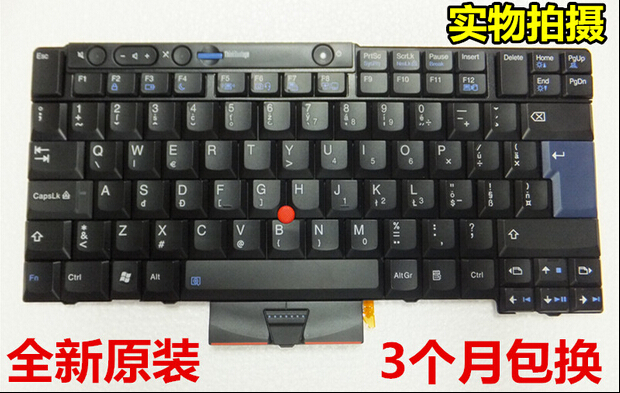
its that they don't belong in the middle of the key, not because that doesnt look good, but because it changes the shifted position of they keycap between different types of keys. Its not quite

3       and it could have worked if it wasnt for 5.

2

1

For the purpose of looking good, big letters top left, doesn't work. Especially so when its out of question due to space-concerns.

New-Laptop-font-b-keyboard-b-font-for-Lenovo-font-b-ThinkPad-b-font-X220t-font.jpg


2

1

3 4

x220.jpg


2

1  3

If we trace it back to its origin it gets progressively worse as time goes by, little by little.

Then lenove takes over completely and they think they have it right , but they thought wrong, ending up fixing many things, and breaking what worked.

If you go by the convention of dividing a key in 1 2 3, in that arrangement, (something that will actually work), the way to get symmetry is to have big letters in the 2 position.

Small versals for letters belong on layouts that are sub-par, because you have to Caps Lock to get big letters, it is also inconsistent on for example French.

Putting them anywhere is therefore non-ideal. Putting them where they don't belong on respective layouts, is not good.

Employing this convention on Germanic and other languages, who aren't even used to it, not even on the right keys, not in the correct arrangement, is a horrendous idea for all the reasons.

Edit: Here is why putting a tab symbol on > is misinformed.
 
Last edited by a moderator:
Trying to mimic a full desktop keyboard isn't the best way. As I've said somewhere else, the function should dictate the form first: typing sentences and coding as well as possible on a handheld with our thumbs. Some things are going to have to be given priority over other things originally, if you want to get it right.  ;)
 
When function dictates form, you end up with trying to mimic keyboard behaviour, a lot of that is done right on desktop keyboards.

Form already dictates function, but that is no reason to not mimic keyboard behaviour. The only possible upgrade is dividing the space-key.

I dont actually think people care as much for two-thumbs efficiency as me, its a shame we didnt get to test that against itself. But alas, any two-thumb efficiency is long lost, and it seems to have swung hard the other way.

Thinking bottom left is central, is something derived from 10-finger keyboards that stops working when all you have is two thumbs. Putting comma and dot there, goes against convention of familiarity.

When you back that up with bad math, pointing the finger towards design-ethics is as contrived as its premise. You derive nothing, and arrive at a misnormer.

Letting idea of form, and other peoples opinion, perceived such, without any rationale, or explanation, dictate both, backed by spurious questioning, and not having the design explain itself, is how we ended up with every single button broken in some way, apart from the one that says Esc in layout 10.

I understand trying to reduce shift or altGr-like modifiers on the same side as its often used counterparts, but that is effectivly only a concern for non US-shiftrow symbols, how they got on letters in the first place. So i dont understand how that is more better.

Nor does it explain moving them away from combos, which solves the matter of less optimal two-thumb clicks, by one less optimal one-thumb click.

All in all it just means US diactrics and symbols are to be found where you have to look for them in the wrong places.

Lets forget about lofty goals and not break completely for people who are used to, and accept, less.

Not less is more, but less good, for exactly the same reasons you state. Being able to code and type.

Divided space, dedicated compose, 1,2,3/4 and no finger-gymnastics.
 
Last edited by a moderator:
Btw, I like the red because it goes with the theme, but blue looks like it could be easier to see. I don't want orange. 
The "orange" I was talking about is the red/orange that is used on many layouts.  Do you dislike that one?  I wouldn't want something with much less red than that.
 
Editor here.

Why 10 over 7? Not sure about the mixed colors. How would it look if you swapped the colors.

Oh, and I realIy don't like things on the d-pad altogether.

The "orange" I was talking about is the red/orange that is used on many layouts. Do you dislike that one? I wouldn't want something with much less red than that.
Oh, you are right. For some reason, I thought it was redder than that. That's fine, tho I wonder how an actual red would look. Of course we don't know how good it look in real life.

Not sure how strong the lights are or if possible, but how about making them a bit see through or clear for the light to go through.
 
Last edited by a moderator:
Why 10 over 7?
Because he designed layout 10. It is not about satisfying the majority, it's about winning the poll :p
Sorry for this stab at your expense Saber, but you might want to provide some motivation and explanation for those changes.

I.e. why is this better according to the poll? Just posting more layouts only distracts at this point.

While it is unlikely that ED even reads this thread, you might at least try to wrap it as if it is intended to help him.
 
Here is an evolved version of the poll based layout:

http://www.keyboard-layout-editor.com/#/layouts/3c0c7c5c9a4481939bc615433148a6e4

I doubt ED reads this thread, but that doesn't mean that your comments here will be ignored.

Open questions:

  • Should we keep § or should we replace it with something more useful? (what?)
  • For which keys should we use symbols (like ↵), for which keys should we use words/abbreviations (like Esc or PgUp) and for which keys should we use both (like ⇧Shift) ?
  • Is dead circumflex / dead diaeresis on one Fn key (Fn+I for dead circumflex, Fn+Shift+I for dead diaeresis) a good idea?
 
Here is an evolved version of the poll based layout:

http://www.keyboard-layout-editor.com/#/layouts/3c0c7c5c9a4481939bc615433148a6e4


I doubt ED reads this thread, but that doesn't mean that your comments here will be ignored.


Open questions:

  • Should we keep § or should we replace it with something more useful? (what?)
  • For which keys should we use symbols (like ↵), for which keys should we use words/abbreviations (like Esc or PgUp) and for which keys should we use both (like ⇧Shift) ?
  • Is dead circumflex / dead diaeresis on one Fn key (Fn+I for dead circumflex, Fn+Shift+I for dead diaeresis) a good idea?
I don't even know what the § symbol is, so if there's something more useful, then sure.


I don't think any key needs both. Well, maybe FN, but I rather just have shift on the keyboard.


What does the Block/buttom after f10 do and why is there need for a symbol on space? I'm guessing there wouldn't be any actual words on the sticks. Lol I admit, the home etc keys look better as words, but the arrows are less cluttered.

Nevermind, that's the backspace button. I rather have the actual symbol than a rectangle.
 
Last edited by a moderator:
I think the double S thing should be replaced, but I nearly never use it anymore.  When I did use it I never typed it, and would type "Section" instead.  What to use instead?  A letter for a big language that is not currently present.

Symbols vs. words vs. abbreviations, huh?  I think that needs to come from ED.  I think some symbols will be more confusing (such as on the gaming buttons).  I am fine with the carriage return symbol, which is how I think of it, or the word Enter or Return.  If the symbol is widely used it might be a better choice.  I think that anything that is unlikely to fit on the key or button it is on and be legible should be abbreviated (Escape=Esc, Control=Ctrl, Page Down=PgDn (if symbol isn't used) Space=Any (if we don't get a dedicated any key)).  I see no reason to combine letters and a symbol, such as in the shift example.  If one doesn't work use the other.

I can't give an answer to the third question since it doesn't apply to me.
 
EvilDragon in the past stated he wanted the § (section) symbol on the keyboard. I'm not sure of the uses, but since he wants it I guess it has some uses. 
 
EvilDragon in the past stated he wanted the § (section) symbol on the keyboard. I'm not sure of the uses, but since he wants it I guess it has some uses. 
Let's try to avoid circular justifications. Otherwise we might in the end include a useless symbol because ED thinks the community wants it while the community only wants it because they think that ED wants it.

Is there anyone who actually uses the § symbol sufficiently often to want to have it available easily? (as opposed to having to type Compose S O)

Is there anyone who looks at http://www.keyboard-layout-editor.com/#/layouts/3c0c7c5c9a4481939bc615433148a6e4and misses a symbol? Perhaps £ or ½ or ¬ or ± or ¤ ?
 
Back
Top