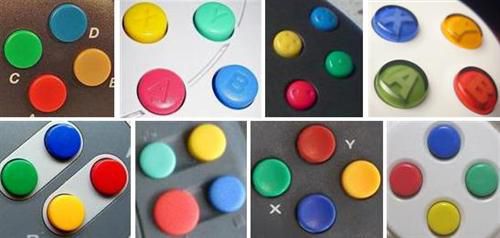
Action button labels


Instead of arrows or dots what about making them large triangles with the Latin letter of each buttton defined to almost touching the polygon's inner three walls?
Well to me if the buttons gets cramped then it's just messy... Personally I could take or leave the guihints dots or otherwise.. I was just explaining the reasoning behind it and why it's not entirely a bad idea.
Sure, too much of a good thing so to speak. The alternative could be stylizing the Latin lettering as someone before suggested. :)
Well the whole point of the dots was to make the actual button labeling irrelevant, it's a simple scheme to allow a universal guihints for developers that want to put in such a thing in their programs.. which isn't a bad idea since some developers here develop for several different handhelds with different button schemes. And like I said earlier the dots don't have to be on the actual buttons, just helps a bit for explaining what the dots mean.. I think I saw one program for the Pandora that actually uses the dot scheme.. Could be mixing it up with a PC game when using a controller.
 
Last edited by a moderator:
^ actually just noticed that was it. maybe a few others..
 
It depends on the color of the case, but if everything else is black I think pink buttons would look nice.
 
buttons.png


Source: http://people.cs.kuleuven.be/~jon.sneyers/tmp/buttons.dia
 
Why the Z and W?
W,X,Y and Z build a rectangle. It is not so random like with C. If you use C and Z the end user would assume some kind of logic groups for A,B,C and X,Y,Z. But this is not possible if we keep the pandora layout! So I suggested W instead of C. ;)
 
Last edited by a moderator:
So what im getting is that confusion between consoles and between games on the same platform is unavoidable if you want similar style or function.

Which leads me to believe an (another) arbitrary arrangement is not solving anyhing and adding to the confusion.

If instead of having a layout that is "sort of similar - some of the time", it makes sense to go for something unfethered.

A is the B unless its the X which has similar function to * on another, and then you are in the drink.

  • A combination of everything is by default confusing _in itself_
  • the playstation markings is a registered trademark.
 
Last edited by a moderator:
How about thinking about some colours.
White    Red
Gray            Green
Black   Blue
 

RGB is something we all know, and its not arbtritrary, its prime colours. White gray black is grayscale. So its scale on the left. Colour range on right. Needless to say grouping of buttons is also different on each controller on each platform.

 
Red  White
Green                    Gray
Blue   Black
 

Green is in the "right" place here, but R(ed) is on the L(eft) side. I dont like the notion of colouring a button with a letter that doesnt represent its colour. A and B is a legacy thing, and everything after that seems to be an afterthought that wasnt thought through.  Y being yellow and on the Y axis makes some sense i guess.


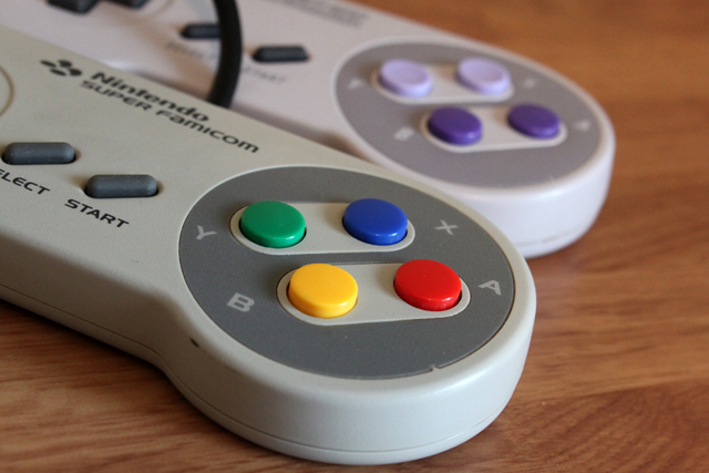
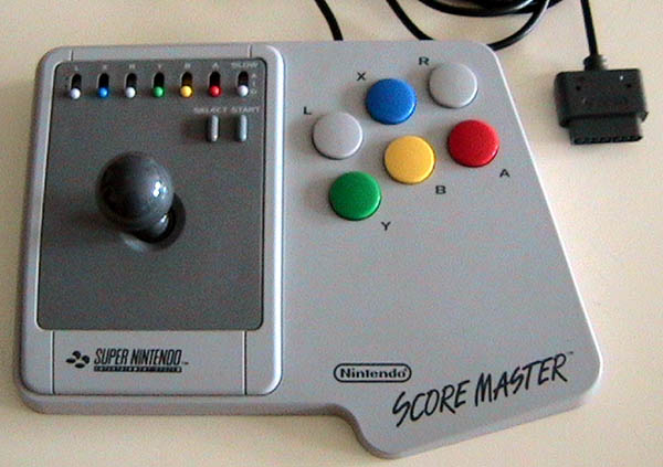
SNES - Most influential gamepad
 
SNES_SFamicom_Controllers.jpg

 
Nintendo%20Snes%20Score%20Master%20SNSP026%20_z1.jpg

Super_Advantage_Super_nintendo_arcade_stick.jpg

 
Indeed, and now we have:
 
snes-clone.jpg
 
Last edited by a moderator:
No multi-colored keys please.

Keep in mind that this isn't JUST a game console.  Some of us need to be able to have it sitting open on our desk at work.
 
Q       W

A                  D

Z        S

;)
 
Last edited by a moderator:
No multi-colored keys please.

Keep in mind that this isn't JUST a game console.  Some of us need to be able to have it sitting open on our desk at work.
As I have pointed out (and proven) in another topic, colors can be just fine when used correctly.

-God Ginrai
 
I can deal with color letters not the whole button. I mean, the whole button can work, but still prefer just the letters.
 
Last edited by a moderator:
Back
Top