Action button labels: poll 3 (final poll?)

Which of these options are acceptable to you?


  • Total voters
    89

Hey, I had a new idea. Meant seriously:


(Z) (Y)
(A) (
(W) (X)
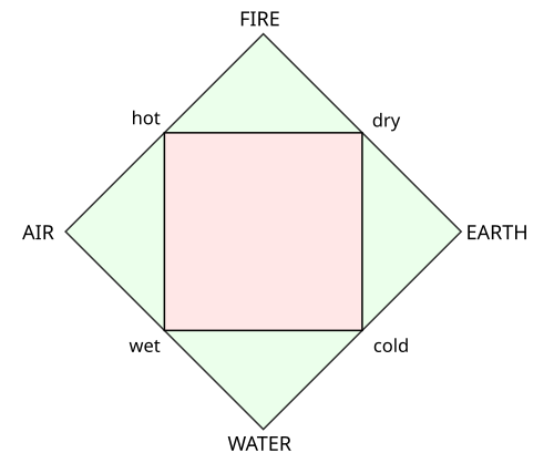
(A) would be the main button like for the Gamecube. (X), (Y), (Z) and (W) build a logic square around it and ( B) is right to (A), which makes sense, too. :)
I am truly amazed at the quality of the constructive feedback you guys have. Such interesting and compelling argumentation! Please continue!

I dislike this idea even more than greek letters...
I already talked with you about this idea in the channel, but I know, the board has a problem with things said only in the channel... Furthermore you didn't ask for the reasons for my opinion, you just asked, whether the greek haters like the new idea more and I answered. But here a list, what I don't like about the new idea
  • Instead of having bad font support like for greek letters now we don't even have font support at all. So every fucking homebrew application, port or emulator has to add little element pictures with size and style depending on the used font to the written text or have to use descriptions like [AIR], [WATER] or [sHADOW]/[LIGHT], which sucks.
  • The idea has nothing to do with the pyra at all. I it just nerdy... Why don't we take Pokémon types? Press [GRASS] to continue or [DRAGON] to cancel. We could give the shoulder buttons types, too! Or why don't we take Klumpens proposal and take cardinal directions like [NORTH] or [EAST]. Or just colors without lettering at all. Press the red button. Looks even nicer than press [RED].
  • We have to print the symbol, the name of the button, the semantic (like PgDn or Insert) and maybe the old Pandora layout for backward compatibility on the button. This is ridiculous. We use symbols, but have to write their names too, because nobody knows, what they mean...
  • A big disadvantage is, that I just don't see any advantage. It just makes everything even more complicated
 
I understand. But Greek letters are a real alphabet so it's neutral not like water/wind... when you say "press water" it sound weird because there isn't water.
When you say "Press Pi" is sounds weird, too. There is no pi, because the pie is a lie!
 
14031408575699286.png
                                                        
140314085417832292.png


A  JUMP                                                                                                              Δ  JUMP

B  PUNCH                                                                                                          Ω  PUNCH

C  INVENTORY                                                                                                  Π  INVENTORY

Y  DROP BOMB                                                                                                 χ   DROP BOMB  

FIRE                                                                                                               ψ  FIRE

CAST SPELL                                                                                                  γ CAST SPELL

Not to mention that the fact they are used on the keyboard will make latin letters  look even more banal.
 
Last edited by a moderator:
I was thinking something like this:

pyra_elements.png


Somebody with more artistic skills than me should give it a go, this is just to explain the concept.

Here is the source file for my drawing, in case someone wants to start from that (it's a dia file): http://people.cs.kuleuven.be/~jon.sneyers/tmp/pyra_elements.dia

The idea is to have Pandora-compatible Latin letters. There is a majority that wants that, so we cannot ignore them. However, just keeping the Pandora layout without any change is too boring.

So the elements FIRE, AIR, EARTH and WATER are added. The element is the background for the Latin letter, and it is colored: red-brown for earth, orange-yellow for fire, blue for water and light blue-cyan for air. There is are some nice coincidences:

- A is the first letter of AIR

- B is Brown and Y is Yellow (cf. the "colored letters" proposal

- Fire refers directly to Pyrrha, water and earth too to some extent if you consider the story of Deucalion and Pyrrha

- Elements are often used in RPG games and in particular for dragons, so there is a (weak) reference to EvilDragon and DragonBox

- there's a correspondence to the Playstation layout: X is cross, earth is a circle, fire is somewhat like a triangle and air is square or a menu list.

This layout follows the classical Greek elements:

500px-Four_elements_representation.svg.png


What do you think?
 
So your newest argument is, that the other idea is boring? o_O
 
@wb I like that a lot actually, need to do something with the earth icon, but I personally like the rest, they're simple and easily identifiable

EDIT: confused the earth with the fire I think red/yellow with fire, green/brown with earth maybe switch the colors?
 
Last edited by a moderator:
So your newest argument is, that the other idea is boring? o_O
It's not new, I just maked an image comparison to make you realize.
 
Last edited by a moderator:
Somebody with more artistic skills than me should give it a go, this is just to explain the concept.

Here is the source file for my drawing, in case someone wants to start from that (it's a dia file): http://people.cs.kuleuven.be/~jon.sneyers/tmp/pyra_elements.dia

The idea is to have Pandora-compatible Latin letters. There is a majority that wants that, so we cannot ignore them. However, just keeping the Pandora layout without any change is too boring.
I think Greeks letters are the right way, I think we should convince people that it is. Your idea look good but it change nothing, people will never use it and will forget it.
 
I'm ready to be convinced. If I'm really wrong I will be happy because it is more likely that Latin be chosen.
 
I think Greeks letters are the right way, I think we should convince people that it is.
I'm ready to be convinced. But if I'm really wrong I will be unhappy because it is more likely that Latin be chosen.
 
I think latin characters are the right way, I think we should convince greek people that it is.
I'm ready to be convinced. If I'm really wrong I will be happy because it is more likely that Latin be chosen.
That's not convincing. Oh I get, you haven't any idea. I'm not suprised because you just want to keep the same things.

Just compare:

14031408575699286.png
                                                        
140314085417832292.png


A  JUMP                                                                                                            Δ  JUMP

B  PUNCH                                                                                                         Ω  PUNCH

C  INVENTORY                                                                                                  Π  INVENTORY

Y  DROP BOMB                                                                                                 χ   DROP BOMB  

FIRE                                                                                                              ψ  FIRE

CAST SPELL                                                                                                  γ CAST SPELL

Not to mention that the fact they are used on the keyboard will make latin letters  look even more banal.
It's very explicit, latin letters are just worse in any point. You prefer it? Allright.
 
Don't be sorry, your opinion is your opinion and  it does not concern me.

But I would like to see EvilDragon here.
 
Back
Top