Action button labels: poll 3 (final poll?)

Which of these options are acceptable to you?


  • Total voters
    89

I'm kind of with thinkpad here, I'd rather have only 4 face buttons than some thrown together space constricted 6 button configuration. We have 4 shoulder buttons and to me that's a fine upgrade from the Pandora.

So I guess my question is if these two additional buttons are slightly smaller, how much smaller, are they inline with A button or slightly staggered? Will these 2 buttons not interfere in the arc of moving from A to Y or A to X? 
 
Last edited by a moderator:
The poll is biased since options 2 and 3 are very much the same thing - so you are actually giving statistically more weight to the same choice/direction/design.
Of course it is. It's being pushed like there's no tomorrow. That bias was already shown a few post after it was mention and it wasn't even a real


suggestion.
 
As with previous polls, new options are allowed in to be voted for and old options are dropped based on previous votings. The current new option attempts to diminish the downsides to the greek layout, arguably creating new problems in the process. It's a mutation of the layout based on feedback. There's no shame in trying to do better by addressing voiced concerns.

At this point I'm quite certain ABXY(CZ?) will be the final layout based on the ED quote and poll results so far. It has persevered this far, and probably will after this too. Still, I like seeing this being carried to the end instead of announcing a winner when it feels convenient. Saying "My preferred option won the last poll! No more polls are needed! No new options should be considered! It's decided!" is a bit selfish. If you believe your preferred choice has the majority backing of the community, it will win in the future too. No need to feel threatened by new challengers arriving or old nemesi rising from graves.

Regarding giving more weight to the Greek options by having two of them: In my opinion the two can't have their votes combined here like in previous polls because of the balance issue. This poll doesn't allow for people to set their second preferred option, so it's impossible to tell if a voter who voted 3 would want 1 or 2, given only those choices. Categorization is a good tool hwen the options are many, not when there are only a handful. This should actually more be beneficial to the one Latin option, since the Greek votes are divided between two options, while the only Latin one will get all anti-greek votes.

EDIT: BTW, I just noticed Unicode has, in addition to many other nice things like greek alphabet, these: Ⓐ Ⓑ Ⓧ Ⓨ Ⓒ Ⓩ. They might be able to fix the button ambiguity issue at least for written text? A letter in a circle is a button? Of course that doesn't do much good for auditory learners or spoken text, but it's at least less ambiguous to say "Press Ⓐ to continue" than "Press A to continue".
 
Last edited by a moderator:
The poll is biased since options 2 and 3 are very much the same thing - so you are actually giving statistically more weight to the same choice/direction/design. 
Isn't it rather obvious from the get go that the multicolour, multi-glyph extravaganza is there because funny joke?
 
This is one of the very few design decision with little to no added cost and impact on marketability. To me it seems that this is an area where the community actually can make a contribution while all the E-ink and camera discussions are much more irrelevant because of design constraints.


In the end we'll probably have the same labels as on the Pandora, but nonetheless it is an interesting discussion and I'm not yet convinced some acceptable to all yet at least slightly innovative solution cannot be found.
 
EDIT: BTW, I just noticed Unicode has, in addition to many other nice things like greek alphabet, these: Ⓐ Ⓑ Ⓧ Ⓨ Ⓒ Ⓩ. They might be able to fix the button ambiguity issue at least for written text? A letter in a circle is a button? Of course that doesn't do much good for auditory learners or spoken text, but it's at least less ambiguous to say "Press Ⓐ to continue" than "Press A to continue".
Yes, that is at least a better solution than having to add the word "button" or "key" everywhere.

I would personally put guihint icons in a standard folder and encourage all devs to use those (by loading the icons from their standard location). It would give a neat standardized look and feel to all native applications (using unicode symbols would still look different depending on the font, and there will be no good unicode symbols for things like START, SELECT, PYRA). And it means we can use different labels in the Pyra or one of its successors without any additional effort.

This is one of the very few design decision with little to no added cost and impact on marketability. To me it seems that this is an area where the community actually can make a contribution while all the E-ink and camera discussions are much more irrelevant because of design constraints.


In the end we'll probably have the same labels as on the Pandora, but nonetheless it is an interesting discussion and I'm not yet convinced some acceptable to all yet at least slightly innovative solution cannot be found.
It is surprising to me that the compromise proposal 3 gets so few "acceptable" votes. I wonder why people think it is unacceptable. It may have originated as a joke, but that does not imply that it is a bad idea.

In any case, whatever labeling is picked, I think the small-print labels for Home/End/PgUp/PgDn/Ins/Del have to be added (either on the button or on the case). Adding one small-print letter to three button labels (or four, depending on what you do with X) is trivial compared to that.

I wonder what other reasons besides "worried the labels won't fit" people have to say proposal 3 is unacceptable.
 
"Ugh stop voting the greek layouts down - it was winning before you started voting for latin layouts, your voting is biased, you shouls just accept defeat! *throws toys out of the pram and proceeds to stamp and scream*"
 
The poll is biased since options 2 and 3 are very much the same thing - so you are actually giving statistically more weight to the same choice/direction/design.
Of course it is. It's being pushed like there's no tomorrow. That bias was already shown a few post after it was mention and it wasn't even a real


suggestion.
You are still "pushing" this layout in your signature:

         Z


    Y       C


X      B


    A

which is a layout that received fewer votes than the Greek proposals even before it became clear that the physical button layout will not be like that.

I don't really mind you doing that, but my irony detector is picking up something here...

Anyway, I don't see any bias in this poll? As always, you have to be careful when interpreting results, but I don't see how it would be biased.
 
Just came back. I haven't had a chance and to be bothered to change it yet . Anyway, I scanned those posts. The layout was not even the same.
 
Yes, I'm catching up and apparently, unfortunately, it wouldn't fit that way.

Doesn't really make any sense since that the most simplest layout and Greek would be much more confusing, but whatever.
Greek isn't happening anyway.


I wonder what other reasons besides "worried the labels won't fit" people have to say proposal 3 is unacceptable.
Probably want to keep it simple like the Pandora and not some symbols hodgepodge.
 
Last edited by a moderator:
Well, for some Greek letters just don't seem acceptable. The real reasons are not obvious, but I suspect something other than Greek symbols has to be found.


I like the rune proposal and have looked at the Hanzi for up/previous (上), down/next (下), north (北), east (东), south (南), west (西), left (左), right (右), front (前), back (后), middle (中), and straight (正), next (as in tomorrow) (明), previous (as in yesterday) (昨), sun (日), moon (月), electricity (电), energy (力), wind (风), rain (雨), fire (火), earth (地 or simply 土), big (大), small (小), add (for insert) (加), insert (插), delete (删), but I would be surprised if they don't get the same kind of opposition.
I think any other alphabets/characters (Rune, Chinese, Japanese, Cyrillic, Hebrew, Arabic, Egyptian hieroglyphs, Mayan, Aramaic, Georgian, Armenian, etc) will get the same or even more opposition. They look "weird" to people, and for many people "weird" seems to imply "bad" (I don't agree with that, but I think I'm in a minority). Additionally, Chinese characters in particular could give the device a "Made in China" look, which is probably not desirable.

Also I think Greek letters have some advantages over other non-Latin letters/characters: they fit well with the device name theme, their shapes are geometrically simple and distinct enough to be easily recognizable even in a small or low-res font, and the resemblance to Playstation buttons is also nice to have.
 
I agree, though ideographs have the benefit of meaning. Klumpen could get symbols the not only represent North/East/South/West but actually are North/East/South/West on his buttons. And I imagine some games could be fun with earth/water/fire/wind/rain/air buttons :)


I think some symbols from the various logo design threads could be used and developed into a family of 6.
 
Also I think Greek letters have some advantages over other non-Latin letters/characters: they fit well with the device name theme, their shapes are geometrically simple and distinct enough to be easily recognizable even in a small or low-res font, and the resemblance to Playstation buttons is also nice to have.
2d%20shapes.PNG


These are also geometrically simple, distinct, recognizable and some (3/4) resemble PS buttons. It would be easy to add a cross of some sort if you want that full PS experience :p
 
I agree, though ideographs have the benefit of meaning. Klumpen could get symbols the not only represent North/East/South/West but actually are North/East/South/West on his buttons. And I imagine some games could be fun with earth/water/fire/wind/rain/air buttons :)


I think some symbols from the various logo design threads could be used and developed into a family of 6.

http://en.wikipedia.org/wiki/4_Elements#Greece

500px-Four_elements_representation.svg.png


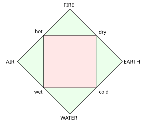
With good-looking icons, this could be very nice. The extra two buttons could be called (A)ETHER / VOID / HEAVEN and something else, or METAL and WOOD.
 
Nice! Would fit the key binding perfectly (IMO) if we rotate the air and earth symbols to point outwards.


edit: but even as is, these are very nice symbols for home/end
 
Last edited by a moderator:
At least after these polls everybody will know their Greek :)
not everybody, I am making no extra effort to actually learn them as an experiment. I still can't identify the chi, phi, or lambda, and only have an idea on which one the delta might be. You'd figure with reading all this discussion on it I'd have to pick it up by osmosis, but you'd be wrong.

I did read through the entire greek alphabet once as a quick reference, but made no attempt to memorize any of them.

yea, I'm bragging about my ignorance. I know.
 
It would be fairly easy coming up with some nice iconography for the "elements"

Google has hundreds that could be used as a basis...
 
Last edited by a moderator:
BTW, I just noticed Unicode has, in addition to many other nice things like greek alphabet, these: Ⓐ Ⓑ Ⓧ Ⓨ Ⓒ Ⓩ.
I see nothing but squares. They may be in unicode but that doesn't guarantee they'll be available in every font, nor even the same font across different systems.
 
Nice! Would fit the key binding perfectly (IMO) if we rotate the air and earth symbols to point outwards.


edit: but even as is, these are very nice symbols for home/end
Maybe put Earth left and Air right?  I associate Home to Earth (my home is on earth).

As the extra two buttons, we could split the fifth element (AETHER) -- which corresponds to the heavens, space and the stars -- into VOID and STAR, YIN and YANG, MOON and SUN, or just DARK and LIGHT. Essentially these are all - and +, negative and positive, delete and insert.

So that gives us:

[LIGHT]    [FIRE]

    [EARTH]         [AIR]

[DARK]   [WATER]

I'm starting to like this idea. The icons could look really nice if done in a uniform way, it fits the Greek theme but at the same time those elements are quite universal across different cultures. It would be quite fun to use these buttons in homebrew games, and it certainly adds some character and personality to the device. It's original but not obscure. Even ignorant people will have no trouble to recognize the icons (if they're done right), and just to be sure we can add the name of the element in small-print to the button. You can use Latin letters to describe the buttons (and in proper context, e.g. describing button combos, you can abbreviate them to their first letter).

What do the opponents of Greek letters think about this?

Coincidentally, http://en.wikipedia.org/wiki/Platonic_solid#History says:

"The Platonic solids are prominent in the philosophy of Plato, their namesake. Plato wrote about them in the dialogue Timaeus c.360 B.C. in which he associated each of the four classical elements (earth, air, water, and fire) with a regular solid. Earth was associated with the cube, air with the octahedron, water with the icosahedron, and fire with the tetrahedron. There was intuitive justification for these associations: the heat of fire feels sharp and stabbing (like little tetrahedra). Air is made of the octahedron; its minuscule components are so smooth that one can barely feel it. Water, the icosahedron, flows out of one's hand when picked up, as if it is made of tiny little balls. By contrast, a highly nonspherical solid, the hexahedron (cube) represents "earth". These clumsy little solids cause dirt to crumble and break when picked up in stark difference to the smooth flow of water. Moreover, the cube's being the only regular solid that tesselates Euclidean space was believed to cause the solidity of the Earth."

So fire corresponds to the 3D version of a triangle, and earth corresponds to the 3D version of a square.
 
Back
Top