Yes, I know this topic has been discussed before a lot already (e.g. here, here, here, here, here and here). But none of the earlier discussions have really lead to a convincing conclusion. Greek Playstation-like letters (Π Ω Δ χ) and Pandora-like Latin letters (A B Y X) were rather popular options. There was a weak majority in favor of ABYX, but without a clear consensus on how to extend ABYX with two extra action buttons: adding C and Z does not exactly make sense in this physical button arrangement; Roman numerals I and II could be confused with the letter I (uppercase i) or l (lowercase L) and with the pipe symbol |. Also there is some concern about potential confusion between the action buttons A, B, X, Y and the letter keys A, B, X, Y — one proposed solution is to use the labels ( A ), ( B ), ( X ), ( Y ) for the action buttons.
A lot of these earlier discussions took place before we knew how the physical buttons would look like: for example, it was not clear from the beginning where the extra buttons would be located (some people were hoping for two diagonal rows of three, which would make ABC XYZ possible).
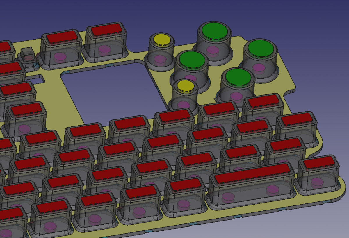
Today we have much more information about the actual design. We now know how the buttons are arranged, we know that they will also be backlit like the rest of the keyboard (which means their labels will be much more visible than the Pandora's), the keyboard layout discussions have progressed a lot so we know what the actions buttons will be mapped to, and we know that the two extra buttons will be smaller than the four main ones. Here's a detailed picture from one of ED's most recent news posts:

So perhaps it is a good time to restart this discussion.
All the current keyboard layout proposals assign the functions Home, End, PageUp, PageDown to the four main action buttons, and Insert, Delete to the two smaller extra action buttons.
I personally think that it is best to label buttons/keys with their actual function, to make the learning curve as smooth as possible and to reduce the amount of things users are supposed to "just remember".
About the two extra game buttons:
Looking at the above picture, I don't think the labels Ins and Del would be very readable on those small action buttons. Those main key labels (the red ones) are 3 x 7 mm, so those small action buttons (the yellow ones) would probably have no more than 3 mm diameter in printable area. It should be possible to print "INS" and "DEL" in the same font size as the "START" and "SELECT" on the Pandora, which perhaps is big enough.
The labels + and - (as proposed by Saber) would fit well, but it is rather confusing to have buttons labeled + and - that do not produce the symbols "+" and "-", even though "plus" and "insert", and "minus" and "delete" are semantically somewhat related.
The labels I and II (Roman numerals, could also be rendered as Ⅰ and Ⅱ, or Ⅰ and Ⅱ ), as proposed by ED at some point, would also fit easily, but that leaves nearly no clue at all about what those buttons do. Ⅰ could be considered as the first letter of "Insert", but there is no link between Ⅱ and "Delete".
The labels C and Z have the same problem.
Another option would be to use the symbols ⌶ (or perhaps ⎀) and ⌦ for Ins and Del (and use ⌫ for backspace). That is perhaps a bit more cryptic than simply "Ins" and "Del", but at least it could be a big symbol instead of small letters.
About the four main action buttons:
I still kind of like the "Playstation Greek letters" Π Ω Δ χ , but since those don't describe the actual meaning of the button, the labels "Home", "End", "PgUp", "PgDn" would have to be added (in a small font). For Pandora-compatibility, the letters for the corresponding Pandora button (ABYX) could be added as well, but then it's a bit much.
Pandora-style ABYX could be used too, but with added brackets to disambiguate: ( A ) ( B ) ( Y ) ( X ), and also with the labels "Home", "End", "PgUp", "PgDn" added in a small font.
The symbols ⇤ ⇥ ⇞ ⇟ are more or less standard symbols for Home, End, PgUp, PgDn, and they make good game button labels because the symbol itself gives you a direct clue as to where it is located. More cryptic than simply "Home", "End", "PgUp", "PgDn", but also language-neutral and arguably more æsthetically pleasing. Again, the letters A B Y X could be added in a small font, for Pandora-compatibility.
Comradekingu has proposed to use the symbols < > ^ v, which give a directional clue to where the buttons are, but the reference to Home, End, PgUp, PgDn is weaker, and there is potential confusion with < (less than) > (greater than) ^ (circumflex) v (letter V) and the dpad.
Personally, I don't think Pandora-compatibility is very important w.r.t. the labels of the action buttons (I do think it is important to maintain compatibility w.r.t. their mapping though). I am currently in favor of using just the symbols ⇤ ⇥ ⇞ ⇟ for the main action buttons, and ⌶ and ⌦ for the smaller ones, or "Ins" and "Del" if that fits.
A lot of these earlier discussions took place before we knew how the physical buttons would look like: for example, it was not clear from the beginning where the extra buttons would be located (some people were hoping for two diagonal rows of three, which would make ABC XYZ possible).
Today we have much more information about the actual design. We now know how the buttons are arranged, we know that they will also be backlit like the rest of the keyboard (which means their labels will be much more visible than the Pandora's), the keyboard layout discussions have progressed a lot so we know what the actions buttons will be mapped to, and we know that the two extra buttons will be smaller than the four main ones. Here's a detailed picture from one of ED's most recent news posts:

So perhaps it is a good time to restart this discussion.
All the current keyboard layout proposals assign the functions Home, End, PageUp, PageDown to the four main action buttons, and Insert, Delete to the two smaller extra action buttons.
I personally think that it is best to label buttons/keys with their actual function, to make the learning curve as smooth as possible and to reduce the amount of things users are supposed to "just remember".
About the two extra game buttons:
Looking at the above picture, I don't think the labels Ins and Del would be very readable on those small action buttons. Those main key labels (the red ones) are 3 x 7 mm, so those small action buttons (the yellow ones) would probably have no more than 3 mm diameter in printable area. It should be possible to print "INS" and "DEL" in the same font size as the "START" and "SELECT" on the Pandora, which perhaps is big enough.
The labels + and - (as proposed by Saber) would fit well, but it is rather confusing to have buttons labeled + and - that do not produce the symbols "+" and "-", even though "plus" and "insert", and "minus" and "delete" are semantically somewhat related.
The labels I and II (Roman numerals, could also be rendered as Ⅰ and Ⅱ, or Ⅰ and Ⅱ ), as proposed by ED at some point, would also fit easily, but that leaves nearly no clue at all about what those buttons do. Ⅰ could be considered as the first letter of "Insert", but there is no link between Ⅱ and "Delete".
The labels C and Z have the same problem.
Another option would be to use the symbols ⌶ (or perhaps ⎀) and ⌦ for Ins and Del (and use ⌫ for backspace). That is perhaps a bit more cryptic than simply "Ins" and "Del", but at least it could be a big symbol instead of small letters.
About the four main action buttons:
I still kind of like the "Playstation Greek letters" Π Ω Δ χ , but since those don't describe the actual meaning of the button, the labels "Home", "End", "PgUp", "PgDn" would have to be added (in a small font). For Pandora-compatibility, the letters for the corresponding Pandora button (ABYX) could be added as well, but then it's a bit much.
Pandora-style ABYX could be used too, but with added brackets to disambiguate: ( A ) ( B ) ( Y ) ( X ), and also with the labels "Home", "End", "PgUp", "PgDn" added in a small font.
The symbols ⇤ ⇥ ⇞ ⇟ are more or less standard symbols for Home, End, PgUp, PgDn, and they make good game button labels because the symbol itself gives you a direct clue as to where it is located. More cryptic than simply "Home", "End", "PgUp", "PgDn", but also language-neutral and arguably more æsthetically pleasing. Again, the letters A B Y X could be added in a small font, for Pandora-compatibility.
Comradekingu has proposed to use the symbols < > ^ v, which give a directional clue to where the buttons are, but the reference to Home, End, PgUp, PgDn is weaker, and there is potential confusion with < (less than) > (greater than) ^ (circumflex) v (letter V) and the dpad.
Personally, I don't think Pandora-compatibility is very important w.r.t. the labels of the action buttons (I do think it is important to maintain compatibility w.r.t. their mapping though). I am currently in favor of using just the symbols ⇤ ⇥ ⇞ ⇟ for the main action buttons, and ⌶ and ⌦ for the smaller ones, or "Ins" and "Del" if that fits.
Last edited by a moderator:


