Action button labels, again


⇞ ⇞ ⇟ ⇟ ⇤ ⇥ ⇤ ⇥ LAMBDA GAMMA PLAY HOME. Konami code on the Pyra can't sound worst :p .

After read the whole thread AGAIN, i can't still understand what REAL problem have the use of ABXY, I and II. Maybe I'm slowpoke, but the motives exposed are... senseless.
 
Last edited by a moderator:
You are mistaking ISO symbols for directions. The konami code is

↑ ↑ ↓ ↓ ← → ← → B A Start Select

↑ ↑ ↓ ↓ ← → ← →

↑ ↑ ↓ ↓ ← → ← → > v

⇟ ⇟ ⇤ ⇥ has the 87-key qualities, but they look foreign moreso than you get any benefit of people recognising them as 87-key. The foreign-part is a big issue. Also it suggests that pairs are  ^v  and <  >    which isn't the case.

Roman lettering because those are easily typed and have always been there. KISS!

SONY's stuff is kind of okay since X O [] /\ works.

We also shouldn't try to make up for the non-standards nonsense NinSega has brewed up over the years. You can't account for what people are used to unless you just blatantly copy one that exists, which will always leave a portion of people disgruntled because they didn't get their favourite.

This also reminds me of Japanese PSX games having O for accept and X for cancel, while western games had it the other way 'round.

People get used to stuff. Newcomers will always have to learn. I mean, hell, you're getting an opensource linux handheld and are worried because X is now A... really!? Just because a few people get vocal over such trivial matters doesn't mean that it really is important.
People are for the most part already exposed to confusion, and will want to play multiple things. Learning a new system when they are mutually exclusive to the common denominator is harder. We are trying to do all of them, and not leave anyone disgruntled.

Just because you dont care, doesnt mean i dont.

The mainstream (I know ED is targeting a more niche linux market) would frown upon anything that isn't abxy or PS button. We need the casual people to look at Pyra and be immediately familiar with the action buttons.
I remember when I first saw the concept of the Gizmondo action buttons...I was like WTF!??
Both of which are trademarked, patented, and whatever else. Frown all you like. Good point, it looks out of place.

Seriously? The fact that the main 4 are arranged in a diamond and are opposite a DPad with two nubs in-between isn't enough of a clue? People may very well go WTF, but they'd do that for the Pandora's odd ABXY order anyway. No matter how they are labelled I think there is no risk that anyone would not recognise their intended function.

- Neelix
As mentioned above, that doesnt matter when you put something on it that looks out of place. The voting clearly showed people are confused by BYXA.

Lets have something that doesnt look out of place.
 
Actually these are the real ISO symbols:
international-keys.jpg

 
as used e.g. here:
clavier.gif


But I don't really like how that would look on our game buttons:
 
    ⎗
   ⇱     ⇲
    ⎘


Luckily, those ISO symbols are rarely used and not very well-known. So instead of those symbols, I would propose to use the following Unicode symbols:
 
 ⌶      ⇞
    ⇤     ⇥ 
⌦     ⇟
 
I forgot what the actual ISO symbols were, but doesnt their unknown character make the point moot?

A semi-resemblance to the ISO-symbols is not something that gets communicated at face value.

I kinda like  ␥ but i dont know how to type it.

Long story short i tried a lot of things and made something that required a mirrored sigma, for which there is no symbol.

In the end its a tradeoff between easy enough to type, and not so "easy" that it gets mistaken verbatim for other primary keys. Thats why i landed at <v^> and also because it retained the symmetry.
 
Last edited by a moderator:
I'm not too picky about what's on the buttons, I think some variation of A B X Y is probably the best bet for the main 4.

for the other two something like a diamond and circle would be cool.

If I was just making it for me I'd do something like this:

hb9RWxy.png
 
I           Y

       P        A

II          R
 
Last edited by a moderator:
Seems to me that being able to uniquely describe them easily on a normal keyboard is important.

So "triangle" or "delta" or "home" are good, roman characters, arrows and weird symbols are bad.

...that is until someone points out why I'm wrong, probably in the post below  :rolleyes:
 
Good point, but how can you have directional shapes without that?

The problem is unique and low entrophy shapes is already done by playstation, and they got all the best shapes.

So we have <v^> as the easiest possible shapes.

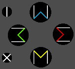
The lowest possible complexion i was able to add to "the pointy", is this (waited to implement, and in the meantime forgot and started simplifying)

buttoncluster.png

It has the benefit of being easier to describe as "the one that looks like" W M 3 and Σ (or E), at the cost of more complexity and with dual colors, a more difficult/costly key to make.

The problem is there is no inverse sigma-symbol.

Smaller buttons are flathead and screw.
 
Last edited by a moderator:
Seems to me that being able to uniquely describe them easily on a normal keyboard is important.

So "triangle" or "delta" or "home" are good, roman characters, arrows and weird symbols are bad.

...that is until someone points out why I'm wrong, probably in the post below  :rolleyes:
If all else fails, we can still use Home/End/PgUp/PgDn/Ins/Del.

Who needs to type the labels of those keys? Mostly people writing documentation. As long as the labels can be represented in Unicode, I see no problem: you just have to copy/paste them from somewhere.

Who else? Perhaps people who will be talking about native Pyra games on these boards? Some convention will be used, perhaps < ^ v > like comradekingu proposes (regardless of what the actual labels are), perhaps West North South East, perhaps some kind of ascii art like |<-   ->|  or something, perhaps Action Left/Right/Up/Down. Probably N  S  E  W  NW  SW would be a good convention when the context makes clear that you're talking about action buttons.

In the end, I think it's like ↵ for Enter or ⇧ for Shift. Nobody is suggesting that we shouldn't use those symbols to label those keys because those symbols are hard to type or describe.
 
The thing is, they will already have names - Home, End, PgUp, PgDn, and (probably) Insert and Delete.
I think _wb_ has the right of it in choosing symbols to represent those functions, as those names will be an unambiguous way to refer to those keys that won't clash with the scheme used by any emulator the user might be running. While it might be unconventional for a gaming device, the Pyra is more than just a gaming device, so for the Pyra it works.

That said, I'm not sure about _wb_'s choice of symbols, but I've not seen any better options either.

- Neelix

Edit: :ph34r: by _wb_
 
Last edited by a moderator:
Curiously both chromebook and macbook air come without enter and shift symbols.

For me the issue is having the same convention in the same area of the keyboard. Shift enter tab and backspace are in one such cluster. It makes sense to use symbols on a small device,

but ISO-symbols only go so far. I could never bring myself to accept all of them.

Maybe we can do a vote in firstpost when all ideas and arguments are in?
 
I don't actually remember seeing any posts on the forums here asking which Pandora game buttons to press in certain games.  That coming up in conversation a lot and needing to be typed or copied and pasted is mentioned a lot by those who want nothing to change because shut up, and that sounds like a very good point, but I actually never see anybody asking "Do I press the A button or the B button to do things?" or anything.

comradekingu, isn't your button label preference close enough to _wb_'s for you to feel happy with _wb_'s?  I certainly have personal reasons I think _wb_'s is cooler, but besides that, doncha think that firmly steering attention from a good idea to an extremely similar good idea is going to divide up opinions over silly little details and make the overall idea look weaker?

Votes for "ABCD I CAN SPELL": 75

Votes for "⇞ ⇤ ⇟ ⇥": 57

Votes for "^ < v >": 48

"Well, I guess the community likes the old way best!"
 
^ That right there is why simple majority voting should not be used if there are more than two options. Consider a ranking-based voting system. Let's assume the arrowy people always set the other arrowy option as their second favorite, and alphabet-people evenly spread their second and third places among the arrowy options. You get the following results:

  • ABCD: 1. 75,  2. 0,  3. 105
  • ⇞⇤⇟⇥: 1. 57,  2. 85,  3. 38
  • ^<v>: 1. 48,  2. 95,  3. 37
We can now issue weights to the ranks. Let's go with a simple 2p, 1p, 0p system:

  • ABCD: 2*75 + 1*0 + 0*105 = 150
  • ⇞⇤⇟⇥: 2*57 + 1*85 + 0*38 = 199
  • ^<v>: 2*48 + 1*95 + 0*37 = 191
Does that look like it better describes the collective opinion of the people in your vote?
 
^ Why bother?

I'm hypotheically right and, hypothetically, everyone agrees with me.

We should just go ahead and order 5000 hypothetical keymats!
 
Material and colours available for buttoncluster needs to be disclosed.

What i can say is the one i like the most is the most iconic one, being the straight lines and coloured square brackets. There is something to be said for something that just blends in without notice too, <^v> is that one. Im not opposed to ⇞⇤⇟⇥, since it has the quality of not being abxy, and it does have direction, but for me its needless complexion and it favours one set of pairs over the other.

I also think much of the focus on being able to reference the buttons is bit of a constructed criteria. As long as it isnt ABXY, that takes care of itself.

<^v> is a system that works for showing direction. With the colours i think its enough to reference the W3EM symbols, its a little bit to far removed from ⇞⇤⇟⇥

If ^ is ⇞, its not obvious that ↑ isnt.
 
Last edited by a moderator:
Back
Top