TeDaDeS
Forum Addict!
I'll be there tomorrow. Hopefully I don't forget to take pics.
Because he's not looking at his crystal ball

Not that bad with keyboard mappings.It is clumsy to play games like MSG1 with no proper 4 shoulder buttons.Do we really need four shoulder buttons? We still have six face buttons right?
Could the additional shoulder button area be used for something else? Two shoulder buttons may be enough. Its enough for dreamcast and gamecube (if we get gamecube). Ps1 and ps2? We can remap the buttons?
If four is absolutely required then maybe just two small nibs or pronounced bumps?
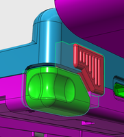
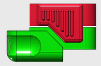
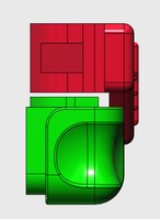
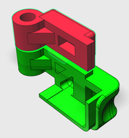
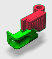
...and I even like the color.I restarted the triggers from scratch, based onto the actual Pandora trigger and then added the 2. trigger after these ideas from the ascii sketch. Both buttons are made after the Pandora render pics but I tried to "fit" them into the Pyra renderings from ED where he showed us his ideas of 2 pairs of triggers. Still not that accurate (no idea of the new measurements and PCB position) but you get the idea. Lower button is basicly a shorter Pandora trigger, flush with the case. New button above sticks out a little bit and is of course not flush with the case. Gap between both triggers is 2-3mm, should be thick enough for the case to fill it out.
Both triggers share one hinge with enough space in between for the PCB.
Well, I said clumsy not impossible. You can get by but not comfortable/enjoyable with the Q and P or 1 and DEL as L2 and R2.Not that bad with keyboard mappings.It is clumsy to play games like MSG1 with no proper 4 shoulder buttons.Do we really need four shoulder buttons? We still have six face buttons right?
Could the additional shoulder button area be used for something else? Two shoulder buttons may be enough. Its enough for dreamcast and gamecube (if we get gamecube). Ps1 and ps2? We can remap the buttons?
If four is absolutely required then maybe just two small nibs or pronounced bumps?
We need Calico Pyras!...and I even like the color.I restarted the triggers from scratch, based onto the actual Pandora trigger and then added the 2. trigger after these ideas from the ascii sketch. Both buttons are made after the Pandora render pics but I tried to "fit" them into the Pyra renderings from ED where he showed us his ideas of 2 pairs of triggers. Still not that accurate (no idea of the new measurements and PCB position) but you get the idea. Lower button is basicly a shorter Pandora trigger, flush with the case. New button above sticks out a little bit and is of course not flush with the case. Gap between both triggers is 2-3mm, should be thick enough for the case to fill it out.
Both triggers share one hinge with enough space in between for the PCB.
Nice job.
I still think ED's solution of not having the bottom shoulder button wrapping around the bottom of the device is preferable since it should mean the device is less fragile in case it falls on that corner. I can't quite forsee how F_P's design would look if the bottom trigger was less tall as needed for that design feature.Looks like Fusion_Power has a nice solution there.
Here's an idea:Only if we sacrifice all ports :/Would the shoulderbutton layout from the Wii Classic Controller be an option?
Cover some of the ports with flaps. With flaps open, you could access the ports. With flaps closed, they would double as extra buttons.
You wouldn't. You choose between the port and the button. Which is better than permanent "ports and no buttons" or "buttons and no ports".How would you use those port while pressing the buttons at the same time? And how is this technically possible?
          flap

       =============---\
                    \--o    hinge
        ----------  _
        |        | -|-
--------|  PORT  |-|B|--------
        |        | |T|
  PCB   |        | |N|
        ----------


            ||
          __||__
         /      \
        /  plug  \      ||
        |        |      ||
        ----------      ||
         |      |       ||
         | [][] |       ||
         |      |       ||
         --------       ||
                       / |
                       | |
        ----------  _  o-/
        |        | -|-
--------|  PORT  |-|B|--------
        |        | |T|
  PCB   |        | |N|
----------Well, Nintendo uses wrapped shoulder buttons for the 3DS/XL line and whatever they've done with those shoulders has survived innumerable collisions from the children(like my nieces) who use/abuse their devices. It is true what you say about the Pandora triggers being fragile, but if the Pyra's L1 and R1 are redesigned, to be more like corner caps like the XL's but shorter, then typical short depth falls could have little impact on the frame at those two junctions. The caps may even provide minor protection against spills, but we don't know for sure yet.I still think ED's solution of not having the bottom shoulder button wrapping around the bottom of the device is preferable since it should mean the device is less fragile in case it falls on that corner. I can't quite forsee how F_P's design would look if the bottom trigger was less tall as needed for that design feature.Looks like Fusion_Power has a nice solution there.
Thanks but no thanks, I rather have the current situation primary button that are okay to press and secondary shoulder buttons that are a tad more awkward to press.You wouldn't. You choose between the port and the button. Which is better than permanent "ports and no buttons" or "buttons and no ports".
So you're suggesting something more along the lines of this then?Holding the Pandora in my hand, my finger tips are pointing slightly downwards along the backside, so ideally the inner buttons should be as low as possible, that diagonal design is the other way round than what would probably be ideal. I only trigger the original ones on their edge, keeping my finger tips free to move - as long as they go around the corner there is no need to make them that long on the outside. Cutting the current shoulder button vertically in the middle and eventually make the inner one ribbed and sticking out a bit like in those last render pics does seem to be a very comfortable solution, at least for my hands.
Thanks. ^^ Colours are of course are only for visual separation of both buttons....and I even like the color.
Nice job.
Of course it would not work that way if the bottom trigger is not wrapped like onto the Pandora. That was the basic idea. I don't see it as "design feature" but more as an effective way to place the button as low as possible to maximize it's size. ED's design wastes alot of space so both buttons have to be pretty small to fit.And you so or so shouldn't let your Handheld fall to the ground.I still think ED's solution of not having the bottom shoulder button wrapping around the bottom of the device is preferable since it should mean the device is less fragile in case it falls on that corner. I can't quite forsee how F_P's design would look if the bottom trigger was less tall as needed for that design feature.

