GamesCom, Shoulderbuttons and Heating


I'm sure someone must have proposed this already, but just in case ...

Have you tried rockers instead of shoulder buttons? Rock them out for button 1, rock them in for button 2. They could be on a slight angle too, so rocking them out feel more or less the same as a button press. Would take up much less space on the back, but would protrude somewhat.
 
Last edited by a moderator:
The shoulderbuttons

In the meantime, a green case arrived - the latest revision with the new shoulderbuttons.

Do they work?

Well... yes, basically, they do.

However, there's one thing I can tell you after having assembled the case:

While we've got four shoulder buttons and all of them can be pressed, it won't be comfortable to use the upper ones when gaming.

It's not possible with the extremely small and cramped space we got up there.

The lower ones need a bit of tweaking but will work comfortably then, but for the upper ones, you will have to bend your fingers a bit, which is not nice to do for extended periods of time.

They will be fine for functions you don't need that often in games and they will work fine as modifier keys when typing (as your thumbs are lower when you're typing than when you're playing).
Yes, we already have the upper shoulderbutton more prominent, otherwise they would probably not work at all.


And yes, both can be easily pressed at the same time.
Looking forward to your post GamesCom photos of the shoulder buttons.

In the meantime if you're still open to discussion, I made this rudimentary drawing:

4hjFGYi.png


Yes, it's not to scale.
 
Thanks ED for the cool (or hot, as in heat) news update. :)

I'm sure someone must have proposed this already, but just in case ...

Have you tried rockers instead of shoulder buttons? Rock them out for button 1, rock them in for button 2. They could be on a slight angle too, so rocking them out feel more or less the same as a button press. Would take up much less space on the back, but would protrude somewhat.
How would you press them all at the same time?
 
Do you often need to press L1 & L2 at the same time? My last console was a SNES, so I'm not very aware of how extra shoulder buttons are used in games.
 
Furthermore afaik we speak about emulated games atm, so if shoulder buttons are really prominent in a game, for THIS particular game the mapping can be changed and not so often used buttons can be mapped to the smaller shoulder buttons. ;)
 
Do you often need to press L1 & L2 at the same time? My last console was a SNES, so I'm not very aware of how extra shoulder buttons are used in games.
If they are Shift - Ctrl - Alt - Fn/Meta/AltGr/whatever, then all combinations of shoulder buttons should be possible.
 
Do you often need to press L1 & L2 at the same time? My last console was a SNES, so I'm not very aware of how extra shoulder buttons are used in games.
Honestly speaking, the PS1 is really the only area where I see this being an issue. Unless Pyra can emulate PS2, Xbox and higher, the PSX is the only system where 2 shoulder buttons is relevant, and even then, games that need them aren't in great numbers. I also guess they can be used to replicate analog stick presses as well(L3/R3).

They are way more used on current consoles, as they have been a standard for so long, and they do have minor functions, but it's nice to have more options in the palm of your hand than not enough. The beginning of dual shoulder buttons and L3/R3 is why the Wii was so successful. Gaming had become way to complex for the standard consumer, and simplicity was needed/wanted. 

Now touch screens on tablets/smartphones have taken the place of what was simple on the Wii, and made gaming even more basic to the masses. I kind of skipped over the PS2 at the time, so when the PS3, 360 and Wii came around, I was like everyone else. I found the dual shoulder buttons and L3/R3 to be the straw that broke the camels back. Since I had pretty much skipped this currently, I was unprepared for the games that used EVERY button on the controller, I was overwhelmed. I was so happy to see simplicity at the time.

Nvidia has tons of cash in hand, and look at the shape of Shield Portable to see how hard it is to include everything, and still please everyone, and keep a great form. I think the Pyra's layout is very good and well thought out for what it is and does. Sadly, to keep it's Pandora esk shape, the Pyra can't fit anything anywhere. It has to work in what is there, and in that regard, as long as the shoulder buttons function when press(The Pandora could have DOA shoulder buttons), and my hand doesn't hurt after using them for 5 minutes, I'll be more than happy.

Chris
 
Judging by what's already been discussed, I suspect that what's already been done with the shoulder buttons will end up being the best compromise we can come up with (with only some slight tweaking still possible), unless somehow someone manages to come up with something that hasn't even been thought of.
 
Yes, we already have the upper shoulderbutton more prominent, otherwise they would probably not work at all.


And yes, both can be easily pressed at the same time.
The only other suggestion I have to try/mockup is to swap long/short between the top/bottom button.  I.e. the button that extends to the edge gets an advantage.  If the top one is difficult to access due to the hinge, extend it to the case edge and let the other be recessed?

It is interesting how many different 'grips' there are in the Pandora audience.

When using the analog/game controls, I tend to hold my Pandora with my index fingers behind the screen, my middle fingers curled back to the shoulder buttons and my palms to the sides - not the leading edge.

When using the keyboard, the grip moves back to corners in palms, thumbs on keys, index fingers wedged in the hinge area.

Granted, both of my Pandoras have been used so much that the hinges are thoroughly soggy.

After I get my aluminum cases I should go Frankenstein on the plastic ones and see if I can figure out a hinge mod.  Never time for all of the things I'd like to do though.
 
In the meantime if you're still open to discussion, I made this rudimentary drawing:

4hjFGYi.png


Yes, it's not to scale.
Isn't it much harder to "draw" in ASCII instead of just making an simple sketch in Paint?  ;)

However, I can see some potential in that solution. The actual buttons could be still in vertical array onto the PCB to save space but the button caps are more or less side by side or diagonal, could work indeed. :)

R1+L1 don't even need to be very big, as long as they go around the corner. (I basicly hit the Pandora shoulder buttons at the corner with the middle part of my index fingers)
It's pretty easy to "draw" with notepad and the keyboard. :p

Thanks for confirming what I had thought(and what ED had alluded)that R1 and L1 are pressed with the middle of the index fingers. For the sketch, I see the thicker portions of each part of the individual bumper would be more prominent to the rest of the button so the fingers(middle of and tips) could find the separation between each matched pair. This would give the illusion of more room than we have by, in a way, staggering the keys while continuing to keep them vertically aligned with the switches on the board. :)
 
Last edited by a moderator:
Well since the display portion of the case seems to be obstructing the upper shoulder buttons, why not put the shulder buttons on the lid? would make for two usable buttons, when the unit lies closed on a table for example.

Otherwise how about this:

      _______

      |    R2    |

-----\______|

|   R1     |

-----------

So that the buttons kind of join on a diagonal edge. This way r2 can be pushed down a little and also to the edge of the case
 
hmmm, isn't the temperature reported by the chip an in situ measurement of the temperature within the circuit , while the IR thermometer measures outside and probably averaged temperature over some region?  I don't see a reason why the chip couldn't have hotspots 20C hotter than the outside temperature, since most of the heat is probably generated in a small volume or area of the SoC...

about the shoulder buttons: I don't care so much about the number, just that they are useable and not break easily :)
 
I have a question: "full CPU speed" is referenced several times. Is this 1.5GHz (as opposed to 1.7GHz)? And, is that the intended clock speed for release?
 
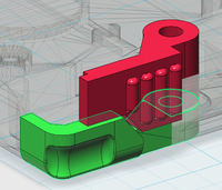
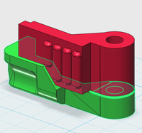
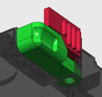
Some quick & dirty 3D sketches of these "diagonal" button mixup, bottom trigger could be larger and upper trigger smaller, I know. ^^"
Really nice job especially the third picture. Only missing the small separation gap where the pair almost make contact between one another from the outside viewpoint. Close to perfection.  :wub:
 
Some quick & dirty 3D sketches of these "diagonal" button mixup, bottom trigger could be larger and upper trigger smaller, I know. ^^"
Pretty nice renders.

But I'm not sure that answers one of the concerns that ED has - i.e the fact that it's not practical to use because of the limited space for your fingers on the unit once the screen is opened? You can easily imagine with the current Pandora, that having an extra button there is not very practical if the unit has the same height. 

So, usability seems to be the major challenge, not necessarily having better buttons.
 
Last edited by a moderator:
Some quick & dirty 3D sketches of these "diagonal" button mixup, bottom trigger could be larger and upper trigger smaller, I know. ^^"
Pretty nice renders.


But I'm not sure that answers one of the concerns that ED has - i.e the fact that it's not practical to use because of the limited space for your fingers on the unit once the screen is opened? You can easily imagine with the current Pandora, that having an extra button there is not very practical if the unit has the same height.


So, usability seems to be the major challenge, not necessarily having better buttons.
What is nice about the "diagonal" set up is that it eases some of the usability issues brought on by the limited space. It brings in some of the "horizontal" quality that some imagine being easier to press.
 
What is nice about the "diagonal" set up is that it eases some of the usability issues brought on by the limited space. It brings in some of the "horizontal" quality that some imagine being easier to press.
Maybe. Are you thinking of using a single fingers to control both buttons, or two separate fingers just like in most controllers?

In my case, my fingers are too thick to fit two of them behind the Pandora/Pyra - and having a single finger to control both buttons may work, but I think it would be painful after a while on your joints.  
 
Back
Top