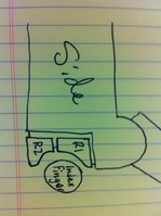
This needs emphasizing imo. Very good point.I still think ED's solution of not having the bottom shoulder button wrapping around the bottom of the device is preferable since it should mean the device is less fragile in case it falls on that corner.Looks like Fusion_Power has a nice solution there.
You are using an out of date browser. It may not display this or other websites correctly.
You should upgrade or use an alternative browser.
You should upgrade or use an alternative browser.
GamesCom, Shoulderbuttons and Heating
- Thread starter EvilDragon
- Start date
I personally would prefer the upper set of should buttons to also wrap around the the corner like the lower set does:
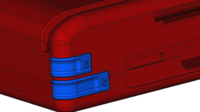
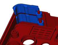
Testing with Pandora it feels like it would be comfortable to press a button at that position. The lid doesn't get in the way much because one's finger would be angled diagonally, fitting thru the corner space between the fully open lid and the back of the case.


Testing with Pandora it feels like it would be comfortable to press a button at that position. The lid doesn't get in the way much because one's finger would be angled diagonally, fitting thru the corner space between the fully open lid and the back of the case.
Last edited by a moderator:
fusion_power
Advanced Member
No chance, they are just to small for that kind of design. You already cover basicly both buttons all the time this way with your fingers.I personally would prefer the upper set of should buttons to also wrap around the the corner like the lower set does:
R2-button-at-edge.png R2-button-at-edge-inner.png
Testing with Pandora it feels like it would be comfortable to press a button at that position. The lid doesn't get in the way much because one's finger would be angled diagonally, fitting thru the corner space between the fully open lid and the back of the case.
Last edited by a moderator:
Tenka
Snakes and Fish
- Joined
- Jan 28, 2012
- Messages
- 701
I don't like the bottom buttons being called 1 and the top buttons being called 2, I think that all the other four shoulder button systems start from the top, and naming them this way can make config files confusing. Perhaps the bottom shoulder buttons will be easier to press than the top ones, but naming them L1 and R1 doesn't make them any easier to find.
Last edited by a moderator:
levi
Still fresh, damnit!
It's not a broken button, it's a broken board component in any number of cases I've seen. And I guess ED's seen far more than I ever have. Perhaps the more robust switches combined with a plastic stop in the case design that's less able to deform out of the way in an impact scenario will be enough to eliminate most of those RMAs, but I don't know if ED would agree.And you so or so shouldn't let your Handheld fall to the ground.And I think a broken button is cheaper to replace than a broken case. There also could be a solution to rubberize the buttons, mainly for grip but also for some extra protection. ^^
I don't personally think rubber coating on a moving fixture will stop the overrotation of that part to a significant extent, and while the extra grip and alternative texture would be appreciated, I worry about those cost of a separate process in case construction.
True, that would be a problem for the upper set of shoulder buttons. The lower set should still be easy to press by simply moving one's fingers to a lower position.No chance, they are just to small for that kind of design. You already cover basicly both buttons all the time this way with your fingers.I personally would prefer the upper set of should buttons to also wrap around the the corner like the lower set does:
R2-button-at-edge.png R2-button-at-edge-inner.png
Testing with Pandora it feels like it would be comfortable to press a button at that position. The lid doesn't get in the way much because one's finger would be angled diagonally, fitting thru the corner space between the fully open lid and the back of the case.
I don't really like the idea of pressing shoulder buttons with the finger tips either. It requires bending the finger awkwardly to reach around the 90º corner. If the corner was a bit more rounded it wouldn't be as much of a problem.
How about making the upper set more prominent:
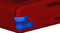
The lower shoulders are still accessible by aiming the press a bit lower (ie. avoiding the upper shoulders completely). While the upper shoulders can be pressed individually even if finger overlaps the lower shoulders a bit, because they are more prominent.
Another option would be for the lower shoulders to wrap around the bottom of the case, but it seems that configuration is undesired due to potential fragility issues.
Last edited by a moderator:
fusion_power
Advanced Member
Don't know, my Pandora never fall down.It's not a broken button, it's a broken board component in any number of cases I've seen.
ED's design of the Pyra buttons seems to be even more critical in that point, it seems the smaller triggers do only stop because of the PCB and the internal button. Pandora and my design are meant to stop the button against the case itself, both triggers by the way, I made sure to think onto that.
So or so, only ED can test this stuff and we have to wait for new informations. I just recommend to make it as durable as possible, Nintendo uses metal pins as hinge for the 3DS shoulder triggers for example. Stuff like this makes the difference. ^^
Last edited by a moderator:
comradekingu
Glowing ember
Good thing its the other way around then. Top is 1, bottom is 2. Like on playstationI don't like the bottom buttons being called 1 and the top buttons being called 2, I think that all the other four shoulder button systems start from the top, and naming them this way can make config files confusing. Perhaps the bottom shoulder buttons will be easier to press than the top ones, but naming them L1 and R1 doesn't make them any easier to find.
bzar
A Commando
FelixNemis
Very Active Member
- Joined
- May 15, 2012
- Messages
- 308
personally I would prefer to have the "L1" be the more prominent one (bottom in this case) and I wouldn't see this causing much confusion for me at all but I really don't care what it says on the physical button, and If people are confused by 1 being the bottom then I'll take their word for it.
DrHAX
T̶h̶e̶ ̶A̶u̶t̶h̶o̶r̶ The Artist
- Joined
- Sep 18, 2013
- Messages
- 850
That's exactly what I had in mind! Just a little bit better executed!I restarted the triggers from scratch, based onto the actual Pandora trigger and then added the 2. trigger after these ideas from the ascii sketch. Both buttons are made after the Pandora render pics but I tried to "fit" them into the Pyra renderings from ED where he showed us his ideas of 2 pairs of triggers. Still not that accurate (no idea of the new measurements and PCB position) but you get the idea. Lower button is basicly a shorter Pandora trigger, flush with the case. New button above sticks out a little bit and is of course not flush with the case. Gap between both triggers is 2-3mm, should be thick enough for the case to fill it out.
Both triggers share one hinge with enough space in between for the PCB.
rygD
Nihilistic Mystic
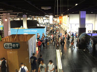
It stresses me out just looking at that. I think I only see one place in that picture with enough open floor space to walk without getting stuck behind or trampled by the herd, and even there it looks like you will be surrounded, but have more elbow room. It really sucks getting stuck behind a group of slow moving people, and that it what this looks like.
/me yells "FIRE!"
I hope it isn't too stressful for ED and others there.
TeDaDeS
Forum Addict!
I'll post some pictures later, but just returned from gamescom.
It was crowded but the picture is from the hallway between halls including toilets etc. So pretty busy there.
The pandora booth is not crowded like in the picture, it had enough visitors and you can still walk around normally.
For people going the booth can be found in hall 10, top floor in the retro section (the floor above the cosplay/indie-games/merchandise).
Also ED gives pretty accurate updates as the Pyra expectations I had where met, and it was nice to meet and talk to other forum members.
The gamescom in general was nice, but personally I liked hall 10 most, the larger companies shield of the areas and don't show that much of their products (isn't that weird?).
TeDaDeS
Forum Addict!
Photos:
Gamescom floor photo, you can see that there is room enough to walk but it is still very busy.
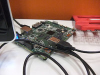
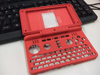
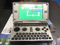
A pic of the developmentboard with the original red pyra case, this was hooked up to a screen running multiple applications (I normally have much less opened on my pc) including two Playstation emulators running smooth.
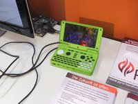
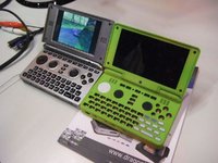
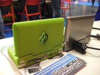
And of course the green Pyra case we've already seen on ED's updates.
When looking around you can see multiple pandora's being used, so I also put the Pyra next to it to compare.
(The silver supporting the logo on the Pyra case became loose btw.)


Last edited by a moderator:
rygD
Nihilistic Mystic
A pic of the developmentboard with the original red pyra case, this was hooked up to a screen running multiple applications (I normally have much less opened on my pc) including two Playstation2 emulators running smooth.
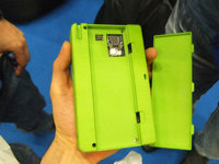
I am checking twitter and stuff now since this is the first time I have seen the green case. I like the color. Did something happen to the back of it, around the ports?
TeDaDeS
Forum Addict!
Not sure, the red one wasn't complete (missed the bottom) so I couldn't check. I think the green one is the only one featuring the four shoulder buttons.
Also ED mentioned it didn't feel comfortable and the buttons on the back do indeed feel like that, but it gets the job done (it's bit cramped with screen and all, and I don't have very thick fingers).
(wow, ED's fast it is indeed playstation1, not 2, it's two playstation ones)
(added booth pics)



Also ED mentioned it didn't feel comfortable and the buttons on the back do indeed feel like that, but it gets the job done (it's bit cramped with screen and all, and I don't have very thick fingers).
(wow, ED's fast
(added booth pics)


Last edited by a moderator:
rygD
Nihilistic Mystic
I mean it looks like part of the case is missing around the top of the ports. I wonder if this was caused by (mis)handling by people at GamesCom.Not sure, the red one wasn't complete (missed the bottom) so I couldn't check. I think the green one is the only one featuring the four shoulder buttons.
Maybe the case maker has some ideas to tweak it for comfort, or maybe some ideas from here can be explored by them.Also ED mentioned it didn't feel comfortable and the buttons on the back do indeed feel like that, but it gets the job done (it's bit cramped with screen and all, and I don't have very thick fingers).
Well, I can always wish...(wow, ED's fastit is indeed playstation1, not 2, it's two playstation ones)
TeDaDeS
Forum Addict!
The green case didn't fit thigh around the ports on the back, I think maybe they left some room or introduced some manual labor to make them fit correctly.
This case was complete so there weren't any case parts missing (obviously other parts are not there).
This case was complete so there weren't any case parts missing (obviously other parts are not there).
We've seen stuff being improved on the pandora making unplayable games playable, we'll wait and see how hard people can push the Pyra hardware.Well, I can always wish...(wow, ED's fastit is indeed playstation1, not 2, it's two playstation ones)
Similar threads
- Replies
- 268
- Views
- 116K
- Replies
- 348
- Views
- 171K


