Waiting in October


Quote said:
 Now you can still draw some flowers yourself if you want a cool! Pyra, you can even add some LittlePoney stickers.
 
Hey, good idea actualy. XD
 
Well, things I don't like about the Pandora case design - all personal opinion of course:

1. The corners on the lid - no need for such pronounced roundness which makes it look like a fisher-price design.
2. because of said corners we have those raised-and-rounded ends to the shoulder areas when the lid is open which leaves huge open sections below the lid when open which when opened at any angle doesn't look good - and is most pronounced when open in laptop position. When opened at 180 degrees, it leaves lumps to the sides in contrast to the sharp edges of the lower screen corners.
3. Number keys way too close to the hinge. 
4. In contrast to the softened lid appearance, the lower half is all angles which, as has been pointed out numerous times before, cuts into the hands. The only part that is rounded is the lower corners which of course doesn't mitigate this in the slightest. 
5. The recess around the inner lid is pretty sharp, and the recess around the actual screen seems pointless.
 

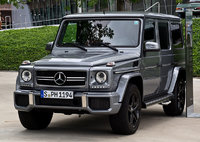
Yupp, basicly this. Pyra will have improvements here and there for sure. And we must wait to see how the final Pyra case will look, the chances are good that it will have a much better overall quality. However, this does not solve the general design issues like the (strangely rounded) Lid design just does not fit right to the (edgy) base unit design. Not to get me wrong, I also don't like to rounded designs, today, alot of stuff looks like a piece of soap, I prefer edgy stuff if it's done right. There are some nice "rugged" Laptops out there that indeed look cool. And nothing beats an good old Mercedes G-Class SUV.  :D
Imagine a Handheld that look like this car:
Mercedes-Benz_G_63_AMG.jpg
 
Imagine a Handheld that look like this car:

So... display on the windshield, controls on the hood? I dunno, seems kinda back-heavy to hold :p

EDIT: Personally, I consider the rounded lid functionally better than a needlessly sharp one. The current design slips into pockets and bags much more easily without tearing into fabrics or shearing stuff. It could be aesthetically better sharp, but function over form.
 
Last edited by a moderator:
The paint was to cover the shrinking marks which wouldn't have happened if the design was fit for the machine... which is the reason I'm happy that one company is designing, creating the mould and producing the cases. 
They know their machine and they have to make sure it all works :)

I'm happy as well. The Pandora case was, and is a HUGE mess. I've had a few units over the years, and everyone cracked, and had issues. I'm very much looking forward to the Pyra case removing and improving any and all of the issues the Pandora originally had, and having one facility doing everything from top to bottom, should ensure that happens.

I can't wait, bring on those preorders and some prototype vids.

Chris
 
Pandora is ugly

Suits me fine - it is made by and made for ugly people. Just except the fact that beautiful devices don't make you more attractive.
 
Last edited by a moderator:
Imagine a Handheld that look like this car:

So... display on the windshield, controls on the hood? I dunno, seems kinda back-heavy to hold

:p

EDIT: Personally, I consider the rounded lid functionally better than a needlessly sharp one. The current design slips into pockets and bags much more easily without tearing into fabrics or shearing stuff. It could be aesthetically better sharp, but function over form.
OK, you need some imagination to see the design of the car in a Handheld but I only meant the actual design  pieces, not the general form of course.  :D
I have no real problem with the rounded Pandora lid, it is indeed good to slide into a pocket. But the problem for me was always that the base does not match this. It looks like a coffin. I'm not sure if this is the best design that is possible for an Handheld device... 
default_ph34r.png
 
Off Topic: ät Fusion Power: dotnt put SUV in the Same text as the Mercedes G Class :(

The G isnt one of this only for road use SUVs,

Its a OffRoader like the good old ones, like Nissan Patrol, Landrover Devender, etc ..

There work Cars, you can tow a Horse Trailer from the "Koppel" whit they,

Ok they also work in the City, but there terrain is off road ..

The Pandora Design wasnt that bad, i can play whitout Problems i can write verry fast, its still survived the poket carry

Its design is good, but the plastic isnt that good..

Im looking forward to the Pyra design
 
To be fair, the only way we're realistically getting a better design is if it's significantly larger around the edges. For example, my laptop right now has gentle slopes from the main bulk out to the edges on both lid and underside of the base. A slight (angled inwards) indent around the lid aids in getting your fingers in to open it up.

The keyboard is flush with the base surface, being in a recessed rectangular area which solves the problem with the recessed Pandora lid which is needed because the awful keys are protruding.

Again though, to solve all these you need to add more space, which makes the overall unit that little bit bigger. I'd accept that but I understand that many wouldn't. 

D.
 
 
Pandora is ugly

Suits me fine - it is made by and made for ugly people. Just except the fact that beautiful devices don't make you more attractive.
What the hell are you talking about ?

Plus I'm not into beautiful devices but they do make people more attractive to some people.
 
Last edited by a moderator:
Well, things I don't like about the Pandora case design - all personal opinion of course:

1. The corners on the lid - no need for such pronounced roundness which makes it look like a fisher-price design.
2. because of said corners we have those raised-and-rounded ends to the shoulder areas when the lid is open which leaves huge open sections below the lid when open which when opened at any angle doesn't look good - and is most pronounced when open in laptop position. When opened at 180 degrees, it leaves lumps to the sides in contrast to the sharp edges of the lower screen corners.
3. Number keys way too close to the hinge. 
4. In contrast to the softened lid appearance, the lower half is all angles which, as has been pointed out numerous times before, cuts into the hands. The only part that is rounded is the lower corners which of course doesn't mitigate this in the slightest. 
5. The recess around the inner lid is pretty sharp, and the recess around the actual screen seems pointless.

1. Not exactly sure what you mean here... you rather want them cornery? I think that those rounded edges make it slide better in and out of pockets (and yes, I keep them in my trousers).
2. Well, not sure what could improve that. Edgey doesn't help much. For me, the 3DS is one of the most ugly handhelds out there, and that one is edgy.
3. That's why we moved them on the Pyra, so: Fixed.
4. That's also what has been fixed on the Pyra.
5. The recess is also more smooth now. And the recess around the screen is necessary with most resistive touchscreens (that's why the 3DS also has that)
The resistive touchscreen is usually with a metal frame around the LCD. Or glued on top of it. In both cases, the edges of the touchscreens need to be covered, because pressing them can either damage the touchscreen or at least give out values that are in a totally different area of the screen.
So to cover the edges, such bezel is needed.

With a capacitive touchscreen, this is no problem. The full glass cover of the front has the capacitive touchscreen included, so no bezels are there.
Doesn't work with a resistive one though.

So, 1 and 2 are discussable (and based on different preferences), 3 and 4 are fixed and 5 can't really be done differently.
 
Plus I'm not into beautiful devices but they do make people more attractive to some people.

A toy makes you attractive? How superficial.. Don't take my comments too seriously though, I am blessed with a terrible sense of humour.

Anyway, function is more important than beauty. Making a device like the Pandora or Pyra is already complicated enough without considering its looks. Make the damn thing look like a black brick and make it as sturdy as one.
 
Something i ask me when i see some renderings:

Will there be a "Gamingmode" for the Keyboard Backlight?? So the Keyboard is dark but the ABXY Buttons have light??

Or a Tool in the Options, which lets you configure the LEDs??
 
..transparent..

I have said before that I like this option as a way for everyone to have the option to customize the color/look how they want.  I still like it, but it doesn't look as nice as colored plastic, and depending on the design of the case it may look terrible even when painted properly on the inside since there will be places for screws and such.  

On the positive side, you really don't need an airbrush to get good results, as I have had decent success with a rattle can on other transparent cases.  You can also use multiple colors, make it translucent, or even glow in the dark.  I have a GBC I painted dark translucent blue and purple with the Nintendo logo the original color (it was the common light tranlucent color before I started painting).

 
Normally color is an additve to the resin you use (as far as I know). Durability and toughness is more likely reached by adding fibers (glass, carbon..) so having no pigments in the resin, but fibers should result in some frosted/milky/diffuse transparent color, which should be paintable from the inside as mentioned.
So yes my RC car comparison was kinda misleading.
So if 2 options might be available: no color and black (changing the colors in process might give some marble effects for some cases
 
Well, things I don't like about the Pandora case design - all personal opinion of course:

1. The corners on the lid - no need for such pronounced roundness which makes it look like a fisher-price design.
2. because of said corners we have those raised-and-rounded ends to the shoulder areas when the lid is open which leaves huge open sections below the lid when open which when opened at any angle doesn't look good - and is most pronounced when open in laptop position. When opened at 180 degrees, it leaves lumps to the sides in contrast to the sharp edges of the lower screen corners.
3. Number keys way too close to the hinge. 
4. In contrast to the softened lid appearance, the lower half is all angles which, as has been pointed out numerous times before, cuts into the hands. The only part that is rounded is the lower corners which of course doesn't mitigate this in the slightest. 
5. The recess around the inner lid is pretty sharp, and the recess around the actual screen seems pointless.

1. Not exactly sure what you mean here... you rather want them cornery? I think that those rounded edges make it slide better in and out of pockets (and yes, I keep them in my trousers).

2. Well, not sure what could improve that. Edgey doesn't help much. For me, the 3DS is one of the most ugly handhelds out there, and that one is edgy.

3. That's why we moved them on the Pyra, so: Fixed.

4. That's also what has been fixed on the Pyra.

5. The recess is also more smooth now. And the recess around the screen is necessary with most resistive touchscreens (that's why the 3DS also has that)

The resistive touchscreen is usually with a metal frame around the LCD. Or glued on top of it. In both cases, the edges of the touchscreens need to be covered, because pressing them can either damage the touchscreen or at least give out values that are in a totally different area of the screen.

So to cover the edges, such bezel is needed.

With a capacitive touchscreen, this is no problem. The full glass cover of the front has the capacitive touchscreen included, so no bezels are there.

Doesn't work with a resistive one though.

So, 1 and 2 are discussable (and based on different preferences), 3 and 4 are fixed and 5 can't really be done differently.
God, this editor is shite - how do I reply in-line with your quote? It only lets me insert after the entire quote!

Anyway, before I dissect your post - I stated that this was my opinion, so no need to get defensive. Second, I was listing what I dislike about the Pandora. Here we go:

1: The corners can be rounded, just thinner and less bulky. Round is what helps get it into pockets; wedge like as well as rounded would make it easier.

2. Can be solved easily by making it bigger - attach the hinge to the back edge, not the top surface of the base section like the Pandora. Hey presto, the lid sits flush without the retarded-looking gaps at the left and right. Making it bigger (as I said in my previous post) wouldn't be very popular so we'll just have to put up with it looking awful. That's OK though, we've been putting up with silver paint for a while now, which is worse.

3. Yep, know that already.
4. Looking forward to it. More rounded? Well, so long as it's been done right...
5. Keys that are recessed into the base (like a laptop) won't impact the resistive touch screen. The Pandora's keys are enormous in profile, I'm sure we can get keys that are slimmer. 

However, as I said before - much of what can be fixed needs more room internally to fix. Apart from the keyboard - I have several laptops whose base (and lid) are much slimmer than the Pandora. But getting the bets parts would be impossible without a large MOQ or a huge payment, neither of which are feasible. So I suspect that we're stuck with making the best of what we have, which is acceptable. At least we've got a more accurate idea of what can and cannot be done (unlike Craig and the Pandora). 

Still won't stop me from getting one though!

D.
 
 
ZXDunny, I'm not sure what you mean by these 'retarded gaps' on the left and right.  Do you mean those to the left and right of the hinge, between the bottom of the lid and the hinge supports/signal lights area on the Pandora?  At first I thought you were referring to the uneven gap underneath the hinge which I find more ugly on my Pandora personally, though of course it's not a deal breaker.

And I'm not sure about making it hinge to the back edge, rather than above the top of the keyboard.  That would swing the lid back as it opens, and at 180 degrees it would probably foul the shoulder buttons, unless those were also redesigned (and I'm personally rather in favour of the current Pyra button design that was fought out over months here, and resulted in a rather clever design that by reports works well).

Something i ask me when i see some renderings:

Will there be a "Gamingmode" for the Keyboard Backlight?? So the Keyboard is dark but the ABXY Buttons have light??

Or a Tool in the Options, which lets you configure the LEDs??

Yes, the LEDs should be fully configurable via software, so if someone writes that software, it will be possible.
 
ZXDunny, I'm not sure what you mean by these 'retarded gaps' on the left and right.  Do you mean those to the left and right of the hinge, between the bottom of the lid and the hinge supports/signal lights area on the Pandora?  At first I thought you were referring to the uneven gap underneath the hinge which I find more ugly on my Pandora personally, though of course it's not a deal breaker.

And I'm not sure about making it hinge to the back edge, rather than above the top of the keyboard.  That would swing the lid back as it opens, and at 180 degrees it would probably foul the shoulder buttons, unless those were also redesigned (and I'm personally rather in favour of the current Pyra button design that was fought out over months here, and resulted in a rather clever design that by reports works well)
To the left and right of the hinge itself there are gaps where the square lid edge rises over the curved top of the base. That's really not attractive. There's no reason why the hinge couldn't attach flush with the base back edge, there's plenty of room between the shoulder buttons for the hinge to inhabit. But all that said, in order to do that we'd have to make the whole thing bigger which is unacceptable.

I'll wait and see what decent plastics can do for the overall design, but I suspect that what we'll get is an ugly device that functions beautifully - and that's what's important at the end of the day, no?

D.
 
 
Quote said:
[COLOR= rgb(82, 82, 82)]God, this editor is shite - how do I reply in-line with your quote? It only lets me insert after the entire quote![/COLOR]
It is, which is the reason I want to switch to XenForo as soon as possible!

I just copied and pasted your text and added he quotes later.... there's no other proper way right now :(
Quote said:
[COLOR= rgb(82, 82, 82)]Anyway, before I dissect your post - I stated that this was my opinion, so no need to get defensive. Second, I was listing what I dislike about the Pandora. Here we go:[/COLOR]
Oh, I am not defensive. Just trying to explain what already has been fixed and why some things have been done as they were with the Pandora.
Quote said:
[COLOR= rgb(82, 82, 82)]1: The corners can be rounded, just thinner and less bulky. Round is what helps get it into pockets; wedge like as well as rounded would make it easier.[/COLOR]
Not sure if wedges would've worked - from what I learned, things like that can easily lead to shrinking marks, etc.
But I can't answer that question - I also never thought it to be ugly myself :)
Quote said:
[COLOR= rgb(82, 82, 82)]2. Can be solved easily by making it bigger - attach the hinge to the back edge, not the top surface of the base section like the Pandora. Hey presto, the lid sits flush without the retarded-looking gaps at the left and right. Making it bigger (as I said in my previous post) wouldn't be very popular so we'll just have to put up with it looking awful. That's OK though, we've been putting up with silver paint for a while now, which is worse.[/COLOR]
You mean where the ports are right now?
Where would you put the USB ports, etc. then?
In case of the Pyra, it would also get in the way of the second shoulder buttons :)
Quote said:
[COLOR= rgb(82, 82, 82)]5. Keys that are recessed into the base (like a laptop) won't impact the resistive touch screen. The Pandora's keys are enormous in profile, I'm sure we can get keys that are slimmer. [/COLOR]
Not sure if we were talking about the same thing.
You were talking about the Bezel - the Bezel doesn't have anything to do with the buttons, the bezel has to be there for the reasons I explained above.
Or were you talking about the big surroundings on the lid, which are so huge in order to close the case properly and because the keyboard is not recessed?

Well, those have been made smaller on the Pyra.
You can't remove them completely, as you can't recess the keyboard that much. With a laptop, it's not a problem - with thumb typing, it feels awkward when the recession it too much.
Additionally, it's uncomfortable when pressing the DPad to the left, as the DPad goes further down than the surrounding and that's not feeling good with your thumb.

We tried that and found the best in-between solution. 
Quote said:
[COLOR= rgb(82, 82, 82)]However, as I said before - much of what can be fixed needs more room internally to fix. Apart from the keyboard - I have several laptops whose base (and lid) are much slimmer than the Pandora. But getting the bets parts would be impossible without a large MOQ or a huge payment, neither of which are feasible. So I suspect that we're stuck with making the best of what we have, which is acceptable. At least we've got a more accurate idea of what can and cannot be done (unlike Craig and the Pandora). [/COLOR]
Parts are not really the problems. But your laptop probably has the battery at the back, behind the actual PCB and keyboard (like my laptops have).
The battery is what makes the Pandora and Pyra that thick.
 
 
Last edited by a moderator:
Thanks ED. 

Personally, I'd prefer a slimmer-at-the-edges lid - like a very much flattened house roof - with the LCD sitting flush (or with the small <1mm deep bezel) with the base section but I do understand that isn't an option. And of course you're right about the DPad.

USB ports etc? On the sides. Or have two slim (1cm) wide hinges with a gap between for the ports. But anyway - the case is finalised, so we'll wait and see.  Oh, and my battery is at the front of the keyboard, to the right of the touchpad - but then there's a lot more room to work with in a laptop. 

Just no silver, yeah?

D.
 
 
USB ports on the sides? Doesn't seem it'd be easy to hold with a cable or device attached like that, don't you think?

If I've got a USB cable plugged it then I'm sitting on the desktop - it's too unwieldy to use as a handheld with anything plugged in, I've found.

D.
 
 
Back
Top