emilio
Member
- Joined
- Jan 7, 2010
- Messages
- 189
Because we are all experts: It must have 7 red lines with green ink and transparent 
https://www.youtube.com/watch?v=BKorP55Aqvg
https://www.youtube.com/watch?v=BKorP55Aqvg
Because we are all experts: It must have 7 red lines with green ink and transparent
https://www.youtube.com/watch?v=BKorP55Aqvg
7 perpendicular lines. Get it right. And a balloon in the shape of a kitten.
Perhaps Black and Red for the color combination? Or is that too obvious?
Perhaps Black and Red for the color combination? Or is that too obvious?
At least no one is asking for camo.
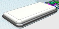
With the real Pyra CAD files, I finaly could try to design a case I had in mind.More streamlined and less "bricky". Because I still don't like the old Pandora-case appearence. Pyra deserved to look better (or more expensive actualy). :rolleyes:

hmm, I wouldn't make categorical statements like this - designwise there is a huge number of degrees of freedom, even if fixing the volume of the device - for example only looking at the hinge: you can change the moving part of the hinge, the height of the axes (have it more recessed (just look at the variety in laptop hinges). things like the location of the stylus, whether the screen has an overhang or not, make the body more wedge shaped (in horizontally or vertically. Furthermore, there are fundamental choices like the way the body opens up (right now simple screws, but you could make a sliding design, fixed with only one screw for example). Other things like surface finish can also make a big difference...With the real Pyra CAD files, I finaly could try to design a case I had in mind.More streamlined and less "bricky". Because I still don't like the old Pandora-case appearence. Pyra deserved to look better (or more expensive actualy). :rolleyes:
The Pyra's case is the size and shape it needs to be in order to efficiently contain the volume of it's components. There are very few 'design choices' beyond softening or sharpening of lines that can be made. It cannot be thinner, narrower, or contain less depth than it currently has. It is already the proverbial 10 pounds of shit in a 5 pound bag.
Sharpen the lines and it becomes more expensive looking, and people will complain about it "cutting" their hands and "printing" too much when it's in a pocket.
Soften the lines and it becomes more comfortable and more amorphous in a pocket, and people will complain about it being "toy like" or "cheap" in appearance.
Now, if you're willing to make the case larger than it needs to be to house it's components, then you have all sorts of design choices that can be made - but personally, I wouldn't want that.
I'd like to design some kind of sliding case so the keyboard is under an always-exposed screen. Most sliding keyboards like that are only half the width of the screen though, whereas the Pyra's is the full width, so I'm betting this to be impossible.
Maybe a rotating keyboard like the iCP2 was originally supposed to be...
Ät Fusionpower:
Your CAD Designs were cool, and i like your DPAD Design, but now discusse eggs, they are allready backed, and far away from undroppet (ungelegt)..
"(Jetzt reden wir über eier, die schon längst gebackt sind, und weit davon entfernt ungelegt zu sein)"
The molds are about to be allready, now whe wait for the first real mouldet parts
Now its inportant, to decide the colour of the plastic "Granulat"..
On the Keyboard Layoat, i like that äöü are only on second layer on the key, so just push fn and the key, to have our faferet umlauts..
(In gärmänü, wü lüķä tö üsä ümläüts thä wöhlè däý ö .. ö )

