Unofficial Keyboard Layouts


Also, your X button is in nub area; perhaps moving the right nub to the left by about one action button width could work (there is a bit of room before you hit the START/SELECT/PYRA buttons), but then you would also have to move the left nub to the right to keep things symmetrical. For people with small hands it may become less comfortable to use the nubs if they're pushed further inwards.
It's actually not. I originally suggested moving the nubs inward. However, after EvilDragon informed me that he did not want to move the nubs inward, I developed an alternate version that moves the buttons inward so that the distance between the outer edges of the buttons are equal to the same distance as the diameter of the dpad.
 OK. So let's assume the PCB hole thing can somehow be worked around. Could you please show us your alternate version that solves the nub overlap problem without moving the nubs inwards, without making the unit wider or taller, and without changing the button size?
 Sure, I had a mockup that I made in GIMP based on the only good top-down picture I could find of the Pandora's gamepad. I've already shown this to EvilDragon:

6buttonlayout.png

A couple of things worth noting before you comment:

  • EvilDragon has already confirmed that the position of the top buttons here do not conflict with the speakers.
  • The buttons barely cover that extraneous depression around the nub area. They do not touch the lip around the nub. The nub itself doesn't even travel to the edge of the lip around the nub, so there should be no conflict between the nub and the buttons.
  • As for the screw issue, I've pointed out to EvilDragon that the screw could likely be moved above or below the right B button in this layout. Or in the case that the screw can't be moved, there is room to move all 6 buttons down.
-God Ginrai
 
I suspect that A button is too close to the right nub now, but good attempt otherwise.  Reasons why it can't be that close include that the Pandora nubs base goes slightly beyond the extent of the disc which is pretty much pixel perfect where the left edge of the A button is.  Pyra nubs will be different, and I've no idea how big and what shape the base is for those, but unless they're significantly smaller the tolerance on that part is just nasty.

The other reason is because there's a danger of pressing A when you go right on the right nub, which could well do something you don't want it to.
 
I suspect that A button is too close to the right nub now, but good attempt otherwise.  Reasons why it can't be that close include that the Pandora nubs base goes slightly beyond the extent of the disc which is pretty much pixel perfect where the left edge of the A button is.  Pyra nubs will be different, and I've no idea how big and what shape the base is for those, but unless they're significantly smaller the tolerance on that part is just nasty.
The base extends the same distance as the lip you see around the nub on your Pandora. As the A does not touch this lip, this will not be a problem.

The other reason is because there's a danger of pressing A when you go right on the right nub, which could well do something you don't want it to.
As I have already stressed, the Nub itself does not move far enough for you to do that. It doesn't even go as far as the halfway point of the lip that surrounds it. This is a non-issue.

-God Ginrai
 
Where did ED confirm the y button isnt atop the speaker? You need to link to it.

The speaker position is much lower down than the top row of keys.

Your top button is in the speaker, the leftmost too close to the nub, compromising the casing width. One button is in the screwhole, remember there is a R button up top there you need to accomodate

Bottom button too close to keyboard same weak point.

Also the visual symmetry is ruined.
 
Last edited by a moderator:
Also, your X button is in nub area; perhaps moving the right nub to the left by about one action button width could work (there is a bit of room before you hit the START/SELECT/PYRA buttons), but then you would also have to move the left nub to the right to keep things symmetrical. For people with small hands it may become less comfortable to use the nubs if they're pushed further inwards.
It's actually not. I originally suggested moving the nubs inward. However, after EvilDragon informed me that he did not want to move the nubs inward, I developed an alternate version that moves the buttons inward so that the distance between the outer edges of the buttons are equal to the same distance as the diameter of the dpad.
 
OK. So let's assume the PCB hole thing can somehow be worked around. Could you please show us your alternate version that solves the nub overlap problem without moving the nubs inwards, without making the unit wider or taller, and without changing the button size?
 
Sure, I had a mockup that I made in GIMP based on the only good top-down picture I could find of the Pandora's gamepad. I've already shown this to EvilDragon:

attachicon.gif
6buttonlayout.png


A couple of things worth noting before you comment:

  • EvilDragon has already confirmed that the position of the top buttons here do not conflict with the speakers.
  • The buttons barely cover that extraneous depression around the nub area. They do not touch the lip around the nub. The nub itself doesn't even travel to the edge of the lip around the nub, so there should be no conflict between the nub and the buttons.
  • As for the screw issue, I've pointed out to EvilDragon that the screw could likely be moved above or below the right B button in this layout. Or in the case that the screw can't be moved, there is room to move all 6 buttons down.
-God Ginrai
A couple of things GG. The right B button is far to the edge of the board in the mockup. All buttons look scrunched together. You said the screw hole could likely be moved then you say it might not be able to be moved. Either way, the X button couldn't be moved down much without jutting close to the keypad's top row. If it is moved down, then farther B has to move above or below the repositioned screw hole and we have splaying of the first set of two buttons or greater scrunching of the button cluster going on here. This is how I see it from your graphic.

I would like to see how your six buttons would look as in your pic on a real board. Please show us how it can be done.

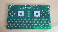
Found this picture for you to work with:

DSC01998.JPG


Pic is from this article.
 
Last edited by a moderator:
A couple of things GG.
Sure thing.

The right B button is far to the edge of the board in the mockup.
It's actually almost in the same position as the rightmost keys on the keyboard.

All buttons look scrunched together.
They're actually the exact same distance as the contacts for the Dpad. The GP2X had even shorter distances. (and smaller buttons)

You said the screw hole could likely be moved then you say it might not be able to be moved.
If that's how you read it, I apologize. I was saying that the screw should be able to be moved. However, in the case that I am wrong and it can't be moved, that we could just move the buttons up or down to get around it.

Either way, the X button couldn't be moved down much without jutting close to the keypad's top row.
 EvilDragon said that there was about the same vertical space to work with for the buttons, so I assumed the top row would be at about the same place it was on the Pandora. In that case, it would be possible to move it downwards.

I would like to see how your six buttons would look as in your pic on a real board. Please show us how it can be done.
Sure. I have taken the image you have posted and made my mockup. Note that the buttons could probably be moved downwards a little bit if need be, or moved upwards so that they touch that metal thing below the screw hole, (notice how one of the keyboard contacts does the same thing near the bottom-right screw-hole) so there is some room to work with.

See here:

6buttoncircuitboard2.png

-God Ginrai
 
That's really pushing it, but it looks like it can work.
Pushing it? Hardly.

-God Ginrai
It won't work.

The problem here is the spacing between the right nub(when it moves fully to the southeast) and the migrated A button. What will happen here is because the nubs sit so low, lower than the buttons, the rest of the thumb(beyond the tip, the distal phalanx) will end up rubbing or worse accidently pressing the migrated A button as it travels from and to that direction.

Although you don't need much spacing, there has to be a minimum of millimeters between the inputs and where your thumb will rest on the controls during movement not just while stationary(which is almost nonexistent in your proposal to begin with). The other side issue about the screw hole and if we wish it to move because we want it to is unimportant as we have no idea if it can or can't be done.

It's been a long weekend so I bid you and all a goodnight.
 
That's really pushing it, but it looks like it can work.
Pushing it? Hardly.

-God Ginrai
It won't work.
The problem here is the spacing between the right nub(when it moves fully to the southeast) and the migrated A button. What will happen here is because the nubs sit so low, lower than the buttons, the rest of the thumb(beyond the tip, the distal phalanx) will end up rubbing or worse accidently pressing the migrated A button as it travels from and to that direction.

Although you don't need much spacing, there has to be a minimum of millimeters between the inputs and where your thumb will rest on the controls during movement not just while stationary(which is almost nonexistent in your proposal to begin with). The other side issue about the screw hole and if we wish it to move because we want it to is unimportant as we have no idea if it can or can't be done.
That's not true. If you look at the nubs, you will see that it can only move a little bit in the center of that platform, and the rest of it is dead space for the base. Even with a nub head that is slightly larget than the black circle in which the nub's center can move, the edge of the nub head would still not reach the edge of that base platform. This leaves plenty of space for the user to not brush up or hit the button.

Also, did you even own a Pandora? The nub head is level with the buttons on the Pandora. The nub doesn't sit lower.

-God Ginrai
 
Last edited by a moderator:
Nevermind.  ;)  
 
Last edited by a moderator:
Minor update to the layout. Added a context menu key called Super_R to go with our other Pyra menu key(aka Super). Should be helpful under Android if we use Pyra Menu key as "menu" for shortcuts and context menu key as "home".
 
Last edited by a moderator:
If there are going to be two shift keys on the keyboard and one as a shoulder button, then there are 3 shift keys, but there are only 2 different scancodes.
We can define our own scancode for a 3rd shift key (or second AltGR, etc...). Existing applications and quick ports wouldn't be able to use it (unless they were just looking for the generic "shift" or "altgr" modifier) but newer homebrew could easily tell the difference, especially if we add them to SDL for easy access.
Assuming we use XKB (which is more advanced than xmodmap), we can relatively easily map anything to anything, so it makes most sense to me to not invent new scancodes but assign existing and distinct scancodes to each key and button, and rely on XKB to make sense out of it. See also: https://wiki.archlinux.org/index.php/X_KeyBoard_extension

In particular, there can be "left" and "right" keys for all modifiers, and we can assign Level3 symbols to all keys and use any key as the Level3 modifier, it does not have to be AltGr/Alt_R.

I propose to put all the "left" modifiers on the keyboard, and all the "right" modifiers on the shoulder buttons. The names I would suggest are Shift, Ctrl, Alt (mod1) and Meta (e.g. mod3). The button below Enter would be Super_L (mod4) (the left Windows key on normal keyboards) and could be mapped to Shift by default, or to Compose by people who don't need a third Shift key, or not remapped at all in case you want to use it as a modifier e.g. when defining shortcuts.

We could make the left modifiers sticky and the right modifiers non-sticky by default.
Few questions.

Meta is the mod_switch key and replaces AltGr?

Super_L under right shift is the windows key?

What is the Pyra menu key then if it isn't Super_L? Super_R?

Why not keep Compose mode as Shift + Enter?

Why not use the vacant but available Hyper_L and Hyper_R as modifiers for only the symbols instead of remapping established AltGr and Meta?
 
Last edited by a moderator:
I thought the left Windows key normally was mapped to Meta.

No, normally the Windows keys are mapped to Super. On a normal keyboard there is no Meta.

Few questions.


Meta is the mod_switch key and replaces AltGr?


Super_L under right shift is the windows key?


What is the Pyra menu key then if it isn't Super_L? Super_R?


Why not keep Compose mode as Shift + Enter?


Why not use the vacant but available Hyper_L and Hyper_R as modifiers for only the symbols instead of remapping established AltGr and Meta?
Most keyboard either have two Alt keys or one Alt key and one AltGr key. Since I want both Alt and the Level3 modifier (Fn/AltGr) available both on the keyboard itself and on the shoulder buttons, it makes sense to call the latter Meta (or Hyper, that would work too) so we can have Alt_L, Alt_R, Meta_L and Meta_R that can all be nicely distinguished from one another.

In my layout, the right shift key on the keyboard would actually be Super_L (or Super_R, it does not really matter), which would be mapped to Shift by default but which would be a good candidate to map to Compose (the default Compose could be Meta+Super, and perhaps Shift+Enter too for backwards compatibility, although I don't really like that since there might be applications that actually use Shift+Enter). The actual Shift_R key is the L1 shoulder button like on the Pandora. A dedicated compose button obviously has the benefit of less keypresses.

The Pyra button would map to the Menu key like on the Pandora. It could also be mapped to Super, that would also make sense. But I'd rather have a Super key and a Menu key instead of two Super keys, so if the Pyra button becomes Super, then the key below Enter (right shift) should be Menu (remapped to shift by default).

Meta and Hyper are both vacant but available modifiers; I prefer Meta because it is one letter shorter and sounds better to me (e.g. it corresponds better to a button that can be used to toggle system settings like wifi/3g/bt/hdmi), it and there is a nice established symbol for it (◆). Also, afaik there are no existing (historical) keyboards that have a Hyper key but no Meta key, while keyboards with Meta keys and without Hyper keys are relatively common:

2.jpg
 
Is the most recent layout suggestion from you the one w/ the weirdly shaped tab and enter keys? If so, I'd much prefer they be shaped like the rest of the keys. I never thought those tall enter keys were a good idea in the first place.

Also, Do we really need 3 shifts? I realize you are suggesting one can be changed by the user. But still, we don't even need it defaulting to shift. As long as we have one on a shoulder and one on the keypad, we should be good.

-God Ginrai
 
Also, Do we really need 3 shifts? I realize you are suggesting one can be changed by the user. But still, we don't even need it defaulting to shift. As long as we have one on a shoulder and one on the keypad, we should be good.
I agree. But ED has made it clear that he wants two shifts on the keyboard itself by default (he does not use the shoulder buttons himself), so I'm taking that as a given.

I also agree about the tall tab and enter being ugly. Fixed: http://www.keyboard-layout-editor.com/#/layouts/33ca14f416ff2af33aebd0be6efb0ddf

(I'm also not sure about the large shift keys, but at least that's not as ugly as non-rectangular keys)
 
I agree. But ED has made it clear that he wants two shifts on the keyboard itself by default (he does not use the shoulder buttons himself), so I'm taking that as a given.
Oh really? That's a shame. :\

Also, the enter and tab keys look much better now.

-God Ginrai
 
Back
Top