Unofficial Keyboard Layouts


IMHO we need some official debate about the keyboard layout, it's obviously a major concern for a lot of people and so it should be as the hardware keyboard is more or less the unique selling point of the Pyra. It's obvious that we'll never get a layout to suit everyone but the more I think about the prototype layout the less I like it due to it being deliberately hobbled by having a row of media / hardware toggles instead of a row of numbers.

It seems to me that the main reason for having a fairly useless row of dedicated toggles instead of a row of numbers is to accommodate the speakers, why not have a single speaker in place of the start / select / menu buttons?

A couple of other worries are :

There will be no dedicated mouse buttons, this is moronic IMHO, using an analogue nub to emulate mouse buttons is far from ideal.

The keyboard will have German characters at the expense of more commonly used characters / functions.

What I'd like to see is ED come out with an officially proposed layout and invite comments / suggestions from the community.
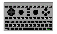
kb-layout.jpg
 
_wb_:

Disadvantage:

1: Slash is hard to reach

2: AltGr must not be on a Shoulder button as it's not recognized by Games.

3: Only one Shift Key on the Keyboard. 2 Are useless for me but ED wants them.
1. Slash is AltGr+N, a dedicated key would be better, but it's not too bad. Don't confuse with Shift+AltGr+L, which is harder to type but it is not slash, it is a dead key bar diacritic, to make e.g. Ø and ħ.

2. The point of having AltGr (a software modifier key) instead of Fn (a hardware key implemented at a very low level not visible for applications) is exactly that it can be recognized by games and other applications. So just like it is no problem for games to detect RCTRL and RSHIFT, it would be no problem to detect ALTGR -- maybe it will not be possible to distinguish between the two locations of AltGr though (normal keyboards only have one AltGr), but that is a relatively minor issue.

3. The compose key in my layout could be labeled as a shift key and act like one by default if that is what ED wants. Many people will map it to something more useful, like a compose key or some special symbol they frequently use. If you never need the compose key, you may not need a dedicated one, and since I already have all important diacritics as dead keys on the Shift-AltGr+ASDF row, many people will in fact not really need a dedicated compose key. AltGr+(right keyboard shift) would be a good default binding for a non-dedicated compose key.
1: I did mean the right button.

For me it's too much in the middle.

The more it's in the middle, he harder it's to reach.

2: I see.

But I know Games that don't recognize the Alt Key as a Key (Jedi Knight on Pandora).

I suppose AltGr is the same or worse.

3: That's a good idea.

I like it.
 
However, what's the deal with the + and - gaming buttons? The other gaming buttons have their real keybindings at the bottom and their gaming interpretation center. Are those buttons default + and -, or default Insert/Delete?
They are default Insert/Delete just like the others are default PgUp/PgDn/Home/End.
Ah okay.  How are + and - meant to be hit then?  I understood that the idea behind the proposal was like using ctrl+- and ctrl+=/+ to zoom out and in in a web browser.  Will ctrl+insert become ctrl+-, that seems useful, but logically inconsistent?  Or is -/+ altgr+ins/del, so the web browser combos become altgr+ctrl+ins etc.?
The latter. L2+R1+(ins or del). It's not super easy or convenient, but at least it's better than on the Pandora. It's even arguably better than on my laptop where I need to do CTRL+SHIFT+'=' for zoom in and CTRL+'-' for zoom out (I don't get why + is a shift key while - is not, but that's the way it is -- luckily we don't have room for those keys between 0 and backspace so we don't need to use that weird convention).

For applications that don't need insert or delete keys (e.g. don't have text input fields), it would of course make sense to map +/Insert and -/Del to something like zoom in/out or any other kind of one-dimensional parameter adjustment.
 
I liked C and Z better than I and -.
Apologies. I thought Roman numeral one befitted the left mouse button more than a plus sign. I occasionally use Delete which is why it stayed, but Insert is dusty like my print screen key. If plus and minus action buttons were + and -, I could see keeping them as labels. In the very least, using Roman numeral one and the minus sign doesn't appear to newcomers as volume or brightness controls.
 
Doesn't really look like the letters have a connection to each other.
Well, this won't be a problem as soon as EvilDragon acknowledges that it is possible to include a normal 6-button layout on the Pyra. I have explained to him through PM how to do it, and now he hasn't responded for a week... -_-

-God Ginrai
 
Said evidence is in a private message to EvilDragon and gta04. EvilDragon and I were discussing it back and forth at first, then he stopped responding last Friday. (and has not responded to my requests for him to continue discussion this week) gta04 still hasn't even read the PM according to the board software.

-God Ginrai
 
Doesn't really look like the letters have a connection to each other.
Well, this won't be a problem as soon as EvilDragon acknowledges that it is possible to include a normal 6-button layout on the Pyra. I have explained to him through PM how to do it, and now he hasn't responded for a week... -_-

-God Ginrai
To duplicate the arrogance of your statement...

Which is irrelevant as soon as you acknowledge that the proposed layout is -better- for gaming as it puts 5 of the 6 buttons in easier thumb range than a 3x2 layout ever could.

C Y

A \ B

Z X \__Your thumb.

Your thumb comes in from an angle of ~ 135*.  The only key necessary to 'move' your thumb for is Z.

:rolleyes:
 
Doesn't really look like the letters have a connection to each other.
Well, this won't be a problem as soon as EvilDragon acknowledges that it is possible to include a normal 6-button layout on the Pyra. I have explained to him through PM how to do it, and now he hasn't responded for a week... -_-

-God Ginrai
 To duplicate the arrogance of your statement...

Which is irrelevant as soon as you acknowledge that the proposed layout is -better- for gaming as it puts 5 of the 6 buttons in easier thumb range than a 3x2 layout ever could.

C Y

A \ B

Z X \__Your thumb.
 
That's actually not true. The current layout has 4 rows that you have to move your thumb vertically between. Vertical movement (forward-back) is harder for your thumb than radial movement, so you have now doubled the amount of vertical movement you have to make, thus making it harder to use. Not to mention, because the buttons are smaller, they are harder to hit.

A 2x3 (2 rows, 3 columns) setup is much easier to move your thumb along. And, seeing as how the buttons also would be able to all be the same size, it is even easier to hit all of the buttons without missing one or making a mistake.

Your thumb comes in from an angle of ~ 135*.  The only key necessary to 'move' your thumb for is Z.

:rolleyes:
That's not true. Most players use the edge of their thumbs to press the buttons. It doesn't work like a dpad. Thus, you do have to move your thumb to reach all of the buttons on either layout. But the difference is, with the current layout, you have to perform forward movement to move from the XB row to the Z row, then from the Z row to the AY row and finally from the AY row to the C row, whereas with the standard 6-button layout, the only forward movement is from the ABC (XBC maybe here?) row to the XYZ (AYZ row?) row.

-God Ginrai
 
Said evidence is in a private message to EvilDragon and gta04. EvilDragon and I were discussing it back and forth at first, then he stopped responding last Friday. (and has not responded to my requests for him to continue discussion this week) gta04 still hasn't even read the PM according to the board software.

-God Ginrai
Quote it here so we dont have to waste their time.
 
Quote it here so we dont have to waste their time.
I specifically started the Private Message situation because EvilDragon asked me to show him a way it could work, and apparently hadn't seen my responses.

There's no point in posting it here because the only people who could prove it impossible would be EvilDragon and gta04, since they have an intimate knowledge of the PCB.

-God Ginrai
 
Last edited by a moderator:
Quote it here so we dont have to waste their time.
I specifically started the Private Message situation because EvilDragon asked me to show him a way it could work, and apparently hadn't seen my responses.


There's no point in posting it here because the only people who could prove it impossible would be EvilDragon and gta04, since they have an intimate knowledge of the PCB.

-God Ginrai
It's a bit annoying that you have secret proposals that you never want to share with us, while you're still making a lot of noise about their existence. Show us your proposal or stop talking about it.
 
Back
Top