Testing alternative Layouts that require single-width space. INTL layout vs Big Space, and other key

I want to test more layouts (for example INTL-layout) which require space to be single-width?


  • Total voters
    42

 - Esc is now a dedicated key in the very top left (not an unusual spot for that key). Tilde is at Meta+Esc.
 - Meta+Space is underscore (makes a bit of sense in my head)
 - put all the hardware toggles on one key (unshifted=wifi, Meta=3G, Shift=Bluetooth, Meta+Shift=HDMI)
- put all the brightness adjustments on one key (unshifted=screen, Meta=keyboard)
I find these especially interesting.

I think i like meta+ better, but how to mark it.   A 16:9 square above a sun, and that keyboard over a sun in gray?
Maybe just a sun and a keyboard.  Alternately,  display (rectangle in rectangle) and keyboard, with or without sun.  If you put the meta option to the right, as with F keys, it might be clear enough, and if white keys are used there grey might help get that across.

Are keyboard leds either on or off?
I think you can, or should be able to, go through keyboard backlight brightness settings.

How about holding the button regulates screen intensity, and clicking the button turns on and off keyboard LED?
What about holding it and hitting upper little button (or +) makes screen brighter, and lower little button (or - ) makes it dimmer, while clicking just the brightness key toggles through keyboard brightness, like you said.  This would allow you to hold it for the menu, as you mentioned.  Would this be difficult to implement?
 
Last edited by a moderator:
I thought about your last idea, and it would make the most sense if the a+ upwards button was white, and the downwards button was black.

Its possible to have an action only on button release, which would prevent holding the button from turning off keyboard.

I really like the primary function of the key to be keyboard lights on off. Same as the thinklight on thinkpads and the light that you click out on hp elitebooks.
 
How everything is done in software is something we can decide later. The point is that one key should be enough to control the two backlights.

On my Pandora I only use two brightness settings: "minimum" and "maximum". On my laptop with keyboard backlighting, I only use one setting: "off" ;)

I think min-medium-max for the screen and off-on for the keyboard are enough. You can select in some settings dialog (in software) what brightness levels min,medium,max, off and on actually correspond to. The default could be 5% (or whatever is the smallest non-black value) - 50% - 100% for the screen and 0% - 100% for the keyboard, but I can imagine that for some battery-life-sensitive people, 0% - 5% - 20% and 0% - 20% would be their preference, while for people who like things bright, 20% - 60% - 100% and 10% - 100% makes sense.

As for the symbols on that key: in that layout editor I'm restricted to unicode symbols, so I couldn't do it right. For the screen brightness, ☀ is fine. For the keyboard, I would make it the keyboard symbol (⌨) with the top half of a circle around it, a circle made of short outwards lines (like the rays of a sun symbol).

Combinations for fine-grained brightness control can be defined later, but I think the important thing is to have quick toggles. Using the small action buttons is probably a difficult combination when both are on the right. Brightness button+dpad is probably easier (where left-right are 2% steps and up-down are 10% steps or so).

* * *

Let's compare my latest Pyra layout proposal with the Pandora layout.

http://www.keyboard-layout-editor.com/#/layouts/03444463edfb61a8b2cb5b0d12cf4811

We get the following 9 new dedicated keys:

Esc, Tab, Delete, Slash (/), Plus (+), Minus (-), Menu, Brightness adjust, Hardware toggles

The very much appreciated Shift and Ctrl shoulder buttons are extended with Meta and Alt shoulder buttons. This will make it easier to chord shortcuts. Compare Ctrl-Alt-Del or Alt-F4 on the Pandora and the Pyra to get an idea:

Pandora: R1+START+L1+Backspace (but that won't even work, even if you can do the acrobatics)  and Fn START+4 (not easy to do)

Pyra: R1+R2+Del  and  L2+R2+R

The number row is in its normal location and shift+number are standard QWERTY.

The M+2 keys are standard and the P+2 and L+2 keys are available for remapping.

These two elements combined mean that the keyboard is much closer to a full standard QWERTY keyboard, appropriate for remapping to French or German or Russian or whatever.

F1-F12 are now in a nice continuous row.

Diacritics are somewhat easier to do. E.g. to get ô:

Pandora: L1+Enter, L1+6, O  (note: 6 is almost impossible to reach on Pandora)

Pyra: L1+L2+6, O
 
For the screen brightness, ☀ is fine. For the keyboard, I would make it the keyboard symbol (⌨) with the top half of a circle around it, a circle made of short outwards lines (like the rays of a sun symbol).
This seems pretty clear to me.  We could ask others and see if they understand those symbols.  Edit:The person I asked, who isn't really into computers and such, guessed correctly on the first try with both symbols.

Combinations for fine-grained brightness control can be defined later, but I think the important thing is to have quick toggles. Using the small action buttons is probably a difficult combination when both are on the right.
Then move that key to the left, or

Brightness button+dpad is probably easier (where left-right are 2% steps and up-down are 10% steps or so).
This also works.  I think if the smaller increments are needed it might just be easier to do it in software, but use whatever people like.  You could use the key for keyboard on/off, and possibly stepping through preset screen brightness levels, as was mentioned earlier, with just the brightness key, and key+Dpad up and down for screen brightness, with left and right for keyboard.  Or skip all of that and just do what comradekingu suggested.  Anything should work as long as people can activate keyboard light from an easy to find key, and they can also easily change screen brightness.
 
Last edited by a moderator:
With a 3 elements per key, a small keyboard to the left, a big sun in the middle, then a small screen to the right. (closest to where abxy+2 are)

[    ⌨ [   ]  ]           

with just minimum maximum and on off on keyboardLED thats just 4 toggles.  Key can remain the same whatever the decision is

wb: 6 on a pandora is where power is on a pyra, i dont know if you forgot while trying to figure things out.
 
impossible to hit accidentally.
You underestimate human stupidity.
No I don't. The power button should behave as usual in GNU/Linux: when you press it, you get a dialog asking you whether you want to shutdown, reboot or logout, defaulting to shutdown in 60 seconds if you do nothing.
Ah, but you agree that people will still hit it accidentally no matter where you put it?
Of course. Just less frequently.

Here is a new, scary layout (but with proper coloring it would be much less scary) :

http://www.keyboard-layout-editor.com/#/layouts/e40ddd41dc965502887cf41485d7bf2b

Features:

It has all the keys of a good old standard IBM PC 104/105-key keyboard, the US one, the UK one, and the European one (except for language-specific keys)

This means the following keys/symbols were added: PrintScreen/SysRq, Scroll Lock, Pause/Break, NumLock (with a numeric keypad on 789 IOP JKL M .), mu (µ), square (²), cube (³),  the section symbol (§), the degree symbol (°), Pound (₤) and Euro (€).

It also has media keys for mute (I know we have hardware volume control, but mute can still be practical imo), play/pause, stop, previous and next.

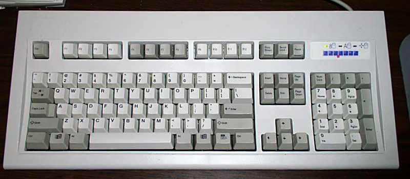
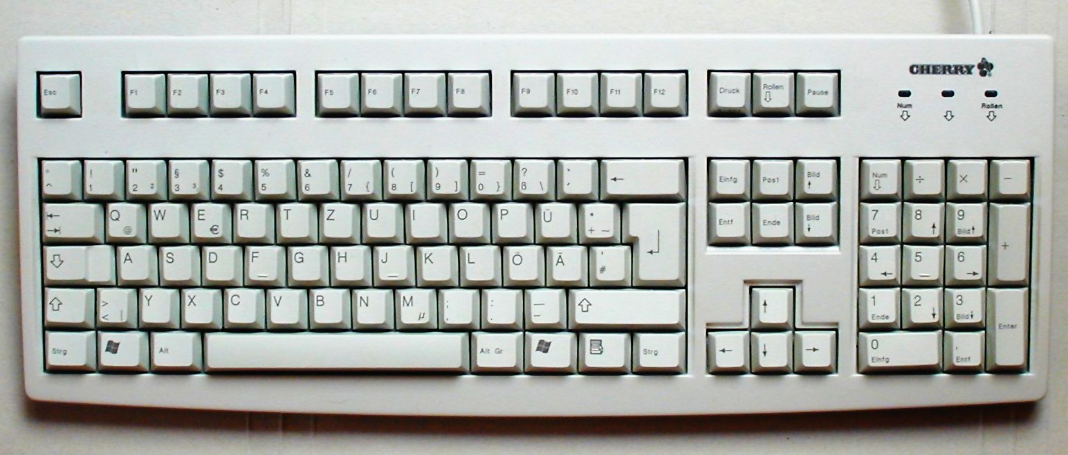
That means you basically get a pocket version of this:

Unicomp_keyboard.jpg


and also this:

Cherry_keyboard_105_keys.jpg


plus media keys.
 
Was trying to figure out how comradekingu made the grey Meta-keys, turns out an incorrect color value triggered that.

Starting from that, I discovered a little css injection hack to get arbitrary colors on the side-print label.

http://www.keyboard-layout-editor.com/#/layouts/eaf133b281bff889b222389911bc6e26

http://www.keyboard-layout-editor.com/#/layouts/b2aa3ea02dda091322c616dfbce2f409

Since meta is a concious decision, we might as well make it look like it is. Meta+shoulders is mediabuttons. Meta is (held) when the lid is closed, so shoulders are only mediabuttons then.

Also fixed the brightness key.
But this means you can't have Meta on a shoulder button. In your layout it does not matter that much because you have AltGr for most of your symbols, but that is not a good idea anyway if you ask me (people will try Meta+2 to get " and they will try AltGr+R to get F4, and it will not work). Still, the F-keys are very uncomfortable in your layout (pressing your only Meta button is too hard, even if it is sticky)
 
Haha, silly me, coming up with CSS injection hacks while you can just use arbitrary HTML:

http://www.keyboard-layout-editor.com/#/layouts/8d4f5562eaaca7be32f9c93f49c7a00d
You won't expect that but I could live with your Layout.

Please reconsider this:

Are the Media Buttons on the Keyboard needed?

Wouldn't it be better to use these keys for + and - and bring Del and Ins back to the Face buttons?

Put Meta where Enter is.

Put Enter where ? is

Put questionmakr where Del is (would be free then)

And F12 where Meta is?

Don't think it's a good idea to not have Meat on the side.
 
Don't think it's a good idea to not have Meat on the side.
Sertainly sir, we have all helped ourselves to a main course of potatoes here in the space divided layout thread. Welcome aboard.

Nice schemes wb.

With a two-tone colourpalette it becomes easy to understand what is what. On the pandora i would go shift+delete to get delete, even though del and ins are in the same "position"

http://www.keyboard-layout-editor.com/#/layouts/4e5bd0f03423bb5a4bd44b35a8ffbc18

Primary,Secondary,Tertiary as on the pandora makes sense in a LtR perspective, but it isnt standard, I went with the central one in the middle, then shift to the left since that is on the left, and altGR on the right, since that is on the right. Meta ive placed up centre, it ought to be on a right shoulder to follow convention, but if thats the only thing with a colour i can get along.

That also means everything that is conventional isnt marked, and the meta is the only one to separate itself, which makes sense. If you dont put in AltGR you end up using meta for other things than hacks, and if you have both, you are just as short on shoulders again.

And with meta on a non-central key and not on the shoulders, it opens up possibilities of meta+anything. Meta+left is ctrl+alt+tab meta+right is alt+tab and so on.

And it would be all rather fitting, if it wasnt for the loss of super. What is super needed for, and can we assume meta will do just fine in its place?

Unity is the only thing ive found that uses super+qwerty keys.

I do really like the ABXY keys to be white for + and black for -, not only is that compatible with brightness controls, but it also puts - closer to the keyboard. It appears to me, straight up + and - is mappable in games without causing problems.

There is the ctrl+ and ctrl- issue if you want to call it that, but when you do want that behaviour its very cool. Would that be a problem anywhere?

It frees up + and - on the number row, and it means the math-cluster is divided between extra abxy and number-row. But what to put in their place?

Im currently working with http://www.brianhetrick.com/kb/ to see what i can do

Edit: since many of these fall under the foreign rule, i propose typing meta+where the symbol is, to get the dead-key compose version of the symbol

This solves the -diatricks on normal layout problems, but it means meta+many keys will be used up.

Problems:

< and , is the same key Meta+altGR can be < and meta+, is

/|\ is the same key meta+ meta+shift+ and meta+altGR works

problems with that: on the numbers row the position varies, but its always just one per key, so always meta+ there

Edit: I ran into http://www.keyboard-layout-editor.com/#/layouts/5900372b6635f4b6d3e8827901b9add2 which stops making sense, to start making a bunch of semi-sense.

+ - and = is in a line

ø and | is on the same key (it is anyway)

And white aup and black adown broke my colourscheme

It we needed a lot more symbols it opens up for that, but we dont. Its just one of the ticks that needs to be on another key than 6, because that is ^

Just + and - on Aup and Adown would be ok, but doesnt brightnesskey+dpad up make even more sense than Aup?

http://www.keyboard-layout-editor.com/#/layouts/404c44f59f8a1065cdb8d05137e52be0
 
Last edited by a moderator:
Haha, silly me, coming up with CSS injection hacks while you can just use arbitrary HTML:

http://www.keyboard-layout-editor.com/#/layouts/8d4f5562eaaca7be32f9c93f49c7a00d
You won't expect that but I could live with your Layout.

Please reconsider this:

Are the Media Buttons on the Keyboard needed?

Wouldn't it be better to use these keys for + and - and bring Del and Ins back to the Face buttons?

Put Meta where Enter is.

Put Enter where ? is

Put questionmakr where Del is (would be free then)

And F12 where Meta is?

Don't think it's a good idea to not have Meat on the side.
Well I do have Meta as a shoulder button, so that should already help a lot to make it more comfortable than on the Pandora. The Shift and Meta keys on the keyboard itself are basically only for when you put the Pyra on a table or when you're playing a game or using an application that uses the shoulder buttons and has text input. Since L2 is "Right Meta" and the keyboard key is "Left Meta" (even though it's on the right, yes that is a bit confusing but the convention is that all the shoulder modifiers are "Right" and all the keyboard modifiers are "Left"), applications can distinguish them, so you can still press F1 (using the keyboard Meta key) in a game that uses all four shoulder buttons.

Anyway, the point is that the keyboard Meta and Shift are expected to be used only rarely, so their position is not that important. I suppose it's current location is nice if you're playing some game with 4 shoulder buttons with an external background music player, so you can use Meta+L to skip to the next song (supposedly the input from the Media keys is intercepted by the OS before going to the game and passed to the music player, I dunno if that actually works but that's a software issue, in principle it should be doable).

At first I thought we don't really need Media keys. But I think they may be practical if you want to listen to music while doing other things.

Putting Del and Ins back as action buttons: I could do that, but there are some arguments for my layout:

- While a dedicated Del key makes a lot of sense, we don't really need a dedicated Ins key.

- If the action buttons are "Ins" and "Del", they either need another name (but what?) as a game button, or they have a weird/crappy name for gaming

- A dedicated key for + and - is useful: - is quite frequently needed in both natural language text and programming, and shortcuts for zooming are typically something like Ctrl + and Ctrl -, which is more convenient if you have dedicated keys for that.

- Del near backspace makes sense (they are both "erase character" keys).

Here is a revision with more NumLock stuff:

http://www.keyboard-layout-editor.com/#/layouts/c8f353d18e9575c173086db338429eb6

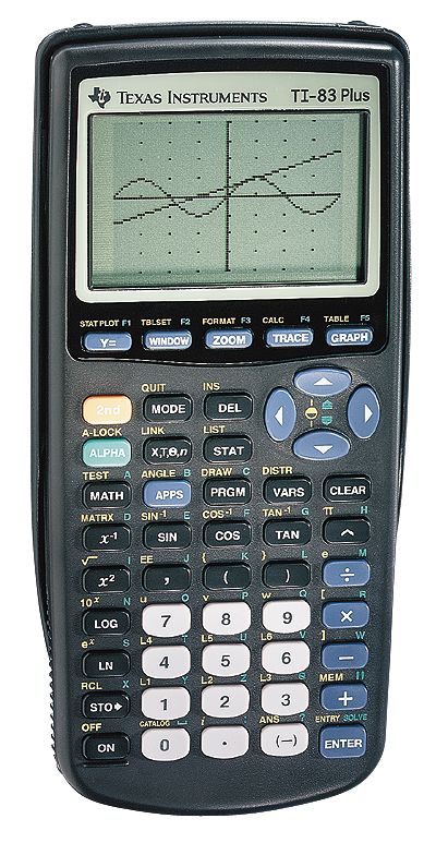
so you can use your Pyra for this kind of stuff:

1731112.jpg


Actually I'm against my own proposal in this case. It is too scary and special-purpose, and probably not even very practical.

* * *

Here is a more serious edition of my current proposal:

http://www.keyboard-layout-editor.com/#/layouts/1c6d05bf2826336cd59e65f0da95ee57

I can't come up with anything for Meta+F, and even Meta+G ("Stop") is probably not that useful. Any suggestions for one or two extra Meta-keys?
 
The ? on +4 isnt ideal. Mutebutton is a nice touch, but im thinking maybe just turning the knob down fully is faster. Also you dont run into the "why is there no sound, i dont think i turned it off"-scenario.

The moon on the powerbutton is not simple, and i was under the impression that closing the lid does suspend?

http://www.keyboard-layout-editor.com/#/layouts/38b31bb05801f9e4e0be9a5f7bc20d20

Changed to purple, a lot easier on the eyes. Also it makes the real focus more of a focalpoint. I think the purple could have been even darker.

When all else fails, keep it simple

http://www.keyboard-layout-editor.com/#/layouts/5d7a98615bb009cd1b082bfd888837ad

Doesnt scare anyone away.

What are we using nubs for

Left nub leftclick and mouse movement

Right rightclick and scroll ?

Still needs a middleclick meta+start ?

and also back forwards for use in browsers. Im thinking shift+meta+backwards and shift+meta+forwards
 
Last edited by a moderator:
Im currently working with http://www.brianhetrick.com/kb/ to see what i can do

That is an interesting keyboard layout.


Here is my attempt:


http://www.keyboard-layout-editor.com/#/layouts/9fa9549bf2e493f8dccd33ae90f35aab


Since I don't have/need an AltGr key (at least not by default, users are of course free to define one and use R2 or one of the redundant Shift or Meta keys as an AltGr key), I use Shift+Meta as a kind of AltGr. Of course this can only be done for keys where Shift+Meta is not already in use: we still need to be able to do Shifted F-keys, for example.


Shift+Meta+(number row) gives dead key diacritics for grave, umlaut, acute, double acute, ogonek, circumflex, [ligature/special], ring above, breve


This makes some sense since there are symbols similar to those diacritics on those keys: ` " ' = \ ^ & * (.


Tilde gives dead tilde, underscore gives macron (can't use - since that's an action button, and | is already taken for circumflex), comma gives cedilla, period gives dot above, and V gives caron (couldn't use < since that is already taken for cedilla, but V makes more sense anyway because that's what a caron looks like).


I put horizontal line through and oblique stroke on the same key: L (for Line through). You can make the Polish Ł, the Danish/Norwegian Ø, as well as Đ Ŧ Ħ. I couldn't use slash (/) because I need Shift-F12, but L makes sense because that makes Ł easy and Ø reasonably easy.


The other symbols from that US Multilingual Keyboard layout can be reached using Shift+Meta+& (ampersand because that is a ligature itself and it symbolises joining two things, e.g. A & E = Æ). It's a 'dead key compose', that obviously can only produce a limited set of symbols but more than enough to get the rest of what we need:


A↦Æ, O↦Œ, T↦þ, D↦Ð, N↦Ŋ, S↦ß, K↦ĸ


+↦±, -↦¬, ?↦¿, !↦¡, { }↦« », [ ]↦‹ ›, C↦©, R↦®, X↦×, P↦¶, V↦¹


I hope I didn't miss any of them. As an easier to find alternative for Shift-Meta-&, I propose Shift-Meta-Tab.


So that gives us a full multilingual keyboard, suitable for all these languages:

Afrikaans, Albanian, Catalan, Croatian, Czech, Danish, Dutch, English, Esperanto, Estonian, Faeroese, Finnish, French, Galician, German, Greenlandic, Hungarian, Icelandic, Irish, Italian, Lappish, Latvian, Lithuanian, Maltese, Norwegian, Polish, Portuguese, Rumanian, Serbian, Slovak, Slovene, Spanish, Swedish, Turkish

where all letters of all those alphabets can be typed with just two thumb presses (the first one with L1+L2 held, the second one without modifiers except if you want upper case, then you can hold L1).

Of course with the compose key you can also get all those symbols, and more, but that takes three thumb presses. I propose to put the default compose key at Meta+Enter, but people can easily change it to something easier (e.g. the keyboard Shift or Meta) if they intend to use it frequently. With all these convenient dead key diacritics, there's much less need for a compose key though.

@ comradekingu:

Yes, turning knob to mute also works, but then to find back the original volume may take some time. If you just want to briefly mute and then resume where you started, a mute toggle is practical.

The purple: while I get your point about barely visible colors being less distracting, I think easily visible colors being more visible is also a good point. I picked fire red because it's easy to see while still distinct enough from the main labels, and also it fits the Pyra theme (Pyra has flame colored hair). My laptop has its Fn labels in something like that color, and it works in my opinion. Better than the traditional blue, even.

About the nubs: I think left nub = movement, right nub = scroll makes sense. I would make left nub click = right mouse click and right nub click = left mouse click, to make dragging possible/easier. Middle click is probably not really needed (could use left+right click if it is).
 
I think targeting languages is the wrong way to go, since those are for the most part fully covered by the +4. Its just to have a way of doing it that is common, rather than reinventing a wheel.

It was more of an overview of all the things that exist.

Lets say i want €, that is supposed to be AltGr+e, when you remove that you end up having to pull hacks. Lets say im a basic user, i cant just disregard the orange stuff, because it has things like ' and it means the whole keyboards needs explaining/getting into.

° is foreign. I need ? from +4

It would be a good point if it wasnt more visible than the regular key. Most people dont use F-keys at all, but everyone has to have their attention drawn to bright colour.

Fn-keys on laptops was always a hack, and it never looked good, or worked particularly well. Its cheap.

Left nub is right click doesnt strike me as particularly intuitive, nor do i see why it makes drag and drop easier, but that remains to be tested.

While we have gotten along with the pandora way, it was never self-explanatory.

I think the screen adjustment stuff is too complex, and i like the triple-toggle. Would it make sense if you held a key on the keyboard and then pressed the brightnessbutton to turn it on/off?

The keyboard leds can be individually controlled, so this could be a way to only light up the parts you want lit.

I got some feedback from ED before gamescom, i showed him my layout, he seemed to think there had to be missing keys because there was empty space on the bottom rows, and i explained the coding cluster

Then he asked about ESC.

"EvilDragon: But there HAVE to be keys missing, if there are two empty META-Keyrows :)"

So no real answers about anything, but no obvious flaws either, which was why i asked.

I would say the same things he said, so to fix that, lets say start and select can be remapped to dedicated escape and delete, if needed. Is that a terrible situation?

I bought a look of disapproval keycap for my esc, and I dont think I became aware that i dont use it i have, but extremely seldom, my caps lock is unused thats a smileyface. Delete i use a bit.

Edit: http://www.keyboard-layout-editor.com/#/layouts/7ef1b115f15a754f6d374c2bb0d2d249

Moved pyrabutton to the middle. If you want combo ctrl+alt thats shoulders.

play/pause is global, unless you have something open i think, so thats kinda like a mute.
 
Last edited by a moderator:
The +4 keys only cover languages that only have a few special letters (like German and the Scandinavian languages).

They do not cover languages like French (which has é à è ù â ê î ô û ë ï ü ÿ ç œ æ), the Baltic languages, the Slavic languages, the Uralic languages, and the Celtic languages. They also do not cover languages that use diacritics only sporadically (like Dutch) or situations involving loan words, names of persons and places, or mixed language use (e.g. in Belgium we often do things in two, three or four languages).

Dead key diacritics are a good solution for the general case. Remapping is a specific semi-solution for those that can use it, but it's not an ideal solution either.

I don't think keyboard leds can be individually controlled, at least not on a per-key basis.

I insist that having both AltGr and Meta is confusing. One kind of third-level modifier is enough for the default layout. If people want an extra modifier key for their custom stuff, there are enough redundant existing modifier keys to use for that: in my layout there are two Shifts, two Alts, two Ctrls and two Metas, and a Super key -- that's potentially five extra modifier keys, for a grand total of 9 modifier keys and thus potentially 2^9 = 512 different meanings per key. But there's no need to do that by default.

Why can't you just unify your Meta and your AltGr into one modifier? I don't think it's essential that € is at AltGr+E so you need a different modifier to have F3=Meta+E and €=AltGr+E.

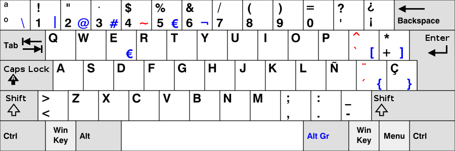
This is the standard Spanish layout:

900px-KB_Spanish.svg.png


Standard UK:

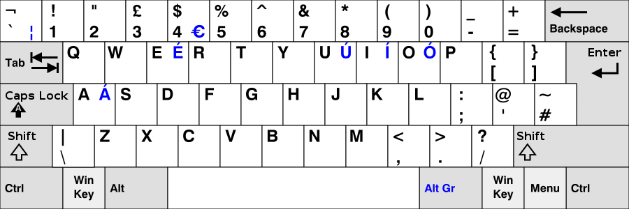
900px-KB_United_Kingdom.svg.png


Hungarian:

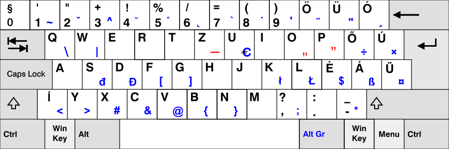
900px-KB_Hungary.svg.png


You get my point. € can be anywhere. It's more important to have all the modifiers on shoulder buttons.
 
Back
Top