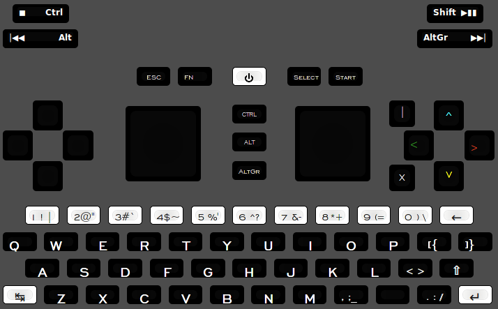
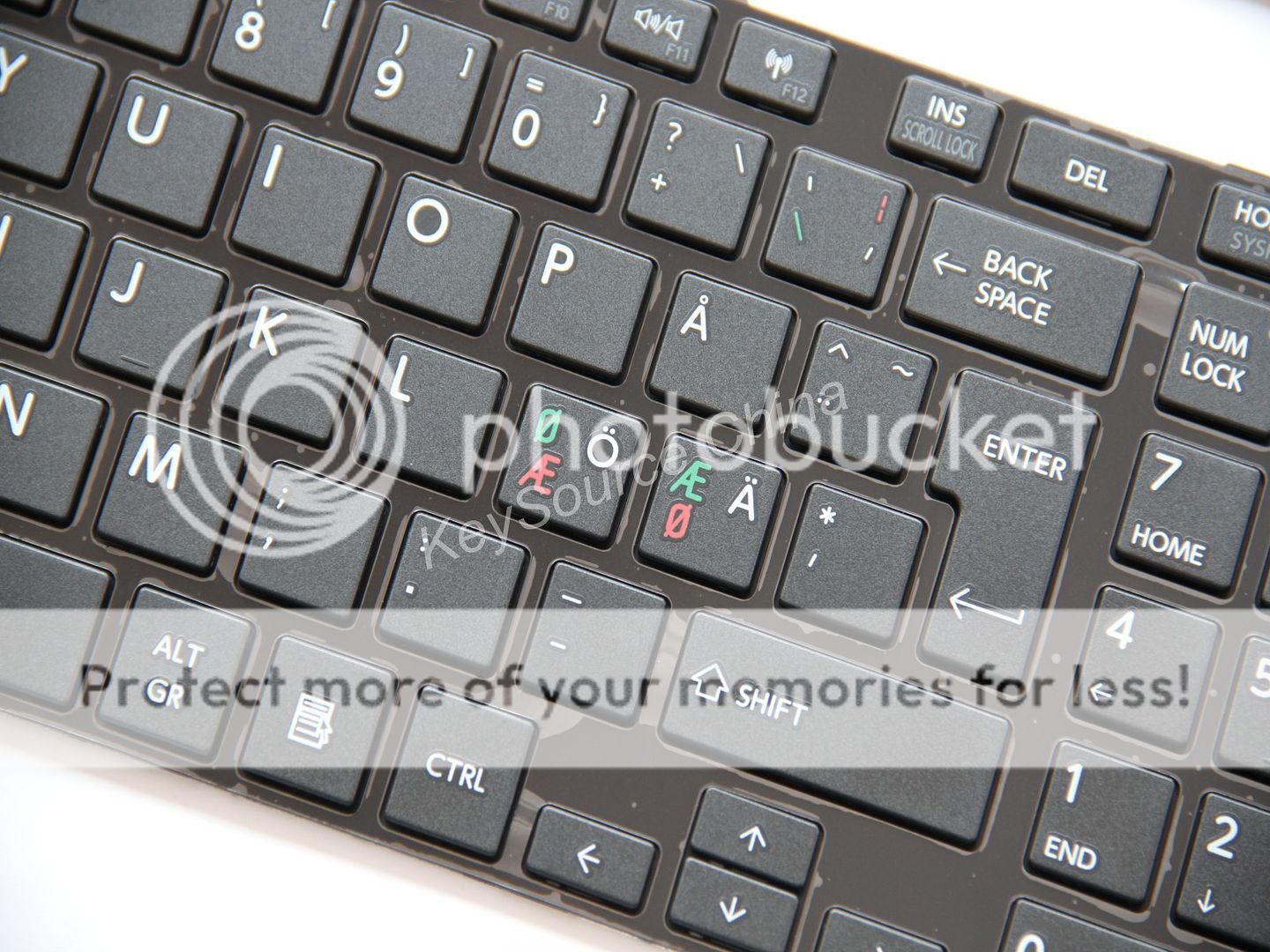
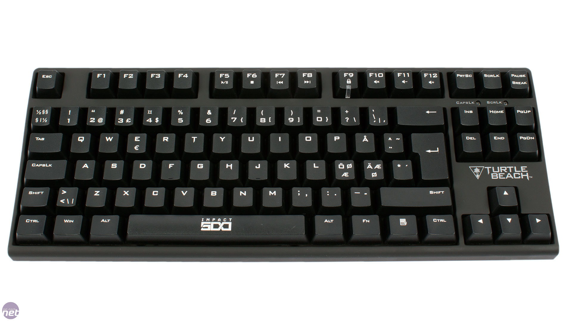
Image for reference.
My thoughts on why mixing things into one assumption is bad:
Mixing many things into one modifier means second spot on a key is sometimes for shift, and sometimes for respective input from the mixing-key. You end up having to do colour-codes to differentiate because the placement is the same. Real keyboards use position, and another problem is created with colours. They are the first thing the mind is drawn to, something that one a keyboard looks toy-like.
The user-demographic for the pandora is adults. A certain segment of users want it to be professional-looking. There is no such benefit to be had from people wanting more colours. Colours add cost too. And they take away from contrast with the back-lighting.
One mixing-modifier as mentioned means a lot of 2 prints per key. 2 prints per key is at its very nature a non-ideal use of area. 1 and 3 is better with the given space, since it utilizes it better, and more standard since you will moreso find that on a regular keyboard.
AltGr is an expected third-level-shift modifier for half the userbase, and its important, which means taking it away is already a loss. Making the most of including it, instead of running out of places to put symbols, they can with the use of AltGr be on third position numbers, as per how the key called AltGr works.
AltGr+the rest of the keyboard, the alternate graphics, is an expected way to produce region-specific symbols for each region. In the opposite case, having no way to produce these, they have to be implemented where they compete with the regular set of alternate graphics symbols, that is a lesser option. Given the scale of differences, its actually no options, because you cant even fit one of them properly.
And most importantly,
nobody expects to see symbols on letters. The clutter this introduces is a big deal to some people, and very much so for the perception of novices thinking that this is a regular keyboard. A very important idea to hold onto as it colours the perception of the whole device.
Putting symbols on letters also means you cant use AZERTY by cutting and moving the keys easily, because then you get symbols moving along with it. The reason for putting the symbol on the key wasn't necessarily the letter, its from what I've seen often about the position.
If the layout is reduced to A-Z, that means even less ways to behave like expected, and that really hurts, obviously since efficiency and habit for everyone is thrown away.
I think a lot of sales are thrown away too, its not like interlingual and international users can be relegated to hacks, they actually aren't faced with this burden at all, they are scared away by it, and are then less likely to pick up a device, which is when you have to deal with it.
Even so, some will undoubtedly do it, and if you hack, you lose assumptions made in software. Its much easier to have everything stay simple if as little change is planned as possible to accommodate as many as possible from the design-stage.
Having no fuller layout also hurts the default, because then it becomes a pressing issue that these symbols have to go into the one-key mix. Its
only OK to have things not printed if those things are
where they should be. For full interlingual coverage with language-layer, where you would have to learn placement, it is much sleeker to do this with an interlingual key. The neo layout already has this behaviour. We can do it with select, because if its not encumbered, its not a problem, The issue with French is they type their keys on the number row, which is solved on a best-effort basis with that key. Importantly now they can type big vÉrsals too (without compose).
While a smaller loss, even English users expect to find their things in this area. [ { and ] }. The number one gripe people have with ANSI keyboards (104) is the lack of <> key. Having all together, means easy shift+combo access to all brackets, and ( ) close by, also at shift.
For others, If there is no dedicated way to type dedicated letters, the need to print them on the visual layout for everyone increases. Even though its only a few languages, its still a detriment to English users, since they are largely monolingual.
A truly multilingual feature is the
compose button, chording it isn't as good, and its a good addition to dedicated special language-modifiers in the fuller layout area.
Yes, sometimes they are even on the two keys to the left of space, but we don't have those keys, so adjustments will have to be made. Same with ß, but that doesn't mean öäü has to go.
Putting each languages special language-modifiers in places they definitely don't belong, with strange looking symbols,
is not good for anyone. It is the downfall of the commons.
For the people that use them, its not what they are used to, and for those that don't, they look foreign. The latter is a big issue.
The
full set of US diacritic-symbols can be included, but as a neccecity born out of limitation, not in the standard places, this is the only conclusion to be drawn. Doing more things in new ways, is more of something that isn't good.
Same as with the typewriter support, just because there isn't room for many non-western-european layouts, doesn't mean the western-european layouts that
do fit shouldn't reap the rewards. Fortunately this is also where the demographic that for the most part buys pandoras come from. (!) And where the pyra can attain a larger marketbase because of the greater support.
For
keyboards that don't have F-keys, a key called "Fn" is the most common, as seen on 60% layouts. Its possible to say it doesn't apply because this is a game-keyboard, but then the question becomes, when was that ever better? Isn't it something to avoid?
People may not want F-keys, for these people it is a small price to pay for the ones that do need them, for them not to be printed. More modularity and more choice.
Printing them can't be ideal, either they are slanted with regards to the number-row if on QWERTY, or F11 and F12 stands out looking like a disaster when they are on numbers.
With a dedicated Fn-button 4 mediakeys on the shoulders can be triggered at all times, that doesn't work at all, or only with 3 shoulders if you have meta to do both in both places.
Making something pyra-specific means chances are taken getting it to work for the first time. Keyboards are famously a conservative geschafft. Improving on the typewriter has been attempted, and it fails mass market every time. Doing something less, has
no chance at it. You can sell it via other means, but not being a true keyboard drags you down.
A bar key
space that isn't centralized, nor stabilized, is a misnomer. The people who have designed keyboards overwhelmingly see this issue, since they have acquired insight. Its not the wobbly nature, nor the non-symmetrical side of it, its that it doesn't
do anything. The important part of it is the left side, the other side is not needed. You press space on the side that matters. The middle isn't a quality feel, because its not the middle of a button, its in between two that actuate independently of each-other. Take the pandora. The tab could have been dedicated, yet the two buttons register as one, so you have wasted your shift+ combo.
If the keys are too small for accuracy, then that is a problem with the size of the singlewide buttons. While this may or may not be true for some users, i'd like to think it makes more sense to design for those that are comfortable using it.
My dad has fingers too big to use the TOHKBD, if that happens, it doesnt matter that ctrl (or space) is wider. We were aware of this in design-stage, and it is a ultimately a design-feature that isn't utilitarian.
This or
this is the difference that single key makes. Variation over same theme on other layouts. For both of them it means:
- Having to hurdle to get from dot to enter, before that was a straight connection.
- Its farther to get to dot since its less central.
All users suffer, and there is no way to get around (heh) the issue.
- All languages that require +4 non A-Z buttons aren't possible. (French, Italian etc)
For the former it means:
- You need to shouldershift even if you want +3. (German)
For the latter it means:
- You dont have to move space at all, but familiarity of [ { ] } is lost for english users.
Right there is enough of a reason why it isn't better for more people. Dualwide isn't a big deal to anyone.
This is a big deal.
- It is worse for efficiency (more distance travelled, see firstpost for ideal solution)
- functionality is spread (brackets are no longer spread out over an array of keys, but <> is condensed where it isn't supposed to be) (coding <xhtml /> is a nightmare on euro keyboards)
- availability of shift, (less shift+combos)
- It makes the keyboard appear non-standard. (Stepped {[ and ]} keys)
When presented with the question, people did not consider the ramifications it brings, and to no-ones surprise, gimping a key when there is a shortage to begin with, isn't pretty. You have to make amends which best case means less dedication, less efficiency, and more non-standard look. Then you are truly done considering it to be what it isn't, a 10-finger button. It can here only be reached with one thumb, by going to the left side of it, never can it be pressed with the left thumb, or anything else. It isn't faster, nor more precise. It has been done before, and is known to work. If you present a layout where the space isn't doublewide, nobody has an issue in my experience of showing it to a lot of people in various stages of technical aptitude. Try it, and see the bigger picture.
The purpose of the
shift is primarily threefold. 1 type big letters 2. type symbols 3 type 4th level modifer along with AltGr
Notice the three fade in relevance 1 is more important than 2 is more important than 3.
Big letters are only typed after space and enter, so it should be close.
There is another way to get efficiency too, its to make both hands do more at once, it seems practical, but what its really doing, is tying both hands up at extreme left and right. It also slaloms motorical attention and visual focus. Instead putting all on the right, which is also good for efficiency since its the dominant hand, means you are free with the left to start a sentence. You are free to start a sentence with the right thumb too, if you shouldershift.
Advanced and newcomer alike, it works. Putting it here also provides an avenue of opportunity to get an extra letterkey on the keyboard for the languages that need 4 non A-Z keys instead of 3.
There is no meaningful effect of having the left side shift for typing symbols on the right. Since for that shouldershift is better. And if the shift on keyboard is dead, this argument is further weakened.
buttoncluster arrangement, mixing Sega, with Snes means at best being confusingly wrong half the time. Introducing a third, means its almost always wrong. From the repo we can see that emulators are more popular than native games using the pandora-style BXAY. That is just the nature of the beast, people want their nostalgic retro games, no matter what. Being right half the time is a good option, but if we look closer we see that its actively
confusing the other half.
BXAY looks like a cheap knock-off thing to avoid getting sued.
Which brings us to the solution to many problems. Which button are you talking about? And where is it? < ^ v > is a easy system both to grasp, and type.
Position translates a lot easier when you consider the cognitive nature of the mind. Attributing letters to what is essentially positions anyway, isn't fast, nor intuitive.
It is as arbitrary as Latin letters are. What there was of a unity once, which is how it came to be, is now a mess that cant be saved. Doing it one way with letters only benefit the big companies that only cater to themselves. To the pyra it is the opposite.
BXAY is effectivly dead, the only people who will support it, are the ones exposed to it, a subset of a subset. And even they disliked it when they were introduced to it. I am one of the people that never forgot about that.
<^v> also references its function, pageup, pagedn, home end. When you call it by those names, they are no longer irrelevant, they have meaning and purpose, as opposed to building a mental map of A being a button and where it is and when.
Mixing select with ctrl, means one of two things, neither of which is good.
It could mean that you cant use ctrl when you want to type select. Ctrl+p for example and other things are useful and expected to work even within things that use select. Or,
if its really just a ctrl branded with select, it means your application wont pick up on that its select by default, and you have to configure it. Not a big deal, but still.
Visually, putting "Select Ctrl" on one button, makes it the worst of the bunch for visual clarity. Going with only select makes it a lot better.
More importantly, Start and Select are not meant to be vertical, (and if vertical, with
select on top (unlike the pandora)), they are meant to be horizontal, as
SELECT START. Like it is on a snes-controller. Etymologically it may be start and then select, but thats the wrong order to do things in, it
feels right because start is closer to your right hand.
The 4key buttoncluster <v^> along with shoulders, are on dedicated gpio. It also has a functionally different purpose than the rest, they can be seen as two different things. When you have modal switching of them, it means you never have any issues, even if you want to use the keyboard along with it. From a developer point of view, it is a very pure approach. If gamepad keys do gamepad actions, a lot of things work out of the box without configuration.


