I'm trying to see how CK's layout looks in the "standard" colors. (I think it would help CK to get a better score, at least from the keyboard designers who are trying to make their keyboards easy to grasp

.) But I couldn't help myself to move some things around.
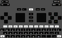
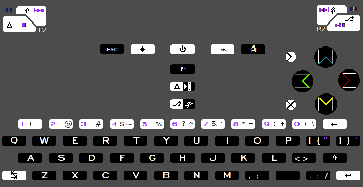
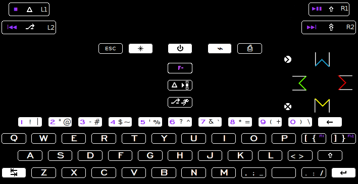
visible keyboard symbols:
http://www.keyboard-layout-editor.com/#/layouts/373a87c70b723f63738c146d7dc51255
Compared to CK's original, I moved F11, F12 up top instead of on Q and W (though I don't have a strong preference here). I also shuffled some of the AltGr+Number symbols. I wanted ' closer to S for possessiveness (Bob's apostrophe), moving `~ further in (to less prime territory). I also put / on AltGr+8 (mnemonic divide is the "opposite" of asterisk, or multiply); + on AltGr+7 (making + next to & for "and").
I also made it so there's only one AltGr (right Alt), compared to CK, to avoid WizardStan's confusion.
hidden symbols for a default AltGr:
http://www.keyboard-layout-editor.com/#/layouts/dd66b39c789c5e63527d1a629a5f4acd
I tried to put slanty-accents up in a nice direction from their vowel (e.g. ú is up and to the right of u). The exceptions are the accents on E, which correspond instead to the ', ", and ` AltGr marks. For people who would actually use those accented vowels, they should probably make the default template, but this is my suggestion.
I also moved CK's {[]} to {}[] so that {} would be next to each other, and [] would be closer to i, j, and k (for my own coding combos). But here no big preference. I also put ç on C instead of Shift+AltGr+0 or wherever CK had it. IMO this makes most sense.
For most of these non-visible changes (besides ç) I don't have a huge preference, so I don't mind CK's original positions.
Any people have qualms with no AltGr on the main keyboard? Does Ctrl+Alt suffice for AltGr? Certain symbols aren't available without it: | ' " ` ~ \ + / - = _ ?


