Conclusion / synthesis of the keyboard poll results


I helped writing the quickstart guide for the pandora. Redundant ways to type does not belong there, even if they are more efficient.
Use of the shoulder button modifiers is in no way redundant, and referring to it in such a way will only exacerbate the problem.

Obviously we can't force people to use them.    What we can do is encourage their use and persistently communicate their convenience, not just in the Quick Start Guide,  but on the boards and in the wiki as well.

-Neelix
 
It is in the way that matters redundant. Efficiency is a secondary concern both to quickstarting and changing convention.

Maybe if comma and dot was put on the right hand side this time that would change, but its on the proposed layouts a premise where all things stay the same.
 
It's not about "efficiency"  it's about "Getting to know your new device"  which is exactly what the Quick Start Guide is for.

-Neelix
 
You are proposing the idea of a new device as exactly that, in reality its a very deeply rooted set of expectations and habits shrunk to a smaller form-factor.

Because of human sociology.

We must know ourselves before we know what the quick start guide is capable of.
 
There will be some getting used to with the Pyra as it pertains to what key does what. I'm referring to users who aren't familiar with the symbols for Tab, Caps Lock, Backspace, and even Enter to a degree. Some learning is a requirement.

What we can be truthful about here is having two of the same class of modifiers(keyboard Shift and shoulder Shift) to type symbols is better than one(just shoulder Shift). It's about choice and overcoming the impulse to be stubborn to a fault. Braces ( and ) should be moved, if we gain from it more than we lose. Sure they aren't on Shift + 9 and 0 as they usually are, but ask yourself is anything on this layout where it's supposed to be? Nope.

If we look at ED's Layout 11 in the poll, it wasn't that ( and ) were moved that it was unpopular, but it's more valid to say it's because the symbols were sort of randomized(- above +, Acute and Grave locations on Backspace, Enter having a Fn value, French scattered about), Escape was put on Tab, and most grievously that it had two Tilde's.   ;)

That said, rumor has it the Pyra is also designed for gaming, but it is also a physically larger and wider device than the Pandora, which entails that the centered buttons and keys are even harder to reach now then they were for some users. So, here is the last of the series of changes I would of made to your layout, if I had a say in it's function over form paradigm: 

 13c: http://i.imgur.com/IyyAH4v.png

IyyAH4v.png
  • Keys that primarily deal with the display(Brightness, F11) are directly below it. I wouldn't mind moving Print Screen to Fn + Brightness(and put Pause at Fn + Escape) and then backlight toggle to Fn + Pyra. In a dark room, when you really want the keys backlit, this may be easiest to locate by feel. Putting Brightness and F11/F12 here also means you can use either thumb now.  :)
  • You don't necessarily have to reassign I and II to a backup Start and Select now, as those game controls are more reachable at the top right. I had urged ED to put Start and Select side by side in the middle like they are on game controllers, but that wasn't received well. It should give a measure of assurance though here in Layout 13c Alt and Ctrl are also on the shoulders. Probably much easier to use them than if Start and Select are columned in the middle.
 
Last edited by a moderator:
Some things not being something worse does not mean anything else should be too.

I dont get beyond the "isnt where its supposed to be", thats also where i lose interest.

But the space, that is pure benefit with any layout, no matter how you reasoning goes.
 
Last edited by a moderator:
Sorry, steps in for a bit. The wide space is not just for looks. Steps back out.
What sort of insight allowed you to arrive at whatever that is supposed to mean?
Really thought I was done with this. Doesn't matter what I say, all you going to do basically is "Nope, it isn't functional etc. I never had it in my hands, I just know." I'm sure repeating something like that will add votes to your side.The wide space button helps to differentiate from other keys.

Now we are arguing the placement of the shift on the shoulder button? What wrong with options, especially since you can change it? I might use it, Idk. I mean if it that serious, we can make all four shoulder buttons any keys.

I had urged ED to put Start and Select side by side in the middle like they are on game controllers,
Is there even room to do that?
Honestly, at first glance, I don't see nothing wrong with your keyboard, but still not enough for me to think we have to change it.
 
I actually explain it, not fully each time, but decidedly different from constructing arguments.

People vote knowingly on the side of singlespace. Ask them, i did. Or change their vote along the lines of reason, as a direct result of that.

What are you differentiating in a manner that not doing the same to enter does, or do you suppose that is the same benefit, whatever that may be?

The way i see it working differently is the button is floppy, interestingly in a way that makes the most efficient use (left side) floppy.

You can have Select Start in that orientation, but then no direct F11 button, which is important all of a sudden. Who knows, if it has been wrong before, people are very ok with it being wrong again.
 
Last edited by a moderator:
Okay, enough with the negativity. This forum thrives too much on it, and it attracts too many of this type to it(and it's had it's fill recently), so here's the real final layout I would of gone with.  ;)

13d: http://i.imgur.com/4LY29TL.png

4LY29TL.png

Except for the single keyboard Shift, which is why ( and ) are moved, I wouldn't of changed a thing here. For those who aren't planted daily in this forum, here is the post where you can witness the official Pyra layout, or here under this spoiler:

post-1-0-70447200-1438221847.png
 
Last edited by a moderator:
So now your space is different, and your shift and enter isn't. State a case where that helps.

How/what are you typing and what is the difference between the two ways of doing it?
 
Last edited by a moderator:
So now your space is different, and your shift and enter isn't. State a case where that helps.
Wide space helps differentiate from other keys. Idk why shift and enter size would effect that. :huh: I mean, it is unfortunate that the other keys are not as big as a wide space, but if we had (and did) to sacrifice

all big keys except one, that one would be (and is) the space key.
 
Thought I'd write a comparison.

13d: here.

4LY29TL.png
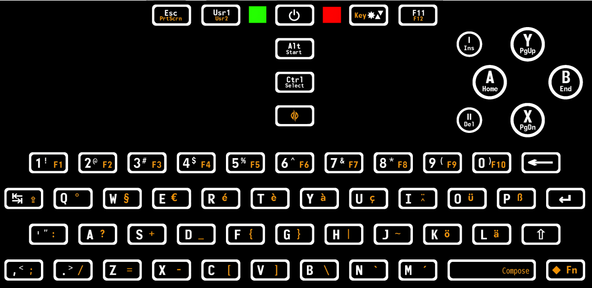
Current ED Pyra Layout: here

post-1-0-70447200-1438221847.png

Display Brightness

In 13d and the Current layout, pressing the brightness key increases illumination till it eventually loops to it's dimmest setting. Both layouts also utilize the Shift key to decrease brightness as well, and if using the shoulder button Shift on L1 both do this satisfactorily. On the otherhand, in the Current layout you cannot use the keyboard Shift located in the lower right corner with the brightness key, unless you set the device down on a flat surface like a tabletop or your lap, because this brightness key is on the upper right, the same side as your right thumb which is already tasked with pressing the keyboard Shift. In 13d though, the brightness key is centered below the display, which allows the owner to use both thumbs in tandem, with the left thumb on the centered brightness button and the right thumb on the lower right keyboard Shift if they need to decrease brightness.  

Keyboard backlighting

In 13d and in ED's layout this can be toggled by pressing the Fn key with the brightness key. Both layouts work well at this, but 13d also lends the customer the option to press keyboard Fn with the right thumb while the left thumb presses the brightness key. In the current layout, only the right thumb would be used to three level the keyboard backlighting, and it would have to be either a double push of Fn to lock it into Fn Lock mode or a repetitive single tap of right thumb on keyboard Fn then right thumb on upper right brightness button again and again till the correct setting is found.

Usr versus User and the bermuda triangles of the brightness key

In 13d, abbreviating the user definable key as it is on the Current layout to "usr" was thought unwanted and wholly unnecessary given the small print and the available physical space on the keycap. Similarly, an overloaded glut of tiny triangles and printing on the brightness key like on the Current layout was thought undesirable for 13d due to the fact it's a looping key, and like the letters, can be learned about in an instant(on how a Shift key decrease brightness).    

Braces ( and )

Like the previous above entries, shoulder L1 Shift in 13d and the Current layout can create these without issue. Unfortunately, the Current layout requires the owner to exclusively use only the Shoulder button to make them, since ( and ) are too far away for the left thumb to reach those buttons while the right thumb is pushing the lower right keyboard Shift. In 13d though ( and ) are placed on the Fn level and on the left half of the keyboard, so now they can be accessed with the left thumb while the right thumb is pushing Fn. A side bonus here is the label for the number O button will have a smaller Shifted symbol put on it °, which will give it a less cluttered look. 

Coder's Brackets 

While 13d and ED's layout involve every symbol needed to code with, the Current layout has notably moved some of the frequently used ones to the far middle of the keyboard. In 13d, { } are on D and F while in the Current they are toward the median on F and G, and in the former, [ and ] are on X and C, while in the latter they are farther from the edge at C and V. The pattern continues as 13d puts \ and | on V and G, while in the Current one they are on B and H, which are farther inward.

The + and the -

These two symbols in 13d are at Q and W while in the other they are staggered from each other on S and X. While also for coding, browser zooming employs - and + too. Some would say it's more a natural thumb arc to press X and then S, but the actual movement here and thus the pseudo benefit is negligible especially with the fact you'd have to relocate where + and - are since they are more inside at S and X rather than the edge like 13d has them at Q and W.

Select and Start  

Doubling as Control and Alt keys, these gaming buttons above the right nub near the face buttons in 13d demand less of a thumb stretch while playing your favorite emulator than they do with the Current layout which puts them isolated(and stacked vertically) in the middle. For Alt and Control shortcuts, in 13d they are far more reachable, and as per the table of keyboad shortcuts here, the vast majority of letters used with these modifiers, particularly the Alt key, are on the left half of the keyboard, so right thumb on either Alt or Ctrl can work together with left thumb on left half of the QWERTY, as an alternative to the shoulder Alt and Ctrl modifiers. 

We can cast doubts about it, muddle it, fool and avoid it temporarily but truth is incontrovertible, as you'll soon find out.  B)   
 
Last edited by a moderator:
Back
Top