God Ginrai
Godmaster
Wow, you really did reroll. XD
-God Ginrai
-God Ginrai
An Fn-Space roll is good enough if you need a single tab or maybe two. It gets annoying if you need many tabs in succession, like when you're indenting something, using tab completion a lot, doing alt-tab between many windows, and so on. It's a key you often need to press several times in a row, like backspace, arrows, space, etc. That's why it needs to have a dedicated key.Agreed. Fn-space just feels so intuitive as well, I might be inclined to say that I don't want a dedicated tab button, and I use tab completion all the time.I was able to roll my thumb on it like it was one button press.
Not that I wouldn't like or use a dedicated tab button, but given the choice between a dedicated button, vs using fn-space and using that button for pretty much anything else, I would choose fn-space and anything-but-tab button.
I do do these things and still have no issues hitting it in rapid succession. Maybe my thumb larger than yours.It gets annoying if you need many tabs in succession, like when you're indenting something, using tab completion a lot, doing alt-tab between many windows, and so on.
No issues, but is it as comfortable as a dedicated key? When I need to press tab multiple times, there tend to be spaces in between etc.I do do these things and still have no issues hitting it in rapid succession. Maybe my thumb larger than yours.It gets annoying if you need many tabs in succession, like when you're indenting something, using tab completion a lot, doing alt-tab between many windows, and so on.
In that point of view I own the very first prototype of the PyraMissed ED's post about using Askarus's shoulder mod idea in the Pyra. Hallelujah.
In a way, that's true. Really nice modding job actually. Thanks for indirectly working on the P1 successor.In that point of view I own the very first prototype of the PyraMissed ED's post about using Askarus's shoulder mod idea in the Pyra. Hallelujah..


A) is a bad idea, it is not user friendly to enforce blind typing. The keys have to be labeled. But I do think it's a good idea to not put Fn labels on all keys, even if they do have a default binding. E.g. maybe Fn+O could be mapped to ö by default, but maybe some people prefer to map Fn+O to ø or ° or whatever. If it is likely that over 50% of the people are not going to use the default mapping (either because they don't need the symbol or because they want to remap it to something else), then I think it's better to not label the key.OK, I confess: I was too lazy to read through the whole thread, but perhaps the keyboard should:
A.) be without any symbols on it (like this: http://www.hongkiat.com/blog/wp-content/uploads/keyboard/12.jpg)
B.)not with a mat for the keys, but single buttons (if affordable)
maybe both. Everybody can then build the layout themselfs (like LEGO somwhat)

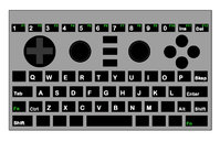
I prefer the number keys below the game controls and don't need a dedicated row for space bar and modifier keys. I always use the shoulder buttons as modifier keys, which is much more practical than keyboard keys that are competing for thumbs. Putting all those non-letter keys in the easy to find spots (the edges) is not a good idea.I've attached what I'd rather see as a default layout, does anyone believe that this would not be a significant improvement in keyboard layout / design when compared to the current prototype?
kb-layout.jpg
It's hard to comment here without knowing what's been fixed in terms of case design, but from my perspective the only real difference between this and the prototype layout is the 6 additional keys on the top row (1,2,3,0,ins,del) could the pegs not be placed below these keys to the left and right of the gaming controls?Mostly, yes. The keyboard layout above wouldn't even work hardwarewise - there need to be some pegs in the case to fix and secure the PCB as well as some other components. We can't use the full space.
Good point, the proposed layout was provided to give a general idea, exact spacings could be changed to prevent accidental key presses. By that I mean things like removing the key to the left of the Q + the backspace key could be done or everything could be moved down slightly.And the space between the gaming contols and the keyboard is too narrow here as well - you'd easily hit accidental keys when playing games.
Cramping stuff as much as possible isn't always useful.

