Final keyboard layout proposals - Discussion thread


How that sounds to a casual user:  "Press Pi to run, whatnow? to jump."

Edit: If the method of distinguishing buttons and where they are isn't better than actually pressing buttons you see where are to see what happens, then why?

Edit2: Oh, "omega, what button is that?"  "its the top button that looks like a _insert shape_"

However you want to describe the answer to that question, is the important information to convey.

Position for learning combos, colour for easy reference. A name that can be learnt isnt as important, but should still be uniquely distinctive. Not A B X or Y.
 
Last edited by a moderator:
Dog Cat Fox Hare.  Well maybe not Hare, they'd be the only non domesticated animal.  Are there any other three letter animals?  And which four different colors would go with them the best?
 
How that sounds to a casual user:  "Press Pi to run, whatnow? to jump."

Edit: If the method of distinguishing buttons and where they are isn't better than actually pressing buttons you see where are to see what happens, then why?

Edit2: Oh, "omega, what button is that?"  "its the top button that looks like a _insert shape_"

However you want to describe the answer to that question, is the important information to convey.

Position for learning combos, colour for easy reference. A name that can be learnt isnt as important, but should still be uniquely distinctive. Not A B X or Y.
As I've written in the other thread(s) that's why I'm still for

 B↖    B↑

B←              B→

B↙     B↓

Or something similar. It's unmistakable just like the F1-12 keys, and the ascii arrows are easily available in programming and aren't as confusing in old games with different labels than shuffled ABXY etc.., including the Pandora ports.

You can talk about it easily as B-Up, B-Down, etc... too.

Exchanging the directions with N, W, S, E, NW, SW would work too but I like the arrows more.

More arrows:

http://en.wikipedia.org/wiki/Arrows_%28Unicode_block%29
 
Last edited by a moderator:
This might be irrelevant in this use case, but beside numbers, symbols, animals or even letters, directions are the least friendly to altered button locations.  If the SNES's A button were called Right, then after the N64 moved it to the bottom if would be Wrong.  Of course we can confidently say that later EvilDragon handhelds will retain the four button star, but not every controller plugged into the Pyra will.

I know that it is simple right away to understand where an Up button is located in a star without looking for it, but I think that's really REALLY simple, and plenty of other things would also be sufficiently simple to find, assuming people don't have a prior layout that shares the same symbols but in other locations in mind.

Edit: Also arrows are damn boring.  Is the "I want this boring so I won't be embarrassed at work" argument any more valid than "I want this pretty/cute/cool so I'll enjoy it more"?  I don't know it might be.
 
Last edited by a moderator:
From the wikipedia, Pink Heart, Orange Star, Yellow Moon, Green Clover, Blue Diamond, and a Purple Horseshoe. They're magically delicious too.
 
"Just press Home to run, PgDn to Jump!" doesn't have as nice a ring as "Press Pi to run, Omega to jump."
It's a foul sounding ring in my mind.. Greek symbols are a horrible idea.
Constructive criticism might offer another alternative... ABXY doesn't work, IMO, since you don't get an A, B, X, or Y when you hit them. Greek letters don't have that problem, because I doubt people are expecting greek letters to appear when they hit them. Plus, why go with a Greek theme (Pyra/Pandora) if you can't have any fun with it?

As I've written in the other thread(s) that's why I'm still for

 B↖    B↑

B←              B→

B↙     B↓

Or something similar.
Seems kinda boring. Also wouldn't be very helpful looking if B-diagonal-up was "insert" and B-diagonal-down was "delete".
 
I still think that my "Greek Playstation-style" labels were kind of nice:

    Δ

Π     Ω

    χ

Clearly Greek, yet clearly Gaming, yet somewhat serious. With some imagination, you can even associate Π to "Home" (it kind of looks like a very simplified roofless home), Ω refers to "End" (being the last letter in the Greek alphabet), Δ refers to "Page Up" (as it points upwards) and χ does not really refer to "Page Down", but it does look a lot like a Latin X which is the Pandora label at that spot.

Anyway, I lost that battle so I should move on :)

As for what to do with the two extra action buttons: yes, in a sense Insert and Delete would be logical since they're also grouped with Home/End/PgUp/PgDn on a regular keyboard. On the other hand, that convention does not make that much sense, since Home/End/PgUp/PgDn are navigation keys while Ins/Del are editing keys, more related to Backspace, Tab, Enter than to navigation keys. Also, Ins is not really very frequently used, and many people can live without Del, so I'm not sure if we need dedicated keys for them.

While + and - also do not really belong with Home/End/PgUp/PgDn, at least they are often used for zooming in and out, which is a kind of "navigation". Also, I think + and especially - are important enough to deserve a dedicated key: "-" is a quite important symbol for coding, command line use (e.g. parameters), and natural language (hyphen, dash). The symmetry of + and - (which is slightly stronger than the symmetry between Ins and Del; in fact Backspace and Del would make a more symmetric pair) and the æsthetics of the labels "+" and "-" versus labels "Ins" and "Del" or "⎀" and "⌦" on action buttons is also something to consider. So overall, I'm somewhat more in favor of putting + and - there than Ins and Del (but I could live with both options).
 
As for what to do with the two extra action buttons: yes, in a sense Insert and Delete would be logical since they're also grouped with Home/End/PgUp/PgDn on a regular keyboard. On the other hand, that convention does not make that much sense, since Home/End/PgUp/PgDn are navigation keys while Ins/Del are editing keys, more related to Backspace, Tab, Enter than to navigation keys. Also, Ins is not really very frequently used, and many people can live without Del, so I'm not sure if we need dedicated keys for them.
Delete is routinely used by typists. On my Mac, I have to press Fn with Backspace to have it, because Apple thought the postion in the top right corner was arguably better for Power, which is pressed once or twice a day by the average user. How smart. As for Insert, not so much, but several on the forum wanted this as a dedicated key at the first level so for them it's worth it. Plus and minus would be good there, but then you have to find where to put Delete, and way above the keyboard up top or hidden under AltGr would be unfortunate. 
If you're not using Insert then you're missing out.  It's one of the more powerful keys on a modern keyboard.

http://en.wikipedia.org/wiki/Insert_key

Using Insert and Delete is part of the Common User Access standard too.

Common keyboard shortcuts {Stolen from http://en.wikipedia.org/wiki/Cut,_copy,_and_paste}


Cut

Copy

Paste

Generic/Apple

Command+X

Command-C

Command-V

Windows/GNOME/KDE

control-X / shift-Delete

control-C / control-Insert

control-V / shift-Insert

BeOS

alt-X

alt-C

alt-V

Common User Access

shift+Delete

control+Insert

shift+Insert

Emacs

control-W (to mark)
control-K (to end of line)

meta-W (to mark)

control-Y

vi

d (delete)

y (yank)

p (put)

X Window System


click-and-drag to highlight

middle mouse button
 
I ran through every keyboard thread to see if i missed something, and wb was onto something with this:

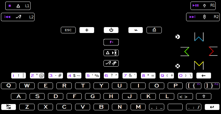
post-2326-0-65982400-1422828069.png


Pageup ^

home is <

end is >

PageDown v

(>) insert     (where home used to be)

(x) delete     (where end used to be)

http://boards.openpandora.org/topic/16822-explaining-keyboard-layout-proposals-update-refined-firstpost-space-fkeys-and-moving-keys/page-17#entry372055

I think functionally this works better with what actually goes on.

Sidenote consideration, it would be interesting to have insert and delete where F11 and F12 is now, just to have it close to shift, but that opens up more problems than it solves.
 
Last edited by a moderator:
I could actually live with that set of symbols and meaning for the 6 game pad keys.  The rest of that layout though... not so much.
 
Well thats some common ground. :)

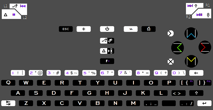
The shoulders have changed, so i updated to reflect it:

post-2326-0-82299600-1423355117.png


L2 is the leftmost one, so i figure ctrl is at home there. L1 is to the right of L2, so thats Alt on a regular keyboard

AltGr is R2, since its the rightmost one, R1 is shift since it makes regular letters bigger.
 
Last edited by a moderator:
I still think that my "Greek Playstation-style" labels were kind of nice:

    Δ

Π     Ω

    χ


Clearly Greek, yet clearly Gaming, yet somewhat serious.


[...]


Anyway, I lost that battle so I should move on :)
I am sorry to hear that you lost this battle. I suppose there was a poll somewhere...?


I do like these guys, probably better than mine. I'd just have to come up with a different symbol for delete, though. Oh nice, actually Psi be nice there. You know, trident blasting things to death, and that would be somewhat "symmetric" with Phi for Insert. (Phi/Psi are used in similar math equations.)

Φ     Δ

    Π     Ω

Ψ     χ

As for what to do with the two extra action buttons: yes, in a sense Insert and Delete would be logical since they're also grouped with Home/End/PgUp/PgDn on a regular keyboard. On the other hand, that convention does not make that much sense, since Home/End/PgUp/PgDn are navigation keys while Ins/Del are editing keys, more related to Backspace, Tab, Enter than to navigation keys. Also, Ins is not really very frequently used, and many people can live without Del, so I'm not sure if we need dedicated keys for them.


While + and - also do not really belong with Home/End/PgUp/PgDn, at least they are often used for zooming in and out, which is a kind of "navigation". Also, I think + and especially - are important enough to deserve a dedicated key: "-" is a quite important symbol for coding, command line use (e.g. parameters), and natural language (hyphen, dash). The symmetry of + and - (which is slightly stronger than the symmetry between Ins and Del; in fact Backspace and Del would make a more symmetric pair) and the æsthetics of the labels "+" and "-" versus labels "Ins" and "Del" or "⎀" and "⌦" on action buttons is also something to consider. So overall, I'm somewhat more in favor of putting + and - there than Ins and Del (but I could live with both options).
I agree almost completely with your logic, which is why I originally put +/- on the small buttons. My concern, however, is for typing mathematical things. If + is on the top small button, it is quite far away from all the other alphanumeric keys. If you want to type " + " (i.e. space + space ), your thumbs are going to be super windshield wipers. And the issue wouldn't be just combo-ing with space, but with other keys on the right side as well.


Personally, I would love to see del and ins on backspace and enter, since those functions match up quite well. But I would much rather have +/- close to other symbols, for easier math/coding. Thus I have gone with tradition (putting del/ins near home/end/pgup/pgdn), and put +/- on enter/backspace (http://www.keyboard-layout-editor.com/#/layouts/a5131c431fc90fb6866d548099e0fb78). In an ideal world, I would have two extra keys...
 
Last edited by a moderator:
I still think that my "Greek Playstation-style" labels were kind of nice:

    Δ

Π     Ω

    χ

Clearly Greek, yet clearly Gaming, yet somewhat serious.

[...]

Anyway, I lost that battle so I should move on :)
I love them. We can call them Triangle, Legs, X and Horse-shoe. With crossed-circle and pitchfork at the side.

If this is the final thread, has ED stated which of you lot's layouts will be used?

D.
 
That's even better! They should be named thus and included in the official documentation. Why have names based on alphabetic characters when you can have body parts instead? We'd be unique!

D.
 
If this is the final thread, has ED stated which of you lot's layouts will be used?

D.
Nope. Radio silence as usual. :)   

He'll likely switch some things around anyways in accordance with whatever restrictions(as of yet were never made public) that the Pyra layout required to be viable. The upside to the secretiveness of this topic is no choice will probably be made so none will feel they've been treated unfairly. For those of us spinning our wheels with our efforts to help, we can only hope some of the hard work from each will make it into the final product, which is enough.

I love them. We can call them Triangle, Legs, X and Horse-shoe. With crossed-circle and pitchfork at the side.
Or Skirt, Legs, Cowboy Legs and Toilet Line Legs.
Omega looks like Kenny from South Park.  ;)
 
Back
Top