Final keyboard layout proposals - Discussion thread


Askarus: why?

WB: Because its somewhat ok to stuff the dvorak users since that is a small concern, doesnt mean its ok to stuff the international users. The argument you make is one against starting the layout at different places.

If you type a language thats more than 26 letter alphabet you need those P+2 L+2 keys. There is no easy diactrics, if they were, people would use them.

I know you have the most hands-on with the pandora keyboard, but you are also the dvorak user, comparatively.

I have _heard_ about people using dvorak, i have talked to some. International users is half the userbase.

If laptop producers started removing those keys for all the international users they would sell no laptops. The pandora and pyra being a distinct and unique thing that can be sold merely on other merits alone, doesnt mean its ok to mess up there.

wb, your shift isnt close to your space and dot. Thats just worse.  Ok with tab, but ideally tab should be right-aligned too, because that makes it easier to use with d-pad. Operating dpad and tab with the same hand isnt optimal.
 
Last edited by a moderator:
If you type a language thats more than 26 letter alphabet you need those P+2 L+2 keys. 
They are vital, but you don't necessarily have to have those keys at P+2 and L+2, even if the presentation will be more appealing for some your way.
 
This is an out-there idea.  So far out-there that I didn't want to take time to make a layout for it yet.

Shift, Alt, Fn, Ctrl all have something in common - single press and release means little.  Yes, there are some things you can map to it - but hold with me a moment.

What if we were to put the 4 of them together in the bottom center row and register press-depress with no other key as space?
 
Askarus: why?
1:

Dvorak remapping is no argument for me.

We can't fulfill the needs of such a small minority.

2: Space is one button more to the middle on the Uncentered layout.

3: I think for me it will feel a lot more comfortable to have the letters centered.
 
Saber: yes they have to be there. Thats how a keyboard works. Thats how a typewriter works. Thats how people writing on machines work.
 
Askarus:
 
1. A layout that starts on the same place for English and multilingual or international users isn't a concern made to accommodate dvorak, thats just a side benefit of doing it the same for all.
 
2.  You did say you preferred his centered layout though... Anyhow, Space is the exact same leftmost key on saber centered and uncentered, same key it is on mine and most of wbs proposals. It just looks different because its written in ascii.
 
There are 12 keys on the bottom row, starting at the left, space is
 
wb 1: 11
wb 2 3 : 10 11
ck: 10
saber centered 1 and 2:  10 & 11
saber uncentered 1 and 2:  10
ible 1 and 2:  10 & 11
 
If we agree space on 11 is useless if you have 10, the only one where space is more to the left, you get it in the middle, which is not ideal, and also means there is no numberrow.
 
mrpalmtop : 6 & 7
 

or wb making a point 1 : 5 & 6 & 7 & 8
 
3. The letters arent centered moreso when writing German or Norwegian on a normal keyboard as opposed to English. Dont see how that is an issue at all. You end up having to use the full extension of the pyra keyboard left to right anyhow.
 
Last edited by a moderator:
I don't like the location of Saber's meta'ing for things like ä and Ö. I feel like those should be on A and O, respectively. Then again, I wouldn't use them often. I like _wb_'s placement of , and . being closer to spacebar for combos:

A 'centered' layout has the advantage that the number row is properly aligned. Also, Tab is in a slightly more standard position.

I would do it like this:

http://www.keyboard-layout-editor.com/#/layouts/658e08c2cfb797a4f1af2aaa6ae7865e

- Shift on the left

- Comma and period near space, for better combos

- In some window managers (e.g. default Ubuntu), Alt-Tab (R2+Tab) cycles between programs while Alt-grave (the key just above Tab on US-QWERTY keyboards) cycles between the different windows of the current program. So I like to put ` on the same key as Tab, for mnemonic reasons.
I'd want to move the shoulder shift over to the right shoulder if it lives as a key on the left-side of the keyboard:

http://www.keyboard-layout-editor.com/#/layouts/a5131c431fc90fb6866d548099e0fb78

Interesting point about ` and Tab, I don't have a huge preference either way, so I bow to your logic.

But with these better spots for ,; .:, I may prefer this over my uncentered one.
 
Last edited by a moderator:
I have _heard_ about people using dvorak, i have talked to some. International users is half the userbase.

If laptop producers started removing those keys for all the international users they would sell no laptops. The pandora and pyra being a distinct and unique thing that can be sold merely on other merits alone, doesnt mean its ok to mess up there.

wb, your shift isnt close to your space and dot. Thats just worse.  Ok with tab, but ideally tab should be right-aligned too, because that makes it easier to use with d-pad. Operating dpad and tab with the same hand isnt optimal.
Yes, you are right about the importance of international users and that's why I'm in favor of a left-aligned layout. But if Meta is on a shoulder button and Meta+AEUO has no label so it can be mapped to ÄÜÖ or ÅÆØ or ÀÉÙÔ or whatever you prefer, it's already a significant improvement compared to the Pandora. Probably not as good as having those keys to the right of P and L for some people. For me though, a dedicated compose key and some dead key diacritics like Meta+' and Meta+" to get áéíóú and äëïöü is more important (since every now and then I need all of those) than having three or four keys to the right of P and L.

Why does shift have to be close to space and dot? I prefer to use shoulder shift anyway, I would probably map the keyboard shift to Compose.

This is an out-there idea.  So far out-there that I didn't want to take time to make a layout for it yet.

Shift, Alt, Fn, Ctrl all have something in common - single press and release means little.  Yes, there are some things you can map to it - but hold with me a moment.

What if we were to put the 4 of them together in the bottom center row and register press-depress with no other key as space?
Interesting idea! Conceptually rather weird though, and it will be impossible to hold space down for a while, something that some software may rely on.

Askarus: why?
1:

Dvorak remapping is no argument for me.

We can't fulfill the needs of such a small minority.

2: Space is one button more to the middle on the Uncentered layout.

3: I think for me it will feel a lot more comfortable to have the letters centered.
1. Yes, we can if we want to, as some of the layout proposals show. Maybe we don't want to, but that's a different argument.

2. Relatively to the other keys, yes, but how does that matter? It's the absolute position that matters, since that determines ergonomics.

3. "Feel" more comfortable in the sense of ergonomics, or in the sense of psychology?

Anyway, we think we are moving in the right direction and to be honest I think that many of the current layout proposals would work well and be an improvement compared to the Pandora. Some things are ultimately just a matter of taste and habits, so we can keep discussing forever about those.

Maybe at some point we should just do a final poll, where all proposals are put to a vote, but please let the question be "Which of these do you consider acceptable?" (with checkboxes) and not "Which of these do you prefer?" (with radio buttons).
 
1. Yes, we can if we want to, as some of the layout proposals show. Maybe we don't want to, but that's a different argument. 2. Relatively to the other keys, yes, but how does that matter? It's the absolute position that matters, since that determines ergonomics. 3. "Feel" more comfortable in the sense of ergonomics, or in the sense of psychology?
1: In my opinion it's not necessary. It should not be the argument to make a decision.

2: That's a strange layout. Was one key added?

3: It's my Personal opinion.

Nothing scientific.

Why I like Saber's layout is also because it has German öäüß.

As I am German and it's a German product it's somewhat important for me.

It is all a matter of personal preference and what I'm used to.

For me the big argument for any centered layout is that on a standard Keyboard there in Tab and Shift on the left besides the letters.

That's all I want.

The more Similarities to a standard Keyboard we have the more intuitive it is (at least for me).

I know your approach is somewhat different.

You have great knowledge of how often buttons are pressed and which ones are important for writing, programming and so on.

Saber's centered layout is the one for me I can look at and I somewhat feel familiar to it (maybe Pandora bias).

The buttons are where I expect them (except space but as it's double sized I won't overlook it).

For me that's more important. The position of Shift and Tab and ESC (and all the other stuff like that).

In my opinion we don't need a Keyboard for the fastest typing experience but one that's easy to get used to and is as near to what majority of people is as possible.

In the end that thing has to be sold to someone.

And for me the Pyra is not a Gaming and computer nerd only machine.

I would like to see it more in business (like hmc uses it) or at schools.
 
Shift has to be close to dot and space because the combo is   dot space shift. Each time you want to start a new sentence.

In sabers centered versions, space is nr 10 and 11. How is that any different for the right thumb than the exact same nr 10 on the bottom row?

you use dot and comma an awful lot, extending the left thumb all the way over there means you spend more time at full extention than the relative positionshift of a would do.

Every other layout "has" öäü by default too, you press ^ and then o a and u. Thats the keyboard standard. Its never meta+something. Also, shoulders are an unfamiliar concept to regular people. And its not self-explanatory.

Having the german letters available where they are in the german layout is easiest, better and more familiar. It is the keyboard/typewriter standard.

Ok, so there is no shift on the left side, but then again thats less effective, as mentioned.

Putting symbols all over the keyboard has nothing to do with regular keyboard practice.

Actually imagine using the layout. Hold your pandora, pretend typing something, and notice the difference by looking at it like a cheet-sheat. Also, ask regular people. You will get rid of the pandora-bias really quick.
 
Last edited by a moderator:
Shoulder buttons are not self-explanatory indeed, so I really hope they get labels that are more descriptive than only L1, L2, R1, R2.

Every key/button should be labeled with their "keyboard" function, including the action buttons and the shoulder buttons.
 
Every key/button should be labeled with their "keyboard" function, including the action buttons and the shoulder buttons.
Uh, that's gonna look really ugly on the action buttons.  I wonder if they're going to be imprinted with their labels again too, hah.
 
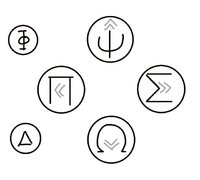
Maybe we can't write Home/End/PgUp/PgDn, but maybe we can have little arrow thingies with Greek letters:

PyraButtons.jpg

If we choose Insert/Delete for the small buttons, Phi looks like an vertical cursor position for insert, and Delta for delete. Otherwise we could use +/- if we go with _wb_'s small buttons.
 
Last edited by a moderator:
Every key/button should be labeled with their "keyboard" function, including the action buttons and the shoulder buttons.
Uh, that's gonna look really ugly on the action buttons.  I wonder if they're going to be imprinted with their labels again too, hah.
According to the polls, Greek letters unfortunately don't get a majority.

In my proposal (http://www.keyboard-layout-editor.com/#/layouts/1c67359aba7c88ff21de298fe8829e89), the main symbols would be arrows, which are (somewhat) standard symbols for Home/End/PgUp/PgDn:

    ⇞

⇤     ⇥

    ⇟

I think this does not look ugly, in fact I think it looks quite nice.

While most PC keyboards use "Home", "End", "Page Up", "Page Down" (or translated versions of that, e.g. "Pos 1", "Ende", "Bild ↑", "Bild ↓" in German), international Apple keyboards use the above symbols for PgUp and PgDn, but they use ↖ and ↘ for Home and End, which does not look nice imo in the cross-shaped Pyra button layout.

For backwards compatibility with the Pandora, there could be smaller ( A ), ( B ), ( Y ), ( X ) labels in addition to that. Personally I'm not in favor of adding those Latin letters, but I'm probably in a minority.

See also: http://xahlee.info/comp/unicode_computing_symbols.html

AFAIK the action buttons will get the same kind of labels as all the other keys, so they can also be backlit.
Greek letters were a well avoided travesty.

However, I -do- like the PgUp, PgDn, Home, End arrows as noted above.  It's a nice clean look and easy to remember what they're doing.

Insert and Delete really DO belong in the Page Up, Page Down, Home and End set though.  I think they're ideally suited for the additional 2 game pad buttons.
 
Ugh, this is another place where the majority is in the wrong. Pandora / Pyra are both from Greek mythology.
 
Ugh, this is another place where the majority is in the wrong. Pandora / Pyra are both from Greek mythology.
Arbitrarily selected Greek letters have no inherent meaning to state their function on a computer keyboard.  Page Up, Page Down, Home, End, Insert and Delete symbols do.

Understandable function wins.
 
Last edited by a moderator:
Pandora / Pyra are both women,  Insert and Delete should be boobs.
 
I agree there are extra utils in calling them by their computer-functions, but it's less cool in your awesome home-developed Pyra video game.

"Just press Home to run, PgDn to Jump!" doesn't have as nice a ring as "Press Pi to run, Omega to jump."

As seen in my graphic, you still get arrows to show directions.
 
I agree there are extra utils in calling them by their computer-functions, but it's less cool in your awesome home-developed Pyra video game.


"Just press Home to run, PgDn to Jump!" doesn't have as nice a ring as "Press Pi to run, Omega to jump."


As seen in my graphic, you still get arrows to show directions.
It's a foul sounding ring in my mind.. Greek symbols are a horrible idea.
 
Back
Top