Will Pyra have a double sized space bar?


I honestly do not see the advantage of wasting a key in order to obtain a larger space key. Esthetics? Looking more like a Pandora?

Ergonomics or functionality are certainly not an argument: whether the key is one or two units wide, it is still only within reach of the right thumb and the way to find it will still be "hit the penultimate key on the bottom row", not "find a larger-than-usual key somewhere and press it". On the very first use the visual clue of a larger space key could make a tiny difference in the learning curve, but I think that is a negligible difference compared to all the other things you'll have to get used to anyway. Yes, maybe you win 2 seconds trying to find space on your very first use. You'll lose much more time in the end by having to live with one less key.

The disadvantages of a double-wide space key are clear: one key is wasted (if you think that is a small price, then please tell me which key you would like to lose. Shift? Tab?) and it becomes impossible to map some keyboard layouts.

Also, consider the scenario where there would (eventually) be two versions of the keymat, one with a single-width space key and one with a double-width space key. Then if we have a case which fits the single-width keymat, then to make it work with the other keymat, you just have to manually remove the separator (presumably with a cutter knife and some time it would be possible to do that relatively cleanly). If the case fits the double-width keymat, then you have to manually create a separator, which is impossible to do in a clean way.
 
From here:

The main PCB

Nikolaus was mostly working on the display PCBs, so the progress on the main PCB was slower, as you can imagine.

It's still nearly finished - but that 'nearly' are the last percent that always need a lot longer than the rest.
I don't want to derail this but as you said the PCB is nearly done and I feel it's the last chance to ask you to consider this. (Edit: Being able to split the two pads of the space key by desoldering a connection and soldering another one and having an unused keycode for the other pad in the driver.)
No need to worry. There has always been a 0R resistor (0402 dimension) for exactly this purpose :) It can either connect both meanders to a single matrix position or add the meanders to different matrix positions.Sometimes we can identify through our crystal ball what the community would like to have :)
What I'd like to know though: How well does it work to split the spacebar yourself? (With a scalpel or a dremel or whatever tool suitable for the keymat material.)
 
Last edited by a moderator:
I honestly do not see the advantage of wasting a key in order to obtain a larger space key. Esthetics? Looking more like a Pandora?
Why do you think we have a space bar on normal full sized keyboards?

Same reason for PYRA, i.e. usability / ergonomics, as space is one of the most commonly used keys it makes sense to give it double width to make typing easier IMHO. 
We have a long space bar on normal keyboards because on normal keyboards, you type with your fingers and you use your thumbs (both of them) for space. It has to be large to make it an easy target for both thumbs. It also has to be centered.

There is no way to make the space key/bar on the Pyra an easy target for both thumbs. You could have a centered double-width key (as in Grench's proposal), although that puts some rather severe constraints on the rest of the layout, but even in that layout, it is not an easy target for both thumbs. It would rather be a reachable but not very easily reachable for either thumb. To make it really an easy target for both thumbs, it would need to be centered and at least QUADRUPLE-width, like on regular keyboards.

By the way, on a normal keyboard, Shift, Enter, Backspace, and Tab are also wider than normal keys. Why is everyone insisting on a long space bar but not on big Shift, Enter, Backspace, and Tab keys?
 
All my phones had a large spacebar so far as well, some also only on the right or left side.

And those REALLY were in need of more keys...

Besides, AFAIR we had a poll about double or single-width spacebar already, and the double-width won.

So why discuss again if the majority was in favor of it?
 
The polls will only end with the release of the Pyra, I guess.
2 polls™


​ Oh and double width is quite nice in my opinion.
 
Besides, AFAIR we had a poll about double or single-width spacebar already, and the double-width won.


So why discuss again if the majority was in favor of it?
Good question.  I noticed the earlier poll after I made mine, my bad.


I can retroactively argue that people should consider the current proposed layouts and make double-sure what they really felt looked right ;) .  Or of course, throw their own idea into the mix.
 
Also, I wonder if comradekingu's post from another thread might be appropriate to ask here:

im unsure who i answered, but i agree having a doublespace means less choice. Especially since you then make a case thats missing a set of dividers.

With a case that has all dividers, It would be possible to file away the seperator between two buttons and doing a doublewide keymat. But once the case is doublewide, its much harder to do a single-width solution. Or move the space at all.
So the question is, does the case have a double-wide or single-wide key space (with of course the double-wide spacebar on top)?  Just thinking about making it easier to mod, if possible.
 
Last edited by a moderator:
Make the issue concern anything more than the spacebar itself and the cookie crumbles in an entirely different manner.

How it works vs how familiar it looks at first glance.
  1. bullet_star_rated.png
    Functions more like a 2thumb keyboard, looks less like a 10finger desktop keyboard? (18 votes [64.29%] - View)

  2. Looks more like a 10finger desktop keyboard, functions worse as a 2thumb keyboard? (4 votes [14.29%] - View)

  3. I dont know. (6 votes [21.43%] - View)

If you just ask if the spacebar should be a spacebar, that is a logical fallacy that doesnt question the inherrent design-decision to be made, and it doesnt give the voter any insight into the matter.

Yes there are keyboards that feature a non-centered space that has made it a large key. Is it in those cases also in error, very much so. For the same reasons wb mentions. There is no special clause to doing the same thing wrong in the past.
 
Last edited by a moderator:
A double with space bar is not because of tradition.

I have an 7 Year 18" Laptop and it has a normal Keyboard.

All the new Laptops have for example an Enter Key that is only as high as a normal key.

It pisses me off so much as I never hit that button. also the shift key is smaller there as well.

It is important to have the mayor keys (and space is one in my opinion) on a position it's hard to miss them like the Fn Key on Pandora as it's on the edge or to be bigger like the space bar.

you are used to Pandora and it's keys.

Bit imagine someone who is not familiar to it.

Confused because of the all the Fn keys.

Confused because Enter has and Shift have the same form factor as every ordinary key.

Confused because hidden mouse movement and clicks.

Don't confuse people even more by make them search the space bar.
 
I have an 7 Year 18" Laptop and it has a normal Keyboard.

All the new Laptops have for example an Enter Key that is only as high as a normal key.

[...]

you are used to Pandora and it's keys.

Bit imagine someone who is not familiar to it.

Confused because of the all the Fn keys.

Confused because Enter has and Shift have the same form factor as every ordinary key.

Confused because hidden mouse movement and clicks.

Don't confuse people even more by make them search the space bar.
You're confusing discoverability and familiarity.
As long as the space key is clearly labeled and located near a "typical" position, it should(!) be rather discoverable.

Frustration, on the other hand, can arise if the key suddenly differs from what you're used to. If you're familiar with big Enter keys on standard keyboards, it can be frustrating to write on a keyboard with a smaller Enter key. This is not dependent on discoverability of the key though, since you already know about the key. To someone who is used to small Enter keys, it can also be frustrating to write on a keyboard with a bigger Enter key, such as when accidentially pushing the Enter key instead of another key that was expected in the same position. This is actually a thing, have a look at the different Enter keys in British and American keyboards, for instance.

I'm not advocating for or against a smaller space key on the Pyra, but you should consider this.

That being said, you should also know that you can never really know for sure which solution is more usable unless you observe people actually use it. Also, remember that the experience of typing on a full-size keyboard doesn't really carry over to typing on such a small keyboard, other than in things such as the rough position of the characters.
 
That being said, you should also know that you can never really know for sure which solution is more usable unless you observe people actually use it.
I observed people 3 Years on Gamescom Fosdem and anywhere else I showed the Pandora.

No one had problems findeing the space bar but enter was harder to find.

Also, remember that the experience of typing on a full-size keyboard doesn't really carry over to typing on such a small keyboard, other than in things such as the rough position of the characters.
The experience you have with one device influences what you expect from further devices.

If the space bar shares some similarity between Pyra and a standard keyboard it will make it mire intuitive and easy to people who are used to a standard keyboard to get into it.
 
Did read your post about the menu button on the other thread.

This is arguable, but most people probably won't be invoking game-pausing menus insanely often. In that sense, it isn't usually really important whether the menu key is extra big. That is, as long as the user /knows/ which key will invoke the menu. The space key is not necessarily the first key a user will think of when it comes to, say, exiting a software. What's worse, when the user is using the software for the first time, then maybe she doesn't even know what would be found in that menu, or that the menu even exists. An important part of usability is to make sure that the user's imagination of how a system works does not mismatch the actual workings of the system in such a way that it will lead to results that are undesired by the user (see, for instance, How Can Mental Models Be Applied in Software Design?). This can be achieved through a variety of measures, and one of them is familiarity. So, it makes sense if a game-pausing menu is bound to, say, the "Start" button, because that's typical on gaming consoles.
Usability is exactly why I would argue for a double sized space bar.

It makes it more easy to get into it and to carry over the experience one has with other keyboards.

Besides I would also argue to make the Enter key a little different and to somehow highlight ESC and TAB.

That's the buttons I observed where searched at most.
 
Last edited by a moderator:
I observed people 3 Years on Gamescom Fosdem and anywhere else I showed the Pandora.

No one had problems findeing the space bar but enter was harder to find.
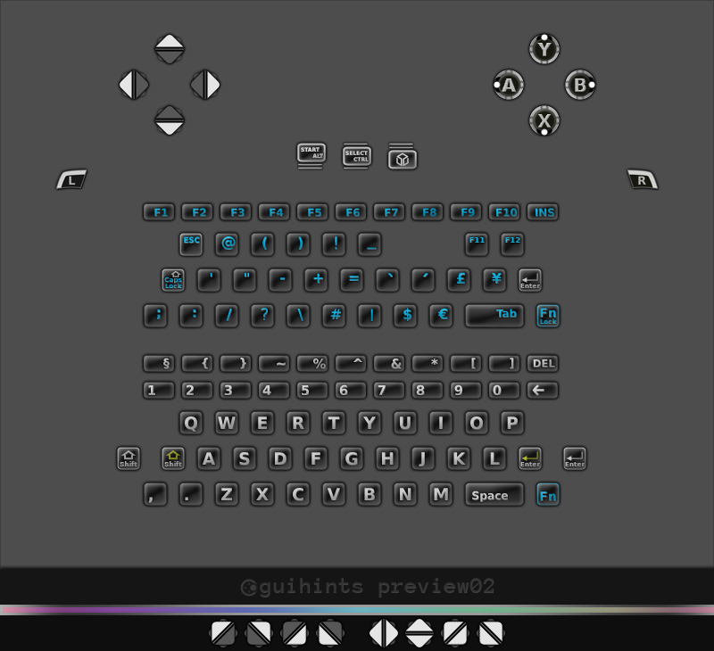
That's helpful information. Maybe it would make sense to actually give the Pyra's Enter key an appearance that differs from the other keys at first sight, without giving it different physical properties.
As an example, look at how in guihints, I've given certain "function-type" keys a bright outline to facilitate interpretation, one of them being the Enter key:

guihints-preview02.png


For the actual physical keys of the Pyra, this may or may not be a sensible approach. This probably depends on the specifics of the keymat production, and the means of design that it allows for. Do you happen to already have any information on that which you could share?

By the way, if you've made more of these observations while observing people using a Pandora, not just limited to experiences with the keys and buttons, but also similar experiences that people have had with the rest of the hardware, or maybe even with popular software on the Pandora, then I'd be very happy if you wrote them down somewhere, such as in a new thread. (Of course you can also send me a PM if you feel like you'd be able to express your observations more precisely in German.)

The experience you have with one device influences what you expect from further devices.

If the space bar shares some similarity between Pyra and a standard keyboard it will make it mire intuitive and easy to people who are used to a standard keyboard to get into it.
I understand that, and I think that we're generally thinking alike here. Nonetheless, just making a differentiation between discoverability and familiarity is important here, if only so that people understand the problem better.
 
Last edited by a moderator:
Sorry Askarus, I hadn't seen your latest post. Personally I'm still not advocating for or against a changed Space key, and, like my previous post says of course, I agree with the highlighting aspect and would still love to hear more about your observations (in a new thread or via PM).
 
Last edited by a moderator:
A double with space bar is not because of tradition.

I have an 7 Year 18" Laptop and it has a normal Keyboard.

All the new Laptops have for example an Enter Key that is only as high as a normal key.

It pisses me off so much as I never hit that button. also the shift key is smaller there as well.

It is important to have the mayor keys (and space is one in my opinion) on a position it's hard to miss them like the Fn Key on Pandora as it's on the edge or to be bigger like the space bar.

you are used to Pandora and it's keys.

Bit imagine someone who is not familiar to it.

Confused because of the all the Fn keys.

Confused because Enter has and Shift have the same form factor as every ordinary key.

Confused because hidden mouse movement and clicks.

Don't confuse people even more by make them search the space bar.
Ive never seen someone unable to use a regular T9 keyboard, which was standard issue on cellphones for well over a decade.

T60 user here. I would never change the functional ISO layout of a regular keyboard, keeping with the expectations of how it works and functions however does not also apply to how its designed for 10 fingers.

Try actually showing someone who isnt already in the loop the different layouts. You will be suprised. Space is not the pressing issue, filling it up with noise is.

Edit: Then as now, people dont want to read instruction manuals. And if it has to be in there, the battle is already lost.
 
Last edited by a moderator:
Back
Top