Unofficial Keyboard Layouts


The user configurable color LED backlighting should look very cool coming up through those translucent key tops.  The central 12 key pad needs to be made whitish - and same with the game controller pads.  Everything but the nubs themselves should glow under backlight - and those should have glowing circles around them.
 

OH NOES KILL IT WITH FIRE!!! THE HORROR! IT BURRRRRNNNNNSSSSSS!!!
 
I reluctantly submit Spacebar becomes a normal sized key. This will allow the migration of all symbols to the east of the letter "P"
 
/me thinks the space-bar should be al least twice as wide as other keys.
Does it mean if the Pandora Spacebar shrunk to only one key, you and others would find it "difficult" to press Binky?
 
Nah, I think we just think it'd be more useful to actually add another column of keytops. Kinda solves the problem more easily :)
 
The user configurable color LED backlighting should look very cool coming up through those translucent key tops.  The central 12 key pad needs to be made whitish - and same with the game controller pads.  Everything but the nubs themselves should glow under backlight - and those should have glowing circles around them.
 

OH NOES KILL IT WITH FIRE!!! THE HORROR! IT BURRRRRNNNNNSSSSSS!!!
You could, of course, simply turn the backlight off or to a very dim white light setting.

Something to note - If you use a blacked-out keyboard where the letters let the light through with multiple maps on each key, color coding those alternate mappings on the key tops becomes impossible.
 
The user configurable color LED backlighting should look very cool coming up through those translucent key tops. The central 12 key pad needs to be made whitish - and same with the game controller pads. Everything but the nubs themselves should glow under backlight - and those should have glowing circles around them.

OH NOES KILL IT WITH FIRE!!! THE HORROR! IT BURRRRRNNNNNSSSSSS!!!
...and fires shall rage and the seas will boil and and and...

A plus is no Pyra will go unnoticed from deep space.
 
Last edited by a moderator:
You could, of course, simply turn the backlight off or to a very dim white light setting.
 

Unless it simultaneously removes the ugly pasty translucent-ish plastic that translucent keys has to be made from, it does not solve the problem.
 
About the speakers: would it be an option to put them somewhere on the outside? That is, not next to the screen, not on the top of the base, but somewhere on the sides or at the back (preferably in a spot that doesn't get covered by your fingers when you hold it)?

That way we don't lose valuable lid or base area, and you can also use the device to listen to music (through crappy speakers, but sometimes that's ok) without headphones while the lid is closed.

Also, my proposal was only about the number of keys and their layout, not about the colors or where exactly the labels would be positioned. The numeric pad between the nubs is not essential if there already is a number row. It would be quite practical if you use the Pyra as a calculator or when entering numbers in a spreadsheet.
 
About the speakers: would it be an option to put them somewhere on the outside? That is, not next to the screen, not on the top of the base, but somewhere on the sides or at the back (preferably in a spot that doesn't get covered by your fingers when you hold it)?

That way we don't lose valuable lid or base area, and you can also use the device to listen to music (through crappy speakers, but sometimes that's ok) without headphones while the lid is closed.
The other obvious option for 'where to put the speakers on the Pyra' is in the front edge left & right of where the Pandora's SD card slots are. Pretty much where the Pandora's headphone jack and volume wheel are.

The SD card slots can be moved to the left or right side on the Pyra. Although someone could, in theory, need to use an SDIO card that extends beyond the slot lip - good luck finding one.

Also, my proposal was only about the number of keys and their layout, not about the colors or where exactly the labels would be positioned. The numeric pad between the nubs is not essential if there already is a number row. It would be quite practical if you use the Pyra as a calculator or when entering numbers in a spreadsheet.
The numeric keypad could simply be moved above the nubs & game controls - just like the Pandora. The Pandora was a 3+1 key row device. The Pyra could be a 4+1 key row device using 3/4 sized keys. The Pandora's keys always felt largish for the device. I think 3/4 sized keys would be fine.
I -do- think that having glowing white keys with Black, red, blue and green symbols printed on the key caps would be really freekin' cool and retro looking.

My TV came with a remote kind of like that. http://www.ebay.com/itm/Original-Genuine-Samsung-BN59-00996A-TV-Remote-Control/221222850647

It's VERY usable in the dark.
 
If you use a blacked-out keyboard where the letters let the light through with multiple maps on each key, color coding those alternate mappings on the key tops becomes impossible.
How so?

Why cant the keys be painted with spots of translucent coloured paint, then a black stencil?
 
The Pyra could be a 4+1 key row device using 3/4 sized keys. The Pandora's keys always felt largish for the device. I think 3/4 sized keys would be fine.

I -do- think that having glowing white keys with Black, red, blue and green symbols printed on the key caps would be really freekin' cool and retro looking.


My TV came with a remote kind of like that. http://www.ebay.com/itm/Original-Genuine-Samsung-BN59-00996A-TV-Remote-Control/221222850647


It's VERY usable in the dark.
My belief is the Pyra keys will be updated versions of the same ones the Pandora number row employs. About the correct fit I deduce for four staggered rows under the gaming controls and ample enough to be comfortable for most.

Green symbols for shifted options and neon blue for Fn sounds delightful however fanciful.
 
One interesting idea of using primary coloured filters over the option text and configurable backlight colours means that, say you had the FN text in blue but the default backlight colour was yellow, it would not be lit, but switch the backlight colour to blue (or cyan, or magenta pink) when the user pressed FN and they would magically appear in blue.


Course that would only be so distinct in complete darkness, but still it might be neat if it were possible to have the FN text with a primary coloured filter behind it. That's of course if we have backlighting at all, which I'm personally not convinced about.
 
Here's a mockup of how my ideal Pyra would look like:

mockup.png
That looks great! I think black keys with white characters would be slightly more pleasing to look at though. Important with construction for tiny and flat keys like this is that it not easily possible for the keys to stick or get jammed. 
Hey I know that picture from somewhere... pls someone give me a hint =D

Doh ! I wont have much time left for keeping those concept arts updated from now on again =S

(Just lacking the time)

EDIT : If you need a 2 Dimensional few of something like this just let me know =)
 
Last edited by a moderator:
Get rid of the double wide keys (space), it is a waste of space. 1.5x wide keys are ok on the ends of an offset row, I don't think half width keys are a good idea.

I think a uniform array of keys where each row is offset half a key from the next would be the most flexible solution. keys could be defined any way necessary for any language.
 
I'd rather the base layout and shifted layouts were standard with international stuff behind an unmapped modifier. Let me explain why.

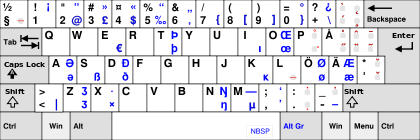
This is the finnish keyboard layout:

420px-KB_Finnish_Multilingual.svg.png


Notice first the Alt Gr in the place of right alt. That is a modifier key that shifts to the right hand side blue characters. Also notice all the dead keys on the right (red).

Now, consider an application saying "next weapon is mapped to ]". Which of the following works?

1) ä,  2) AltGr-9,  3) both,  4) neither

The answer is: depends entirely on the application. I've seen all of the above.

Now consider a common "console key", tilde (~). Which of the following works?

1) §,  2) AltGr-¨,  3) both,  4) neither

The answer is: usually § or neither.

Now see all the stuff in messed up places and behind AltGr. I've seen applications that try to do their own keyboard handling that are not able to produce any of the characters behind AltGr. It wouldn't usually matter if it was just ÅÖÄ behind it, but @, |,  $, ;, :, [, ]?

Many times I've had to just live without some keybindings or shortcut keys.

This is why, for consistency, I propose keeping the base and shifted layout the same for everyone, with any user-dependant characters behind a user-mappable modifier key.

EDIT: One could say "Why not only map the few characters? You don't need to remap all the keys!", but then the question becomes: "Where do the overridden characters go? Behind another shift?"
 
Last edited by a moderator:
Here is a variant of the layout I proposed above:

layout.png
Looks great, but decreasing the Pandora key size would make the keyboard uncomfortable for me.This layout would increase the Pandora width from 14 to at least 17 cm.

That is really too much in my opinion.
 
Here is a variant of the layout I proposed above:

layout.png
Looks great, but decreasing the Pandora key size would make the keyboard uncomfortable for me.
This layout would increase the Pandora width from 14 to at least 17 cm.


That is really too much in my opinion.
From the above proposal you could take away one column of keys by removing some keys like Meta, dedicated Insert, and by putting Fn on the left and removing Ctrl or Alt (remember, Ctrl and Alt are also shoulder buttons and Start/Select). Then the layout is only 14 columns wide, which is only 2 columns more than the current Pandora layout. If we just reduce the spacing between keys by a fraction of a millimeter, we're already there, you probably don't even have to make the keys themselves any smaller.
 
1) no half width keys

2) no keys wider than 1.5 of standard

3) no more than two 1.5 width keys per row (on the ends)

4) no extra space between any pair of keys
 
Back
Top