Silent-Hunter
Hardcore Member
- Joined
- May 29, 2010
- Messages
- 3,485
Perhaps have more than one colour choice then? I like the blue.
I'm pretty sure that molding technics exist to use various colours with one and the same mold. Everything else would be extremely unprofitable. Imagine LEGO needs one mold for every colour one and the same brick can have.^ needs different moulds because the plastic behaved differently with different dyes
That is a valid concern, not because it is necessarily true, but because it could be.^ needs different moulds because the plastic behaved differently with different dyes
If this is the case, and ED wants to offer multiple colors, later runs of can be done in other colors and available to those who want them. Alternately, maybe do one color per year after testing to ensure it meets the standards.That is a valid concern, not because it is necessarily true, but because it could be.^ needs different moulds because the plastic behaved differently with different dyes
Once a mass production colour is known to hold, use that for the entire first production run?
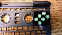
Just nudge the top 3 buttons to the right a bit. Looking back at the past arrangement, the spacing is much better here.Here's my first attempt at the 6-button mockup. The buttons are slightly out of place, but even this feels pretty good when I use it:
http://t.co/2smkj5kjob
-God Ginrai
I'm happy that you can begin. Most user comforts will require keeping the first four buttons in a perfect cross. You should use DS Lite sized buttons for the other two, to easier allow this. I keep thinking I'm seeing the word charizard in my post and having to change it.Here's my first attempt at the 6-button mockup. The buttons are slightly out of place, but even this feels pretty good when I use it:
http://t.co/2smkj5kjob
-God Ginrai
I was thinking more if the (Y) and the lower (B ) were aligned 45 degrees of one another and both were nudged very little to the Northwest.Just nudge the top 3 buttons to the right a bit. Looking back at the past arrangement, the spacing is much better here.Here's my first attempt at the 6-button mockup. The buttons are slightly out of place, but even this feels pretty good when I use it:
http://t.co/2smkj5kjob
-God Ginrai
I see what you are saying, but I was keeping this in mind.I was thinking more if the (Y) and the lower (B ) were aligned 45 degrees of one another and both were nudged very little to the Northwest.
remember the new Nubs have a shroud on the under side to keep it from falling out. this shroud is larger than the hole for the Nubs and my guess have a few millimeters of throw when moved into a specific direction.
Is this shroud the black disc the nub adheres to as shown in the Pyra Prototype video? It does look like this platform moves around a bit independent of the nub.I see what you are saying, but I was keeping this in mind.I was thinking more if the (Y) and the lower (B ) were aligned 45 degrees of one another and both were nudged very little to the Northwest.
remember the new Nubs have a shroud on the under side to keep it from falling out. this shroud is larger than the hole for the Nubs and my guess have a few millimeters of throw when moved into a specific direction.
It is the lower part of the black disc.. I called it a shroud for a lack of a better term for it. As you can see it's a bit larger on the section that resides under the case so it doesn't pop off. Thus these new nubs require a bit more space underneath than the Pandora Nubs.. If the claims are true, these nubs are vastly superior to the Pandora nubs in respect of quality and accuracy so it's worth the hassle.Is this shroud the black disc the nub adheres to as shown in the Pyra Prototype video? It does look like this platform moves around a bit independent of the nub.


