The case of the case.


And if he isn't able to, who cares?
This is your first time being around humans, isn't it?People care. They don't need a reason, they will get flustered about the most arbitrary of things and no one really knows why.
 
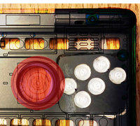
Attached is an image based on the latest layout and the 3D case data.

The red area is the nub movement area of the lower disc.

Also, it seems from the picture that the buttons are VERY close together... they look the same as Askarus mod, which caused me to make accidental button presses whenever I wanted to quickly only push one or two buttons at the same time.

Conflict.jpg
 
Attached is an image based on the latest layout and the 3D case data.


The red area is the nub movement area of the lower disc.


Also, it seems from the picture that the buttons are VERY close together... they look the same as Askarus mod, which caused me to make accidental button presses whenever I wanted to quickly only push one or two buttons at the same time.

attachicon.gif
Conflict.jpg
Not to drum on about it as I support you either way ED, but your transparency unequivocally shows you could move Select next to Start on the Pyra without infringing on the nub's underside platform. Like letter's V and B are easier to press than letter G, Select and the Start buttons will be as well while playing in a game. 
 
Last edited by a moderator:
Attached is an image based on the latest layout and the 3D case data.


The red area is the nub movement area of the lower disc.


Also, it seems from the picture that the buttons are VERY close together... they look the same as Askarus mod, which caused me to make accidental button presses whenever I wanted to quickly only push one or two buttons at the same time.

attachicon.gif
Conflict.jpg

I still think that moving the nubs each a few mm inwards wouldn't be unreasonable.

That aside, they look quite different to Askarus' mod to me, the spacing is much more consistent (where Askarus' version looked warped and cramped) aside from the right-most button, which I believe should make pressing the middle buttons much less likely to cause accidental button presses. 

- Neelix
 
Last edited by a moderator:
It would be really beneficial if the nubs could be moved inward a little bit.

I think the two new buttons must be made much smaller than the rest.  Even if the nubs were moved in a bit the new top button would still be too close to the top and the old bottom button too close to the bottom, not that I personally mind.  It is a great effort considering the constraints, but it will be better to work within fewer constraints.  If the two new buttons are as small as in ED's idea then the topmost button will fit above (theBbutton) without being much closer to the top than (Y) is, and if the nubs were moved inward just a small bit then the tiny rightmost button would be able to fit southeast of the tiny topmost button.  There could even be enough room for a distinctive pattern. 
 
Last edited by a moderator:
That aside, they look quite different to Askarus' mod to me, the spacing is much more consistent (where Askarus' version looked warped and cramped) aside from the right-most button, which I believe should make pressing the middle buttons much less likely to cause accidental button presses. 

- Neelix
I agree. The spacing is much better.
 
Attached is an image based on the latest layout and the 3D case data.


The red area is the nub movement area of the lower disc.


Also, it seems from the picture that the buttons are VERY close together... they look the same as Askarus mod, which caused me to make accidental button presses whenever I wanted to quickly only push one or two buttons at the same time.

attachicon.gif
Conflict.jpg
Would it be difficult to show the same image with your 4+2 button layout (including the disc interference ring)?

If we're treating this as a champion-challenger design piece, then it is important to keep the champion design represented appropriately.

Thank you.
 
Last edited by a moderator:
I still think that moving the nubs each a few mm inwards wouldn't be unreasonable.
Okay, let's say for sake of argument that moving the right nub to accommodate the buttons is an acceptable compromise. Does this automatically mean the left one should be moved too? Is nub symmetry with respect to the edge of the unit that important? I think the left nub is more critical anyway.
 
Last edited by a moderator:
*shrugs*   I don't have any logical or technical arguments for nub symmetry,   but I think asymmetrical nub placement would make it look and feel unbalanced, especially when using both nubs.  I suppose it might work from a practical standpoint,  but I would find it... disconcerting to say the least.

- Neelix
 
I think any bit closer together is pushing it. People already complain about the corners of the Pandora hurting their hands, imagine it when they have to reach further to get at the Nubs.
 
Last edited by a moderator:
I think any bit closer together is pushing it. People already complain about the corners of the Pandora hurting their hands, imagine it when they have to reach further to get at the Nubs.
Exactly.

I have pretty long fingers and would not like to have the nubs moved inside.

For me it would make the nubs feel uncomfortable if they are placed more inwards.

@ GodGinrai.

Move the Diamond to the outer side.

For me that feels better and it will give you more flexibility for the inner 2 buttons.
 
The nubs won't move because it would cause major redesign for everything as well (affects both sides of the PCB, etc.
 
I wouldn't mind asymmetric nubs. There are not that many use cases in which the nubs have symmetrical functionality (my game NubNub is an exception). If symmetry were important, there wouldn't be that many dual-nub game controllers with asymmetric nubs (e.g. XBox, GameCube, OUYA).

Moving the left nub (the most important nub) 1 mm to the left and moving the right nub 3 mm, also to the left, would be totally acceptable to me.

They're just nubs after all, not nipples. Symmetry is optional.
 
Attached is an image based on the latest layout and the 3D case data.


The red area is the nub movement area of the lower disc.


Also, it seems from the picture that the buttons are VERY close together... they look the same as Askarus mod, which caused me to make accidental button presses whenever I wanted to quickly only push one or two buttons at the same time.

attachicon.gif
Conflict.jpg
Would it be difficult to show the same image with your 4+2 button layout (including the disc interference ring)?

If we're treating this as a champion-challenger design piece, then it is important to keep the champion design represented appropriately.

Thank you.
I was thinking the same thing.
 
Last edited by a moderator:
This may be moot, I posted it somewhere else with a responce that led me here... have either of these been considered?

PndraOpta.png
<- or ->
PndraOptb.png


they may not be the "sega" layout, but the buttons fall into lines that can be more easily "patterned" in an emulator...

Although I too am not fond of the two additional buttons, or more specifically their placement (I like the buttons fine, just not sure about their location). Still, I am more than happy to fork over my monies for the finished product as it comes. Evil Dragon is my personal jesus. may he always walk in hallowed meadows surrounded by strong beers and loose women.

NOTE: Image poached from Kiga... then mutilated...
 
Last edited by a moderator:
I think the one on the right would work for my thumb, but I think there is a problem with space for the new button on the right.  I believe this is why ED has not wanted to change the layout.

As for the one on the left, it doesn't look like it would be comfortable for longer gaming sessions.

/me wonders why Depeche Mode is playing.
 
Back
Top