The big Pyra keyboard poll

Single-width or double-width space key?


  • Total voters
    119

I don't see the utility of mouse clicks at ABXY if the nubs themselves are already clickable. What would you map the nub clicks to?
 You could click while moving the mouse and that would be more intuitive, also right nub could be used as center click which is very useful while you're on internet for opening links, closing tabs and on various software, also for copy past.

A scroll wheel does not replace PgUp/PgDn. I need something that moves exactly one page down, and that can be undone by moving back exactly one page up. A scroll wheel is to PgUp/PgDn what a nub is to a dpad.
I see, but on internet scrolling is more comfortable imo because you can chose precisely what you want to see. If I need PgUp/PgDn I will remap, I could have two settings and change whenerver I want. And that's why action button and nubs shoud be left as gaming button and as FREE keys.
 
Last edited by a moderator:
I don't see the utility of mouse clicks at ABXY if the nubs themselves are already clickable. What would you map the nub clicks to?
 You could click while moving the mouse and that would be more intuitive, also right nub could be used as center click which is very useful while you're on internet for opening links, closing tabs and on various software, also for copy past.

My proposal (http://www.keyboard-layout-editor.com/#/layouts/08c4e25159994e9ec8ea54fc0d9acfc0) has left click on right nub (so you can drag easily), right click on left nub, double click on START (if you tap it instead of holding it), middle click on SELECT.


If you don't put PgUp/PgDn on Y/X, then where do you put them?

Blank keymat is absurd, your taking my argument and throwing it to the extreme. Those that argue against qwerty, one of the most popular and standard layouts in the world, should have an aftermarket keymat that has dvorak or whatever they want, but you can't argue against qwerty. Fn key functions can be mapped anywhere on the keyboard because that's actually a normal thing to do, and how often you actually use those functions can be justified as a non standard and suggested mapping.

We are talking about commonly used special keys, ones that will likely used very frequently during each use. Even on a qwerty keyboard (laptops) I've seen lots of variants in those buttons placements. We have to go with a modified qwerty because a lack of buttons. Those special buttons do and should go somewhere but there isn't a standard for additional buttons on a gamepad. That's why I suggest those highly preference based buttons not even be a suggested layout labeled on the buttons. You are extremely unlikely to find a layout that the vast majority agrees on unlike qwerty layout for the keymat.


I think you are overestimating the universality of QWERTY. Here is a map of Europe:

Latin_keyboard_layouts_by_country_in_Europe_map.PNG


The green is QWERTY, blue is AZERTY, orange is QWERTZ and yellow is other stuff. Grey is non-Latin so even more different.

All those different layouts do tend to have PgUp and PgDn in exactly the same spot though.

So if you say a blank keymat is ridiculous because "you can't argue against QWERTY", but having labels on PgUp/PgDn is a bad idea because they are "highly preference based buttons", then that is a rather strange position given the reality of existing keyboard layouts.

I haven't seen a single convincing proposal of anything else than Home/End/PgUp/PgDn on the ABXY buttons.  Mouse clicks was something you may have wanted on ABXY on the Pandora because those nubs were not clickable, but on the Pyra that is no longer a problem.

You say "You are extremely unlikely to find a layout that the vast majority agrees on unlike qwerty layout for the keymat", yet the poll in this thread indicates that 69 out of 74 forum members explicitly say they want Home/End/PgUp/PgDn on the ABXY buttons. That is a significantly larger majority than the one for, say, the alignment of the letter rows (51 out of 74 agree with a left-aligned layout, 44 out of 74 with a centered one). Granted, for the two extra buttons and for the shoulder buttons, the situation is less clear, but I think that as far as the ABXY buttons are concerned, there is a vast majority that agrees on them being mapped to Home/End/PgUp/PgDn by default.

I think that if we label them with symbols (e.g. ⇤ ⇥ ⇞ ⇟), in addition to the letters (A B X Y), then it is sufficiently non-intrusive even if you want to map it to something else.
 
Out of interest, where do those 'shooting an arrow through a cavity wall' pgup and pgdown icons come from? I don't think I've ever seen them before is all (though regardless I prefer having them to not having anything).
 
@wb I'm severely colorblind so I can't tell the difference between green and orange, all I see is one color on those, I can see the grey, blue and yellow though. I also said one of the most popular, not the most popular. Having those special latin characters (EDIT: Diacritic?) I'm sure would be useful to a good portion of the pyras market.

I agree with your proposal for the default mapping, it is sensible, it resembles that of the Pandora, but I disagree that they should be labeled in anything other than their standard game function. An alternate I could still see myself using is left/right click, and may not be required, but I've gotten quite used to using them that way. But whatever, I haven't heard a convincing argument as to why this should be different than the Pandoras labeling of just the game button label. I don't think many have been confused as to their additional functions.

The main portion of the argument I see now I really didn't differentiate in action buttons, was actually for the shoulder buttons, not the face ones. But both should remain untouched I think. For the shoulder buttons, I've heard many varying opinions. I don't feel you're going to find a majority in preference there.

I won't continue to argue that there is no standard layout for a gamepad into keyboard switches. The Pandora/Pyra is unique in that way. I feel the argument is about familiarity or preference on those in the absence of an industry standard due to the frequency of use.

EDIT:

 yet the poll in this thread indicates that 69 out of 74 forum members explicitly say they want Home/End/PgUp/PgDn on the ABXY buttons
ROFLMAO, I see now that this is from question 9 correct? The question where 3 of the 4 available options are the variations of the same answer!?! and you combined those answers to get your response right? I mean I guess there was an "other" answer there but you had to make up your own suggestion... yea... really solid proof there. I would totally expect most people to choose the "other" option. Even the "i don't care" option was tied into the same layout.

I'm cool with that specific layout like I said before, I even voted for it, but don't throw numbers out there for a bullshit and so obviously biased question. Combining 3 answers into 1 to get your total... HA!

I think that's the 2nd time I've caught you in the loopiest comebacks I've ever read... for shame wb, for shame
 
Last edited by a moderator:
Out of interest, where do those 'shooting an arrow through a cavity wall' pgup and pgdown icons come from? I don't think I've ever seen them before is all (though regardless I prefer having them to not having anything).
I don't know where they come from, but I know apple used those symbols on their keyboards in the 90's.
 
A scroll wheel is to PgUp/PgDn what a nub is to a dpad.
But the Y and X buttons are PgUp and PgDn.  The dpad is more like hitting arrow keys.
 Well, yes, that is what I'm saying. Arrow keys and PgUp/PgDn are discrete cursor movement keys, while nubs used as mouse/joystick or scroll wheels are continuous cursor movement methods. Both are needed. Kiga was saying that Y and X can be mapped to something else because PgUp/PgDn are no longer necessary when the right nub is a scroll wheel. I don't agree with that.
I was half joking, but I forgot my smiley.  It is kinda good that happened though since I now get get your understanding of what Kiga said.
I agree with you, Y/X should keep their current functions.  I use AB Mouse, and even if I decide to do that with the Pyra (which I doubt I will, due to the nub button function), I still use page up and down a lot.  The right nub for scrolling is not a replacement for other things to me, for web browsing, working with text and like slaeshjag said:

Especially when you consider terminal stuff
Edit: I hate double clicking. I disable that requirement, but I have never tried using something devoted to it. I guess it would be the same as disabling double click. I would want to use that as the main function of the main mouse button, not the start button. That would cause problems at times, though...
 
Last edited by a moderator:
Out of interest, where do those 'shooting an arrow through a cavity wall' pgup and pgdown icons come from? I don't think I've ever seen them before is all (though regardless I prefer having them to not having anything).

I don't know the "etymology" of the symbol, but I do know that it is in Unicode since 1993 (http://www.fileformat.info/info/unicode/char/21de/index.htm)


21DE ⇞ UPWARDS ARROW WITH DOUBLE STROKE


= page up


21DF ⇟ DOWNWARDS ARROW WITH DOUBLE STROKE


= page down


Here is a page that lists suggested symbols for keyboard keys: http://xahlee.info/comp/unicode_computing_symbols.html


It lists the following symbols:

Home/End ↖ ↘ ⇤ ⇥ ⤒ ⤓ ⇱ ⇲

Page Up/Down key ⇞ ⇟ ⎗ ⎘ △ ▽ ▲ ▼


I picked ⇤ ⇥ ⇞ ⇟because they correspond best with the physical layout of the keys.

Out of interest, where do those 'shooting an arrow through a cavity wall' pgup and pgdown icons come from? I don't think I've ever seen them before is all (though regardless I prefer having them to not having anything).
I don't know where they come from, but I know apple used those symbols on their keyboards in the 90's.

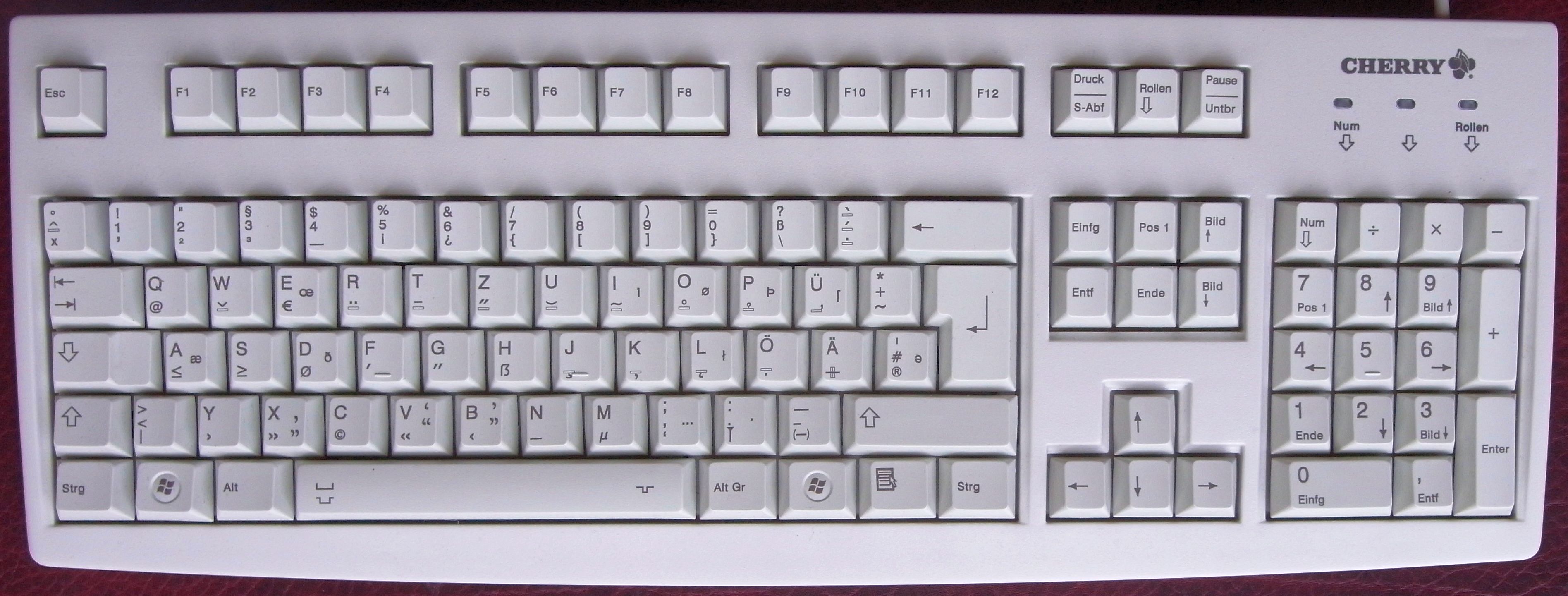
As far as I know, Apple still uses those symbols on their international keyboards:

Apple_pro_keyboard.jpg


On their US/UK English keyboards they use English words (Page Up, Page Down, etc), but on their international keyboards they use just the symbols. This makes sense imo, at least more sense than translating all of those key labels like this:

German-T2-Keyboard-Prototype-May-2012.jpg


The main portion of the argument I see now I really didn't differentiate in action buttons, was actually for the shoulder buttons, not the face ones. But both should remain untouched I think. For the shoulder buttons, I've heard many varying opinions. I don't feel you're going to find a majority in preference there.
I think Shift, Ctrl, Alt and Fn/Meta/Pyra/Sym on the shoulder buttons would get a comfortable majority if the main layout is along the lines of what I propose. What other things do you propose to put there? Super? Space? Enter? Mouse clicks?

I won't continue to argue that there is no standard layout for a gamepad into keyboard switches. The Pandora/Pyra is unique in that way. I feel the argument is about familiarity or preference on those in the absence of an industry standard due to the frequency of use.

We agree on the fact that the Pandora/Pyra is unique in its arrangement of Home/End/PgUp/PgDn.


But isn't that a good reason to put labels there? How else are people supposed to know what the mapping is, "in the absence of an industry standard"?

 yet the poll in this thread indicates that 69 out of 74 forum members explicitly say they want Home/End/PgUp/PgDn on the ABXY buttons
 
ROFLMAO, I see now that this is from question 9 correct? The question where 3 of the 4 available options are the variations of the same answer!?! and you combined those answers to get your response right? I mean I guess there was an "other" answer there but you had to make up your own suggestion... yea... really solid proof there. I would totally expect most people to choose the "other" option. Even the "i don't care" option was tied into the same layout.


I'm cool with that specific layout like I said before, I even voted for it, but don't throw numbers out there for a bullshit and so obviously biased question. Combining 3 answers into 1 to get your total... HA!


I think that's the 2nd time I've caught you in the loopiest comebacks I've ever read... for shame wb, for shame
If there had been another candidate mapping for the ABXY keys, then I would of course have added that as an option to the poll. The fact that only 5 out of 74 people chose "something else" kind of indicates that I didn't really miss anything important.


What is wrong with combining the answers? It was a single-answer question, not one where you can tick several boxes. If the options I proposed were biased towards a fringe minority opinion, then the majority would have chosen "something else", don't you think?
 
I think Shift, Ctrl, Alt and Fn/Meta/Pyra/Sym on the shoulder buttons would get a comfortable majority if the main layout is along the lines of what I propose. What other things do you propose to put there? Super? Space? Enter? Mouse clicks?

I won't continue to argue that there is no standard layout for a gamepad into keyboard switches. The Pandora/Pyra is unique in that way. I feel the argument is about familiarity or preference on those in the absence of an industry standard due to the frequency of use.

We agree on the fact that the Pandora/Pyra is unique in its arrangement of Home/End/PgUp/PgDn.


But isn't that a good reason to put labels there? How else are people supposed to know what the mapping is, "in the absence of an industry standard"?
Kudos to you for without your poll _wb_ I doubt we'd ever know what people wanted in terms of the layout. People here aren't exactly forthcoming with their constructive thoughts(the destructive ones offered it seems they have little restraint in revealing). This place isn't exactly a collective of optimism at times.  :p   

What I'd want done is a simple ABXY etching on the action buttons. No extra symbols or silkscreening to their sides but just plain markings like on the Pandora. I see value in putting a Meta/Fn/Sym key on the shoulder, I also see it has a rather large drawback. The keyboard Meta/Fn/Sym key and the shoulder one would have to behave differently in conjunction with the Dpad, Start, Select, ABXY, (I), (II) controls. I actually don't see a problem with only one Meta/Fn/Sym again on the keyboard if it continues to be a sticky key with the frequent punctuation/symbols arranged farther from it. 
Thanks.

AFAIK, the action buttons can have exactly the same type of labels as the main keys: that is, they can also be backlit. No etching like on the Pandora.

What do you need Meta+dpad/action buttons for? There seem to be enough available keys to restrict the Meta keys to just the non-game keys.
I was hoping the Meta/Fn/Sym key and the Dpad could be used in conjunction for brightness and maybe keyboard backlighting. I remember you had talked about that your laptop utilizes this combination and I've seen that so does the GCW Zero(power switch + Dpad) for it's screen illumination. There is room for two brightness up/down keyboard keys but I think it's kind of nouveau to use the directionals.  B)
 
I was hoping the Meta/Fn/Sym key and the Dpad could be used in conjunction for brightness and maybe keyboard backlighting. I remember you had talked about that your laptop utilizes this combination and I've seen that so does the GCW Zero(power switch + Dpad) for it's screen illumination. There is room for two brightness up/down keyboard keys but I think it's kind of nouveau to use the directionals.  B)
Why not just have a key labeled ☀ that you can hold down and then use dpad to adjust brightness? And you can just tap the ☀ key to cycle brightness between [min, medium, max]. This is what I propose. And for keyboard brightness you add Meta/Sym/Fn/Pyra.

In practice, on the Pandora, I don't use fine-grained brightness control, I just set it to minimum when there is no direct sunlight and to maximum when there is.
The exception being some airport terminals where they have ginormous walls of glass - and all of that light (and heat) gets washed into the terminal - in those cases I find myself using a 'moderate' setting.  Still, that's only 4 real settings.  (off, lowest, 3/4, highest)
 
Here is a (hopefully) final version of my proposal:

final_proposal.png


http://www.keyboard-layout-editor.com/#/layouts/f01be6c8f6dd698f7beb3e644a303308

In the link there was not enough room for all of the comments, so here's the raw source of the entire thing:

{backcolor:"#990022"},
[{x:15,c:"#202020",t:"#ffffff",a:5,f:4,f2:2,w:5,h:1.5,w2:1,h2:1},"Pyra keyboard layout proposal\n8 September 2014\n\n\n\n\nby _wb_"],
[{y:-0.65,x:0.75,c:"#000000",a:4,f:7,f2:8,w:1.75,h:0.6},"L<sub>2\n\n<font color=\"#888888\"><small><sup>Meta</sup></small><font color=\"#ff4400\">◆",{x:8,f:9,f2:7,w:1.75,h:0.6},"<font color=\"#888888\">⎇<small><sup>Alt\n\nR<sub>2"],
[{y:-0.25,f:7,f2:9,w:2.5,h:0.6},"L<sub>1\n\n<font color=\"#888888\"><small><sup>Shift</sup></small>⇧",{x:8,f:9,f2:7,w:2.5,h:0.6},"<font color=\"#888888\">⎈<small><sub> Ctrl\n\nR<sub>1"],
[{y:-0.35,x:13.75,c:"#202020",a:0,f:3,w:7.75,h:3},"☀: Toggle screen backlight between low, medium, high <small>(hold and use dpad for more fine grained control)</small><br>⌨: Toggle keyboard backlight (Meta+☀) on/off\n<font color=#ff4400><b>Meta </b> (L2)</font> = Fn/AltGr/Sym/Pyra/F-ing/...<br><img src=\"http://people.cs.kuleuven.be/~jon.sneyers/tmp/pyrakblayout/dp2.png\"><b>Super</b> = Super (aka Windows Logo key)<small>\n\n<small>Super is also used for media keys<br> (Super + shoulder buttons)<br> and as a modifier e.g. in Ubuntu\n\nMeta+POWER is the Magic SysRq key\nTapping START gives double left click<br>Tapping SELECT gives middle click<br>Tapping META opens context menu<br>Tapping SUPER opens main menu\nShift+Shift: Caps Lock<br>Meta+Meta: Meta Lock<br>Ctrl and Alt Lock if you like<br>Meta+J: Num Lock<br><small>Num Lock changes only IOPKL/,"],
[{y:-1,x:3.3,c:"#000000",f:7,w:1.1,h:0.6},"<b><sup>Esc</sup> <sub><font color=\"#ff4400\">⎙",{x:0.25,a:5,f:9,w:0.9,h:0.6},"<sup><font color=\"#ff4400\">◆\n\n\n\n<b><font color=\"#ff4400\">Meta\n<font color=\"#888888\">Menu</font>",{x:0.55,c:"#a5a5a5",w:0.9,h:0.6},"<img src=\"http://unicodepowersymbol.com/wp-content/uploads/2014/01/IEC5009_Standby_Symbol-fs8.png\" height=\"100%\">\n\n\n\n\n☾",{x:0.55,c:"#000000",a:0,f:5,f2:1,w:0.9,h:0.6},"<b>☀\n\n\n<font color=\"#ff4400\">. · · .\n\n<font color=\"#ff4400\">⌨",{x:0.2,t:"#ffffff",f:2,w:1.1,h:0.6},"3G\n\n<font color=\"#ff4400\">USB\n\nwifi\n<font color=\"#ff4400\">BT"],
[{y:-0.1,x:0.8,a:7,f:5,w:0.8,h:0.8},"△",{x:8.65,t:"#ffffff; color:#888888",f:9,w:0.7,h:0.7},"<b>⎀\n\n\n\nIns",{x:0.5,a:5,w:0.8,h:0.8},"<b>⇞</b>\n\n\n\nY"],
[{y:-0.9,x:6.1,f:2,w:0.9,h:0.5},"START\n\n\n\n⎇ Alt"],
[{y:-0.95,x:3.25,f:4,f2:3,w:2,h:2},"Move mouse\n\n\n\n\n\n(right click)",{x:2.5,w:2,h:2},"Scroll vert+horiz\n\n\n\n\n\n(left click)"],
[{y:-0.35,a:7,f:5,w:0.8,h:0.8},"◁",{x:0.8,w:0.8,h:0.8},"▷",{x:8.25,f:9,w:0.8,h:0.8},"<b>⇤\n\n\n\nA",{x:0.8,w:0.8,h:0.8},"<b>⇥</b>\n\n\n\nB"],
[{y:-0.95,x:6.1,a:5,f:2,w:0.9,h:0.5},"<small>SELECT\n\n\n\n⎈ Ctrl"],
[{y:-0.25,x:0.8,a:7,f:5,w:0.8,h:0.8},"▽",{x:4.5,a:5,f:7,w:0.9,h:0.55},"<img src=\"http://people.cs.kuleuven.be/~jon.sneyers/tmp/pyrakblayout/dp2.png\">\n\n\n\n<b>Super",{x:4.45,f:9,w:0.8,h:0.8},"<b>⇟</b>\n\n\n\nX"],
[{y:-0.9,x:10.25,a:1,f:5,w:0.7,h:0.7},"<b>⌦\n\n\n\nDel"],
[{y:-0.35,x:13.75,c:"#202020",a:0,f:3,w:7.75,h:3.25},"<b>Meta(L2)+Shift(keyboard):</b>  Compose key ⎄ <small>(feel free to map it to simply keyboard Shift)</small>;  common keys used in Compose combos have shorter methods too using immediate 'dead key' diacritics:\n<b>Shift+Meta-symbol:</b> dead diacritics:<small>(just two thumb presses, two shoulders)</small><br>\"=umlaut (äëïöü), `=grave (àèìòù), ~=tilde (ñõã), =:double acute (őű), <:caron (čšžřě), >:circumflex (âêûô),  {=breve (ăğ), }=inverted breve (ȃȇȋȏȗȓ), +=ligature (æ ß þ œ ꜩ ᵫ ð), ?=hook above (ảẻỉỏủ)\n\n\n\n\n<b>Meta+symbol:</b> dead diacritics: <small>(just two thumb presses, one shoulder)</small><br>'=acute (áéióú),  /=stroke (øđłŧħ), -=macron (āēīōū), comma(,)=cedilla/ogonek (çşąęįų), period(.)=dot (ċġżė)"],
[{y:-0.55,x:0.55,c:"#000000",t:"#ffffff; color:#ff4400",f:6,f2:7,w:0.9,h:0.6},"\n<b>1 <sup> !\n\n\n\nF1",{x:0.2,w:0.9,h:0.6},"\n<b>2 <sup>@\n\n\n\nF2",{x:0.2,w:0.9,h:0.6},"\n<b>3 <sup>#\n\n\n\nF3",{x:0.2,w:0.9,h:0.6},"\n<b>4 <sup>$</sup><font color=\"#ff4400\"><b>\n\n\n\nF4",{x:0.2,w:0.9,h:0.6},"\n<b>5 <sup>%</sup>\n\n\n\nF5",{x:0.2,w:0.9,h:0.6},"\n<b>6 <sup>^\n\n\n\nF6",{x:0.2,t:"#ffffff; color:#ff4400;",w:0.9,h:0.6},"\n<b>7 <sup>&\n\n\n\nF7",{x:0.2,w:0.9,h:0.6},"\n<b>8 <sup>*\n\n\n\nF8",{x:0.2,w:0.9,h:0.6},"\n<b>9 <sup> (\n\n\n\nF9",{x:0.2,w:0.9,h:0.6},"\n<b>0 <sup>)\n\n\n\nF10",{x:0.2,a:3,f2:6,w:0.9,h:0.6},"<b>⌫\n\n⟵\n\n\nF11"],
[{y:-0.3,a:0,f:7,w:0.9,h:0.6},"<b>Q <font color=\"#ff4400\">˜",{x:0.2,w:0.9,h:0.6},"<b>W",{x:0.2,w:0.9,h:0.6},"<b>E",{x:0.2,w:0.9,h:0.6},"<b>R",{x:0.2,w:0.9,h:0.6},"<b>T",{x:0.2,w:0.9,h:0.6},"<b>Y",{x:0.2,w:0.9,h:0.6},"<b>U",{x:0.2,f2:6,w:0.9,h:0.6},"<b>I\n\n\n\n\n<font color=\"#888888\">4",{x:0.2,f2:7,w:0.9,h:0.6},"<b>O\n\n\n<font color=\"#ff4400\"><sub>\n\n<font color=\"#888888\">5",{x:0.2,w:0.9,h:0.6},"<b>P <font color=\"#ff4400\">\n\n\n<font color=\"#ff4400\"><sub>\n\n<font color=\"#888888\">6",{x:0.2,f:9,w:0.9,h:0.6},"<b>- <sup>+",{x:0.2,w:0.9,h:0.6},"<b>↵\n\n\n\n\nF12"],
[{y:-0.3,x:0.55,f:7,w:0.9,h:0.6},"<b>A",{x:0.2,w:0.9,h:0.6},"<b>S",{x:0.2,w:0.9,h:0.6},"<b>D",{x:0.2,w:0.9,h:0.6},"<b>F",{x:0.2,w:0.9,h:0.6},"<b>G",{x:0.2,f2:2,w:0.9,h:0.6},"<b>H\n\n\n\n\n<font color=\"#ff4400\">Any",{x:0.2,f2:1,w:0.9,h:0.6},"<b>J\n\n\n<font color=\"#888888\">Num<br>Lock",{x:0.2,a:4,f2:6,w:0.9,h:0.6},"<b>K <font color=\"#ff4400\"> \\\n\n\n\n<font color=\"#888888\">   1",{x:0.2,w:0.9,h:0.6},"<b>L <font color=\"#ff4400\"> |\n\n\n\n<font color=\"#888888\">  2",{x:0.2,f:8,w:0.9,h:0.6},"<b>/ <sup> ?\n\n\n\n<font color=\"#888888\">3",{x:0.2,a:0,f:9,f2:2,w:0.9,h:0.6},"<b>′ <sup> \""],
[{y:-0.3,a:1,f:8,w:0.9,h:0.6},"<b>↹ <font color=\"#ff4400\">`",{x:0.2,a:0,f:7,w:0.9,h:0.6},"<b>Z <font color=\"#ff4400\"><",{x:0.2,w:0.9,h:0.6},"<b>X <font color=\"#ff4400\">>",{x:0.2,w:0.9,h:0.6},"<b>C <font color=\"#ff4400\">=",{x:0.2,w:0.9,h:0.6},"<b>V <font color=\"#ff4400\">[",{x:0.2,w:0.9,h:0.6},"<b>B <font color=\"#ff4400\">]",{x:0.2,w:0.9,h:0.6},"<b>N <font color=\"#ff4400\">{",{x:0.2,w:0.9,h:0.6},"<b>M <font color=\"#ff4400\">}",{x:0.2,f:9,f2:6,w:0.9,h:0.6},"<b> , <sup>;\n\n\n\n\n<font color=\"#888888\">0",{x:0.2,f2:9,w:0.9,h:0.6},"<b>. <sup>:",{x:0.2,f:8,w:0.9,h:0.6},"␣ <b><font color=\"#ff4400\"><b>_",{x:0.2,f:9,w:0.9,h:0.6},"<b>⇧</b><font color=\"#ff4400\"><sup> ⎄"],
[{x:0.25,c:"#202020",a:4,f:3,f2:5,w:11.5,h:1.5},"Standard keyboard symbols explained: (symbols are better than words, because words get translated, e.g. German keyboards have keys called Strg, Druck, Einfg, Entf, Pos1, Ende, Bild↑, Bild↓ etc.)\n<b>↹</b> Tab, ␣Space, <b>↵</b>Enter, <b>⇧</b>Shift, ⎇Alt, ⎈Ctrl, ◆Meta, <big>⎄</big> Compose, <b>⌫</b>Backspace, <b>⌦</b>Delete, <b>⎀</b>Insert, <b>⎙</b>PrintScreen, <b>⇞</b>PageUp,<b>⇟</b>PageDown, <b>⇤</b>Home, <b>⇥</b>End",{x:0.25,f2:3,w:9.5,h:1.5},"<b>General remarks:\n- No double-width space, because extra width only helps if the key is in the middle so it can be pressed with both thumbs. Having space on the right helps to balance QWERTY, which is left-biased and slightly left-aligned here.<br>- Intentionally no Meta-labels on AEIOU, so you can put e.g. Ä Ö Ü there (or Å Æ Ø etc.)"]

Basically this layout tries to take into account the poll results to the biggest possible extent. Of course compromises have to be made, and not everyone will be fully happy with this. Here is how it performs w.r.t. the poll results, going question by question:

  • The most notable exception to "just follow the majority" starts right away at the first poll question. My proposal doesn't have a double-width space key. I still haven't seen any convincing argument in favor of a double-width space key, unless maybe if the key is in the center (but that has a lot of implications, like no number row). It certainly does not have any functional advantage to have a large space key -- maybe it looks nicer, or maybe it very slightly improves the learning curve by making the space key easier to recognize visually. But that's not reason enough to sacrifice a key.
  • This layout works without shoulder buttons, albeit less comfortably. So everyone should be happy.
  • There is a visually non-distracting Num Lock key (this and "no Num Lock" are the two most popular options)
  • The F-keys are on the number row (most popular option)
  • Shift, Alt, Ctrl, Meta and Super are available by default; RightAlt (R2) can be used as AltGr if needed
  • Shift, Alt, Ctrl and Meta are available on shoulder buttons (the four most popular choices)
  • The QWERTYUIOP row is left-aligned (which was the most popular option)
  • The new dedicated keys that received the most votes were all added: Tab, Del, Esc (those 3 got a lot of votes, i.e. more than 40 votes), also Slash, Menu (as Meta tap, though probably some people mistake this as "main menu" which is also available, as Super tap), Apostrophe, Dash/Minus (those 4 got quite a lot of votes, i.e. more than 15 votes), Insert, Brightness, and HardwareToggle (those 3 keys got 12 or 13 votes). Of course not all keys can be added. There is no dedicated Plus key (13 votes), but it's available as Shift+Minus, which kind of makes sense (- and + together, and + is a Shift symbol on many keyboards). There is no dedicated SquareBrackets [ ] (9 votes), and no dedicated AngleBrackets < > (14 votes), but those are available as Meta keys in the bottom row, together with CurlyBrackets { }. There also is no dedicated Backtick key (7 votes), no dedicated Backslash (14 votes), no 2nd Brightness (8 votes) or 2nd, 3rd and 4th HardwareToggle (5,4,3 votes). There is no dedicated Any key (8 votes), which was in the poll just for laughs anyway, but anyway I put it at Meta+H (suggested mnemonic: H stands for Ha Ha Ha) in case anyone likes such a thing. So all in all, I think most people will be pleased with those extra dedicated keys.
  • The action buttons are Home/End/PgUp/PgDn for the main ones, Ins/Del for the two smaller ones, which is the most popular option.
  • The labels on the action buttons are symbols describing their function, with the letters A,B,X,Y in the Pandora order and "Ins", "Del" less prominently added to that. I hope this makes most people happy. 18 voted for "just the symbols", 54 voted for ABXY in the Pandora order, it was a tie between showing the functions or not showing them (both 22 votes) which I consider to be broken by EvilDragon who voted in favor of showing the functions. I hope the significant minority who wanted Greek letters (27) or geometric shapes (21) is still happy because of the symbols. The 17 who wanted text strings describing the function ("Home", "End" etc.) should be somewhat happy because "Ins" and "Del" are there, although for the four others it's just the symbols, ⇤ ⇥ ⇞⇟. Both those who want the label to be unique and those who want it to be not unique can interpret these labels in the way they prefer. And it's all representable in Unicode, and also in plain ASCII if you don't mind the ambiguity of something like "Press A".
  • The name of the extra modifier is Meta, which is currently the most acceptable name (27 out of 37 votes). "Fn" gets more "prefer" votes, but it gets less "acceptable" votes.

The image above should be more or less self-explanatory and self-contained to explain how this proposed layout works. No walls of text needed.

Could the other keyboard layout proposal makers (comradekingu, Saber, Grench, maybe others?) also make an image like that?

And then ED can choose between our proposals -- perhaps using a poll where you can simply pick your preferred proposal and indicate which ones are acceptable.
 
Last edited by a moderator:
So clicking right nub is a left click and clicking the right nub is a left click ?


Sound puzzling to me
I suppose this is something that be configured easily in software to fit your preference. The nubs don't have a label so we don't even have to decide yet what the default is.

Left nub = left click, Right nub = right click is more logical, but probably less practical since you can't move the nubs well while clicking them. Left-click dragging is important, so it's important to make that easy to do. That is why I think my proposal is a good default even though it's somewhat counter-intuitive. But I wouldn't mind at all if the default would be the "logical" one instead.

Of course everything should be configurable in software: maybe some people will want to use the shoulder buttons or the action buttons as mouse buttons, or use the right nub for movement and the left one for scrolling, or even reverse the up and down directions of the nub movement or whatever.

I'm just proposing a default. I indicated a proposed location for the left and right mouse buttons mostly to make it clear that they are available _somewhere_, so the shoulder buttons and action buttons can be used for other things.
 
Since I tend to ignore the box...

Right nubclick = left mouse click IS a bit cumbersome - but logical within the limitations of left nub as mouse.

What if we made the right nub as mouse and left nub click = left mouse click?

Just because it was done the other way on the Pandora doesn't mean we have to restrict to that.

So - roll that thought around a bit...  right nub = mouse movement?  Great idea or hateful concept?
Yes, why not! Could be the default, to make the clicks make more sense, at least on paper.

I'd probably configure my Pyra to use left nub for movement and right nub for clicking because I'm used to that, and because it makes sense to me: left side is arrows and mouse movement (i.e. micro-navigation; even Tab can be micro-navigation if you use it to go from field to field in a form), right side is scroll wheel, pgup/pgdn/home/end, and "confirmation"-things like click, Enter, action buttons (i.e. macro-navigation).
 
Since I tend to ignore the box...

Right nubclick = left mouse click IS a bit cumbersome - but logical within the limitations of left nub as mouse.

What if we made the right nub as mouse and left nub click = left mouse click?

Just because it was done the other way on the Pandora doesn't mean we have to restrict to that.

So - roll that thought around a bit...  right nub = mouse movement?  Great idea or hateful concept?
 Yes, why not! Could be the default, to make the clicks make more sense, at least on paper.

I'd probably configure my Pyra to use left nub for movement and right nub for clicking because I'm used to that, and because it makes sense to me: left side is arrows and mouse movement (i.e. micro-navigation; even Tab can be micro-navigation if you use it to go from field to field in a form), right side is scroll wheel, pgup/pgdn/home/end, and "confirmation"-things like click, Enter, action buttons (i.e. macro-navigation).
Going one step more down the rabbit hole...

Left nub as coarse mouse movements. Right nub as fine mouse movements. (Or switched?)

Too much?
 
As a configurable option maybe.


I wonder, for the occasions where you need shift and meta (e.g. compose key and shifted dead keys) can you use L1 and L2 and shift and meta, or do you need to use the keyboard shift as documented in the comments?
 
Also, needs super for the media keys? I thought the idea behind having them on the shoulder was so you could control your audio with the lid closed? I guess you do need some modifier if they are also to be the keyboard modifiers though, as in DeadBeef at least, you can't bind a modifier key to actions.


Actually, I wonder about using the lid sensor as the modifer. Lid open, they act as keyboard modifiers, lid closed they become media keys? You could also use super+shoulder to get at the media keys with the lid open, but not having to use a modifier on the keyboard when the lid is closed would be beneficial I think.
 
Back
Top