porg
Active Member
Honestly, I'm confused, and don't know what should be discussed where now.
Please move the posts accordingly, and tell me where I shall carry on.
Please move the posts accordingly, and tell me where I shall carry on.
That kind of HW acceleration requires quite a deep level of integration and optimization. Current Qt is not built for that (the focus is on cross-platform use), but the next one (Qt5) should be. When I have a little time from PNDManager I intend to attempt porting Qt5 alpha to pandora. If it works as well as my current mental picture of it implies, I'll start porting panorama to it immediately. It's still not magic thoughI guess HW-Acceleration should solve all the speed problems. I've seen how fast and fluid an typical iOS GUI can be, on my buddys IPod Touch. And this thing is not faster than our Pandora, so I guess it IS possible...of course I have no clue how exactly it has to be done...
However, the PND Manager GUI already works very nice.

The show button is finger-friendly. It doesn't look as huge on pandora's screen.
Forgot about the rating, adding now
EDIT: to give some sense of proportion, the show button is actually just about the size of my finger tip (~7mm) in height.
Very nice Work, it is indeed faster, for example when scrolling through the preview images.
I also would suggest that these buttons are always visible, at the moment you scroll them away when going down the list. ^^
That's not relevant!Your level of conversation on this topic is high-end in the context of this community.
My point is that current graphical PND package managers do not offer a lot more than a command line does, despite having a GUI.Isn't it the biggest advantage of an GUI over a command line, because it IS an GUI?


The side panel as an idea was something useful to fill the other half of the screen. The scrollable list needed to be simpler because of performance issues. Any better ideas of what to put there are welcome.I currently don't have much time, but given that a side-panel is quite intrusive to the PNDManager interface, here are some rather isolated observations and considerations.
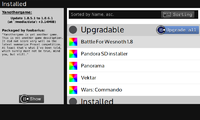
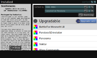
It's wrong? How? Y upgrades all. The description is the selected PNDs description. I don't understand this one at all.The attached images are rather dirty; for instance the guihint for "Upgrade all" is wrong, and the description does not fit the selected PND.
Think of it this way. First the user doesn't really know what button does what, so the hints are helpful. At some point he may want to turn them off from cluttering things, so he can. At some point however, he doesn't remember which button was the cancel key, so he quickly presses F1 to see the hints, then turns them off again. I know this is exactly how I would use it (though I do remember all the keys). Don't think of them as separate modes. Think of it more like the HUD of Zelda Skyward Sword, which too has optional control hints. And most people turn them off gradually as they start getting used to them.By pressing F1, a PNDManager user currently has the choice between one of two modes, "More usable controls" or "Better overview", which is not exactly elegant the way it is. I suggest to instead either use no guihints at all, or to permanently show them and improve the way guihints are integrated into the interface. Considerations:
- What I assume to be the biggest problem about guihints integration in PNDManager: PNDManager has 4 global categories, represented by 4 icons in the bottom bar. 4 is the maximum number of objects a human being is capable of immediately knowing the count of (See: Subitizing), any more objects likely cause the user's brain to require significantly more time when looking at them (as long as it's not used to them, at least). Thus, adding shoulder-l and shoulder-r guihints next to the category icons is very likely to significantly reduce overview. Significantly reducing the size of these hints or making them more transparent is unlikely to solve the dilemma. Try to integrate these two guihints in a different manner.
- Integrating guihints into buttons in a different manner can reduce clutter, see attachments for examples.
This could work, though I'm already differentiating them as option buttons by a completely different style from action buttons.Experimenting with giving all buttons related to filtering sharp corners to indicate that they are serving a purpose specific to filtering; guihints can be used to indicate that these buttons are buttons despite not having round corners (See: Affordances).
Possible, already proposed by Binky. I counterproposed floating indicators at the top of the list element when the sorting buttons are not visible. The title bar is a bit confusing place for such control-specific information.Experimenting with adding a "sorted" indicator to the top bar when current sorting differs from default sorting so that the list's status is clear at all times.
It's not #fff, it's #f8f8f8 to differentiate it from the list's background.Experimenting with making the side-panel's background color !=#FFF (or possibly even adding texture).
I absolutely agree. The current contents are stuff I thought would be helpful, but good ideas regarding this are welcomeThe side-panel's contents have to be chosen extremely carefully at all times. It cannot absorb a lot of information, and an attempt at forcing it to do so is likely to result in redundancy of concepts.

