You are using an out of date browser. It may not display this or other websites correctly.
You should upgrade or use an alternative browser.
You should upgrade or use an alternative browser.
Pics From Mweston: Silk Screen Design
- Thread starter gruso
- Start date
TJSomething
Member
- Joined
- Apr 29, 2008
- Messages
- 52
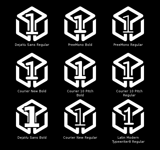
I redid mine with a bunch of different fonts... so yeah.

This sums up the entire threadGruso said:
Last edited by a moderator:
musicalwoods
Member
- Joined
- Feb 16, 2009
- Messages
- 128
Kagato said:I'm a bit late to the party, but a couple of comments:
- Aside from logos, stick to a single font. Certainly don't mix serif & sans-serif fonts without reason. The sans font you're using (Myriad?) looks fine.
- Try to keep all the icons as close to the same size as possible.
- Mixing icons & text labels is a bit messy; I'd iconify the BT label (just putting it in a rounded box as suggested earlier would do). If there is indeed no fee for using the real BT logo, you should definitely look into it.
- The wireless icon is probably too fine-detailed to print clearly. I'd use a bolder, simpler antenna icon than that one.
- Wherever practical, use the same baseline for all labels across the whole casing. (You may need more than one line, but align labels in rows, rather than the tops of the connectors)
- The GP2X labelled its expansion port as "EXT" (external/extension?) -- this is fairly common, keeps a legacy association (as was done with the game buttons), and is less tightly coupled to English.
- I don't think there's any licensing restrictions on using the "trident" USB logo, so that should be used on the back.
- Should the power connector label include the current (eg 5V 1A)?
I really like the ideas you've put forward. You've made the rough initial idea into a clean execution and articulated your reasoning very well.
Last edited by a moderator:
rokdcasbah
got me a date with botticelli's niece
Make sure you kern if you end up using any full words.
It's worth asking whoever does the BT chip (TI?) what other companies do as far as getting the BT logo. You might be able to get away without paying if you have someone vouch for you or something. Or just don't put anything there. I think "BT" is a little silly but that's just me.
First edition should go on the back, I think. Keep the front as clean as possible. I don't even think the numbering on the SD card icons are necessary. Put one near the slots and one near the lights. It's clear that left goes with left, right with right, making the numbers redundant.
edit: kagato...I agree with everything you said but I don't think you went far enough, for instance the "HS 2.0" is unnecessary since a person is not going to be looking at a Pandora on a shelf and buy it based on what it says under the USB port. What I meant to say is that is not the right place to advertise specs. It's great that it's high speed, but the place to put that is in the literature, on the web site, etc. I suppose there's some desire to point out the difference since one is USB and one is USB OTG but the ports look different anyway.
The main thing I try to do when designing is to avoid saying something twice. There are other things but I won't get into it here.
Just suggestions of course, I don't want to be the bikeshed guy Gruso is alluding to... then again mweston put it out there so if he thought it was a bikeshed-type problem he wouldn't have presented it until it was done.
hells_dark
★★★
Kagato +1 
Polossatik
I reject your reality and substitute my own
Dead1nside
Well-Known Member
Another vote for Kagato's changes. Icons are always better and his design looks a lot more unified and clean. BT is fine (the way Kagato has done it) but as with the USB icons, if you can get the Bluetooth icon without paying a license then use it.
I'm pretty against the idea of having a 1 in the middle of a Pandora logo... it shouldn't be that blatant, it looks incredibly tacky. Just have something smaller, hidden away, at least Kagato has removed it from the front panel (although I can't really see if his Pandora icon is the one with a 1 in the middle).
I'm pretty against the idea of having a 1 in the middle of a Pandora logo... it shouldn't be that blatant, it looks incredibly tacky. Just have something smaller, hidden away, at least Kagato has removed it from the front panel (although I can't really see if his Pandora icon is the one with a 1 in the middle).
rokdcasbah
got me a date with botticelli's niece
Here's what I was referring to before. The DC specs are going to be on the back anyway I'm assuming. And the USB vs USB OTG distinction is obvious from the size of the connector. No need to repeat things. Simple as possible, but no simpler
Polossatik said:
Also +1 from me, though I'm becoming more of a fan of the original "First Batch" idea after sleeping on the idea...
Last edited by a moderator:
Trip
Sorry, but I suck at explaining stuff :P
Bosbeetle
Terminally lost
I like the idea of 1 sd card and 2 numbers and his microphone is nicer
some combination should be good
some combination should be good
droneb
Well-Known Member
- Joined
- Aug 28, 2009
- Messages
- 1,072
im aware of that thats why i suggested the use of tampo maybe more known as pad printing but even with that, there are still some constraints you cant take away.Kagato said:Ah, I see where you're coming from now.DroneB Dev said:1. im pretty sure its impossible to position the canvas and leave at least 4-5cm...
Product printing isn't always literally silk-screening (even though it's often informally called that), and almost certainly wouldn't be on an odd-shaped object like this.
The factory is far more likely to use a pad printing process, which is much more appropriate for handling weird shapes. There are still tolerance limits to take into account, but as long as you're not too close to an edge or a corner, you can print on just about anything.
i always like more the silkscreen instead of tampography since they usually use UV ink instead of common or IR Ink that usually last much more.
not to mention its much more economic than the silicon based rubber used for the pads, you can even do it inhouse if you have the photo chems(tryed once for making my own pcb silkscreen).
anyway, lets see what the OP Team is going to say about this.
Last edited by a moderator:
kagato
Member
- Joined
- Jan 28, 2008
- Messages
- 303
Spec advertising isn't the reason for listing the details. If it was a truly general-purpose USB port, I'd just use the logo; but the full-size port is only USB 2.0, and doesn't (directly) support USB 1.1 devices. OTG ports also have differing features to standard USB. I think the extra labelling is warranted. (I'm not so sure about "HS", however, as I think USB 2.0 only covers that.)rokdcasbah said:for instance the "HS 2.0" is unnecessary since a person is not going to be looking at a Pandora on a shelf and buy it based on what it says under the USB port. What I meant to say is that is not the right place to advertise specs.
It is common practice to list the accepted power inputs next to the connector. And by labelling the USB ports identically, you imply that they have exactly the same functionality, which isn't that case. You've gone too simple, in my opinionrokdcasbah said:(Image)
Here's what I was referring to before. The DC specs are going to be on the back anyway I'm assuming. [...] No need to repeat things. Simple as possible, but no simpler
Here's another idea for the first batch printing:
(No, those aren't the Pandora dev signatures. A No-Prize to whoever guesses them...)
Last edited by a moderator:
Agreed. The USB ports could have "OTG" and "2.0" next to the logo. At least the 2.0 to remind the user that the port doesn't do 1.0/1.1.Kagato said:It is common practice to list the accepted power inputs next to the connector. And by labelling the USB ports identically, you imply that they have exactly the same functionality, which isn't that case. You've gone too simple, in my opinion
Now that has class. I voted in favor of the "First Batch" text but those signatures are superior. The only problem is that they might rub off easily as the bottom of the case gets a lot of contact.Here's another idea for the first batch printing:

(No, those aren't the Pandora dev signatures. A No-Prize to whoever guesses them...)
Last edited by a moderator:
quartercast
Well-Known Member
- Joined
- Feb 13, 2007
- Messages
- 1,551
Isn't USB backwards compatible?
Alec
Member
- Joined
- Mar 5, 2009
- Messages
- 440
quartercast said:Isn't USB backwards compatible?
No, usually there are two chips (1.1 and 2.0), but our high-speed will only have 2.0.
Last edited by a moderator:
Similar threads
- Replies
- 30
- Views
- 7K
- Replies
- 51
- Views
- 12K

