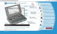
Just tried it out on my netbook. It mostly works, although the introduction graphic is too wide for the screen, so the layout engine puts the testimonial quotes on top of the right hand menu, which looks messy and makes it hard to click on the menu links. Also, on Firefox-based browsers, on the introduction page, the graphic seems to get rendered in front of the top menu, meaning the 'forum' link is very hard to click on. Once you switch to any of the menu pages the smaller graphics means it all works though, even on my netbook. On old Firefox 3.5 specifically (the default on Debian Squeeze currently), you get the same rendering problems as Opera. Works if you upgrade to the backported firefox though.
It does take rather a long time to load, and with most of the links being almost the same colour blue as the background, they're hard to see until the background loads in. It mostly all works without javascript too, which is nice - although since it renders as a long list of sections then, the headers and links under 'emulation' and 'movies, music, web & productivity' are almost invisible. The right menu doesn't work without javascript, but since you can just scroll down to the content, that's no biggie.
Speaking of those links, are they meant to do anything? I can't get them to do anything with either javascript on or off.
Typos:
On the intro graphic, you've used 'analogue' to describe the controllers and 'analog' to desribe the volume wheel. Best to stick to one spelling IMO.
Relatedly, on 'QWERTY keyboard & gaming controls', second paragraph refers to 'the analogue' rather than 'the analogue nubs'
Even with all those minor issues though, the website still looks very professional to my eyes.


