Logo twerking


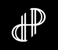
i was thinking about that just now. Its bordering on "someone must have done this before" -territory.  If one adds to that, in the curve of the d and p the double-line, and there is no middlebit, then if the pillars are increased you get the dragons back i think. the tapering is as hard. Really like the little notch to solve it still.
 
Yes, it may be a repeated design kingu. Another version of the same logo:

Pyra_l4.png
 
Last edited by a moderator:
I did flake out last night just before you posted that other version yeah.


Like these versions too, especially this latest one from pengo, with the offset vert lines, looks clean and has a bit of a graphic equaliser look to it which I like.


The [d/p] is not immediately the obvious thing here, it looks just like a nice logo, but of course those in the know will see the initials and a new Pyra owner would probably clock it soon enough, which would be nice, a little "ah haa, there's more to the logo" moment
 
Seems like #1 is final.

I like something between this.

Pyra_04.jpg
Pyra_09.jpg
Pyra_12.jpg
 
Last edited by a moderator:
Fishing hooks? Or some sort of seedling. Dont know how to fix

Could some fire be added to the dragon(F)[box]-pyra Handheld approach? Then i think it checks all boxes, could work and could fail.
 
Last edited by a moderator:
Fishing hooks? Or some sort of seedling. Dont know how to fix
Fish hooks are a stretch and seedling even more so.


That said, it could curve in better and the last point inside should be like the other points or just get rid of it although.

Could some fire be added to the dragon(F)[box]-pyra Handheld approach? Then i think it checks all boxes, could work and could fail.
Not following. Which one are you referring to?
 
Last edited by a moderator:
Thats just the connotation i make. Flame doesnt really burn both downwards and upwards as implied in #1, so maybe they could meet at the middle to make it a bonfire like shape, with some 3d effect going outwards. The pointy bit would then be towards you, as if you were looking down into the flame.

57d42166b0cbabba04fd2c50319c204c-image.jpeg
8622352-green-bean-seedling-just-beginning-to-open-macro-with-shallow-dof.jpg
I figure if the d for dragon and p for pyra can be made to work and arent arbritrary to the design, then certainly no H which is a result of the two. I like the shape, so i dont think thats the problem. Handheld isnt a stretch, whereas hardware was. The colouring made all the difference to how i saw the fire. Even a dithering effect with just led could work i think. Either with a centered starting point, to go with the ambigramaticality (?) of it, or a top to bottom palette to indicate whats up and down, however on the lid there is no such thing, because then it will have a wrong way up. The sleek one looked more to a logo to me, but this has more going on

2q9dikx16.png
 
Last edited by a moderator:
I don't like the crossing middle line. Just rather have them separated.

Thats just the connotation i make. Flame doesnt really burn both downwards and upwards as implied in #1, so maybe they could meet at the middle to make it a bonfire like shape, with some 3d effect going outwards. The pointy bit would then be towards you, as if you were looking down into the flame.

 *Pics
Can you get even bigger pictures? :lol: Anyway, still seems like a stretch to me.

I wouldn't mind a 3d outward effect if possible.
 
One thing important for the designs:

It needs to be cut out of the lid - so there can't be any holes in there.
 
I didnt know that, i thought it was going to be placed into a groove, with only one led hole behind that...

The logo cant be very big then, unless you want warping to be greatly increased and tearing on the actual joints.

Edit: One would have to add another layer behind the screen not to get lightbleeding then.

I suppose multiple elements are still fine with that restriction, as all the logopoll logos have had that.
 
Last edited by a moderator:
One thing important for the designs:


It needs to be cut out of the lid - so there can't be any holes in there.
I suppose that also means that near-holes have to be avoided -- I suppose you can't make a good cutout if the remaining bits are too flimsy, holding on only by a thin sliver of plastic.
 
Also, you guys are aware that the abbreviation "DP" means something very, very different on the internet at large? Surely you are?
It means something different, only if your mind is already in the gutter. :p
Sure, but keep in mind the logo is mostly for the benefit of the person who sees you with the device, not for the the user, who will spend most of their time looking at the opposite side of the lid.   Do you want the person sitting opposite to take an interest in the device or do you want them sniggering behind their hand because you're advertising "DP" in large lit up letters?   Keep in mind that unless they already know it's meant to stand for Dragonbox Pyra, (and very few will)  their mind will fill in whatever words come to mind first.

- Neelix
 
Last edited by a moderator:
Back
Top