Logo twerking


Fzero

Advanced Member
Joined
Mar 9, 2010
Messages
4,702
As per the Final Logo Poll thread, over here: http://boards.openpandora.org/topic/16091-final-logo-poll/page-2#entry329410/URL]


I personally also like Nr. 2 better.
Has a bit of a simple look, a plain and simple flame.

Nr. 1 needs a bit more tweaking to give it an elegant look, but I'm up for that as well  :)


Soooo, sounds like open season to carry on creating :)

Drop some ideas for how you feel the logo idea #1 could be tweaked, either to add a touch more elegance as ED would like, or just however you feel it would look nicer for yourself.

Here's a few efforts I just done, changing it up a little bit

14ce05x.png
 
Last edited by a moderator:
Top right one is ostentatious, nice work.

Bottom left one looks good too, i love the over under-action. Middle bit is a bit too thin compared to the rest.

Try shrinking the rest or making it all angles?
 
Last edited by a moderator:
Bottom left seems nice.

Another version of logo 1 a while back.


Pyra_1A.png
 
Last edited by a moderator:
I like that one too, quite future-tech looking to me somehow, and I like the up/down arrows of the negative space
 
I like the top left, it would fit perfectly the lid.
 
Last edited by a moderator:
post-3032-0-85325600-1392987186_thumb.png


How is the top left more elegant?  :lol:   Top right, I see what you are trying to do with the black points, but why cut

it farther than that?
 
Last edited by a moderator:
I like some of these much more than the current version of 1. If they could be cleaned up and developed I might like them as much as 2. The top corners and lower left look good.

The one in the upper left might benefit from a little reduction on the lines that replaced the the loop part of d/p, and if the area where the wavey part and the angled part was a single point
or made to look more flame like.

The square removed from the version in the top right looks a little odd to me as it is.
 
@Natsu That one is no dif to the one that ED has shortlisted already, apart from the thick outline, but that's not going to show up is it, not if the logo is cut out to be showing LED through it, which I believe is the case.

Or are you thinking of having that outline in gloss or something, against a matte console lid?

And I wasn't saying my top left one [or any of them] was more elegant, I was echoing what ED said there about his thoughts to tweak to make more elegant, I'm just doing what I like, which isn't necessarily elegance :)

Just do what you like, elegant or not.

Same with the top right one, I just like it like that, no real reason for cutting those square shapes into it other than I liked it
 
Last edited by a moderator:

@Natsu That one is no dif to the one that ED has shortlisted already,
Closer together. Yes, a slight difference.
Or are you thinking of having that outline in gloss or something, against a matte console lid?
That or have the outline the led instead.
 
Last edited by a moderator:
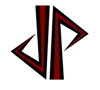
I thought the other logo could use some re-weighting and streamlining.

logo2mod.jpg
logo2mod2.jpg


logo2.jpg
 
Last edited by a moderator:
Back
Top