Logo Discussion


comradekingu: It's most important that ED likes the logo, so he picks what he likes and we "vote" on those. "Vote" in quotes since the result is at best advisory.
The task to design a logo is very much, as i understand,  a community effort based on what the community wants and needs. So your best bet is to make a guess, and then consult the audience based on that guess. Since for the most part nobody knows till they see it, its mostly a road of guesswork and craftmanship with no finality in sight unless you are looking directly at it. Apart from that, ideas beyond this, from the ones who do know, are mostly the ones who have ideas different enough to produce a whole range of results. We are as critics, makers and in between, only qualified in our ability to learn, I like that environment.

Its not about who wins, nor so much how, but foremost about the opinion of the community. Making a logo of your own liking is easy in comparison, you are at your own disposal, and you like what you like. The opinion of one person is just like that, a subjective truth. If nothing more is known, and there isn't a constructive process back and forth, then that is just random.

The same is true for a community approach, but given what the scope is, doesn't it matter what the community has to say about it also in the manner i described?

With votes I can learn from feedback. Instead of guessing, much the same way I assume ED did/does, If I learn something about perceived aesthetics and ED gets more data to make his decision based on, also casting light on his sampling, aren't we both better off? Maybe I just want to believe it has the answers, maybe I don't. If anything it doesn't hurt, the majority is the same people who would make up a silent majority. It just bums people out less if they can be a number, big or small. In the best kind of vote, each voter represent an increasingly small deviation on the whole, and people can agree no matter what the results are.

On a personal level not only do i want to learn, I want at the very least something to vote for that I can understand, after that its out of my hands, an even playing field where everyones opinion is respected in that it's represented somehow.

TL;DR The input of a singular person is a game of chance in the bigger picture. With respect to the latter, the feedback of a singular person is the same. Apply one to the other, and its still a game of luck that nobody knows the odds to. If we understand where the foundation lies, its only a matter of sampling it till we can have a accumulated second hand reconstructed account of how to approach the answer. The rest is only doing the work.
 
Last edited by a moderator:
 
post-3032-0-85325600-1392987186_thumb.png
B)
 
Unrelated to the logo's being discussed here:

The current graphic/temp. logo on pyra-handheld.com has a tag line  that says, "Successor of the Open Pandora". Strictly speaking that should be "Successor to the Open Pandora". I only mention it in case anyone was going to bake it into the new logo, put it on e-mail letterheads or the like.
 
Hey, I just played Micro Maniacs (an underrated spin-off to Micro Machines) and met a good old friend. Pyra. I'm kinda stoked but don't know in which topic I should post. However - juicy thing is that you can select a character called Pyra. This might help to enhance a logo idea...

http://www.youtube.com/watch?v=uvsoU_wBT6o   


1:00-1:08

MicroManiacs_Pyra.gif


... looks like Pyra's female.

http://www.angeldust.org.uk/MicroMachines.htm
Of course Pyra is female.

In Greek mythology, Pyrrha (Greek: Πύρρα) was the daughter of Epimetheus and Pandora and wife of Deucalion.


When Zeus decided to end the Bronze Age with the great deluge, Deucalion and his wife, Pyrrha, were the only survivors. Even though he was imprisoned, Prometheus who could see the future and had foreseen the coming of this flood told his son, Deucalion, to build an ark and, thus, they survived. During the flood, they landed on Mount Parnassus, the only place spared by the flood.


Once the deluge was over and the couple were on land again, Deucalion consulted an oracle of Themis about how to repopulate the earth. He was told to throw the bones of his mother behind his shoulder. Deucalion and Pyrrha understood the "mother" to be Gaia, the mother of all living things, and the "bones" to be rocks. They threw the rocks behind their shoulders, which soon began to lose their hardness and change form. Their mass grew greater, and the beginnings of human form emerged. The parts that were soft and moist became skin, the veins of the rock became people's veins, and the hardest parts of the rocks became bones. The stones thrown by Pyrrha became women; those thrown by Deucalion became men.

I like the flames on that hair. It shows that the graphic artist knew what he was doing.

In Latin the word pyrrhus means red from the Greek adjective πυρρός, purrhos, i.e. "flame coloured", "the colour of fire" or simply "red" or "reddish".%5B1%5D Pyrrha was evidently named after her red hair. Horace (Ode, i. 5) and Ovid describes her as red haired.


That's why I like the dual flame logo by Binky:

 
Last edited by a moderator:
Hi,

maybe I am wrong, but I wonder which label would you like to establish on the long run ?

dragonbox or pyra.

Its like sony and xperia. I think dragonbox is more important and should be emphasized.

So when the 3rd generation of handhelds will come out, there will be some brand recognition which will hopefully help to sell them .

Greetings
 
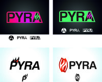
I like the look and the flames of #1 (on the right). I tried to refine/simplify it a bit including a fresher colorway. I could upload the .svg but "I'm not permitted" for this kind of file...

pyraaaa.jpg
 
:)

Strigoi has a keen eye :)

@texture, the top right image there, those 3 small white icons are all very nice. Really like that [A] with the flames like that, looks great in that circle too
 
I think I'd like to have one of Kingu's designs up for vote personally. We've already had one simple one posted here, but there are better versions in that thread already I think.


I may not personally end up voting for that one, but I think it's good enough to be voted on. I will try tomorrow to find a good one from the thread.
 
Last edited by a moderator:
post-3032-0-65573500-1392987157_thumb.png


I like this one too. I also like the first one in the OP in the white.
There was a few Infinite looking symbols floating around, and also a snow flake looking one. I dislike these. The infinite ones remind me too much of Fedora Gnu/Linux, and the Snowflake shaped one reminds me of Snowlinux.

Since the Pyra will not be running these operating systems by default i think that they should be avoided.

I haven;t seen it mentioned before but i'm sure i'm not the only one to have thought that the current Pandora logo looks too much like the Gamecube logo. I think it's good to move away from that concept.
 
I think I'd like to have one of Kingu's designs up for vote personally. We've already had one simple one posted here, but there are better versions in that thread already I think.
Why does everyone seem to assume that there is going to be voting involved? ED never said anything about choosing the logo by popular vote.

He's selected some ideas he liked, so perhaps the focus here should be on developing those ideas further...

Just a thought...

- Neelix
 
Last edited by a moderator:
grad5.jpg
grad6.jpg
grad7.jpg
grad8.jpg


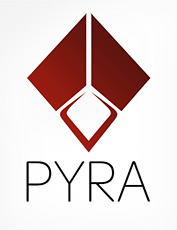
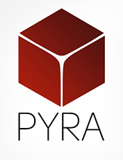
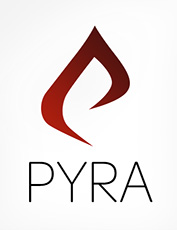
Trying to mess around with some simpler modifications of stuff. First is mod of #4, but wider and more ambiguous. Second one is kind of a capstone pyra-mid. Third is abstract dragon in flight. Fourth is just a thong cube. :p
 
Back
Top