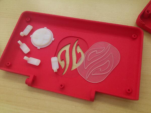
Logo led on the back of the lid


Yeah, some people may not like it but it's pretty well established that proper branding has a net positive effect on sales. If two people see the flashy logo and followup on it where before they wouldn't have then it automatically becomes worth while.
Is this really of measureable relevance here? We are already in a niche, with people usually having some experience in that sector. So the people that would be interested probably already can distinguish the Pyra from a similar looking device. And even if the unlikely event occurs that a potential customers sees one, how much help does the logo give in identifying the device ?
I would rather see that money spent on advertisement on some gadget or linux enthusiat site/blog/tumblr/whatever.
The small logo will have a negligible effect on sales numbers for the Pyra. When someone glances over, what will catch their eye is the keyboard, gaming controls, and the big beautiful screen. It's the features of the handheld and the big smile of the person using it that will be the beacon for potential customers.
 
I meant they would glaze over if they weren't already noticing the difference (the features Saber pointed out).

Yes, you are right _WB_ - a review / article is, of course, much better than a wasted advert.
 
I think a device carried by good design is a niche device, as not a lot of people are _that_ interested. As such, its a secondary to how the device functions, but its still massively important.

Remember heartbleed? The logo made it a story about SSL that normal people could understand, that logo was the introduction to that issue.

Similarly to how its a whole picture, some people do want to advertise it, and much more so if its a logo that they can feel.

Even if you are not one of those people, and not everyone is, there are also other people, those who dont want to be walking advertizements, and if thats their take on it, then they are right, and that doesnt have to do with those that dont think so.

Being a niche is no good reason to make improper judgements, some parts of being a niche is bad. Being bigger is better, and the mindset that says decisions isn't important because the device is niche is dangerous circular logic.
 
The small logo will have a negligible effect on sales numbers for the Pyra. When someone glances over, what will catch their eye is the keyboard, gaming controls, and the big beautiful screen.
While _wb_ brought up a valid point, but already gave an exact description what will ultimately propell sales: "word of mouth", I don't see were this has any relevance at all. Keyboard and gaming controls are rather obvious things, and with a person interested into the specific field of mobile gaming/computing, it seem to be a given that the interested person won't confuse it with another device from Nintendo, but rather with some of the hundreds of cheap chinese gadgets that are already out there. A situation where the logo won't help anything at all: a part of the people may recognize the letters "dp", but unless we are already in a situation where the pyra has a certain ranking in search engine databases, things get complicated. And if we are in that situation, enough awareness for the device is already there.


And you still have the features and the shape as an optically distinguishble feature. Especially the "brickish" shape should create attention as it is apparently a sin in times like these where things have to look "non boring" and "sleek" instead of concentrating on whats actually usefull or not.

It's the features of the handheld and the big smile of the person using it that will be the beacon for potential customers.
I may have a sad life or a sad take on it, but I usually respond to an emotional attractor that is presented in whatever form (like a dense situation in a game, a funny moment in a movie, hard programming problem to solve, etc), which is independent of the device this happens on. So lets hope nobody sees me with a Pyra as I probably make a face like this more often then having a constant (moronic?) smile on my face.
 
BrDHNOBIMAA6-tY.jpg


jummy
 
It's the features of the handheld and the big smile of the person using it that will be the beacon for potential customers.
I may have a sad life or a sad take on it, but I usually respond to an emotional attractor that is presented in whatever form (like a dense situation in a game, a funny moment in a movie, hard programming problem to solve, etc), which is independent of the device this happens on. So lets hope nobody sees me with a Pyra as I probably make a face like this more often then having a constant (moronic?) smile on my face.
It would be creepy to have a constant smile on one's face. I had a friend in high school I ran into years later by chance meeting who became what I'd call "super" Christian. While his family was always very religious, it seemed to have become a paramount focus in his life, even though the good job he had wasn't a faith based one. I do remember finding his unwavering smile uncomfortable. We didn't reminisce for too long, but no matter the topic, he never deviated from the expression or mask on his face. Almost like he was in a dream state channeling divinity at the exclusion of the world around him. :(   

Didn't know the logo was going to be so, uh, obvious. Reminds me of a superhero chest emblem. Do you think they'll be a cloth cape to go with it? 
 
Last edited by a moderator:
Didn't know the logo was going to be so, uh, obvious. Reminds me of a superhero chest emblem. Do you think they'll be a cloth cape to go with it? 
Well it's the backside, the front doesnt have the outer 'shield' btw this image was posted by ED on twitter.
 
Looks good, flush and the size is OK. I guess it needs that size, otherwise it would be to thin at these small spots there. It still looks pretty fragile, the transparent piece should be glued completely to support these sensitive parts.
 
Last edited by a moderator:
It's about as obvious as the Pandora logo when the LED is off ;)
 Do you have a picture of the other side...?
Not yet, but it wouldn't be accurate with the current 3D print anyways, as it's fully transparent (whereas the real version should be a diffused darker grey instead of white).

So without the LED, it should look similar to the Pandora logo.
 
It's about as obvious as the Pandora logo when the LED is off ;)
 
Do you have a picture of the other side...?
Not yet, but it wouldn't be accurate with the current 3D print anyways, as it's fully transparent (whereas the real version should be a diffused darker grey instead of white).


So without the LED, it should look similar to the Pandora logo.
Ah cool, I was wondering about the transparancy
 
That looks really big to me, too.


maybe it would look better if it was half the size.
 
The size looks good to me. I wouldn't mind if it were even bigger.

Is the color related to the actual color of the device, or is it just a random color? While I wouldn't mind a red Pyra, I think this shade of red is too flashy and toy-like. I'd prefer a much darker red. Or just black.
 
The size looks good to me. I wouldn't mind if it were even bigger.

Is the color related to the actual color of the device, or is it just a random color? While I wouldn't mind a red Pyra, I think this shade of red is too flashy and toy-like. I'd prefer a much darker red. Or just black.
Since the previous one was blue I dont think they've decided on color yet.
 
It could be the red color of the case makes the logo standout more and appear larger than it really is over the lid. 

Besides, it adds another new feature to the list. We could always utilize the larger logo and attach the Pyra to a baseball cap and go spelunking
 
Looks perfect.  Hope the pieces are all falling together nicely.
 
Also, I feel that sometimes a logo can make the device look better.

Is the color related to the actual color of the device, or is it just a random color? While I wouldn't mind a red Pyra, I think this shade of red is too flashy and toy-like. I'd prefer a much darker red. Or just black.
I was thinking the same thing.
 
Back
Top