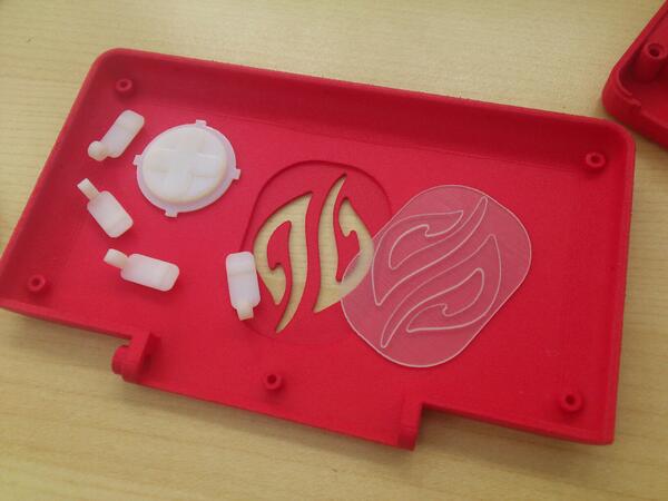
I suppose the milky plastic will not be colored, because that would make it rather pointless to put an RGB led behind it.Stealthy! ^_^ I like the idea. So the colour of the transparent plascic will match the case colour more or less. Adds a "surprise" effect when suddenly lit, not bad.It's about as obvious as the Pandora logo when the LED is off
You are using an out of date browser. It may not display this or other websites correctly.
You should upgrade or use an alternative browser.
You should upgrade or use an alternative browser.
Logo led on the back of the lid
- Thread starter ekianjo
- Start date
Saber
Advanced Member
- Joined
- Jan 23, 2012
- Messages
- 1,303
As it's good business for us to be left in the dark on the true case color, we can merely speculate at this point to ourselves. Since ED's decisions of recent with the Pyra seem to more flamboyant and riskier compared to the relatively stodgy by comparison Pandora, it wouldn't be too much of a stretch to say the color of choice will be either a theme inspired dark blood red and/or a darker midnight blue shade. Both colors would be safe in a business setting, striking, and appealing.Also, I feel that sometimes a logo can make the device look better.
I was thinking the same thing.Is the color related to the actual color of the device, or is it just a random color? While I wouldn't mind a red Pyra, I think this shade of red is too flashy and toy-like. I'd prefer a much darker red. Or just black.
FaeMinx
Rainbow Liberation Instigation
It looks to me like they've rounded out all the 'points' in the logo.
jummy
I assume it was absolutely necessary to do that?
That would be a shame, as from here it appears some of the flame like appearance has been lost by doing this.
I would love to see some more close ups, and from the other side with the cutout in place.
If there are issues with it being transparent, perhaps some coloured board can be taped over it.
But apart from that, it looks good to me. That size is exactly how I was envisioning it.
fusion_power
Advanced Member
You can tint transparent plastic in any colour and it's still semi-transparent. Sun glases you know...I suppose the milky plastic will not be colored, because that would make it rather pointless to put an RGB led behind it.
Last edited by a moderator:
Granitehead
Advanced Member
- Joined
- Oct 16, 2009
- Messages
- 3,011
No mold, and someone keeps claiming molds need to be adjusted for different colors (I assume if you use similar enough chemicals in similar quantity to color the same kind of plastic, them that shouldn't be true, otherwise, I guess).I suspect that one is only red for testing the mold and stuff...
ED gets them 3d printed.
"mention that red plastic is common to use for prototype builds as it shows defects better than any other colour "
I'm pretty sure someone said that about the blue prototype we saw last.
Oh I see. Well if that is possible, sure, why not. As long as it does not modify the color of the RGB led or restrict its color space.You can tint transparent plastic in any colour and it's still semi-transparent. Sun glases you know...I suppose the milky plastic will not be colored, because that would make it rather pointless to put an RGB led behind it.A slight tint in case colour would be enough to make the logo "flush" with the case. But any light under the logo would still shine through and not even it's actual light colour should be affected by the plastic.
Fzero
Advanced Member
- Joined
- Mar 9, 2010
- Messages
- 4,702
Ok, probably was that comment about the blue one I'm thinking of then... remember reading about that being why a colour was used, and I didn't know about that previously so sort of took note ... but I may well have forgot it was blue and not red.
Good job I'm not ordering plastics for testing then
Good job I'm not ordering plastics for testing then
I assume that rounded corner is because the printer isn't enough accurate but...
Too big, way too big. That will be way too flashy when alight. I would prefer an elegant small logo which would be highlighted by the light.
Too big, way too big. That will be way too flashy when alight. I would prefer an elegant small logo which would be highlighted by the light.
Last edited by a moderator:
I can choose from a given set of colors from 3D Prints and always choose a different one with each revision.
I mean the logo is rounded.What rounded corner?
Others issues with a big logo beside it's too flashy are that because the light will not be homogeneous with one led. And it will be too visible when the light is extinct. I assume that's why ED want to make the transparent part grey. But grey would make the colors bad.
With a little logo, a lighter transparent part could be chosen because it'd be less visible when exctinct so prettier colours + A little logo would give an homogeneous light on the logo even when the light is low plus a stronger light when it'd be set high.
Last edited by a moderator:
Homogeneous lighting is indeed important to look good. I suppose that depends mostly on how well the milky material scatters the light. The keyboard backlight also needs to be homogeneous with only a few leds. It shouldn't be impossible.I mean the logo is rounded.What rounded corner?
Others issues with a big logo beside it's too flashy are that because the light will not be homogeneous with one led. And it will be too visible when the light is extinct. I assume that's why ED want to make the transparent part grey. But grey would make the colors bad.
With a little logo, a lighter transparent part could be chosen because it'd be less visible when exctinct so prettier colours + A little logo would give an homogeneous light on the logo even when the light is low plus a stronger light when it'd be set high.
thatgui
Advanced Member
- Joined
- Apr 2, 2009
- Messages
- 3,048
Now I get why its rather "cheap" to produce, I thought the (semi) transparent material would be integrated more seamless either by "melting" two parts together or having the logo material directly injected during the modling process.
jummy
Wouldn't a smaller logo, placed at one of the upper edges a lot more subtle (and less of a dirtcatcher) ?
Last edited by a moderator:
The logo will be glued into the back, and no worries, it seamlessly fits. I agree it's a bit big though - will let the designers know.
Bosbeetle
Terminally lost
easy to keep apartI can choose from a given set of colors from 3D Prints and always choose a different one with each revision.
thatgui
Advanced Member
- Joined
- Apr 2, 2009
- Messages
- 3,048
How much smaller do you want it be ?The logo will be glued into the back, and no worries, it seamlessly fits. I agree it's a bit big though - will let the designers know.
If it would be a quarter of that size (if that makes sense, regarding the loss of detail), would you mind putting in in one of the edges.
Similar threads
- Replies
- 8
- Views
- 5K


