Keymat Layout - the Final Poll!

What layout would you prefer? Multiple layouts can be chosen.

  • Layout 1

    Votes: 66 34.4%
  • Layout 2

    Votes: 13 6.8%
  • Layout 3

    Votes: 15 7.8%
  • Layout 4

    Votes: 28 14.6%
  • Layout 5

    Votes: 22 11.5%
  • Layout 6

    Votes: 29 15.1%
  • Layout 7

    Votes: 83 43.2%
  • Layout 8

    Votes: 10 5.2%
  • Layout 9

    Votes: 7 3.6%
  • Layout 10

    Votes: 53 27.6%
  • Layout 11

    Votes: 22 11.5%

  • Total voters
    192

Status
Not open for further replies.
Except when its pointed out that it has to do with typing for half the audience, I cant think of anything less elusive. If you invent new ways to type, its both unfamiliar and ineffective.

We can add a key called Fn, not have it on shoulders, and it will be able to do a whole heap of things.

The things in green are the hotkeys that stop working with Fn when Fn is on a shoulder. 26 if i count correctly.

More if you want to be able to use numbers in games, which considering 4 is also F4, is a quick way to get alt+F4 by the use of two shoulders and 4, or be left in a different tty with the use of 3 shoulders and any number (other than 7) for Ctrl+alt+F*

If the Fn key stops being having those drawbacks, and instead does Functions and F-keys, you have it available for the whole rest of the keyboard too, not counting numbers and 2 more buttons for F11 and F12.

The key called AltGr has alternate graphics, which answers the question of where to add things people expect, better than anything else could, without overfilling the keyboard.

Furthermore, that way you get symbols on numbers and otherwise in places they belong, rather than on letters. Which looks cluttered and not like a keyboard.
 
Last edited by a moderator:
EDIT : I hope ED makes a German layout as it has some of the Turkish characters.
Yeah, instead of trying to find something that will fit most people as equally as possible let's each one hope we get the best layout for our own. That's the spirit. Also, exactly what ED was asking for.


Well, humankind at its best, I guess...
 
Its just game-theory, and its already solved by every keyboard having the same buttons, and extended alphabet buttons being on the right hand side. If that extends outside of the keyboard, assuming A is on A for everyone, then you have a reduced layout english keyboard.

At one point there are too many characters to fit for the pyra keyboard, which is way before turkish 2, which has 6 extra ones. In any event, if you need 6 in usual positions, 0 is as bad as it gets.

Some of the proposed layouts dont even have 6 open spaces for Fn to put things in. If you want something that just sucks, do Fn+buttoncluster and there are your 6 buttons in places they shouldnt be, typed in ways that have nothing to do with typing.
 
Last edited by a moderator:
Over and over I read the same thing repeated about a key being wasted if we have two keyboard Shift keys but I never hear what this wasted key will be filled with. It's always vague, always elusive and just something we need to reserve for because of a lack of keys, but like I said, both camps, if you really really think on it a bit more, get what they want if we have two keyboard Shifts.
And about the spare shift key:

  • You asked what key would be good to replace it with; the answer is it's very layout-dependent. Some are already missing dedicated ESC or WiFi keys, nevermind if they lose yet another space,
Following that logic we can just add a key called "userMap" and people either map it to a shift or to whatever they prefer (which in my case would probably be a "ñ". It can still generate a custom or unused keycode for apps to detect and has the same functionality for both sides. If you want to create a key "that others can remap" then might as well call it "userMap" :p
Just so you know, Meta + n becomes the ñ in my layouts. You're already covered.  :)
 
Notice that for spanish people, the button that says ñ is always on ñ. You answer the question for multilingual use, not for typing in spanish.

To type every letter in spanish you need ñ ü and a dedicated diactric for á ó é í (edit: and ú) and also shift+altGr for ¿ and ¡
 
Last edited by a moderator:
Notice that for spanish people, the button that says ñ is always on ñ. You answer the question for multilingual use, not for typing in spanish.

To type every letter in spanish you need ñ ü and a dedicated diactric for á ó é í  and also shift+altGr for ¿ and ¡
We also use ú ;) But we don't have dedicated keys for á é í ó ú or ü, we use dead ´ and ¨ for that. That being said we also need ñ and ç, ¡ and ¿, and by the time you add all, there's no space for anything else; one of the things I hate the most of my N900 is the fact that the Spanish layout eats all the keys.


On handhelds compromises have to be made, and if I can't easily access ¡ or ¿ I'm not particularly fussed. I will probably end up using some other alternative, just ñ is useful even for informal use of the device.

That being said, I value programming over Spanish :p

Just so you know, Meta + n becomes the ñ in my layouts. You're already covered.  :)
That's cool, one less thing to map out of spec :) but I'm not sure if it will make it to the final layout, all I know is, as a Spaniard, the ñ would be useful to have even for informal writing. I would still prefer a user configurable key over a second shift though ;)


EDIT: ç is for french inherited words, at which point we also need ` and ^... cramped mess of a layout :p
 
Last edited by a moderator:
My 2 cts : don't forget not everyone is a native english speaker. I know ED has this in mind, being german, but it's important.


Writing natural languageS should have priority over writing code too IMHO.
Pessimists learn Chinese

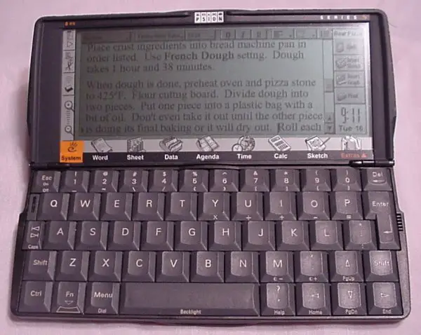
I always used the Pandora for thumbtying and had a small foldable standard keyboard with me when I wanted to use it on a desk.


I can't even imagine having a standard keyboard for normal typing which is only as wide as the Pyra is.
No Psion warmed your pocket.

open.jpg
 
Last edited by a moderator:
I always used the Pandora for thumbtying and had a small foldable standard keyboard with me when I wanted to use it on a desk.


I can't even imagine having a standard keyboard for normal typing which is only as wide as the Pyra is.
No Psion warmed your pocket.
... which is, again 3cm wider and 1cm higher than the Pandora is, but without having nubs there.

3cm is a lot for a device that's only 14cm wide.

The Psion has most probably the smallest usable standard keyboard - as soon as it gets smaller, it's not usable anymore.

And we ARE smaller.
 
Saber: why are you pushing so hard for a third Shift key, but not for a third Fn key? By your logic, all the Fn symbols on the right would be impossible to type, so why are you not proposing to replace, say, Tab (or maybe period or comma) with a third Fn?

If I would design the keyboard just for me, I would simply drop the keyboard Shift and Fn completely (or move it to one of those hard to reach top row keys), and have two more dedicated symbol keys, e.g. /? and `~ or -_ and =+. Not having keyboard Shift/Fn would also help people to discover the shoulder modifiers and appreciate them as a superior input method.

I can live with one keyboard Shift and Fn key as a compromise, mainly because people could look at the keyboard superficially and get worried about the apparent lack of those keys, but let it be clear that they're essentially just there for marketing, not for efficient typing. If you're holding the device in your hands, shoulder modifiers are superior. If you put it on a table, the location of the modifier key is not very important (it could be on the very top row). There is no use case in which the placement of keyboard modifiers is actually important.

So to me, one keyboard Shift and Fn is already a compromise. Two keyboard Shift keys (or Fn keys), for a total of three Shifts (or Fns), that is just insanely wasteful. You could just as well add an extra Space or letter E key (those are very frequently used keys, so the other thumb has to be able to press it too, you know? and you can always remap it to something else, so don't you complain!).
 
Disclaimer:
there are certain pros and cons that I do not mention in every layout, not because I did not recognize them, but I just did not feel I needed to add them:

Layout 1
-con accidental press of [ESC] or [Enter] are possible
Layout 2
- can't really tell why (except for placing '=' on [Enter]), it just does not float my boat
Layout 3
- con: accidental press of [ESC] or [Enter] are possible, placement of [sysReq] and [F12]
Layout 4
- pro: good thinking about [ESC]s place
Layout 5
- pro: two shifts on the keyboard
- con: accidental presses of [ESC] or [Enter]
Layout 6
- pros: [Enter] placement
- cons: I actually "paniced" , sort of.. , [ESC] not primary, accidental presses of [Enter], repeatedly using the same symbol (dotted circle for diacritics) add to he confusion
Layout 7
- cons: accidental presses of [Enter]
Layout 8
- pro: placement of [Enter]
- con: looks clean, but lacks functionality, the modifiers Ctrl,Alt,AltGr
Layout 9
same as 8, but without the neat [Enter] placement
Layout 10
- pro: packed with functionality, two shifts on the keyboard, no accidental presses of [ESC] or [Enter], international support
- con: placement of F11/12 is rather unusual, no context menu key, no printscreen, no pause/break (is this the same?)
Layout 11
- pro: packs a lot of functionality, [uSR1(2)]
- con: "wasteful" placement of [F11] and [12] is rather unituitive, accidental press of [ESC] or [Enter] are possible


verdict:
10 is the definitiv favourite, adjustments I would like to see:

- Rename Wifi/4G/BT to "HW" and implement functionality like either
    - Grench-style, with every modifier "selecting" another device, like [strg]+[HW] (toggles) WiFi or [shift]+[HW] toggles Bluetooth and if someone implements this, [HW] only opens up the hardware-menu (with more options for USB, video out etc.)
    - _wb_-style, [HW] is an additional modifier. So [HW] + toggles Bluetooth or [HW]+[W] toggles Wifi

- Move Display/Keyboard - light control on one button, with Grench-style modifier support (one press increases the brightness level, after maximum is reached, minium brightness level is set => loop). Use the free key for "context menu" as primary, "printscreen" as secondary (and maybe "break" as tertiary) function


- if possible, move [F11] on [back] and [F12] on [P]


All in all I only voted for 10, as I can't tell what EDs extract from the polls "winners". To me, it looks like a fortune tellers task, to find out why people voted for a particular layout, without a post that explains it.


Maybe it would have been better if this wasn't a poll, but a tightly moderated "opinion" thread:


"state(or two/tree of) your favourite layout(s), and a short text on what you like about them. Anything else will be deleted"


Last edited by a moderator:
I don't think an explicit "hardware toggle" key is really needed. We can use the Pyra logo key (Super) as a modifier and define some default shortcuts like Super+W to toggle Wifi and Super+U to toggle USB host, or whatever. Tapping Super would make the main menu pop up, holding Super down for more than 1 second would show an overlay with the current status of all toggles, showing also the letters you have to press in order to toggle each thing.

If we're lazy, we implement only the shortcuts, without the overlay menu. That should be more or less trivial to do. But I would prefer to have the overlay menu, and I wouldn't mind writing some Pyra-specific code to implement it.
 
I felt the same as what thatgui said in the final paragraph above.  I like that people are sharing what they think, even if there is a lot of stuff that may not belong, such as this post.  

Those who haven't yet, share what you think.  Give a few examples of what you want to see in the final layout and what should not be done.  It only takes a few minutes and can improve one of the most important parts of the Pyra.
 
 Use the free key for "context menu" as primary, "printscreen" as secondary (and maybe "break" as tertiary) function
I thought I wanted to have a "context menu" key too, until I learned that you can also use Shift+F10 for that (since many keyboards don't have that key). On the Pandora, that is not a particularly easy shortcut, but on the Pyra, it will be L1+R1+0, which shouldn't be too hard to do.
 
Personally, I like layout 1.

What about the shoulder buttons when thumb typing?

I was wondering, would it be possible to have the choice (say in a config panel) to switch the behaviour of the shoulder buttons functions in the general OS (i.e outside of games, emulators, etc).

I when I first received my Pandora (April 2012) I really liked the keyboard and the typing setup, that is, both shoulder buttons were configured to shift. For the first time in my life I was able to touch type quickly. I have a physical disability that makes typing on a conventional keyboard difficult. However the Pandora is great, I love the controls and the keyboard on the Pandora, much easier for me -- thumb typing. But I prefer a dual sided shift.

However, when I updated OS  (can't remember which update it was) one of the shoulder buttons were reallaocated (remapped) to ctrl. I tried reading articles on the wiki and forums to find a solution, i.e. be able resetting both shoulder buttons to shift. But to this day, I still haven't had any luck getting it to remap. Any suggestions on how to do this on Pandora? (Sorry, a little off-topic, maybe).

My point is that I like the idea of being flexible, being able to change the behaviour of the Pyra's shoulder buttons in a config panel, similar to the ability to change the behaviour of thr nubs on the Pandora. I don't mind if one the Pyra's shoulder buttons on ctrl and the other is shift, by default, but I would appriacate being to easily change to mapping.
 
#10 has my vote - though I wish the "R.Shift" on the keyboard would be ditched or at least swapped as "L.Shift"
 
Just so you know, Meta + n becomes the ñ in my layouts. You're already covered.  :)
That's cool, one less thing to map out of spec :) but I'm not sure if it will make it to the final layout, all I know is, as a Spaniard, the ñ would be useful to have even for informal writing. I would still prefer a user configurable key over a second shift though ;)


EDIT: ç is for french inherited words, at which point we also need ` and ^... cramped mess of a layout :p
Actually, I view the second keyboard Shift as a user mappable key if the person doesn't need it for Shifting. As modifications go, it's far easier with a layout with two keyboard Shifts to remap a secondary Shift to something else than work a layout with only one single keyboard Shift key. If you only use the keyboard Shift, if it's sticky, you're stuck with bounding back and forth like you'll do with the one keyboard Meta, if the keys you need are on the right half side.

Also for diacritics, as was mentioned before(and by _wb_ at an earlier time), it would be fantastic to have a checkbox in the gui to turn ` and ^ into their dead key diacritic counterparts as default. 

Saber: why are you pushing so hard for a third Shift key, but not for a third Fn key? By your logic, all the Fn symbols on the right would be impossible to type, so why are you not proposing to replace, say, Tab (or maybe period or comma) with a third Fn?

If I would design the keyboard just for me, I would simply drop the keyboard Shift and Fn completely (or move it to one of those hard to reach top row keys), and have two more dedicated symbol keys, e.g. /? and `~ or -_ and =+. Not having keyboard Shift/Fn would also help people to discover the shoulder modifiers and appreciate them as a superior input method.

I can live with one keyboard Shift and Fn key as a compromise, mainly because people could look at the keyboard superficially and get worried about the apparent lack of those keys, but let it be clear that they're essentially just there for marketing, not for efficient typing. If you're holding the device in your hands, shoulder modifiers are superior. If you put it on a table, the location of the modifier key is not very important (it could be on the very top row). There is no use case in which the placement of keyboard modifiers is actually important.

So to me, one keyboard Shift and Fn is already a compromise. Two keyboard Shift keys (or Fn keys), for a total of three Shifts (or Fns), that is just insanely wasteful. You could just as well add an extra Space or letter E key (those are very frequently used keys, so the other thumb has to be able to press it too, you know? and you can always remap it to something else, so don't you complain!).
I agree with some of what you are saying here, and I did have a keyboard layout with two keyboard Meta's and two Keyboard Shifts plus both of those modifier types on the shoulders, but that was contingent on having a centered spacebar, which isn't an option sadly.

Disclaimer:


there are certain pros and cons that I do not mention in every layout, not because I did not recognize them, but I just did not feel I needed to add them:

Layout 1


-con accidental press of [ESC] or [Enter] are possible


Layout 2


- can't really tell why (except for placing '=' on [Enter]), it just does not float my boat


Layout 3


- con: accidental press of [ESC] or [Enter] are possible, placement of [sysReq] and [F12]


Layout 4


- pro: good thinking about [ESC]s place


Layout 5


- pro: two shifts on the keyboard


- con: accidental presses of [ESC] or [Enter]


Layout 6


- pros: [Enter] placement


- cons: I actually "paniced" , sort of.. , [ESC] not primary, accidental presses of [Enter], repeatedly using the same symbol (dotted circle for diacritics) add to he confusion


Layout 7


- cons: accidental presses of [Enter]


Layout 8


- pro: placement of [Enter]


- con: looks clean, but lacks functionality, the modifiers Ctrl,Alt,AltGr


Layout 9


same as 8, but without the neat [Enter] placement


Layout 10


- pro: packed with functionality, two shifts on the keyboard, no accidental presses of [ESC] or [Enter], international support


- con: placement of F11/12 is rather unusual, no context menu key, no printscreen, no pause/break (is this the same?)


Layout 11


- pro: packs a lot of functionality, [uSR1(2)]


- con: "wasteful" placement of [F11] and [12] is rather unituitive, accidental press of [ESC] or [Enter] are possible
verdict:


10 is the definitiv favourite, adjustments I would like to see:


- Rename Wifi/4G/BT to "HW" and implement functionality like either


    - Grench-style, with every modifier "selecting" another device, like [strg]+[HW] (toggles) WiFi or [shift]+[HW] toggles Bluetooth and if someone implements this, [HW] only opens up the hardware-menu (with more options for USB, video out etc.)


    - _wb_-style, [HW] is an additional modifier. So [HW] + toggles Bluetooth or [HW]+[W] toggles Wifi


- Move Display/Keyboard - light control on one button, with Grench-style modifier support (one press increases the brightness level, after maximum is reached, minium brightness level is set => loop). Use the free key for "context menu" as primary, "printscreen" as secondary (and maybe "break" as tertiary) function


- if possible, move [F11] on [back] and [F12] on [P]


All in all I only voted for 10, as I can't tell what EDs extract from the polls "winners". To me, it looks like a fortune tellers task, to find out why people voted for a particular layout, without a post that explains it.


Maybe it would have been better if this wasn't a poll, but a tightly moderated "opinion" thread:


"state(or two/tree of) your favourite layout(s), and a short text on what you like about them. Anything else will be deleted"


In my signature is a "b" variation of the layout you liked the most, with screen and key backlight controls moved to keyboard Meta + Dpad. If it can be done, we could add in the hardware toggles and even a universal "ANY" remap key for those who say want Pause or Print Screen. 


9.1b: http://i.imgur.com/PMNkiGs.png


PMNkiGs.png


#10 has my vote - though I wish the "R.Shift" on the keyboard would be ditched or at least swapped as "L.Shift"


If it's determined Left Shift can actually be on the left and Right Shift on the right that would be great.


When I wrote these latest layouts out, I tried to fit everyone's needs within reason into them. It seems apparent that the two layout leaders garnered quite a lot of votes partially because they included à, è, and é so it seemed logical they had to be somewhere. That clever idea from one of the other member's proposals to put F11 and F12 on one top key was also sound to keep. In the end, this poll turned out to be surprisingly valuable.  :)
 
I remember an interesting layout by Grench that did a lot of things different from the others that had been posted up to that point, and I believe it had 2 of each modifier on the keyboard.  My guess is his current version is the "Don't Panic" layout.  Some other features are still present, like the locking meta layer, but many things are gone or changed (no centered space bar for obvious reasons).

I do like the idea of providing a user assigned key in the main keyboard area if we have room for it.  I don't know what the default function should be, maybe shift.  Since it is on the keyboard it might help with some languages.  ED seemed to like 2 shifts and a Usr key, and they can be combined to benefit many people, so I hope he considers doing that.
 
I always used the Pandora for thumbtying and had a small foldable standard keyboard with me when I wanted to use it on a desk.


I can't even imagine having a standard keyboard for normal typing which is only as wide as the Pyra is.
No Psion warmed your pocket.
... which is, again 3cm wider and 1cm higher than the Pandora is, but without having nubs there.

3cm is a lot for a device that's only 14cm wide.

The Psion has most probably the smallest usable standard keyboard - as soon as it gets smaller, it's not usable anymore.

And we ARE smaller.
That's simply untrue. The HP 200LX has an even smaller alphabetic keyboard section and it is more usable than the Pandora per the people I know who have owned both. There are two reasons for this: 1) The keys do not require as much force to depress and 2) there are two shift keys.

#1 has been solved in the keymat design but let's not forget #2!

I can type about 70 wpm on a 200LX because it can support two handed typing. Essentially, what I do with it is have three fingers from my right on the home row and then three fingers from my left on the row above it.
 
Last edited by a moderator:
Status
Not open for further replies.
Back
Top