Keymat Layout - the Final Poll!

What layout would you prefer? Multiple layouts can be chosen.

  • Layout 1

    Votes: 66 34.4%
  • Layout 2

    Votes: 13 6.8%
  • Layout 3

    Votes: 15 7.8%
  • Layout 4

    Votes: 28 14.6%
  • Layout 5

    Votes: 22 11.5%
  • Layout 6

    Votes: 29 15.1%
  • Layout 7

    Votes: 83 43.2%
  • Layout 8

    Votes: 10 5.2%
  • Layout 9

    Votes: 7 3.6%
  • Layout 10

    Votes: 53 27.6%
  • Layout 11

    Votes: 22 11.5%

  • Total voters
    192

Status
Not open for further replies.
The HP 200LX is 16cm by 8.6cm. It has 14 keys (at most) per horizontal row, 6 rows. It has no shoulder button modifiers.

The Pyra is 14cm by 8.4cm. Roughly half of that vertical space is used by the dpad/nubs/action buttons. It has 12 keys (at most) per horizontal row, 4 rows. It has shoulder button modifiers.
 
9.1b: http://i.imgur.com/PMNkiGs.png

PMNkiGs.png
 Nice, I like the idea of only the keyboard Meta allowing you to change brightness with the d-pad.  This should be possible since it's distinguishable from the shoulder meta.  But what this layout doesn't take into account, is that it's (very) popular to keep shift-pairs close to each-other.

If it's possible to do this "only keyboard meta changes d-pad function":

I also like _wb_'s idea of using Super+[some letter] to be the short-cut to hardware togglers. Like Super+W -> toggle WiFi, Super+B -> toggle bluetooth, etc. This frees up yet another key for user mapping ;) .
 
Last edited by a moderator:
Its not possible to have anything but two thumbs on the topside keyboard part of a handheld keyboard when you are actually holding it with your thumbs.

List of things i dislike:

No real typing keys, or Fn-typing of language

Dualwide non-centered, non-stabilized spacekey filled with compose or insert

Comma and dot on the left (or stepped comma and dot)

Other things, like tab, backspace and enter with symbols, functions or F-keys on it.

Symbols on letters, looks cluttered and makes it harder to find things.

Keys you cant read, or have much lower visibility than the rest (SELECT/CTRL being the main offender)

Symbols that are too big on buttoncluster, like writing "Ins" on one of the +2 keys.or ⌫

Pictograms that are unknown, like ⌫

Keyboard key named Fn or orange square to type symbols

Coloured symbols, suggesting they have something to do with Fn, colours for Fn type things is ok.

Colour instead of position on the key to determine shift-type modifiers.

Accidental Alt+F4 or Ctrl+Alt+F* as a result of having Fn on shoulders

No alternate graphics

Caps lock not on Fn+shift, which isnt possible if shift and Fn are both on shoulders.

Missing symbols like ¡ and ¿ which should be on shift+alternate graphics (and isnt possible)

Foreign symbols that should be on alternate graphics layer visible

No language layer

No dedicated compose

No dedicated diactric button

Fn combos that dont work

Fn combos that are used up

Foreign letters on the keyboard in the wrong place, in the wrong arrangement

Select start in wrong order and wrong orientation

Alt Ctrl on columnkeys with Alt up top, and ctrl bottom, means you have to combo ctrl+alt upwards, which is harder than pressing them downwards

BXYA has no native games, and is activly confusing all the time

Buttoncluster buttons that instead/can mean scroll lock, or left or right tab.

No useful keys next to AltGr or Shift so that you can do them in one press

Hard to reach often used symbols as a result of shift-type modifiers in the wrong places.

Not being able to do Dvorak or NEO, as a result of big space key

Not being able to do custom stealth layouts as a result of big space key.

Not being able to do AZERTY without disturbing also the arrangement of symbols on letters.

Things that are worse or different when these are solved:

Not possible to type F-keys with shoulders

No dedicated pause, break or printScreen buttons, arent used in the case of pause and break, (start ingame pauses) fn+p works to envoke the screenshot-tool. Programs use ctrl+p.

Sticky shift instead of second shift on keyboard part   (second keyboard shift means one additional hack)

No super, but Fn+rightnub works                               (stops working with Fn on shoulder)

No dedicated hardware toggles, but Fn+power works (stops working with Fn on shoulder)

So does Fn+↓ and Fn+↑ if you want to adjust ingame. (stops working with Fn on shoulder)

Answer me this, is the second best of anything good enough? That is not the dream. Where is the passion?
 
Last edited by a moderator:
I remember an interesting layout by Grench that did a lot of things different from the others that had been posted up to that point, and I believe it had 2 of each modifier on the keyboard.  My guess is his current version is the "Don't Panic" layout.  Some other features are still present, like the locking meta layer, but many things are gone or changed (no centered space bar for obvious reasons).

I do like the idea of providing a user assigned key in the main keyboard area if we have room for it.  I don't know what the default function should be, maybe shift.  Since it is on the keyboard it might help with some languages.  ED seemed to like 2 shifts and a Usr key, and they can be combined to benefit many people, so I hope he considers doing that.
Actually, the one you're referencing is my, "In the 'fat chance in hell' category IFF a centered space bar possibility comes into consideration:" keyboard. It was an early design where I was exploring 'what would be possible if...' and exploring whether it would be possible with a centered space and all needed modifiers on the keyboard - there are other concepts thrown in as well. This one has not been fully refined or vetted out.

http://www.keyboard-layout-editor.com/#/layouts/3909b1ca9e87a590a89d24608b7a5de9

Posted here for reference to the above inquiry. It does not require argument. Think of it as 'entertainment'. Those of you who didn't follow the keyboard threads may not know or understand just how 'far and wide' we went in some of the ideas. Though, if we could center that space bar, I would jump on something like this.

I've stepped out of this conversation for the last few days in order to defuse the incessant attack/defend response cycle. Thank you to everyone who put in well-reasoned and thought out responses to the poll. I hope it all helps ED figure out what to do next.
 
Last edited by a moderator:
Grench, it still had some interesting ideas.

The HP 200LX is 16cm by 8.6cm. It has 14 keys (at most) per horizontal row, 6 rows. It has no shoulder button modifiers.

The Pyra is 14cm by 8.4cm. Roughly half of that vertical space is used by the dpad/nubs/action buttons. It has 12 keys (at most) per horizontal row, 4 rows. It has shoulder button modifiers.


The HP 200LX has an even smaller alphabetic keyboard section and it is more usable than the Pandora 

 
What mrpalmtop said is true.  I compared my 100LX and Pandora.  Ignoring the number pad, the widest rows on the 100LX is narrower than the qwerty row of the Pandora.  Additionally, the LX keys are around 2/3 the width of the Pandora keys, and shorter than the top row of Pandora keys.  I don't have a measuring device handy, but just wanted to try to clear this up.
 
I cannot believe that anyone thinks that labelling the shift keys such that they inhabit the wrong side of the keyboard is at all sane. This is gonna get the piss ripped out of it when it comes to reviews.

D.
What you are seeing is the logical mapping. I.e. how things function UNDER the skin.

What will be PRINTED on the keys is the simplified 'Shift', not 'LeftShift'.

There is a bit of disagreement on how the left/right split should be done. On the Pandora, Right Shift and Right Ctrl were on the shoulder buttons. Because of this, some want the shoulder buttons to all be ther 'Right' version of their related keys. So, shoulders 'right' and main keyboard area modifiers are all 'left'. That convention could work.

The alternative is 'mixed' where the left shoulder is left shift and left Fn and the lower right keyboard area's shift & Fn are 'right'.

Either can be correct - neither convention has to be explicitly labeled on the final product's keyboard map.
I've said the same as ZXDunny multiple times.
It's almost worse if you *don't* label because when your game says "Left Shift to Fire", which "Left" are you going to press? The shift key on the left side of the Pyra is a good bet.
 
The HP 200LX is 16cm by 8.6cm. It has 14 keys (at most) per horizontal row, 6 rows. It has no shoulder button modifiers.

The Pyra is 14cm by 8.4cm. Roughly half of that vertical space is used by the dpad/nubs/action buttons. It has 12 keys (at most) per horizontal row, 4 rows. It has shoulder button modifiers.

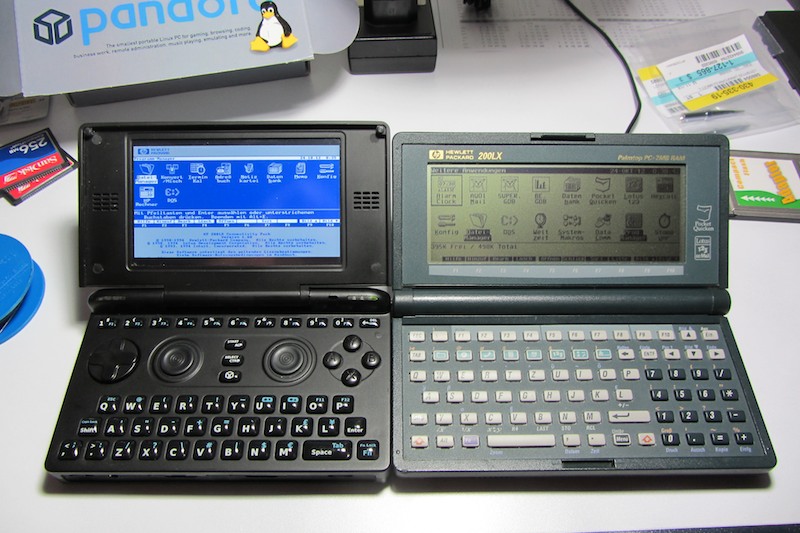
The keys on the 200LX are smaller than the Pyra's. And yet you can type much faster on it, with thumbs or with fingers. You can see for yourself:

pandora_cpack_comparison%20012.jpg
 
The HP 200LX is 16cm by 8.6cm. It has 14 keys (at most) per horizontal row, 6 rows. It has no shoulder button modifiers.

The Pyra is 14cm by 8.4cm. Roughly half of that vertical space is used by the dpad/nubs/action buttons. It has 12 keys (at most) per horizontal row, 4 rows. It has shoulder button modifiers.
 The keys on the 200LX are smaller than the Pyra's. And yet you can type much faster on it, with thumbs or with fingers. You can see for yourself:

pandora_cpack_comparison%20012.jpg
Actually - the 200LX's keys are about the same -height- as the Pyra's keys will be. The Pyra's keys will all be about the same dimensions as the SMALL keys on the Pandora.

So, the Pyra's keys will be about the same height and a big wider than the 200LX. Key density on the Pyra has to be greater than the 200LX in order to have room for the game controls. Key density can only go so far - and then you need to make keys do more than one thing.

Notice that the secondary functions on the HP tend to center around calculator functions. Each key has a Fn layer - it's just printed on the case instead of the key. The Pyra doesn't have room on the case to do that - higher key density.
 
 
Nice, I like the idea of only the keyboard Meta allowing you to change brightness with the d-pad.  This should be possible since it's distinguishable from the shoulder meta.  But what this layout doesn't take into account, is that it's (very) popular to keep shift-pairs close to each-other.


If it's possible to do this "only keyboard meta changes d-pad function":

I also like _wb_'s idea of using Super+[some letter] to be the short-cut to hardware togglers. Like Super+W -> toggle WiFi, Super+B -> toggle bluetooth, etc. This frees up yet another key for user mapping ;) .
I'm not a big fan of letting L_Meta behave differently than R_Meta by default. It's possible though. Power users can do that if they want, but for the default mapping I think we should avoid confusion, so I think we shouldn't distinguish left and right modifiers.

On the Pandora it happens quite often to me that I press Fn to input some symbol, but then change my mind and use the dpad or action buttons to move the cursor.
 
EDIT : I hope ED makes a German layout as it has some of the Turkish characters.
Yeah, instead of trying to find something that will fit most people as equally as possible let's each one hope we get the best layout for our own. That's the spirit. Also, exactly what ED was asking for.
Well, humankind at its best, I guess...
:) I was trying to find the middle ( :) )
If ED uses a English layout with some German characters which some of them are also Turkish characters and some symbols for terminal as well as esc and backspace in a comfortable place and dual shifts for both gamer and coder people it would be better, of course.


EDIT : Spanish would make more sense than Turkish
 
Last edited by a moderator:
Status
Not open for further replies.
Back
Top