You are using an out of date browser. It may not display this or other websites correctly.
You should upgrade or use an alternative browser.
You should upgrade or use an alternative browser.
Logo twerking
- Thread starter Fzero
- Start date
FaeMinx
Rainbow Liberation Instigation
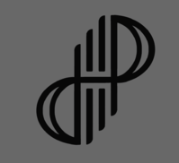
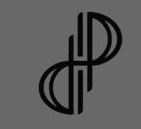
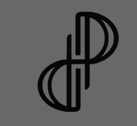
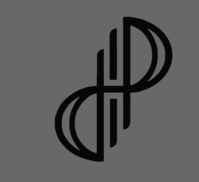
I think the bottom left one is great! Would be happy with that on the lid....Here's a few efforts I just done, changing it up a little bit
FaeMinx
Rainbow Liberation Instigation
Cooking a meal that is a masterpiece isn't just about making sure you have all the 'right' ingredients...@FaeMinx: I just wanted to say that I think the box in comradekingu's logo is quite important because of the "box" in "Dragonbox". His logo seems to have incorperated everything relevant (i.e dragons, wings, box, fire etc).
It's about how you combine those ingredient... which ones to disguise, which to leave raw...
And in your creative endeavour you may find that the meal just has more impact and clarity of flavour if you 'remove' one of the ingredients you thought was so vital...
Etc etc...
A meal can be cleverly created, and has great meaning and impact for the creator of that meal... (and those who admire the creator)
... but someone else can come along, taste it, and not like it at all.
The creator may be flabbergasted, and attempt to convey the meaning to this person, but if that person has different values to the creator, no amount of cleverness will impress him/her.
Thus, in order to be a master chef... you need more than cleverness... you need something that isn't easily quantified... you need an empathic affinity with your audience... the ability to appreciate their values...
Anyway, enough of that.
I can appreciate the workmanship in the logo, and agree it is a good logo... it simply isn't to my taste. All the suggestions I made are in an attempt to make it more to my taste.
That is all.
comradekingu
Glowing ember
I just find box to be more relevant to dragonbox than a dna string. There is a point there, but it applies equally well to all organic things, and all logos thereof as a result. The H in hardware has more to do with the pyra handheld hardware if finding an explanation is how to explain someting/a change. At least that is a plausible sentiment to get, rather than a possible interpretation.
I think if one does curves it has to be the outline, or the outline has to follow. Curved parallell lines with circle around it is overused, so other than
i dont really know what to do.
We are now looking into why people are voting for dp now when they werent before, and how to get the best one. If that is a direct overlay with fixed relations, well then i cant contribute, nor do i want to.
I see what i see, and i made my best effort based on that. If you see that as working out any other way, then feel free to edit it. And i am _only_ concerned with whats on the lid as far as this effort is concerned.
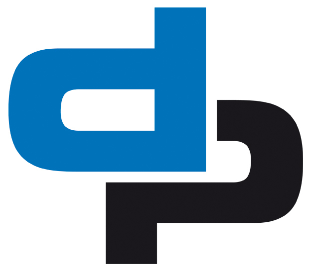
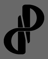
From all the problems that were raised with #1, i tried to fix what i could, and came upon this as an answer. It doesnt look tribal, like existing artwork/design layout/idea, its easy to read, and its precise.
The curve is also kept, but comes from the standard latin lowercase d and p, thats what you have to work with if given d and p to make a pleasant curve. There are no natural curves in d and p unless you go cursive, and ive tried that. What happens is you end up with a very vertical logo, or a not so good straight edge representation. With highercase they are no longer ambigramatical, because the P has a pillar and the D doesnt. (heh)
All the lines that are used already do more in the combination they are put in
 , otherwise you end up with a "why is this unreadable, the pillars in d and p arent bent like a sine wave..."
The interleawing/cuts has already been figured out, and i should think all combinations have been tried. This or no cuts is a final state.
What it boils down to is the question, do people like this better than #1, because i know I do.
I think if one does curves it has to be the outline, or the outline has to follow. Curved parallell lines with circle around it is overused, so other than
i dont really know what to do.
We are now looking into why people are voting for dp now when they werent before, and how to get the best one. If that is a direct overlay with fixed relations, well then i cant contribute, nor do i want to.
I see what i see, and i made my best effort based on that. If you see that as working out any other way, then feel free to edit it. And i am _only_ concerned with whats on the lid as far as this effort is concerned.
From all the problems that were raised with #1, i tried to fix what i could, and came upon this as an answer. It doesnt look tribal, like existing artwork/design layout/idea, its easy to read, and its precise.
The curve is also kept, but comes from the standard latin lowercase d and p, thats what you have to work with if given d and p to make a pleasant curve. There are no natural curves in d and p unless you go cursive, and ive tried that. What happens is you end up with a very vertical logo, or a not so good straight edge representation. With highercase they are no longer ambigramatical, because the P has a pillar and the D doesnt. (heh)
All the lines that are used already do more in the combination they are put in

The interleawing/cuts has already been figured out, and i should think all combinations have been tried. This or no cuts is a final state.
What it boils down to is the question, do people like this better than #1, because i know I do.
Last edited by a moderator:
No, I don't.What it boils down to is the question, do people like this better than #1, because i know I do.
FaeMinx
Rainbow Liberation Instigation
Sorry, me either. I have a different aesthetic affinity.
I.e. If I were to build a house... it would look like it was moulded out of the earth, and feel alive as if it were some massive strange tree lit from within... water would flow from room to room with no uniformity of room shapes or spaces... you wouldn't find a straight line anywhere.
Every piece of furniture would look as if it grew out of the floor or walls...
And it would be sooooo comfortable and cosy and blissfull to live in as opposed to these awful unnatural little closed off boxes humans ensconce themselves in.
comradekingu
Glowing ember
I find natsu to be unconstructive, and i dont really know how to make a FaeMinx logo. That being said, i suppose you are right, and we are probably quite different. I like the flowing water though.
Were i to it would probably be the worst of both worlds.
However, that brings us no closer to something we can agree on. Nor does it fix the problems the #1 logo has. I guess some semi-rounding of the hard angles on the Fzero/kingu one it is what i can do.
Were i to it would probably be the worst of both worlds.
However, that brings us no closer to something we can agree on. Nor does it fix the problems the #1 logo has. I guess some semi-rounding of the hard angles on the Fzero/kingu one it is what i can do.
Last edited by a moderator:
Fzero
Advanced Member
- Joined
- Mar 9, 2010
- Messages
- 4,702
Bit OT, but regarding your comment...
Every piece of furniture would look as if it grew out of the floor or walls...
And it would be sooooo comfortable and cosy and blissfull to live in as opposed to these awful unnatural little closed off boxes humans ensconce themselves in.
I imagine your place would be a bit Gaudi-esque.
You been Barcelona and seen his houses, especially Casa Batilo, it's very curvy and the floors melt into the walls and ceilings in some rooms. Beautiful space.
http://www.casabatllo.es/en/virtual-tour/
http://www.casabatllo.es/en/gallery/officials/
....back to the logos
FaeMinx
Rainbow Liberation Instigation
There are a few variations of no1 that I am already happy with... those that still take issue with it obviously have a different aesthetic.
We are very different indeed.
You should only try to meet me half way if what I suggest has appeal for you, otherwise it's best you don't even try ... because creation must arise from passion for it to be true... if there is no passion, then what you attempt is sure to fail.
Who knows? Maybe Ed's aesthetic is more akin to yours than it is to mine.
I liked the organic nature of no1, and I sought to refine what I saw there.
If the logo we were voting on was... what word can I use? - as mechanical as yours I wouldn't have felt any inspiration and I wouldn't have worked on or submitted any variations.
I still don't think it's a bad logo - it's polished for what it is. I also like your pyra ambigram.
If you wanted to meet me half way, you could still adhere to your insistence of geometric precision, but introduce some fractal elements.... I.e. the Fibonacci spiral.
I like things that flow and have depth... I'm not a fan of 2 dimensionality... a logo that has perspective, as if it could exist in 3 dimensional space instead of on a flat plane.
FaeMinx
Rainbow Liberation Instigation
Quite nice... but not even close to what I have in mind... most of my floors won't even be level.I imagine your place would be a bit Gaudi-esque.
You been Barcelona and seen his houses, especially Casa Batilo, it's very curvy and the floors melt into the walls and ceilings in some rooms. Beautiful space.
http://www.casabatllo.es/en/virtual-tour/
http://www.casabatllo.es/en/gallery/officials/
Think more in terms of a nest with many chambers and passageways... but more open and on many levels, spiralling and flowing into each other.
I would crawl and climb in that home far more than I would walk...
Better than #1 to me. But do you really want to give to Pyra the image of 1/two letters 2/which are already used in that way by dozen of logos? I think you could do a good variation of #2 according to your box logos.What it boils down to is the question, do people like this better than #1, because i know I do.
Tenka
Snakes and Fish
- Joined
- Jan 28, 2012
- Messages
- 701
That sounds like just the kind of home I have wanted for a very long time. A home built for me, not built for furniture.Quite nice... but not even close to what I have in mind... most of my floors won't even be level.
Think more in terms of a nest with many chambers and passageways... but more open and on many levels, spiralling and flowing into each other.
I would crawl and climb in that home far more than I would walk...
Fzero
Advanced Member
- Joined
- Mar 9, 2010
- Messages
- 4,702
Quite nice... but not even close to what I have in mind... most of my floors won't even be level.I imagine your place would be a bit Gaudi-esque.
You been Barcelona and seen his houses, especially Casa Batilo, it's very curvy and the floors melt into the walls and ceilings in some rooms. Beautiful space.
http://www.casabatllo.es/en/virtual-tour/
http://www.casabatllo.es/en/gallery/officials/
Think more in terms of a nest with many chambers and passageways... but more open and on many levels, spiralling and flowing into each other.
I would crawl and climb in that home far more than I would walk...
Tombliboo?
...If you not familiar, they're from a very popular children's program here called In The Night Garden, your comment there made me instantly think about them and their home, which is within a bush/tree, and like a warren of nests, and they have to crawl into it too from the outside.


http://www.youtube.com/watch?v=zrkbFxPzQAg#t=13m55s
Sorry for this extended OT
comradekingu
Glowing ember

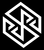
I like the structure of this, but I have the feeling that there are too many redundant lines. Can you boil it down to its essence, with less lines?
comradekingu
Glowing ember
Similar threads
- Replies
- 25
- Views
- 6K


