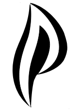
Logo Discussion


I went through the threads, of the ones that arent tied to a name that didnt get picked, there are just over 100 submissions
of those

Simple  
http://boards.openpandora.org/topic/14915-finding-a-proper-name-and-logo/page-67#entry311916/URL]

5.
pyra-mobius-dp.png

the d-p(ragonbox) / pyra.  Very polished, so stylish, pure fantastic concept, great use of colour gradients. I hope nobody has used it before, because its too iconic not to use for something.

Fonts: 
http://boards.openpandora.org/topic/14915-finding-a-proper-name-and-logo/page-74#entry316651/URL]

6.
28hfjgw.png

Simplifies pure font in a way that makes it a thing of its own.

http://boards.openpandora.org/topic/14915-finding-a-proper-name-and-logo/page-38#entry297831/URL]

7.
24w6iwh.png

p-y-r-a boxen, many colours that work in many environments. Nice and welcoming. Nice bootsplash

Emblems:
http://boards.openpandora.org/topic/14915-finding-a-proper-name-and-logo/page-29#entry294463/URL]

8.
pyragon.png

A more voluminous version of the pyragon p flame, less agressive pointiness out into nothing, more 3d. Has some theme-matical meaning to it.
 
http://boards.openpandora.org/topic/14915-finding-a-proper-name-and-logo/page-26#entry294011/URL]

9.
20131116162850-df8278e9.png

Get blasted off the map, its fresh, its a take on the old that is a successive successor design. Wish the lines outwards were a bit shorter.

http://boards.openpandora.org/topic/14915-finding-a-proper-name-and-logo/page-26#entry294011/URL]
A symbol that is unique, cool logo, pun intended. Great work, doesnt check all the boxes, but is still contending on pure approach. With some tuning, speaker grille perhaps?

10.
20131122012928-5e8e2874.png


http://boards.openpandora.org/topic/14915-finding-a-proper-name-and-logo/page-3#entry290029/URL]

11.
dragonbox.PNG

Its very hard to capture the essence of a dragon in any sort of symmetry, iprice did it, many others tried. Looks like a crest. Maybe it could cast a shadown down on the square.


These i think need some work:

Organic design
http://boards.openpandora.org/topic/14915-finding-a-proper-name-and-logo/page-51#entry306379/URL]

12.
db-pyra-flame.png

The wonderous pYRa Has a foresty magicalness to it, really draws, i like its roughness, but it doesnt tie together that well.

Styles 
http://boards.openpandora.org/topic/14915-finding-a-proper-name-and-logo/page-46#entry300751 /URL]

13.
2iitq93.png

60s pyra. Solves ambigram problems in a way that is stylish and with serifs, it makes sense. Little rough though, needs tuning.
 
http://boards.openpandora.org/topic/14915-finding-a-proper-name-and-logo/page-56#entry310235/URL]

14.
250qoeg.png

The cookiecutter 60s Very few elements, lots of repetition, much potential, also a little rough and needs tuning.
 
I think if a poll ever did anything its good in this case to gage interest from a wide selection. Several hundred hours went into this, its a huge amount of time to discard based on what just one person thinks.
If so, then pick one and stick with it. If not, then it doesnt hurt for the process to be as wide spanning as the scope it sets.
 
Avoiding design by comitee i still think a logo, especially in a community manner, is about what a community wants.
And some part of great logo design is applying to a broad mass of people, namely a selection of which is this community, which the device is for.
Its not a problem if something is popular, nor is it a problem if everything ends up being equally voted on, thats just back to square one. But i think everyone wants to have their say nontheless.
 
Its not about winning, its about taking part. How about we all get to nominate our favourites, they are all pasted in firstpost and numbered. Then we get to vote for our first second and third pick.
There wont be too many submissions because very many of the 100 were brainstorming ideas or variants of eachother, and probably of the rest, not everything will get nominated.
One big vote, and then it wont be "but. but.."
 
For it to be 100% on the back of the device, information about colour selection, material, tooling, and extrusion or protrusion (3d logo like the pandora lid was) is needed. Or if its going to be illuminated, and if so, what parts.
Its all a part of the design process.
Also i think one approach works one place, and that a readable companion for some of them is needed other places.

Edit: Interestingly, there were many many submissions for dragonbox. If that ball in the air it would be nice to know. I dont know if they were intended as device names, as the logo name was dragobox, and only the model name was pyra, or if it was for the shop. Posters, t-shirts, favicons, bootsplash, emblems, logos, there are many areas and certainly no shortage of creativity. Need some more direction to funnel it to.
 
Last edited by a moderator:
How can you guys be dissing the dragon? You got to at least like the form of the words under it.
Actually the lettering is the aspect of that logo I like least.

I'd like to see a variation of #2 with a normal D and without the word Pyra.

I could see that being backlit on the lid to advertise the DragonBox brand. Then have the small white logo from #1 silk-screened on the top corner of the lid for the device specific part.

- Neelix
 
comradekingu: It's most important that ED likes the logo, so he picks what he likes and we "vote" on those. "Vote" in quotes since the result is at best advisory.
 
Last edited by a moderator:
http://boards.openpandora.org/topic/14915-finding-a-proper-name-and-logo/page-46#entry300751 /URL]

2iitq93.png


60s pyra. Solves ambigram problems in a way that is stylish and with serifs, it makes sense. Little rough though, needs tuning.
 That's always been  my favorite (with another), just awesome.

I agree with what you said but I know that sole logo could fit so much better, but I'm just tired.

I my opinion there should be a big poll , then a little poll , then a poll while the chosen logo will be improved.
 
Last edited by a moderator:
It is the coolest status led I can imagine! I would use it for all kinds of notifications -- hopefully it has an RGB led, but even with a monochrome one, there's a lot you can do with blinking/brightness. If it's an RGB one, there's enough "information bandwidth" for it to replace all other status leds as far as I'm concerned.
Its just a matter of taste, I like my devices to look humble, not to show off some brand (as I don't relate to brands and generally think that modesty is a virtue).Regarding functionality: Why not place the LED somewhere in the hinge area or beneath the lcd (with transparancy on both sides, like the thinkpads), so status infos can be seen both if the Pyra is openend and closed ?
 
2 is my favorite, with 1 being a fairly close second because I'm a fan of simplicity.
 
First of all, THANKS to everyone who contributed something here!

I was baffled by some ambigrams (I really like ambigrams), but I'm not sure they really fit as logo... they look a bit weird :/

Please don't be sad if your logo is not included here - there were many many nice contributions, but a lot of them were simply too complex to be useful as logo.

What do you guys think?
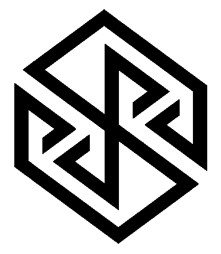
I wonder why you chose some of the most complicated ones then.

My favourite is still comradekingu's Pyra ambigram Pandora reminiscence box with the pyramids, especcially if it gets an LED.

http://boards.openpandora.org/topic/14923-logo-idea-by-comradekingu-is-logo-idea/page-13#entry310648
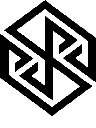
post-2326-0-71539500-1392971430.png


Since it is symmetrical, it doesn't even matter which way it's embossed on the lid.

He has put many thoughts and work into it and the result hits the spot for me.

Edit: Updated to current, more smooth version.
 
Last edited by a moderator:
I would also still vote for this one.

My favourite is still comradekingu's Pyra ambigram Pandora reminiscence box with the pyramids, especcially if it gets an LED.

http://boards.openpandora.org/topic/14923-logo-idea-by-comradekingu-is-logo-idea/page-13#entry310648

post-2326-0-18064600-1391249017.png
On the other hand, if ED doesn't like it, I prefer:

- set 1, the 1st

- set 2 the 2nd (the box) as the illuminated logo on the lid (nothing would fit better there).

Set 3 remembers me to the Debian logo, that's why I would like it as well, but it seems a bit to complicated though.
 
Last edited by a moderator:
[[3]] Was one of my efforts, which should now be eliminated from the options though, as ED has mentioned, it's not going to work due to the style we having with the cut out and LED

[i knew that surprise LED was going to be on the logo, and personally I think that sounds great, will be a nice touch] :)

[[2]] The dragon one is a nice design but not that keen on it as the logo myself, I agree is a bit too gothic looking. I much prefer the box/wings one ... though I think that's actually box/eyes :)

My favs of these selection though - Definitely:

The small white icon shown in the corner of [[1]]

or

The third one, just single colour shape with the flame P cut out, shown in [[4]]

Those both would work well IMO as the LED and both very recognisable.

I agree with ED that the [[1]] logo should be accompanied with an alternative font choice though. Something with a touch of style and uniqueness about it

Also good to hear Traylorpark is hopefully going to be working on something, he obviously has style, evident from the JP box art.

Even if he just comes with some tweak ideas to one of these, would probably have some input which would be an improvement
 
I'm currently thinking that a device call pyra, made by a company that associates with dragons, really should a have a logo that suggests a flame.

That includes [1], [3] and [4], but not [2].

A logo that includes a dragon is suitable for dragonbox the company, but not pyra the product.

horizontal-rule-1a.jpg


Here's an attempt to merge the ideas in [1] and [4]:

  • Its got rotational symmetry
  • Makes (IMO) a aesthetically pleasing shape
  • Can be seen as the initials dp for dragonbox pyra
  • Looks like two flames

View attachment 8536
 
@ First post:

1: Wouldn't take it

2: Why not gothic?

3: No

4: My faforite.

For the back of the Pyra I wouldn't use the flame but only the "P" without flame (First one).
 
I'm currently thinking that a device call pyra, made by a company that associates with dragons, really should a have a logo that suggests a flame.

That includes [1], [3] and [4], but not [2].

A logo that includes a dragon is suitable for dragonbox the company, but not pyra the product.

horizontal-rule-1a.jpg


Here's an attempt to merge the ideas in [1] and [4]:

  • Its got rotational symmetry
  • Makes (IMO) a aesthetically pleasing shape
  • Can be seen as the initials dp for dragonbox pyra
  • Looks like two flames

attachicon.gif
screenshot4.png
I like this a lot. Rotational symmetry is very nice for something you put on the lid.

One tweak suggestion: can you make it so that the ( and the ) line up to become part of one big circle?
 
Last edited by a moderator:
Back
Top