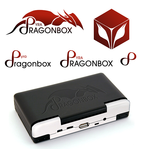
As mentioned, I want to decide on a Logo until the end of the month - and here is what I found best so far (with comments).
First of all, THANKS to everyone who contributed something here!
I was baffled by some ambigrams (I really like ambigrams), but I'm not sure they really fit as logo... they look a bit weird :/
Please don't be sad if your logo is not included here - there were many many nice contributions, but a lot of them were simply too complex to be useful as logo.
Also, I'm in contact with Traylorpark (he designed the japanese boxart for the Pandora) and he might contribute something as well
Now, here for some logos I find quite good (in no particular order).
These should not be considered as final, they might be improvable (with different fonts or small details), but I think that's the direction we should be heading.
1.

The last one (on the right and lower right) looks nice.
Not sure about the colored flames though - somehow, I like it white more than with the flames.
Also, maybe a bit different font - it looks a bit too generic.
2.

While that dragon looks stylish, it's a bit too much into Gothic, somehow.
That box with the wings has something though...
3.

Hmmm... it looks nice - but I'm planning to have a transparent logo (with LED light) on the back of the lid... and that swirl inside of the flame can't be properly cut out.
4.

I also like that one - on the lid, the flame could be transparent and the PYRA-letters embossed (or the other way round?)
Well, or, for the back of the device, simply this:

What do you guys think?
First of all, THANKS to everyone who contributed something here!
I was baffled by some ambigrams (I really like ambigrams), but I'm not sure they really fit as logo... they look a bit weird :/
Please don't be sad if your logo is not included here - there were many many nice contributions, but a lot of them were simply too complex to be useful as logo.
Also, I'm in contact with Traylorpark (he designed the japanese boxart for the Pandora) and he might contribute something as well
Now, here for some logos I find quite good (in no particular order).
These should not be considered as final, they might be improvable (with different fonts or small details), but I think that's the direction we should be heading.
1.

The last one (on the right and lower right) looks nice.
Not sure about the colored flames though - somehow, I like it white more than with the flames.
Also, maybe a bit different font - it looks a bit too generic.
2.

While that dragon looks stylish, it's a bit too much into Gothic, somehow.
That box with the wings has something though...
3.

Hmmm... it looks nice - but I'm planning to have a transparent logo (with LED light) on the back of the lid... and that swirl inside of the flame can't be properly cut out.
4.

I also like that one - on the lid, the flame could be transparent and the PYRA-letters embossed (or the other way round?)
Well, or, for the back of the device, simply this:

What do you guys think?

