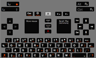
It's the keyboard layout.


Fortunately for the sake of rationality, ED prefers keys that are labeled nice and relatively squint-free and less busied, leaving the fourth level modified characters to user memorization, should they ever need them.
Well that's what I'm saying, if you can fit three characters on a key then you can fit a fourth. Period. No need to make anything smaller. If you need to squint with four characters than you'll need to squint with three as they'll all be the same size.
But... if the numbers will also have fourth level values, then they must/should also be "printed" on those caps. Look at the number buttons on this here Pandora, which are identical in dimension to what they'll be on the Pyra. I don't see how anything on those keys won't be scaled down to fit a fourth mark, unless they are super cozy(=cluttered).  -_-
cimg5899w.jpg
I agree with Grench that the number row has 4 "characters" printed on each key (and 7 on one).  If we skip printing "F1" etc. on the number row (for those that have F1-F10 on those keys) that opens up the 3rd marking for a 4th character/function.  


I forgot how tiny the F# markings were since I never use those to find those keys.  Maybe that is why some of us are ok with not including those completely on their own.

I would also argue that the main number and symbol labels on the Pandora's number keys would only need to be marginally smaller to fit vertically stacked, (The F-key labels prove that smaller labels can still be legible and those are smaller than they need to be IMHO) and the keys are wide enough to leave a nice gap between symbol pairs to avoid looking cluttered.
Don't forget that, while the Pandora number row and Pyra keys may be similar in size, the Pyra key caps will be smaller and have less space to print everything.

I am not getting into the debate over more or less characters printed per key.  I have stated many times that I prefer few key markings.  As for the size of dots for .:;, I don't see why they would be tiny.  If they are too small the user won't be able to distinguis : from ; and ./,.  I am using a keyboard with tiny little painted keys with the character area probably about the same as it will be on the Pyra and all of those are distinguishable in 2 colors at full arm length from my unassisted eyes, and I am pretty myopic.  They don't take up much space on a key, so why would they be unusably tiny?
 
Last edited by a moderator:
I agree with Grench that the number row has 4 "characters" printed on each key (and 7 on one).  If we skip printing "F1" etc. on the number row (for those that have F1-F10 on those keys) that opens up the 3rd marking for a 4th character/function.  


I forgot how tiny the F# markings were since I never use those to find those keys.  Maybe that is why some of us are ok with not including those completely on their own.
Perhaps on keys 1-9+0, there could be explicit markings for F1-10 with reduced redundancy by only discriminating (through colour) the 'F'. That is, we would have (F)X, where X is 1-9, and (F1)0. Or F5, F7, etc. and F10. That way the 'labels' for the number and for the function key are 'combined' to save space, while still being explicit.
 
"Empty" space is not wasted space, and has a vital two fold function, first is the less than trivial esthetics - produce some amateur over crowded keyboard and people will walk away just on initial impressions. Longer term and more importantly actually finding a character when visually scanning a small keyboard will be very much harder with three or greater characters, its just how the visual part of our brains works


There isn't really a "standard" place to put a colon and finding it even in a modest forest of characters will be time consuming and off putting...


Less is genuinely more in this case - and this from a none Apple fan boy !
 
Let's compare some proposals in terms of visual complexity. I'm trying to do the comparison in a fair way, using the exact labels as found in the current versions of each proposal, with just all of the labels in a row -- in reality the layout could be different, e.g. shifted (and fn/meta+shifted) labels will probably be slightly higher than the non-shifted labels, but since the keys are rectangular, not square like most of the Pandora ones, a horizontal row of labels makes sense.

Here's the ASD row  (feel free to repeat this exercise for other rows, but I got tired after this one)

_wb_:                ' " ′ ¨  A  S  D  F  G`  H  J  K[{  L]}  ,<;:

Saber:               Shift  A?  S=  D-  F+  G_  H`  Jö  Kä  L§  Shift

Grench:            Alt_Lock_  AÄ  SÖ  DÜ  Fß  G;:  H' "  J[{  K]}  L\|  Shift_Lock_

_ible_:          ' "   A  S  D  F  G  H  J+  K-  L  ,;\|

comradekingu:  A  S  D  F  G  H  J  K  L   <>  ⇧

WizardStan:      Shift_Lock_  A[{  S]}  D  F  G  H  J{  K}  L|  Shift_Lock_
 
Last edited by a moderator:
Select/Ctrl is by far the worst idea of a print on the whole pandora keyboard.

What makes it so bad is that its so much worse than the rest. Granted, its only the one button.

Filling up other buttons, especially the typewriter-buttons, with other things, perhaps 3 other entirelly different things, takes down visibility to a worse level. Ease of use is very tied to functional adaptability.

Im not saying foreign concepts dont work, maybe they do, but they look out of place. Like you have to think about it to see if the hacks are for you or not. Whereas without them its just "ok, this is a keyboard, i know this"

Take a look at the above. I know whats going on with one of those. 

Edit: Looking at it without my browser css now, opened up with colours enabled to mark the offenders in red. Was about to comment on how i see things stand out, and its exactly how its already marked, and also the _Lock_. Mark the text and it looks just the same.

F11 and F12 on a different row, and something other than space only on space looks bad. Same goes for shift tab and whatnot.

Id very much like to drop printing not only F1-F10, but also F11 -F12 for this reason. It looks forced.

Its even better than doing the numbers in F-colour and having F11 and F12 match. Because then you dont need another colour on the keyboard. View attachment 11076 here i see no troubles.

Would be nice to have that in the vote, because thats what i would go for. Arguably printing "AltGr"  "Esc" and soforth is better.

Are the moulds made for the case design so that doublespace is definately in?


Edit: Everything having to be put in orange/red/purple, is out of place, or, for the most part, doesnt belong on a international keyboard at all.
 
Last edited by a moderator:
This is mainly a joke... would it be possible to have various symbols painted per key in a way that they are invisible by default, then have a UV type light which makes the keys show up. Then 'adjust' the UV type lights 'wave length' to make other symbols show up (as they have been painted with paints which show up under different UV light wavelength). Then you could choose which UV settings it switched on, if you set it in French mode you'd see the French symbols, German mode for German symbols, and so on and so forth.

I can think of quite a few reasons why this isn't going to be possible, but I just thought it was a fun idea that I wanted to share. Sorry if this has already been suggested, I have not read through all 32 pages of this thread!
Well technically white light is broad spectrum so all youd really need are glasses that filter out the band thats reflected off the respective inks...
 
The AltGr + Shift values wouldn't get a print. Space on the key's caps is just too limited for them to fit. 
This is the sort of stuff that is important to know.  You may have said this many times and I somehow still missed it.  Since we now have the layout popularity poll this is important to consider (I don't remember how you get each thing on your layouts, so I will take a look again in a few).  It could have a heavy impact on the usability of a layout if commonly used characters are not found when looking at the keyboard.   Would you be willing to modify the version of your layout that somebody put into the layout editor thing most others are using to reflect the actual appearance of your layouts, and include notes on how things are done, including things that may not be printed on keys? 
All of what you ask is thoroughly detailed in each of my layout's pictures(consolidated and unconsolidated) and the accompanying summary. I put effort into making them quite comprehensible(like separate panes for what the Shifted and AltGr values are in the unconsolidated ones) but I'll answer any specific questions you and others have if you cannot understand how something is done. :)
 
Looking back, I think I was confused.  Are you saying diacritics won't be on the keys, or the entire right side of your unconsolidated pictures?  Now it seems obvious, and I probably just misread what you said.
 
Looking back, I think I was confused.  Are you saying diacritics won't be on the keys, or the entire right side of your unconsolidated pictures?  Now it seems obvious, and I probably just misread what you said.
The Shift + AltGr values which include the diacritics won't be labeled, but I did put them under keys that I associate with the marks like / for stroke and ? for ogonek and cedilla and such.

For the record, I view my layout as filled not cluttered with everything having a clearly defined task. Anyone can customize it to their individual needs as they wish with most of these remaps occuring over the umlauts. Personally, I'd rather we not frame the keyboard after Australia(clustered exterior and barren interior). ;)
 
This is mainly a joke... would it be possible to have various symbols painted per key in a way that they are invisible by default, then have a UV type light which makes the keys show up. Then 'adjust' the UV type lights 'wave length' to make other symbols show up (as they have been painted with paints which show up under different UV light wavelength). Then you could choose which UV settings it switched on, if you set it in French mode you'd see the French symbols, German mode for German symbols, and so on and so forth.

I can think of quite a few reasons why this isn't going to be possible, but I just thought it was a fun idea that I wanted to share. Sorry if this has already been suggested, I have not read through all 32 pages of this thread!
Well technically white light is broad spectrum so all youd really need are glasses that filter out the band thats reflected off the respective inks...
I actually had a similar idea quite a while back.  The idea was to use color controllable LCD back light to change with the mode of the keyboard and what symbols were presented.  Since the Pyra is dimmable white light only LED, I dropped the idea.
 
Let's compare some proposals in terms of visual complexity. I'm trying to do the comparison in a fair way, using the exact labels as found in the current versions of each proposal, with just all of the labels in a row -- in reality the layout could be different, e.g. shifted (and fn/meta+shifted) labels will probably be slightly higher than the non-shifted labels, but since the keys are rectangular, not square like most of the Pandora ones, a horizontal row of labels makes sense.

Here's the ASD row  (feel free to repeat this exercise for other rows, but I got tired after this one)

_wb_:                ' " ′ ¨  A  S  D  F  G`  H  J  K[{  L]}  ,<;:

Saber:               Shift  A?  S=  D-  F+  G_  H`  Jö  Kä  L§  Shift

Grench:            Alt_Lock_  AÄ  SÖ  DÜ  Fß  G;:  H' "  J[{  K]}  L\|  Shift_Lock_

_ible_:          ' "   A  S  D  F  G  H  J+  K-  L  ,;\|

comradekingu:  A  S  D  F  G  H  J  K  L   <>  ⇧

WizardStan:      Shift_Lock_  A[{  S]}  D  F  G  H  J{  K}  L|  Shift_Lock_
That is an interesting look at it.  It seemingly tries to gauge 'clutter' by the length of the line.  However, it assumes that the secondary markings are as large as and in the same visual range as the primary ASDFGHJKL string - they aren't.  Give the human brain some credit.  It isn't a random search of the keyboard for the { symbol.  You know going in that it's not a letter - so it will be in the other (orange?) color symbol set.  You know that it should be on the right side of the keyboard.  You know that it should be paired with the [ symbol.  I suspect we have lost grasp on the meaning of clutter.  Lots of stuff logically arranged is NOT clutter.

From Google:

clut·ter


ˈklədər/


noun


1.


a collection of things lying about in an untidy mass.

"the attic is full of clutter"


verb


1.


crowd (something) untidily; fill with clutter.

"his apartment was cluttered with paintings and antiques"

synonyms: litter, mess up, disarrangeMore


With regard to readability:

Looking at the pictures of the number and center keys on the Pandora picture above (on my screen it's just about normal-sized), does anyone actually claim that a person without serious eye issues cannot read the markings?

Look at the top right key.  It has a big fat left arrow for backspace on the left side and INS and DEL on the right.  They're perfectly legible and would be MORE legible on the flat top keys planned for the Pyra.  (To my understanding the Pyra's keys are supposed to be flat topped - I may be wrong.)

This whole 'too cluttered' and 'unreadable' things are simply a false set of arguments.
 
Last edited by a moderator:
Clutter, as in a bunch of things in places they dont belong.

"Too much clutter" is an arbitrary definition, but in saying that, you seem to understand what part of making it cluttered isnt un-cluttered.

On a scale from good to worse, un-cluttered is best, more clutter being worse.

When UK/US symbols are picked from the right right half of the keyboard, a part that isnt included, and those symbols are instead atop letters,  the concepts of keyboard are cluttered together on many levels.

Shorten the length of the row, and fill it with symbols... There are two diamentrally opposite variations of that theme, one is cluttered, the other isnt.

AÄ  SÖ  DÜ  Fß doesnt make sense. Not in german, not in any of the other languages that use it.

If anything ß should be on S, like AltGr+S. Yes ä looks like a. No, it isn't a variation of a. They are both vocals, but entirelly different letter. I sense a visual pattern in that ö is on o, and ü is on u. But - but.. Letters from the right half of the keyboard, are placed all the way over on the left side. In a different arrangement.

Employing the logic of J[{  K]}  L\| on the right, there seems to be an incosistency. If [ ] { } \ | logicall has to be within somewhere on the right, could it for case of argument have been on the left?

If i know something isnt a letter, that doesnt tell me its one of the oranges. That concept isnt regular practice. Huge pitfall to bank on that working.

If i see a symbol that my brain thinks should be shift+ or altgr+, then why should it be something else just because its in the wrong place and in orange?

Design for people. People use their brains differently. People use their keyboards differently. Fortunately people use keyboards much the same, because they are the same. Stray away from that and its a uphill battle.

Remove something from the number row and place it on a much larger area means two things. I dont know where it is, and i have a harder time finding it. Where ideal is one key per keyboard key(which cant be done there) it gets worse from there.

What makes things tidy is seperation, expected conventions, visibility, familiarity. It is a holistic entity.

I can read select/ctrl at an arms reach, but the visibility is much lower than the other keys.

What part of selling units to people with worse eyesight is bad? I showed the pandora to my neighbour, and he would have bought one if the visibility of screen and keyboard was better.

Low(er) visibility and foreign placement is the worst of all worlds. First people have to look where things dont belong, then its hard(er) to see.

People are tied to the US standard, "just do US layout they say" yet the closest thing to it isnt an option, because it uses 4 symbols per key. Things can be logically arranged all they want, not even the full US layout qualifies in that regard.

The "3 per key" is a good rule, but its not as good as "2 per key" however given limited keys we cant get 2 per key without compromising limitations.
The question is if visibility and sense of clutter suffers enough or not enough to warrant it. Not whether clutter is problematic, or if it exists or not.
 
Last edited by a moderator:
Minor iteration of my proposal: http://www.keyboard-layout-editor.com/#/layouts/e1b05961a2c31a6b89288597b9642ae6

Slightly tweaked the label layout.

Added five explicit dead key diacritics as meta-keys: acute, umlaut, grave, caron and circumflex. I think that covers a lot of languages. Plenty of letter keys are still empty, so you can still put Ä€ÖÜß on Meta+AEOUS if you're German and have other mappings (e.g. these: http://www.keyboard-layout-editor.com/#/layouts/86df760fd41803365c8390943101d4e1)to have direct access to your popular special letters. But I would prefer not to print those on the keymat.

Preferably I would make it a bit more obvious that the dead diacritics are actually dead diacritics, e.g. by making them look like this: ◌́ 

(but the placeholder dotted circle should be really thin and the actual diacritic should be big and fat).
I like this one !

For me, dead key are the best way to satisfying the most.

Someone was talking about shift+AltGr as a combinaison to print another char… if AltGr+a = à ; Shift+AltGR+a must = À not ä or Ä nor å or Å.

Sorry if I misunderstand… my english is rubbish :/
 
Someone was talking about shift+AltGr as a combinaison to print another char… if AltGr+a = à ; Shift+AltGR+a must = À not ä or Ä nor å or Å.

Sorry if I misunderstand… my english is rubbish :/
You mostly understand.  Of course shift+Fn for any key where Fn generates a lowercase letter, Fn+shift will generate the capital.  So, you understand that part.  Each key can have the lower and capital of two letters.  In most cases this is one English symbol on the Normal and Shift modes and one Non-English on the Fn and Shift+Fn modes.  This is essentially mapping 4 characters to one key.

For symbols where there is no case difference, they can be set up as 4 to a key as there are 4 conditions that can be selected.

Normal

Shift

Fn

Shift+Fn

So, using this as an example:

http://www.keyboard-layout-editor.com/#/layouts/b863ac229b0af4b0f46d5e73ca3104b8

The 1 key has 4 funtions.

Normal:  1

Shift: !

Fn: `

Fn+Shift: ~

Although this may sound complicated at first, most of the keyboards that use that 4th symbol capability will have the Shift and Fn keys next to each other on both the keyboard and the shoulder buttons.  This allows the user to chord them - pressing both modifiers with one thumb.  That means that the Shift, Fn, Shift+Fn versions all take the same effort/presses.

An additional benefit to this system is that it allows the condensed Pyra keyboard to retain the key pairs from the US standard keyboard which allows DosBox and QEMU to work properly.

Cheers!
 
I have to say I like _wb_'s latest layout (besides Ins/Del not being on the +/- buttons):

http://www.keyboard-layout-editor.com/#/layouts/e1b05961a2c31a6b89288597b9642ae6

One of the reasons:  Though there are some keys which have two modifiers to reach (e.g., Meta+Shift+L = }), Meta and Shift can be "chorded" by one thumb button mashing event.  In fact, I would say you don't need a compose key for this layout, because of the diacritics that are available, and the customizability inherent in the choice of what's not printed on the keymat.

If one of the design constraints is having Hardware keys up in the top 4 keys (Saber seems to think this), the keyboard can be easily modified; Esc can come down to Meta+Q, and Ins/Del can come down to the +/- facebuttons:

http://www.keyboard-layout-editor.com/#/layouts/8e6a14b3f67c37747248d2bc19c3d2fa

[edit] I put in HDMI and screen on/off toggles up in the hardware keys.

[another edit]

If ED doesn't want multiple Meta prints per key, and only Hardware keys up top:

http://www.keyboard-layout-editor.com/#/layouts/41698e997e4e6cbe779e3c7d89494204

Still some room for other characters, like the euro sign on E, etc. I just put down keys that I think I have a stronger preference for ;) . I think this one does well for coding and has lots of good diacritics, in addition to German and English writing abilities.
 
Last edited by a moderator:
Here's another variant, avoiding Meta+Shift for punctuation symbols, and moving Ins/Del to the action buttons:

http://www.keyboard-layout-editor.com/#/layouts/0ae20c3670099feed1b2d636a2b9eeb1


Obviously more letters get Meta-labels now, but vowels and C N S are still free of Meta-labels so the default mapping could include Ä € Ö Ü ç ñ ß, with some spare room at W, T, Y, I.
This is looking good not over busy, quite uncluttered...

Not too sure about the , button on the left with 2 commas ?


Shift symbol could do with similar placement to letters with a smaller compose key.


The brightness keys could be the same colour as the meta symbols without confusion as those keys have only a single function so saving on multi colour runs (2 is enough!)


With some minor tweaking this will make a nice clear uncluttered design
 
The button on the left is quote/doublequote (' "), which together with Meta is dead acute / dead umlaut. Maybe it is clearer when using ◌ to indicate the dead diacritics, like this: http://www.keyboard-layout-editor.com/#/layouts/830bab21f79f40a880a15a6a1dd5b738

The brightness keys are just white like all the regular labels.

Here's an image (the alignment of the diacritics is not perfect but you get the idea) :


pyra_kbdlayoutproposal.png
 
Odd the brightness "suns" looked orange!


The dead chars look confusing there at least to me, too similar? I dunno its a hard call!
 
Back
Top