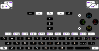
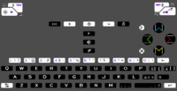
It's the keyboard layout.


I'm not super comfortable with the place of insert and delete on _wb_'s layout here.
Why?  When typing they are out of the way, so you won't hit them by accident, and when playing games they should be mapped to game controls.  If you think they are too far away, many people are concerned about delete being destructive.
How often do you hit Home or PageDown by accident on the Pandora?  I suspect that will be about the frequency in which you accidentally hit delete when typing, if it is the lower small face button.  As other people have noted, it's nice to have Ins and Del near to Home/End/PgDn/PgUp, since that is a standard grouping.

Also, ins and del can be remapped in games.  Pressing Ins in a game won't put your computer into Insert mode until the next time you hit it for all other programs.  AFAICT, Ins only puts a linux program into "insert mode" if the program has an insert mode, and then only if Ins was hit when the program had focus.

That was initially one of my concerns with having Ins and Del near PgUp, etc., but then I realized how Linux programs worked ;) .
 
attachicon.gif
nr62.png
What is the point of this? Yes, there are good reasons to have a 'left-aligned' (P+2, L+2) layout with single-width space. But I think this discussion is not at all moving forward if we keep running in circles. ED has made it quite clear that he wants a double-width space bar, and it looks like he really prefers a 'centered' layout. He also made it clear that he wants to have only one 'special' modifier (call it whatever you want, AltGr/Fn/Sym/Meta). Your proposal either does not have F-keys, or it requires two 'special' modifiers.

So can we please move forwards and discuss proposals that are in line with what ED is saying in the first post?

We are trying to tweak the details at this point, within the constraints of the design decisions that have been made by ED. So no F-ing modifier, no double-width space, and probably no 'left-aligned' layout.
 
Last edited by a moderator:
I'm not super comfortable with the place of insert and delete on _wb_'s layout here.
Why?  When typing they are out of the way, so you won't hit them by accident, and when playing games they should be mapped to game controls.  If you think they are too far away, many people are concerned about delete being destructive.
How often do you hit Home or PageDown by accident on the Pandora?  I suspect that will be about the frequency in which you accidentally hit delete when typing, if it is the lower small face button.  As other people have noted, it's nice to have Ins and Del near to Home/End/PgDn/PgUp, since that is a standard grouping.

Also, ins and del can be remapped in games.  Pressing Ins in a game won't put your computer into Insert mode until the next time you hit it for all other programs.  AFAICT, Ins only puts a linux program into "insert mode" if the program has an insert mode, and then only if Ins was hit when the program had focus.

That was initially one of my concerns with having Ins and Del near PgUp, etc., but then I realized how Linux programs worked ;) .
I'm not sure which position is actually easiest to press: where I have Ins and Del (very top row, roughly where 8 and 9 are on the Pandora), or where I have plus and minus (at the new action buttons, which are small low buttons).

I'm also not sure which keys are most important: Ins and Del or + and -. I think Ins is probably not important at all to most people, Del is quite important but not crucial since many people are used to using only backspace. Plus and minus are more evenly matched in terms of importance; probably minus is a bit more important than plus, but the difference is less pronounced. In many applications (e.g. zooming) they are equally important.

The main reason for putting Ins/Del in the action button group together with Home/End/PgUp/PgDn is that that's what normal full-size keyboards traditionally do. Then again, normal keyboards have - + near the number 0. Laptop keyboard typically don't have a traditional Ins/Del/Home/End/PgUp/PgDn block: instead they often have Ins/Del somewhere at the very top-right corner, and Home/End/PgUp/PgDn at or near the arrow keys. Laptop keyboards do tend to have - and + at their normal spot though: between 0 and backspace. In other words: the argument "do what a normal keyboard does" can be used to justify both Ins/Del or +/- at the extra action buttons.

So I have no strong a priori preference as to whether to put Ins/Del or +/- at the action buttons. Still, I do think that my layout proposal (+- at the action buttons, Ins/Del at the very top) has some advantages:

  • Dedicated primary keys for + and - are better than having + and - as Meta/Fn/Sym/AltGr + some letters
  • Nobody wants to put +/- up there in the very top row, so if you don't put them at the extra action buttons, then they take up two Meta-keys
  • '+' and '-' are æsthetically nicer labels for game buttons than 'Ins' and 'Del' (and please, don't use +/- as labels if they don't correspond to those symbols!)
  • If you consider the left hand side of the game controls as "micro navigation" (dpad and mouse cursor) and the right hand side of the game controls as "macro navigation" (scroll nub, home, end, pgup, pgdn), then zooming (+- are often used for zoom in/out, sometimes with Ctrl) does kind of belong in the "macro navigation" block. In this way, it makes more sense to put +/- there than Ins/Del.
 
My main concern with +/- on the small face buttons is that they are a little further away from the action (i.e., other parts of the keyboard) where most of my evil mathematical calculations will be performed.  For readability, I sometimes put spaces between my additions and subtractions, which would make my right thumb feel like a windshield wiper, if +/- were on the small face buttons.

I agree we shouldn't call the small face buttons +/- however, if that's not their function :) .

Perhaps we all can update our "final keyboard layout" post with some of our final ideas, to post an unofficial poll...
 
Inspired by ible and Grench, here is another version of my proposal:

http://www.keyboard-layout-editor.com/#/layouts/8b93808af832d16168b37549f55698c6

Here it is with some options for the unused Meta-labels:

http://www.keyboard-layout-editor.com/#/layouts/6605c02eed859ed9f02c4bd92445ba5e
I like where you're going on a lot of this.  I'm a bit concerned for DosBox and QEMU and how they would function on it.

Something I tried to do on mine that would be an easy fix here...  I notice that shift and Fn/Meta/Phred is on the left side in both the keyboard and the shoulders.  When I considered usability, I had decided to put them on opposites so that it is 'select modifier' with one hand then 'select symbol' with the other.  It should help cut down on 'hand stretching'.  Maybe consider swapping the shoulder button maps side to side?
 
Any preferences for where [] and {} should go?

Original one:

http://www.keyboard-layout-editor.com/#/layouts/ff067143d71cf2d57a32dde9ef4a62c9

I've "greened" out certain region specific letters that one may desire to modify in a different way. For example, the above is a German layout.

{} and [] moved about:

http://www.keyboard-layout-editor.com/#/layouts/62926063848605049d6879eed5720e76

This leaves room for some other Meta-modified letters, especially E, like in _wb_'s.

I still keep only (max) 3 prints per key, and [] is nice and close to numbers, where you might expect to be putting in numbers. (Either as an index ARRAY[0] or as a python array e.g. [ 1, 2, 3 ].)
 
Last edited by a moderator:
Hi, I am new to this board but I've been following the development of the Pyra for a while now and I also used to own a Pandora (emphasis on _used to_). I hope to be a Pyra owner at one point in the future and therefore would like to lend my voice to the discussion. I am not sure if this has already come up so please indulge me if someone already mentioned the same things. (Translation: If I'm too late to the party, just tell me and I'll show myself out.)

My main points are:

  •  leave the physical keyboard layout (QWERTY) alone as much as possible
  •  do not try to accomodate for language specific issues (localization) with dedicated keys (e.g. single keys for ä, ü, é, etc.)
  •  solve such issues with modifier keys (Fn, Alt, etc.) and in software (please see explanation below)
  •  try to allow for users to configure their keyboard layouts and input methods in software as much as possible
 
To briefly show you where I'm coming from in terms of user experience, here's a list of portable devices I've owned and used over the years (in no chronological order):

  •  IXI Mobile / PocketWeb OGO CT-17 and CT-25E
  •  HTC Universal, aka Qtek 9000/Vodafone VPA IV/T-Mobile MDA Pro (Windows Mobile 5 PocketPC)
  •  E-TEN Glofiish M800 (Windows Mobile 6 PocketPC)
  •  Nokia N900
  •  Nintendo DS, 3DS
Believe it or not, for me the two PocketWeb devices had the most pleasant typing experience on a portable device with a physical keyboard. Neither the Pandora nor my current Samsung smartphone allow me to type as fast and with as little hesitation as these two devices.


Based on this experience I would like to propose two solutions:

1) Allow use of a "timing based" approach for keyboard combinations for character capitalization and keyboard commands

Here's an example: You want to type a name with proper capitalization like "Alexander the Great". What you do is press the modifier key (SHIFT ) on your keyboard and then _let go of it_ and press the next key, in this case the letter (a) to be capitalized within a brief period. The result is the letter "A". The reason for this is that you only have two fingers (your thumbs -- and index fingers for shoulder buttons) and it can be awkward and clumsy having to replicate the way of typing on a desktop keyboard on a thumb keyboard. This was especially apparent on the Pandora keyboard which made it clumsy to use special characters or use common keyboard commands because of the need to "reach around" the keyboard to press several buttons _at the same time_.

The software part of this should be configurable to allow it to be turned ON or OFF (user preference) and to set a timing intervall within which the successive keys need to be pressed (#.# seconds, with a fixed maximum, e.g. maybe 1.0 second).

Another somewhat related example to this timing issue is the way you can access files in Windows Explorer (I assume it applies to other operating systems as well). Say you have a folder that contains lots of files and/or folders and you quickly want to jump to a specific file by selecting it.

Folder contents:
...
opera.*
open.*
opening.*
party.*
pat.*
patty.*
patrick.*
pet.*
pets.*
pi.*
pie.*
pies.*
post.*
...


Press "p" on your keyboard and the first file beginning with that letter will be selected. Press "p" and then quickly "e" and the selection will be the first file beginning with "pe", and so on. To my knowledge, this is practical and works for at least three letter inputs in quick succession. Therefore, I would like to argue that it is indeed a viable solution to allow keyboard commands such as the following examples by pressing the keys not at the same time like on a desktop computer but rather in quick succesion:

  • SHIFT + a to get A
  • SHIFT + ALT + a to get Ä
  • CTRL + C to execute COPY command
  • ALT + F4 to execute QUIT command
2) Regarding the input of special characters (non-ASCII)

How do current smartphones with their touchscreen based keyboards deal with this issue? They allow for standard alphabet characters on the onscreen keyboard to be pressed and then show all the available variations of those letters. So, if you press and hold (e) you get to choose from é, è, ë, etc. This is also the most logical solution: locate special characters _where_ their base characters are, so under (a) you will find à, ä, á, æ, etc. Similarly, users could be allowed to map their most frequently used special characters to a certain level of keyboard combinations, e.g.

  • press (e) to get e
  • press SHIFT + (e) to get E
  • press ALT + (e) to get é
  • press SHIFT + ALT + (e) to get É
Please do not create extra physical buttons for such cases. (US English is the superior layout.) And again, such a solution would have to be built into the software.


So, in summation, my two proposed solutions are:

1) Allow timing based character and command input.
2) Use UI and modifier keys to access non-ASCII characters.


P.S.: I may have missed this, but I hope the mouse buttons can be assigned to other keys than the analog nubs?
 
What made the pocketWeb-devices good?

The shift idea makes sense. How does one implement that?

Mixing letters with accentuation is misguided.

--------------------------------------------------

Ible, preferably [ ] and { } should go on the right half of the keyboard, where you will find them on a UK/US keyboard.

You will be able to fit that in if you start the keyboard at the beginning.

Ctrl shift at the far left doesnt make sense for two thumb typing, even less with above shift-idea.

The Ogo devices employ a lot of good ideas:

https://en.wikipedia.org/wiki/Ogo_(handheld_device)#/media/File:Ogo-aufgeklappt.jpg

, and . on the correct side.

http://upload.wikimedia.org/wikipedia/de/a/aa/Ogo-auf.jpg

Ctrl and shift? Caps now fixed.

Strange tapering of QA-Z introduced

http://www.pocketbrain.de/typo3temp/ce_gallery/d_788_450_540_80.jpg

Ugly colours introduced, or fixed.
 
Last edited by a moderator:
Hi comradekingu, thanks for taking the time to read my lenghty post.

Here are some more thoughts:
 

What made the pocketWeb-devices good?

1) Solid plastic clamshell case design: highly shock-resistant, i.e. almost indestructible. No worrying about scratching or cracking a 5 inch OLED touchscreen like on today's smartphones.

2) Rounded case/keyboard corners: Very comfortable to hold the device in both hands for typing (as shown in your linked photos) with both thumbs.

3) Almost no uncomfortable "reaching" in typing: each thumb stayed on its respective side of the keybaord, just as your left hand should only cover mostly keys on the left half of your desktop keyboard and vice versa.

4) Keys are separated, the way they should be, regardless of desktop or handheld keyboard. Makes for better tactile feedback and distinction between keys.

5) Keys had a nice rounded shape to them that was easy to feel and press.


The shift idea makes sense. How does one implement that?
It could be like a global setting in the OS, configurable through a utility or part of a/the keyboard mapping program. The OS would have to "remember" which key was last pressed, e.g. SHIFT and then "know" if another key was pressed within a short amount of time after that if that key combination, e.g. SHIFT + A, would result in a new input. If no key is pressed after the time limit has expired, it can "forget" the pressed key. (Sorry, I am not a programmer.)


Mixing letters with accentuation is misguided.
 
I presume you refer to the idea of associating letters like (a) with their respective accented versions like á, ä, and so on?
Could you please elaborate why you consider this not ideal?


Ideal is the thing you adviced against, having them available in default locations. To the right of P and L. This is the difference between a keyboard and a non-keyboard to international users. It is nice having you onboard, please register an account and vote here http://boards.openpandora.org/topic/16868-the-big-pyra-keyboard-poll//URL]

And no, they shouldnt be visible to the user or printed per default, that sort of thing just helps making it local, not global. Multi-local is a mess, so the sleek compromice is english per default and having to remember positions for everyone else. Fortunately that is how it works. People type by motorical learning, not by visuals.

Changing it into anything else, and productivity drops to the floor. It may pick up again somewhat, but people are _not_ keen on learning new keyboard-rituals.

Yes, there is a small benefit to having visuals too, but thats possible by changing only a small part of the keymat. You swap in for example Ö for the regularpress and then put what was on regularpress at the open AltGr position.

Non-ascii is about as descriptive as non-AZ, a lot of things fall into that category.

By not having the keys available in default locations you do not solve anyhting for english users, it just means you cant have [] and {} at default positions.

Furthermore having shift and ctrl at extreme left and/or all the way at the bottom left, isnt an ideal placement for these keys. And in the case of shift, never one that becomes preferential.

You can see the explanation

http://boards.openpandora.org/topic/17881-its-the-keyboard-layout/page-15#entry377443/URL]in the first spoiler

here http://boards.openpandora.org/topic/17881-its-the-keyboard-layout/page-21#entry377827/URL]is how the design follows.
 
Last edited by a moderator:
My main points are:

  •  do not try to accomodate for language specific issues (localization) with dedicated keys (e.g. single keys for ä, ü, é, etc.)
ED wants ä ö ü ß in the layout but you should be able to remap them to what you like, same as the mouse buttons. There's a program called ABMouse for the Pandora that performs the action you seek. :)   
 
While this might have been a joke! This is *exactly* how the key maT should be! With localised characters printed on the case or a removable overlay...


This gives everyone the power to make their key maP dedicated to their exact language...
 
Last edited by a moderator:
I thought that was because its slightly less cumbersome than using dead-keys. He did vote for P+2 L+2 in the poll, stated for internationalization. Then there was the no foreign things on the keyboard scaring away prospective buyers. Cant have both worlds with the last one.

However condensing all into one visual layout becomes this:

nr64german.png

You would be at the option of either AltGr-ing the öäü or ^-key or, at your option, remembering that you switched them around for the first letter, which then becomes the AltGr, along with shouldershift only. The alternative to swapping AltGr position for regularpress is to move everything along 1 step, remembering it like this

nr64german2.png

Thats the most efficient way to type german. Trying to fit that into a layout where you have to remap recursively, and remember your choices, is an exercise for the very technical and determined. Ending up with a big blind matching-game.

Edit: My idea was you could switch out only the left part of the keymat, the piece seen here. Instead of doing the whole thing.

If the keymat comes in several parts i dont know. If its just the one part, you could cut off the rightmost part and add a regional one. I imagine the smaller the regional keymats are, the cheaper they are to produce.

Something else im wondering about is this, it says 2 colours for prints, same as pandora. Would that make it possible to invert the black for white on some keys?

Black key with white print

White key with black print

Its really nice to have, and I'd be willing to fund it.  But it look wonky with the backlight?
 
Last edited by a moderator:
I thought that was because its slightly less cumbersome than using dead-keys. He did vote for P+2 L+2 in the poll, stated for internationalization. Then there was the no foreign things on the keyboard scaring away prospective buyers. Cant have both worlds with the last one.

However condensing all into one visual layout becomes this:

attachicon.gif
nr64german.png

You would be at the option of either AltGr-ing the öäü or ^-key or, at your option, remembering that you switched them around for the first letter, which then becomes the AltGr, along with shouldershift only. The alternative to swapping AltGr position for regularpress is to move everything along 1 step, remembering it like this

attachicon.gif
nr64german2.png

Thats the most efficient way to type german. Trying to fit that into a layout where you have to remap recursively, and remember your choices, is an exercise for the very technical and determined. Ending up with a big blind matching-game.

Edit: My idea was you could switch out only the left part of the keymat, the piece seen here. Instead of doing the whole thing.

If the keymat comes in several parts i dont know. If its just the one part, you could cut off the rightmost part and add a regional one. I imagine the smaller the regional keymats are, the cheaper they are to produce.

Something else im wondering about is this, it says 2 colours for prints, same as pandora. Would that make it possible to invert the black for white on some keys?

Black key with white print

White key with black print

Its really nice to have, and I'd be willing to fund it.  But it look wonky with the backlight?
We should rearrange the qwerty letters to form a hidden message.  
 
Last edited by a moderator:
Inspired by ible and Grench, here is another version of my proposal:

http://www.keyboard-layout-editor.com/#/layouts/8b93808af832d16168b37549f55698c6

Here it is with some options for the unused Meta-labels:

http://www.keyboard-layout-editor.com/#/layouts/6605c02eed859ed9f02c4bd92445ba5e
I like where you're going on a lot of this.  I'm a bit concerned for DosBox and QEMU and how they would function on it.

Something I tried to do on mine that would be an easy fix here...  I notice that shift and Fn/Meta/Phred is on the left side in both the keyboard and the shoulders.  When I considered usability, I had decided to put them on opposites so that it is 'select modifier' with one hand then 'select symbol' with the other.  It should help cut down on 'hand stretching'.  Maybe consider swapping the shoulder button maps side to side?
Yes, you could put Shift/Meta on the R1/R2 shoulder buttons and Ctrl/Alt on L1/L2.

I put Shift on L1 and Ctrl on R1 for backward compatibility with Pandora and I don't think it's hard to use the same hand to hold a shoulder button and press a key. So I don't think it matters much, having the modifiers on opposite sides or not...

Here is another, more 'Grenchified' version of my proposal:

http://www.keyboard-layout-editor.com/#/layouts/8c97d978364024477776b181cb8032de

In this proposal, all of the punctuation symbol keys are available, more or less near their normal position, as a Meta-key. The shifted Meta symbols are completely standard. There are seven such keys: `~    -_    =+   [{   ]}    \|    ;:    and   /?. The other three punction keys are dedicated primary (non-Meta) keys: ,<   .>  and '".

Most of these Meta keys are at the right hand side, which should help for those who use the keyboard modifiers only.

A nice thing is that [ ] and { } end up neatly below ( ), which makes plenty of sense.

There's no more room for ₤ or Ł at L, and obviously some symbols have been 'demoted' from being a direct Meta-key to being a Shift-Meta-key, but I think it's conceptually nice to get this close to a standard US-QWERTY keyboard. Also æsthetically it is pretty nice to have most of the letter keys free of clutter. Of course we could add labels for the default Meta-mapping of those letters (e.g. ÄÇ€ÑÖÜߥ and so on), but I wouldn't do that. The latin letter by itself can serve as a mnemonic, it doesn't help to have an extra label Ä if you're going to want to map it to À or Å, to the contrary.
 
Wouldn't having "compose" on a key combination that is also used as a standard modifier combination cause problems? (meta+shift)

- Neelix
 
Here is another, more 'Grenchified' version of my proposal:

http://www.keyboard-layout-editor.com/#/layouts/8c97d978364024477776b181cb8032de

In this proposal, all of the punctuation symbol keys are available, more or less near their normal position, as a Meta-key. The shifted Meta symbols are completely standard. There are seven such keys: `~    -_    =+   [{   ]}    \|    ;:    and   /?. The other three punction keys are dedicated primary (non-Meta) keys: ,<   .>  and '".

Most of these Meta keys are at the right hand side, which should help for those who use the keyboard modifiers only.

A nice thing is that [ ] and { } end up neatly below ( ), which makes plenty of sense.
Perfect, now we just need Ins and Del to come down onto the small face-buttons, since - and + are already taken care of in the AltGr's ;) :

http://www.keyboard-layout-editor.com/#/layouts/2e38fe2c52c6fbab39a4eb118e23dd38
 
Last edited by a moderator:
Back
Top